Adding a “Subscribe” Bar to Your Blog

It makes me uneasy that such a huge number of people still visit blogs the old fashioned way: by checking them manually every now and then. This, of course, is in opposition to subscribing via RSS and then only clicking over when there is new content.
I am guilty of keeping an extremely unpredictable publishing schedule at Mike Industries, sometimes posting multiple times per week, and other times going almost a month without any new entries. For this reason, I wish all readers were subscribers. That way, no one would ever be greeting with old content.
In an effort to convert more casual readers to subscribers, and hopefully convert people onto RSS in general, I’ve developed a PHP-powered module which prompts users to subscribe to my feed if they aren’t already. Here’s how it works:
- If you come to Mike Industries and don’t have at least one of two cookies, you see a bar encouraging you to subscribe via RSS or e-mail. One cookie is the “subscriber” cookie while the other one is the “promptclosed” cookie.
- If a user clicks over to Mike Industries from my feed, I set the “subscriber” cookie. If a user manually clicks the “close this message” link in the module, I set the “promptclosed” cookie. Both cookies last for three months.
In order to accomplish this, you need to do a few things:
- Write some simple HTML to display your prompt message. Include it at the top of every page of your blog, hopefully using something like PHP so you only have to do it once. Using PHP, or your dynamic language of choice, set the message to only render if neither the “subscriber” nor the “promptclosed” cookies are set. Here’s what mine looks like:
- Modify the URLs in your feeds such that they pass a variable at the end like “how-to-make-a-margarita?subscribed=true”.
- Using PHP, or your dynamic language of choice, insert code right above the code in step 1 which checks for the presence of “subscribed=true” in the query string and sets the “subscribed” cookie accordingly.
* Note: If you are using Mint w/ BirdFeeder like I am, you can skip steps 2 and 3 and just add the following to Birdfeeder’s class.php right above the line that says header("Location:{$_GET['seed']}");:
Voila. That’s it. An unobtrusive message encouraging you to subscribe which goes away after you either subscribe or decide to close the message.
Interestingly, I got this idea while experimenting with Google AdSense several months ago. I only wanted to show the ads to casual passers-by (perhaps coming in through search engines) and not to Mike Industries subscribers. Now that we have the ability to set cookies and identify who is a subscriber, we can do all sorts of things. I can imagine a small subset of features on the site which are perhaps only made available to subscribers. Who knows. I like the possibilities though.
Fantasy Football Spot Up For Grabs
Once again, the blogosphere’s trashtalkingest and most reprehensible fantasy football league, the IKNFL, is increasing its roster. We’re expanding to two leagues of 14 teams each this year, and there is an extra spot up for grabs. Past champions include D. Keith Robinson (2004), Jeff Croft (2005), and Wilson Miner (2006).
Personal transformations have been known to occur in winners, as can be witnessed by Keith’s opening of the highly successful Blue Flavor design and development studio, Jeff’s relocation from a rural chicken farm in Kansas to the city of Seattle, and Wilson’s remarkable metamorphosis from early Swiffer mop prototype to ladykilling heartthrob (see below).
Before IKNFL Championship:
After IKNFL Championship:
The IKNFL is $80 to join but the payouts are equally rich. We include individual defensive players and use a normalized scoring system that ensures every position on the field can score big. There’s a lot of trash talk so make sure you can take the heat before applying.
SO… if you’d like to join, all you have to do is leave a comment below requesting membership. As a simple test of your football knowledge, name who should be the #2 pick of the draft and why.
Gnomedex: No Stinkin’ Badges
Chris Pirillo’s Gnomedex conference kicked off last night in Seattle and the turnout looked fantastic. Lots of people from out of town, and a great venue to boot. The thing that pleased me more than anything else at the pre-conference party though was the design of the conference badges. Gnomedex badges are big and bold, with visual real estate doled out in almost perfect proportions. I wrote about the issue of carelessly designed conference badges a few months ago, and upon congratulating Chris on his conference last night, he informed me that the Gnomedex badge design was inspired by that article. Hooray for design evangelism!
Below is a photo of the badges snapped by Laughing Squid:
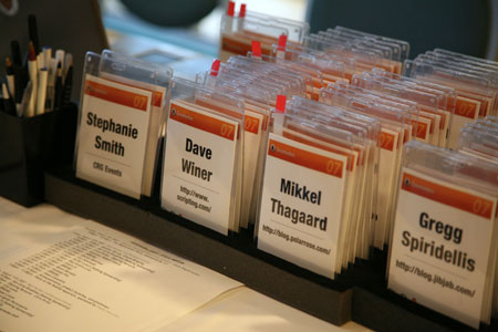
Positives:
- Attendee name is huge and readable from far away — set in
UniversHelvetica Neue Condensed Black, an extremely legibile, yet space-efficient typeface. - Attendee’s blog URL (instead of company) is listed below name. A nice touch considering the subject matter of Gnomedex.
- Title of conference and all other non-essential information is minimized.
- Sponsor (Polar Rose) is all over the lanyard instead of mucking up half the badge.
- Badge is two-sided.
Potential Negatives (Not many!):
http://could theoretically be lopped off the blog URL to increase the size and readability of the URL, but one could argue the prefix adds geek appeal.- A commenter on my previous entry suggested perhaps emphasizing the person’s *given* name so you know what to call them. This is more important in other countries though where names don’t always follow the “call me by the first name you see on my badge” rule. Not really fair to call this a negative, but it would be a nice potential issue to solve.
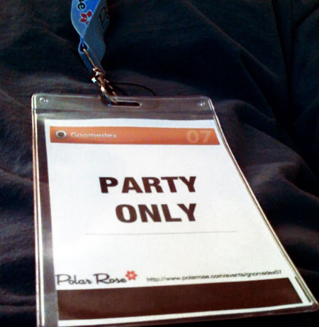
Oh, and there’s another big positive too. This has got to be the coolest badge ever. Party only! —
A Low-Fi Solution to E-Mail Overload: Sentenc.es
I’ve written about e-mail overload issues in the past, and today I’m presenting what I believe is a simple, low-fi solution: sentenc.es.
In a nutshell, I have two issues with e-mail:
- More than any other medium in the world, the time commitment difference between sender and receiver is huge. For instance, if you call me on the phone and we chat for 10 minutes, that’s 10 minutes of your time and 10 minutes of my time. If you write me a handwritten letter and I write you one back, that’s maybe 30 minutes of your time and 30 minutes of my time. If we exchange text messages, that’s 10 seconds from you and 10 seconds from me. But with email, often times the sender will ask two or three open-ended one sentence questions which elicit multi-paragraph answers. In these cases, the sender spends one minute and the receiver is asked, implicitly, to spend maybe an hour.
- When faced with an inbox of 100-400 messages, I usually find myself replying to the messages which are quickest to reply to, rather than which are most important to reply to. The end result is a continual paring down of my inbox until I have 50 really important messages to reply to which are then too old to take care of.
In thinking about how to reduce this problem for me personally, I came up with a technology solution which, while cool, would require way too much buy-in from OS makers, mail application providers, and individuals. Essentially, whenever you send me an e-mail, I’d like to be able to instantly pop up a Toast or Growl message on your desktop for a few seconds with a status message of my choice. Something like “Current response time estimate: 7 days” or something more personable. I don’t like auto-responder e-mails because I’m not trying to clog up your inbox, but the ability to send you a quick, fleeting status message would be excellent. Perhaps even when you just hover over my name in the To: field before you even send the mail.
Annnnnnnyways… that solution is a bit too hi-fi and it doesn’t really solve the core problem, so instead I’m enacting a new policy today which seems potentially much more effective:
Every e-mail I send to anyone, regardless of subject or recipient, will be five sentences or less. Like a cinquain. Ideally, it would be a 160 character count like an SMS message, but since that would require an actual e-mail plug-in (viz. “work”), we’ll go with the much-easier-to-count concept of sentences instead.
In order to politely explain the systematic brevity with a similar amount of brevity, I will link to a new site I just set up called five.sentenc.es in my signature line. By ensuring that all e-mails I send out take the same amount of time to send (viz. “not a lot”), I am evening the playing field between emails and attending to many more of them in the end.
Read more…
Got iPhone? Get Leaflets…
 The good fellas’ at Blue Flavor are announcing this morning the release of “Leaflets” — mini browser-based apps for your shiny new iPhone. Available flavors currently include Flickr, Del.icio.us, Upcoming, The New York Times, Newsvine, and a few others.
The cool thing about Leaflets is that they display data from the services listed above in a format tailor made for the iPhone. Apple has made a big deal about how the iPhone can view “the real web” and not “the mobile web”, but while this is true, it still doesn’t mean “the real web” is an ideal format for the iPhone. The mobile savants at Blue Flavor have taken this axiom to heart and created a nice middleware layer which lets me get more out of my Newsvine, my Flickr, and my Del.icio.us by getting less.
Check out iPhone Leaflets at GetLeaflets.com.
Letting go of the Trumpets: A Week with the iPhone

In discussing the iPhone with Dan Benjamin a couple of days ago, at one point I mentioned it was “like someone assembled the finest orchestra the world, but decided to leave out the trumpets”.
Given such an orchestra, one can come away with either of the following reactions:
a) “Wow, what an absolutely fantastic orchestra.”
b) “Uhhh, where are the trumpets?”
With apologies to trumpet players around the world, I find myself decidedly in camp A — sometimes appreciative of what Apple has left out of the iPhone and sometimes frustrated by it, but never losing sight of what a great device this is and what it will become in the months to follow.
A lot has been said already about the jesusphone so who knows how much of this article will be interesting, but it’s a cathartic post for me, having waited several years for this device to become a reality. I first wrote about the iPhone almost exactly three years ago at a time when most of the world thought Apple would never get into the phone business. It’s interesting to see how opinions have changed since then from “why would they ever” to “why would they ever NOT” get into this market.
Read more…
Announcing ElectionVine: Distributed Presidential Elections
This morning on Newsvine, on Mike Industries, and on thousands of blogs across the world, we launched ElectionVine.
ElectionVine is a giant distributed polling system designed to gauge the momentum of the U.S. Presidential race through the eyes of the independent internet and blogosphere. While traditional polling methods are carried out by single organizations, ElectionVine is entirely in the hands of site owners like you.
Here’s how it works:
- Head to electionvine.com and get your personalized poll code. You can customize what your poll will look like so it fits the colors of your site and even personally endorse a candidate if you’d like.
- Place your poll code in the sidebar of your site or blog and watch the votes come in.
- Check your own site’s political breakdown right from within the poll itself or on the ElectionVine Leaderboard.
Cumulative vote totals on the ElectionVine leaderboard will continue to rise up until the presidential primaries, but users’ votes will reset every month, allowing you to essentially see an entirely new set of data every 30 days.
The coolest part of ElectionVine, however, is that once you’ve voted on one site (say, Techcrunch), your vote will automatically count on any other sites you happen to visit thereafter (say, Mike Industries).
The dream of ElectionVine is to collect the most distributed view of how the election is shaping up online, and for that, I ask the assistance of you, faithful Mike Industries reader. We’ve provided two quick, unobtrusive methods of embedding, via a standard embed tag and via the newly developed WEDJE javascript method.
So head on over to ElectionVine and set up your polling place today. The country and The Vine thank you!
How To Keep Widgets From Slowing Down Sites: WEDJE
The whole world is going to widgets. This overused, overhyped term refers to third-party code one places on their website or blog in order to display such things as Flickr photos, Twitter status, or iTunes playlists. Everybody and their mom is putting out widgets these days, and although only about 1% of them are useful or interesting, they are an important new distribution mechanism that is changing the way companies think about syndication.
But there is a big problem with widgets: they slow down the sites that use them. In the best case, you have a company like Flickr whose servers are almost always snappy, and in the worst case, you have a young startup that is constantly struggling against increasing demand and occasionally can’t serve up any code at all.
The problem is that in either of these cases, the completion of your site’s loading and rendering depends on someone else’s code living on someone else’s server. Including a fast and reliable Flickr widget still slows your site down by at least a split second and including a less stable one can leave your site hanging indefinitely.
We’ve been developing what we think is going to be a gangbusters widget at Newsvine over the last few months but just as we were getting ready to deploy it, Intern Rob and I hacked together what we think is a method of deploying widgets in such a fashion that they don’t affect the load times of their parent sites whatsoever.
Following is a breakdown:
Read more…
Is It Okay To Eat 50 Year Old Cough Drops?
 So after my post about the disappearance of Pine Bros. cough drops, Freckles discovered there was an eBay auction offering up one unopened box of the honey-flavored variety. The rub being that they were from a production run in the 1950s.
I placed a bid of $6, won the auction, and my 50-year-old box of cough drops is now en route. So the question is: what is the shelf life on an item like this and are they safe to eat? If yes, I will eat them. If no, I will just keep them as memorabilia.
Any scientists out there in the audience? What happens to honey and glycerin over the course of 50 years? I have actually heard that honey is the only food in the world that never spoils.
The Most Useless Infographic Ever
The purpose of infographics is to take data that is initially tough to interpret and distill it into some high-level knowledge that readers can remember and take away with them. Upon picking up a six-pack of Cottonelle last night though, I think I found the most useless infographic ever:
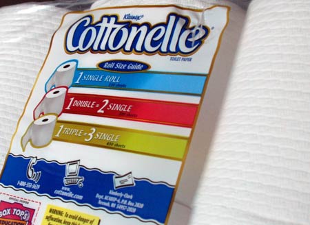
Yes indeed. It’s a visual reminder that:
- 1 x 1 = 1
- 2 x 1 = 2
- 3 x 1 = 3
That’s good times. And there’s even a 1-800 number you can call for further details as well as a website where perhaps you can plug in different values and see how many single rolls a quintuple roll would equal.
If I were the makers of Cottonelle, I’d probably use this space to showcase and romanticize the process by which they get Aloe into the toilet paper. I’ve always wondered about it.
For much better examples of infographics, check out a great book Rex showed me: Understanding USA.

