A Loving and Well-Loved Man
A couple of weeks ago, one of the most unique people in our industry passed away.
A quiet man of incredible volume, Om Malik was the person whose voice traveled only a few feet but always filled the room. He was the first national reporter to write about our little startup Newsvine in 2005, and for that I will always be indebted to him. Om and Rafat Ali were the two writers I could always count on to ask hard questions and keep founders honest when they tried to describe how they were improving the world. His article was hopeful and optimistic, yet balanced, which happens to describe his personality as well.

When I moved to San Francisco in 2012 to work at Twitter, I got to see Om more frequently. He always wanted to meet at Piccino. He said it was his favorite restaurant, but I imagine he had hundreds of others around the world he loved just as much for different reasons.
Om was a loving and well-loved man. Spend 10 minutes thumbing through every single photo in Christopher Michel’s Om The Great and you’ll feel it in your bones. How does a person so prolific in his field find this much time to experience the natural world, surrounded by hundreds of loving friends and even more exotic cameras?
It’s because he knew that the whole point of life is to experience it in whatever way gives you joy and purpose. That wasn’t spending every waking hour working on a startup, attending a tech conference, or promoting himself online. It was putting his best energy into his writing whenever inspiration struck, and then putting his best energy into travel, photography, generosity, and friends at all other times.
If there’s one thing you take from traveling through Om’s life via Chris’ gallery, it should be the importance of getting your priorities in order. Om often credits his heart attack at age 41 with giving him the clarity to re-prioritize his life. Sometimes, we need to experience a moment of mortality like this to remember our days of even drawing another breath — let alone surrounded by friends and nature — are finite. There is no reason that needs to be the case, however.
Any one of us can decide on any given morning we want to live a bit more like Om Malik. A bit more travel. A bit more smiling. A bit more actually connecting with friends instead of dozens of “we should hang out sometime” near-encounters.
I’m starting today.
The Future Favors the Curious
If you’re a designer in the market for a job right now, you probably feel behind the AI wave already, and you’re wondering if the skills you’ve honed in your career are even useful anymore. One of the benefits of being an oldster in this field is that you begin to see patterns in everything, and I’m here to tell you that this pattern has happened many times before and there is a clear way through it as a designer.
In 1995, halfway through college, I determined I was going to be a designer. At that time, 99.99% of “professional designers” had no experience designing anything for the internet. You could have tasked some of the most accomplished designers at the time — Jony Ive, Paula Scher, David Carson, Paul Rand, Massimo Vignelli — with creating a simple 468×60 banner ad and none of them would even know what you were talking about.
Over the next five years, the world would discover what banner ads and the internet were, but most experienced designers stayed put in print, television, or whatever field they were already comfortable with. The designers who would go on to help shape the internet were from two groups:
- People brand new to the industry
- People who looked forward to starting over and getting good at something new
I was somewhere between the two groups, having spent a few years in print but leaning more into a childhood love for new technology than anything else.
Within a few years, the demand for internet-native designers exploded and created the thriving job market we have enjoyed almost uninterrupted until now. Analog design still produces some of the most amazing creative work on the planet, but the growth of that part of the profession has not been the same.
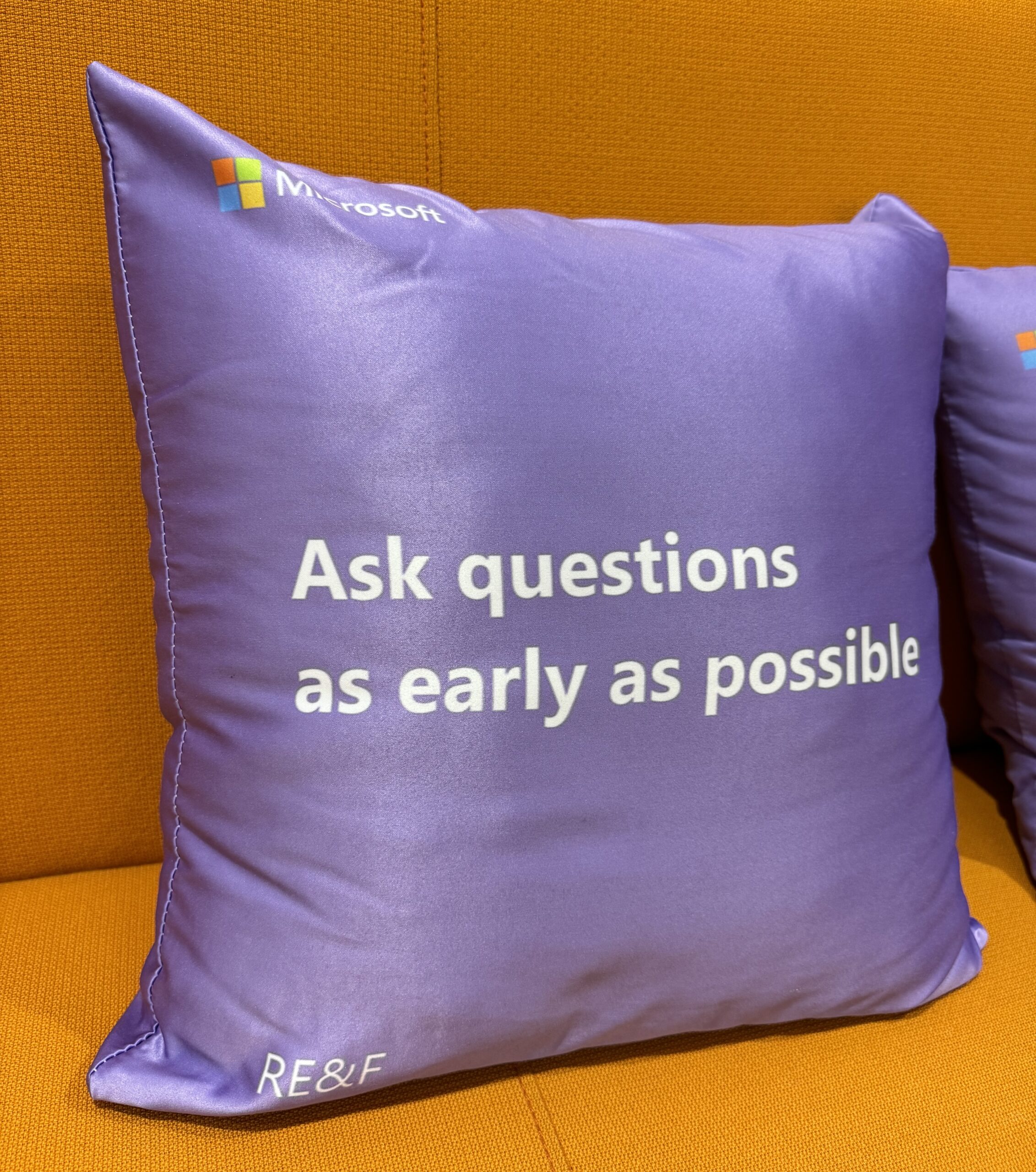
Running design at Microsoft AI and having done a decent amount of hiring lately, I can tell you that the patterns emerging now are exactly as they were in 1995. There is a giant population of designers who have a bunch of really great skills. Some of those designers will decide they are content doing the same sort of design they have done for their whole careers. Others will decide to learn as much as they can about AI and prepare for an industry that will look very different in 5 to 10 years. Finally, there is another group of people who have no design experience whatsoever but are so enamored with this new technology that they will teach themselves very useful skills in a short amount of time. Do not underestimate this third group as it’s easier than ever to fake it ’til you make it right now.
If you are content in your comfort zone, that’s perfectly fine. If, however, you are looking to lean into what’s next, here are some suggestions.
47 Years Later, The Palisades Disappeared Overnight
I grew up on Iliff Street, right in the middle of the ashes that up until a few nights ago, was a sunkissed neighborhood known as Pacific Palisades.
It was 1978, and I remember my dad climbing up on our roof with a garden hose. Every couple of hours, he would wet the house down, top-to-bottom, and everything surrounding it. I don’t remember everybody doing this, but my Dad is a Meteorologist, and back then he worked at the SCAQMD, the regional agency charged with studying, regulating, and improving air quality in Los Angeles, Orange, Riverside and San Bernardino Counties. Because of his specific remit and where we lived, he had a deep understanding of the Santa Ana winds and their effect on the Palisades.
When my dad explained what he was doing, he would point northeast to the hills behind us and tell us that if the winds didn’t die down, the fire miles in the distance would come towards our tiny little house and there would be trouble. As a small child, I don’t actually remember being scared about any of this. Every year there was a fire, the smoke was always so far away and so barely visible that it just seemed like anything else in life at the time. And besides, dads are superheroes to their children, so of course there was no danger.
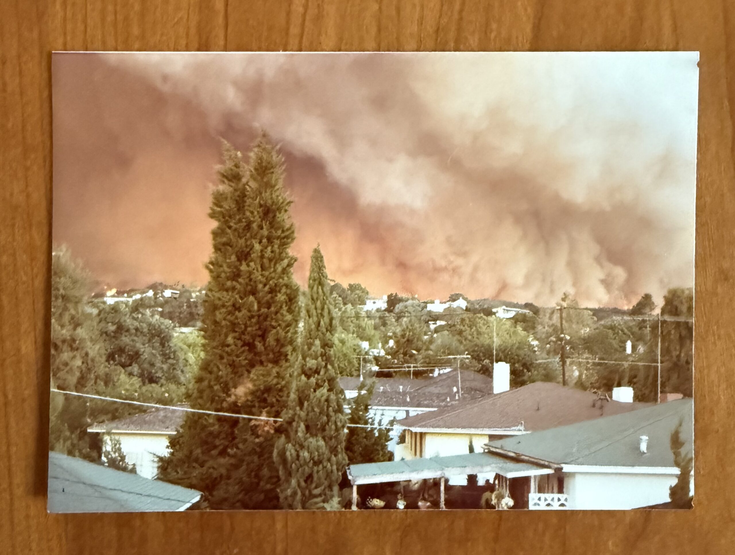
We ended up living in the Palisades until I was 15, when we moved up to Seattle, but in that time, these sorts of fires happened almost every year to some degree. The 1978 one was a big one though, and my dad had a flight scheduled to New York the following morning. He woke up every hour during the night to check the wind readings, and loaded up our Impala wagon for a prompt evacuation. That is how precarious things were, even 47 years ago. By sheer luck that night, the winds subsided, and the Palisades were spared. A few more hours of wind and 1978 would have been 2025. Same damage. Completely flattened.
I guess Pacific Palisades has always been a wealthy area, but wealth back then seemed less of a step-function than it is now. The “alphabet streets” where we lived seemed like the most modest of the neighborhoods; the place where teachers, government workers, and clerks lived. My parents bought our 1200 square-foot rambler for $38,000, and pretty much no one in the neighborhood had views of anything. The neighborhood was so named because the streets went from Albright, to Bashford, to Carey, to Drummond, to Embury, to Fiske, to Galloway, to Hartzell, to Iliff, to Kagawa. Felt really great not having to even look that up just now, but I will admit that I was Today Years Old before realizing there is no J. I wonder why. Each street was basically the same, although I distinctly remember Galloway having more tree trunks pushing the sidewalks up, making it a better route for jumping your Mongoose bike or Powell-Peralta board.
As a kid growing up in the ’80s, the Palisades had everything you could possibly want. It was a “free-range” neighborhood, where we could ride our bikes as far away as the Santa Monica pier without worry. Palisades Park was home to AYSO soccer, tennis, basketball, “Par Course” stations, and most importantly to me, little league baseball. I was part of the “orange” franchise which started you off as a Ranger, then a Twin, and finally an Oriole. Our patron saint was Mel Haggai, who up until now, I didn’t know had flown 30 missions over Germany as a gunner when he was growing up (!!!). Mel got me to switch from first base to catcher, where I could have more impact on games. We didn’t have a single left-handed catcher’s mitt in the entire league, so he bought me one with his own money. I also remember perennial umpire John Meyers, who took me, my friend Adam Segel, and a few others to Disneyland, only to have to deal with us getting thrown out of the park for jumping off of a few of the rides and causing havoc.
We Live in the Golden Age of Ice Cream
I tried some absolutely outstanding ice cream yesterday that reminded me of yet another reason I feel lucky to be part of Generation X:
We are living in the golden age of ice cream.
In the 1970s, we had a few basic flavors to choose from: vanilla, chocolate, strawberry, chocolate chip, mint chocolate chip, and rocky road. There were a few shops like Baskin Robbins that marketed some scary stuff like Rum Raisin, but if you were just getting ice cream at the supermarket or some other ordinary location, those were your choices.
There also wasn’t as much science to ice cream back then. The term mouthfeel was still relatively obscure. It all seemed perfectly good back then because… ICE CREAM!!! … but compared to what we have today, it was, as the kids say, “supes basic”. In the 1980s, along came the frozen yogurt craze which pointed to how much untouched frontier was ahead of us. Shoutout to Humphrey Yogart, by the way — the world’s best named frozen dessert shop. Shoutout also to Aaron Cohen’s Gracie’s, which not only has excellent ice cream, but the world’s only bathroom dedicated to Dolly Parton.
Anyway, we’ve learned so much about fat content, texture, and flavor combinations since then that we have practically invented a new food group.
A few years ago, during a trip to the underrated gelato mecca that is Croatia, I had a variety which tasted different than anything I’d ever tried. It was a “fig yogurt gelato” from a little shop in Cavtat. I usually stay away from frozen yogurt because it’s generally not as good as ice cream, but this was intriguing. A great flavor (fig), combined with a beautiful tartness (yogurt), along with best texture for frozen desserts (gelato). It was outstanding, and I have not been able to find anything like it ever since…
Until yesterday!
Behold, Hellenika Cultured Gelato:
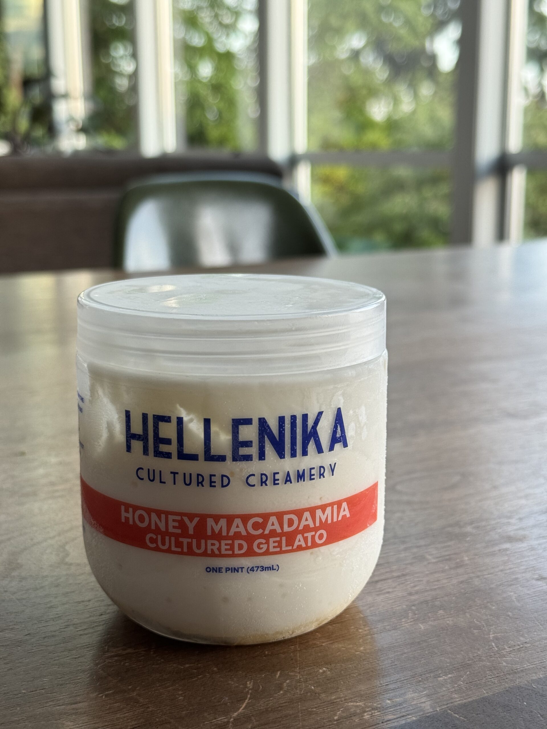
I don’t think I will ever purchase another brand of ice cream at the store ever again. It is the most perfect ice cream I have ever tasted. The creamiest mouthfeel, wonderful flavor combinations, and that little bit of tang which reminds you this is no ordinary substance.
Hellenika is a small creamery run by three Greek/Australian siblings with a single location in Pike Place Market in Seattle. Until recently, it was not available in stores, but you can now pick up pints in Metropolitan Market.
If you live in Seattle, you need to try this immediately.
If you don’t, you should try to get someone to mule you some in dry ice. Hopefully one day it will ship on Goldbelly.
Don’t get me wrong. I like a good low-grade Blue Bunny mini-cone as much as the next person, but I feel like we’ve passed through some sort of intergalactic hyperspace with this gelato. The future is now. Get this to your freezer any way you can. 🙌
One year at Microsoft
Last week marked one year at Microsoft for me, and what an unexpected adventure it’s been! I thought I was coming in to lead a a stable of popular, but well-trodden web properties, and I ended up getting to work on a whole lot more, including Windows, Bing Chat, and the company’s biggest bet in years: Copilot.
I usually write a lot about the companies I work at but have held off until now because we haven’t been hiring. Well now we are! We’re specifically looking for Designers and UX Engineers to work on our design system for Copilot. Some of these positions are on my team and based where we have offices (Puget Sound, the Bay Area, Atlanta, New York, Vancouver, Barcelona, Hyderabad, Beijing, and Suzhou) and some are on adjacent teams and can accommodate fully remote work. If you are a Designer or UX Engineer with a passion for design systems and AI, we’d love to chat.
So what has year one been like? The good and the “needs improvement”. 🙂 👇
One of the reasons I decided to join Microsoft was I missed the joy of in-person product-making. I know not everyone feels the same way so I’m not trying to make any broad statements about local vs. remote work, but for me, it has been even more refreshing than I expected. I usually come in 3-4 days a week, while others on the team are anywhere from 0 to 5.
It’s funny, sometimes I will wake up on a Monday and think to myself “ahhhh, this is going to be a chill work-from-home day” and by the end of the day, I realize I’ve been staring into a screen on video calls for almost the entire day and how much that slowly saps my energy. Meanwhile, in-person days are filled with walks, whiteboarding, and energizing sessions with some of my favorite teammates I’ve ever had. I realize not everyone feels this way about being in the office from time-to-time, but I do. Even our fierce, interdepartmental karaoke battle helped bring a bunch of teams together who had never met before.
The other great thing about lucking out and joining when I did is that we are embarking on one of the rare paradigm shifts that occurs in technology maybe once a decade. The 1980s were about personal computers. The 1990s were about the internet. The 2000s were about smartphones. The 2010s were about the cloud. And the 2020s will be about AI. The really powerful thing about all of these developments is that they don’t replace each other, but rather they build on each other. AI is the result of everything that came before it. If you got into design to help shape the culture of the world around you, these are the moments you treasure.
These turning points are also wonderful because they give you a chance to reawaken to your Beginner’s Mind. I have learned more in my first year here than at almost any other time in my career. Not only does the pace of technological change in AI force you to build skills as you go, but there are so many amazing engineers, designers, researchers, writers, marketers and other creative people to learn from, that it happens almost automatically.
When I was interviewing here, not even my prospective new boss told me about any of what was behind the curtain. Only during my first week did I find out all we are working on to empower every person and every organization on the planet to achieve more. That is Microsoft’s mission statement, if you hadn’t heard it before. It’s an uncommonly good filter with which we can all ask ourselves every day “does this project actually do that?” It’s quite freeing as it gives you license to question projects at every stage of development.
Another thing I’ve loved about my first year here is that I joined a group that has figured out how to ship very quickly. That also has its downsides, as we have plenty of craft problems to solve, but it’s great working for one of the largest and most established companies in tech and being able to ship within weeks of designing something.
One more thing that’s blown me away is the Inclusive Tech Lab, where we work on new technologies to make our products inclusive to people all of abilities and walks of life. No one experiences technology the same way, and teammates like Dave Dame and Bryce Johnson do a ton of great work to make sure that’s top of mind for everyone.
Finally, one of the unsung benefits of working for a native Seattle company again is that Seahawks stuff is all over the place. Presentations, charity auctions, everyday office attire… you name it. It’s nice to not be the only one with good taste in football teams.
I am no corporate shill, however, so I must also be honest about some of the things that need improvement over here.
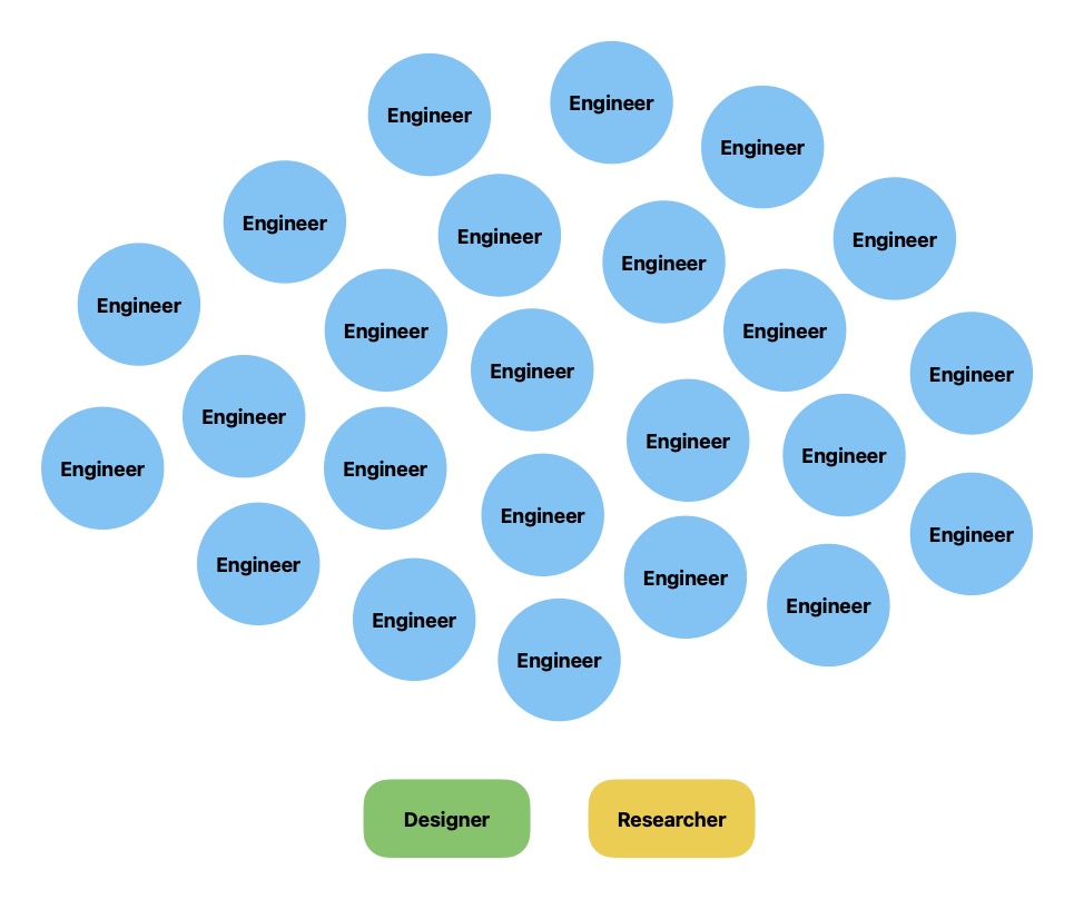
At the top of my list is that Microsoft has not yet fully embraced the role design plays at most other tech companies. We were engineering-driven in 1975 and we are squarely engineering-driven in 2023. The world, meanwhile, has changed in that time. It is no longer sufficient for complex things to work. They must also shed their complexity. People expect the products and services they spend their time and money on to delight. To overdeliver. To give them superpowers. Those sorts of qualities only materialize when you have supergroups building products.
In music, a supergroup is when a singer, a guitarist, a bassist, a drummer, a keyboardist (and so on) who are all at the top of their game come together to create an album. In tech, a supergroup is a researcher, a couple of designers, a product manager, and a Volkswagen Bus or two full of engineers. Up until a decade or so ago, a lot of tech companies followed the model of packing projects with as many smart engineers as they could find and only sprinkled in things like design and research as necessary. I still see some of this thinking in pockets over here. I’m trying to influence things, but it’s a delicate dance, especially when the company has had such enormous success by doing so many other things very well.
I think there are plenty of people here who still feel like being engineering-led is unequivocally good, but to those people I would say that in a modern tech company, design is engineering. It’s no better or worse, but it does have very different leverage in the building of a product.
On the plus side, Microsoft has never had as much design and research talent as it has right now, and we are increasingly looked to by the executive leadership team as lighters of the path. When we go into high-stakes meetings, we always go in with pixels and prototypes, which are uniquely good at cutting through bullshit and ambiguity. As a wise person once said, a prototype is worth a thousand meetings.
There are a ton of amazing designers and researchers who have been here for 10 and even 20+ years whose hard work has led to this moment of evolution for the company, and every day I am in awe of their perseverance.

Next on my list is how often we get in our own way with “procedural goo”. I’ve worked in plenty of large companies including Twitter, Disney, and MSNBC, and have never seen the level of approvals, paperwork, and rules that get in the way of speed and autonomy here. Just transferring someone from within my own org to a slightly different role within my own org took a dizzying amount of effort. At most companies, this would have been about 10 minutes of work: one minute from me and nine from someone in HR trying to navigate to the right screen in Workday.
Then we have acronyms. My GOD do we have acronyms. I actually liked acronyms before I got here! I usually think they are cute. After seeing a new one almost every single day since getting here, I have resolved to never use them either inside or outside of work. I even say “Cyan Magenta Yellow Black” out loud if I have to!
Finally, the last thing on my list — and this is where you come in — is dedication to craft. It is so tempting to try and “science” your way into viable products these days. Build the beginnings of a customer base through rudimentary product-market fit, and then fastidiously optimize your funnel, your game mechanics, your viral loops, your push notifications, and so on and so forth. These gains are not always easy to come by, but they are rooted in ruthless experimentation and allegiance to short-term data. Our north star is at least pretty pure — Daily Active Users — and that metric is usually a good indicator that you’ve made something people like, but doctrinaire allegiance to almost any singular metric can quickly make people forget why we are in this profession to begin with: to improve lives. Or to put it squarely in Microsoft parlance again: to help every person and organization on the planet achieve more.
If you ever find yourself asking the question “how can we increase Daily Active Users?” instead of “how can we make our product better for people?”, you’ve already lost. Metrics are trailing indicators of qualitative improvements or degradations you’ve made for your customers… they are not the point of the work.
Recently, we’ve made some excellent strides in prioritizing qualitative product improvements even when they fly in the face of metrics we care about, and it’s really gratifying to see. It reminds everyone that a product is the collision of thousands of details, and the crafting of these details requires taste.
Designers are often looked to as “owners of craft and taste”, but craft is very much a team sport. It’s not just how things look and feel but also how they work. I very much like how Nick Jones (channeling Patrick Collison) at Stripe put it in this video:
“What we put out there should quite plausibly be the best version of that thing on the internet“.
To do this takes an unbroken chain of excellence:
- An idea that can improve lives if executed well.
- Foundational research to light the path before design and coding begin.
- Rich design explorations and prototyping to make the experience palpable.
- Buy-in to build it at a level of quality that makes the team proud.
- Impeccable UX engineering and UX writing to make sure every detail is dialed.
- Well-conceived server-side engineering to make it scalable and maintainable.
- Creative marketing to prime people for the experience.
- … and finally, maybe more important that anything else on this list, the will to keep refining relentlessly after the experience is launched. This part is so often neglected as companies rush to build more things.
Some people would look at this list and think “yep, makes sense”. Others would look at it and think “sounds slow and not very agile”. The trick to balancing this level of quality with speed of development is realizing that it’s often more efficient to experiment in step 3 than it is in step 6. This is why so many modern tech companies realize that hiring more designers and researchers doesn’t waste time and money… it saves time and money. With less than a week of one designer’s time, we can produce a wide variety of prototypes to test with real people. Just recently, we created an entire GPT-powered research application without even bothering a single engineer.
Design is engineering.
Finally, a brief note about prototyping. I would argue that the most impactful innovation in the craft of product development over the last 20 years has been the rise of rapid design prototyping. Prototypes that demonstrate an experience are useful not just in usability testing, but also in selling ideas up and across the organization. Engineers hate working on things that haven’t been thought through or “appropriately politicked” yet, and if you can bring them a working prototype that has already been vetted with users and various stakeholders across the company, they will love you for it and work hand-in-hand with you to get every detail right.
Design prototypes are the currency of a high-craft, high-speed product development organization, and they are increasingly the currency of our team.
Alright, back to the hiring. I plan to hire against the entire growing list of products our team is responsible for: Copilot, Windows, Edge, Bing, Start, Skype, SwiftKey, and so much more… but for now, this is a concerted hiring effort centered around Designers and UX Engineers to help build out the emerging design system for Copilot and our suite of AI-powered products.
If this is you, please have a look at the following roles we’ve just posted:
- Designer II
- Senior Designer
- Principal Designer
- UX Engineer II
- Senior UX Engineer
- Principal UX Engineer
We’d love to work with you on the future of design systems at Microsoft!
Yes, Rubbing Snail Slime on your Face Actually Works
It’s been awhile since I’ve written a post on Mike Industries, so I thought I would resume programming with an unorthodox product suggestion that I am pretty sure you will love: snail mucin.
I recently got back from a trip to Korea where this stuff was all over the place. I had heard about people rubbing snail slime on their faces before but never really gave it much thought since I have quite literally never found any sort of face cream/lotion/serum that seemed any better than anything else. They are usually either too greasy or they evaporate too quickly. I’ve had pretty splotchy, combination skin my whole life, and oddly the only thing that has ever helped me is the sun. Come fall and winter, when sun is harder to come by in Seattle, things usually deteriorate pretty rapidly.
On a whim, I decided to buy three snail-based products: this cleanser, this serum, and this cream. Total cost: $45. (These are not affiliate links.)
It’s been almost two months now, and I am not exaggerating when I say that I haven’t had a single dry patch, blemish, or even a hint of redness since the very first application. Just a dollop of serum in the morning, a regular face wash with the cleanser at night, and a spot of cream right after. Whole thing takes a only a minute.
Other than the results, the best thing about this stuff is the way it feels. It’s just a super thin layer that stays on all day and you don’t even notice it.
Anyway, skin care is way off of my normal beat, but I figure if you’re looking for something new yourself or want to give an amazing gift this holiday season, you owe it to yourself to try this stuff! It really does work.
I’m Joining Microsoft!
Despite living in Seattle for almost all of my adult life, I haven’t actually worked for a local company in almost ten years. Remote work is great in so many ways, but in-person collaboration is what gives me life.
In confident pursuit of that feeling, I’m thrilled to be joining Microsoft to run Design & Research for their Web Experiences organization.
I was Microsoft-adjacent 10 years ago at MSNBC.com in Building 25, but this will be my first time as a blue badge, so to speak. I’m also thrilled to be joining Liz Danzico and John Maeda, who have also started at Microsoft in the last several months. I’ve known them both for a long time and have wanted to work with them forever.
There are several things which drew me to this opportunity, but at the top of the list is the people. Not just Liz and John, but the thousands of teammates in Seattle, Vancouver, Hyderabad, Barcelona, Beijing, and many other cities. There are certainly some great solo efforts in tech, but almost all of the best work I’ve been around has been the result of getting the right people jammin’ with each other. In my first several days here, I’ve already met so many of those people, and I can’t wait to continue the momentum Albert Shum created by carrying the torch for one of the best Design & Research teams in the Pacific Northwest.
The second thing I’m super excited about is the scale of the work. I’ve worked on the largest sports site in the world and one of the largest social networks in the world, but the properties in this group reach well over a billion people. Between the (refreshingly fast!) Edge browser, MSN, Bing, and several other products, Microsoft has quietly built up one of the top five properties in the world in terms of traffic and reach. They’ve also done it with humility, knowing how far they are from being perfect. I also love that so many of these products can and will be so much more as we begin to use some of the technology that’s emerging within Microsoft. In my first two weeks, I’m already overflowing with ideas.
Finally, the other thing I’m most excited about is getting back into the office in a flexible hybrid environment. I’ve worked in-person for most of my career and remotely for the last four years, and where I’ve landed is that everyone’s preferences are different, and it’s just tradeoffs all the way down. Where you land depends on a mix of your personality, your life outside of work, and what type of job you have. For me personally, I very much like being around people and feel like I do better work when I am… but I also like getting back my commute time a couple of days a week and making daily jogging more convenient. Also, Henry (pictured above) enjoys the extra lap time. Microsoft’s hybrid policy is a nice balance, and it sounds like exactly the right setup for someone like me.
Speaking of the exactly right, this also feels — for me at least — like exactly the right time to join Microsoft. The company has been through several distinct eras over the decades, but this feels like the era of re-commitment to the planet. To customers delightful experiences, to employees a great environment, and to the natural world, a smaller and eventually negative carbon footprint.
It’s a new year, and I couldn’t be any more here for it!
How to Automatically Post your Tweets to Mastodon
Over the last several weeks, I’ve gotten in the habit of trying to move all of my Twitter activity over to Mastodon instead. I signed up for Mastodon several years ago, but only now are there enough people using it for it to replace a lot of what you might use Twitter for. Some of your friends are there, some of your favorite bots are there, and some news sources are there. What more do you need in life, really?
I’ve been using Pinafore (along with a user stylesheet I created… feel free to grab it for yourself) to use Mastodon on the web, and a combination of Ivory and Metatext on my iPhone. Ivory looks a bit nicer but Metatext has a Notifications tab that acts more you’re used to it working on Twitter.
If you want to move all of your activity over wholesale, go to town. If, however, you want to keep publishing Tweets on Twitter and have them automatically publish to your Mastodon account as well, this short guide is for you. The entire process should take around five minutes. It’s mostly just clicking around on a couple of websites.
Important: If you do this, the goal should not be just replicate your Tweets and never visit or engage on Mastodon. The goal should be to help you build your Mastodon presence and save you from having to manually double-post. Ideally you quickly get to the point where Mastodon becomes your primary crib.
Step 1: Open a Mastodon account
If you’ve already done this, great. If you haven’t, head to any server you want — like mastodon.social, for instance — and set up your account. You can always switch your server (along with any followers you accrue) later, so don’t stress about the server you choose.
Performance is the Moat
There is no shortage of opinions about today’s news that Adobe will be acquiring Figma, so I’ll try not to repeat any of what’s already been said here. A lot of it boils down to designers and engineers being understandably concerned that the product they’ve grown to love and put at the center of their workflows over the past few years is now under the control of another company. Adobe-specific concerns aside, this unease would also exist if the acquirer was Microsoft, Oracle, Amazon, Atlassian or just about anyone else in big tech, save maybe Apple. The jokes would just be different.
As someone who competed against Figma for a couple of years, I want to talk briefly about what makes them so hard to catch, and why I think Adobe ultimately decided they would never beat them:
Performance.
Even though I have spent over 20 years in the design industry working directly on consumer products, I never fully appreciated the importance of performance until working in the design tools industry.
Most digital consumer products are used in short bursts over a long period of time. Think about the Amazon app on your phone. You open it maybe once a week, peck around for what you need, hit Buy Now, and you’re on your way. If there is a two-second lag between purchasing and getting your confirmation screen, you don’t even think twice about it. Even in the case of an outright error, you just shake your head, hit reload, and things are usually fixed.
With professional production tools though — whether design, engineering, or otherwise — full-time craftspeople spend almost every hour of every work-week inside of your software. Every time something goes even remotely astray, it is noticed. Putting aside catastrophic stuff like data loss, even things like cursor lag, screen flicker, progress bars, and scroll/zoom performance are tiny paper cuts that form into pools of blood by the end of each day.
Figma did a lot of things right over the ten (yes, ten!) years they’ve worked on the product, but one thing they did that no one else has been able to replicate is meet and in some cases exceed native app performance inside of a web browser.
Nothing Figma has accomplished in the marketplace would be possible without this, and it is the thing that competitors have struggled the hardest to replicate. When you build software using native code, you get a lot of stuff for free. Need a scrolling list? Apple, Microsoft, and Google have multiple pre-built components you can use. Need to draw one semi-transparent shape on top of another? The system already knows how to render that. Need to optimize it all for speed? Most of that work has already been done.
Inside of a browser though, the work is rarely done for you. Even in instances where someone has already built a component, it’s often too slow or glitchy to use in a professional development environment. So what did Figma do about this? Over the course of several years, they:
- Built their own components and architecture painstakingly from scratch and never settled for “good enough”
- Worked with organizations like WebKit and Chromium to improve web browsers themselves (the benefits of which go beyond Figma)
- Detailed out in the open what they were doing and how
It was this last one that really made me see how wide the moat was for the first time. Normally companies keep their secret sauce secret. After all, why would you want to give your competitors any information that might help them compete? But a company who routinely publishes information that is useful to competitors? That is some confident shit right there. It reminded me of a tweet I can’t find from several years ago:
“The design tool war is already over, but no one knows it yet.”
Fast forward a few years and everyone who has tried to match Figma’s all-around performance has fallen short. Private companies like Sketch and InVision. Public companies like Adobe. It’s not for lack of effort by hundreds of incredibly smart people. It’s just really frickin’ hard. Combine that with the fact that Figma is a moving target who is now building entirely new capabilities, and you can see why Adobe decided this wasn’t just a move they wanted to make… it was a move they had to make.
… which brings us back to a lot of the reaction we are seeing on Design Twitter today.
I don’t think people mind the abstract concept of Figma being acquired by another company nearly as much as they mind the very real threat of Figma losing what makes it so special in the first place: focusing maniacally on performance, thinking differently, and optimizing for user experience above all else. The backlash is an expression of how a lot of people feel Adobe has done in those categories over the last decade.
If I’m Adobe, I am printing out as many Tweets from today as I can, making a book out of them, and then doing this:

After that, I’m letting Figma lay the tracks for the next decade of this industry and rallying the thousands of talented people at my own company to rethink how the entire organization builds software. Within the next several years, it’s going to be possible to go from idea in the morning, to prototype in the afternoon, to working code in the evening… and the company who can do that most thoughtfully is going to be one of the most important companies in the world.
How to Order Fast Food while Inflicting as Little Damage to Yourself as Possible
Let’s get this out of the way first: I am not a dietician, an economist, or an ethicist. I am, however, a guy who likes to occasionally eat at fast food places. I’m also a guy who stops running over the winter, puts on a few pounds, and then has to lose them again in the spring… so I’ve been paying attention to how to eat “least badly” at fast food places.
Below is my dollar-store wisdom, in case you also want to enjoy fast food in moderation.
First, some golden rules:
Rule #1
No soda. This is an easy one. A medium Coke is 210 calories, 56 grams of carbs, and no protein. It’s also about $2 for something that costs about a nickel to make.
Instead, go with free tap water or an unsweetened iced tea. Zero calories and nothing artificial. Another nice hack that works at some places is going to the soda fountain and filling your water cup with club soda. There are usually two small tabs and one of them says “water”. The other one is the “off-menu” free club soda.

Rule #2
No fries… or if you must, get a small every now and then. I understand people like fries. I like fries too. But even a small order of fries is another 220 calories, 29 grams of carbs, and only 3 grams of protein.
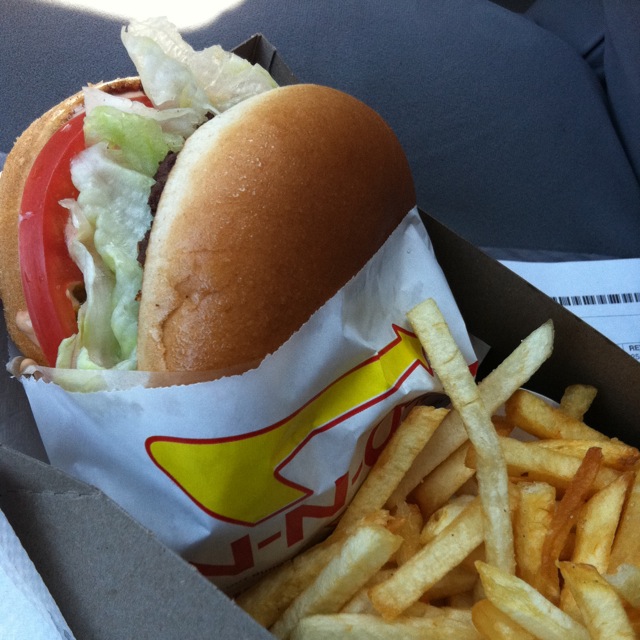
Rule #3
Study menus for what’s overpriced and what’s underpriced. For instance, at Mickey Dee’s, a McChicken, a hamburger, and a 6-piece McNuggets are all $2 apiece or less. Meanwhile, a Double Bacon Quarter Pounder with Cheese is $7.
These places all encourage you to buy the Value Meals, but since you aren’t getting the soda or the fries, individual prices matter.
Now onto the meat of the matter: what should you order at each of the major national fast food places?