The Most Useless Infographic Ever
The purpose of infographics is to take data that is initially tough to interpret and distill it into some high-level knowledge that readers can remember and take away with them. Upon picking up a six-pack of Cottonelle last night though, I think I found the most useless infographic ever:
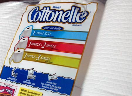
Yes indeed. It’s a visual reminder that:
- 1 x 1 = 1
- 2 x 1 = 2
- 3 x 1 = 3
That’s good times. And there’s even a 1-800 number you can call for further details as well as a website where perhaps you can plug in different values and see how many single rolls a quintuple roll would equal.
If I were the makers of Cottonelle, I’d probably use this space to showcase and romanticize the process by which they get Aloe into the toilet paper. I’ve always wondered about it.
For much better examples of infographics, check out a great book Rex showed me: Understanding USA.
TeamSnap is a Really, REALLY Nice Site
 Just a few hours ago, Matt Triplett and the fine folks at SparkPlug released a site called TeamSnap.
It is quite simply the bees’ knees.
TeamSnap is an application built on Rails designed to help people manage their amateur sports teams online, and it’s one of the best executed pieces of communication design I’ve seen in awhile. Not only is the site beautiful but everything is exactly where it should be. Within seconds, you know exactly what you can do with TeamSnap and exactly where to click in order to get started.
There are just so many things the site gets right that it’s hard to know where to start:
- Feature set — Not only can you do the basics like publish a calendar of your team’s games, but you can even coordinate who’s bringing “refreshments”. For some reason, the team chose to make the beer icon blue which I don’t quite understand, but whatever. A lot of thought has gone into exactly what needs to be organized in sports leagues and these guys are clearly designing from experience.
- Tour — The walkthrough is easy to follow and the screenshots are crisp and illustrative.
- Testimonials — Everyone knows testimonials are often suspicious and overly pithy so TeamSnap created satirical ones instead.
- Beautiful iconography — Every icon exudes a cohesive, friendly tone that makes me want to click.
- RSS Feeds — You can follow all of the latest developments with your team not only via email, but also with your newsreader.
- Structured data — TeamSnap ships with support for 24 sports (including “Dragon Boat”) and one of its important capabilities is storing structured statistical data for each sport. This means, you’re not just uploading a Word Document with play-by-play in it. You’re actually entering stats for all players on your girlfriend’s beach volleyball team (and then hopefully explaining everything in personal sessions later). Hugely powerful.
I’ve always thought the most interesting social networks out there were not pure social networks but rather networks built around an existing subject matter. While TeamSnap may look on the outside like a beautifully executed organizational tool, it’s actually social software built around one of the most technologically dormant (and ripe) social constructs around: recreational sports.
I expect TeamSnap to do very, very well once it’s out of beta, and I give Matt and crew a huge thumbs up for designing an excellent product at an excellent time. I will also be hiring Sparkplug the next time I need something awesome designed.
Well done you!
Building a Better Conference Badge
I just got back from the Economics of Social Media conference put on by Rafat Ali, Staci Kramer, and the rest of the PaidContent crew and it was really an excellent event. One-day conferences are great because there’s no filler. There’s no scrambling to populate 50 panels with people who may or may not be the best choices to speak. There’s also no deciding which of 6 rooms you want to be in every hour.
One track. One room. All superstars. (Needless to say, I wasn’t a speaker.)
For Rafat’s first conference, they really knocked it out of the park. Not every panel was an A+ but there were no duds and they clearly had the right people on stage in most cases.
The only awful thing about EconSM though — as is the case with most conferences — was the design of the conference badges. While talking to Andy Sternberg of LAist, at one point I interrupted him and said:
“You know what super-complicated innovation would double the amount of socializing going on in this lobby? Double the size of the badges. I can’t see anyone’s name!”
Andy agreed.
… which got me thinking about something Kottke has penned about several times in the past: what should a badge really look like?
As an attempt to answer this question, I present the EconSM badge as reference and my newly proposed S.O.B. or “Socially Optimized Badge” as a proposal. An Illustrator file of the S.O.B. template is provided free of charge at the end for any conference organizers who want to use it.
The EconSM Badge (Typical of 99% of badges in the world)
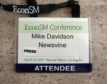
Crimes committed:
- Too small at 3 inches tall by 4 inches wide. Bump that puppy up to 4 by 6.
- First and last name on same line.
- Set in 25-ish point Arial: the worst font in the world and even more unreadable at that size and weight.
- Title of conference — the least important information on the badge — dominates the space.
- “ATTENDEE” is the boldest text on the badge. It’s not *that* important as speakers and attendees share 99% of the same privileges.
- Lanyard contains name of conference instead of being sold to a sponsor. No one cares what the lanyard looks like, so go ahead and sell it to Yahoo or something.
The S.O.B. or “Socially Optimized Badge”
The S.O.B. treats the conference badge like a highway sign, complete with a typeface modeled from U.S. highway signs: Interstate.
* Note: Contrary to popular belief, the actual typeface used on U.S. highway signs is FHWA Highway Gothic
Highway signs are designed to be read from as far away as possible and always present the most important information biggest and boldest. The S.O.B. allows you not only to minimize the awkward glances down while you’re talking to someone whose name you don’t remember, but also makes spotting people across the room a lot easier. The typical conference badge loses its readability at about 10 feet but from my own crack-testing, the S.O.B. appears readable from up to 30 feet away. Go ahead and try stepping away from your computer screen as far as possible and you’ll see the difference:
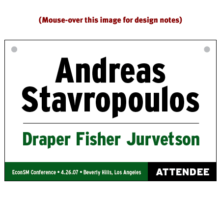
The Deliverables
As promised, here is the sample Illustrator file for the S.O.B. Use it with the knowledge that you are doing your part to bring people closer together at your conference. It really does make a difference. I’ve included the longest name I could think of (actually, Niall thought of it) so you shouldn’t have to reduce the font sizes at all as you print your own badges.
Business Cords
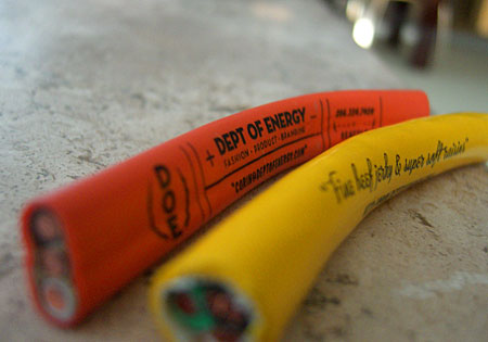
I was out at a bar with my good friend Corin this weekend when he laid some of his badass new business cards from design firm The Dept of Energy on me. They are badass because they aren’t cards at all, but rather functional, palm-sized electrical cords with with his logo and business information imprinted on them.
Very, very cool.
Not only do they reinforce the brand of the firm, but the novelty and tactile values are off the charts. The yellow cable is as pliable as a heavy-duty extension cord while the orange cable is more like a really stiff stress ball.
It’s the most interesting “card” design I’ve seen since The Blood Card and a whole lot less scary. But at 40 cents apiece, Corin is careful who he gives them to.
What are some other examples of creative business card design these days? I haven’t seen anything really jump out at me lately.
Help Virb Win the Fight For Tastefulness on the Web

Butters the puppy says:
“I’m not even crate-trained yet and I am on Virb.”
So this is it. Pretty vs. ugly. Clean vs. cluttered. Class vs. schlock.
I’m talking about Virb. And specifically, its newly initiated battle for the hearts and minds of would-be MySpacers.
Those of us in the web industry have had to put up with a peculiar theory since the meteoric rise of MySpace: that encouraging people make absolute pig sties out of their home pages is the leading factor in the success of MySpace and MySpace-like sites. The theory goes even deeper in saying that MySpace itself succeeds because of its own awful design.
The first part of the theory is built on the notion that people, in general, like crap, and the second part of the theory is based on the idea that the younger generation eschews the appearance of order and professionalism in all sorts of design.
Those of us who refuse to believe such claims have our own claims. Specifically that MySpace instead is succeeding despite its woefully gaudy design esthetic. We hold that it was the only social network around a few years ago that did enough important things right in order to build up a huge lead, and since it’s built up that lead, it’s essentially stood still on a foundation that grows shakier by the day.
It was with great anticipation then that I began beta-testing a new site called Virb several months ago. Virb is the brainchild of a company called PureVolume and it’s absolutely everything a social network should be. It matches MySpace feature-for-feature and then some, but the great part about it is the thoughtfulness and style with which everything is presented. Under the keen eye of founder Brett Woitunski and the masterful design acumen of Ryan Sims, every single pixel of the site impresses. From the typography to the interactivity to the copywriting, it’s a jawdropping piece of work. It’s a place you’re proud to have a personal page on.
So what’s missing from Virb? Well, it just launched a couple of weeks ago, so really only one thing: your friends. And that is why — in my opinion — nobody’s been able to unseat MySpace yet. It’s extremely difficult to move entire social circles of people, no matter how great your offering is.
I could write a long review of Virb here but Brian Ford at Newsvine and many others have already done so, so instead I’ll close this entry with a plea:
Check the site out for yourself, and if you like it, be an ambassador in the name of good taste on the web. Invite your friends and let’s see if we can prove the antithesis of the schlock design theory: that better craftsmanship, better taste, and better effort will always win out in the end.
Here’s my page in case you want to kickstart your friends list with /mikeindustries.
The Old Twenty
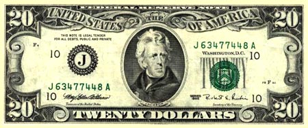
I stopped by my local pizza joint tonight to grab a lazy dinner, and upon getting to the counter I noticed that I had five ones and one twenty.
The tab was $7.30 so the obvious choice would be to whip out the twenty, which I did. Upon holding this Jackson in my hand though, I remembered it wasn’t just any Jackson. It was a pre-1998 redesign Jackson. 1969 in fact.
I’d had this beauty in my wallet for a couple of weeks and tried not to spend it — although I knew I eventually would unless it was put into safe keeping. Such a beautiful bill… clearly superior in every way to the new rubbish.
My head told me I was the only person in the restaurant who would care about such a thing.
Inhale. Exhale. I handed the bill unceremoniously to girl behind the counter.
“Oh wow! An old twenty! I’m SO keeping this!” she said to my surprise as she plucked a modern twenty from her own wallet and made the exchange.
“I’m glad it’s going to someone who appreciates it,” I said as I watched her show it off to the other employees.
After relinquishing the twenty, I realized that it had been probably two or so years since I’d seen one… and I pay with cash a lot. I wonder what that says about the shelf-life and geographic distribution of paper currency in our country. I’d love to see some studies on this.
UPDATE: Kottke, the master of interesting cultural trivia, is up-to-date on this and has detailed info.
Introducing swfIR
 I’m a rule breaker… and when other people break rules in the name of good design, I stand up and applaud.
That is why, I’m happy to point Mike Industries readers to a new creation by Messrs Dan Mall, Jon Aldinger, and Mark Huot: swfIR.
“But I already have a swfIR!”, you say. “I use it to shine my beautiful linoleum floors.”
This swfIR isn’t a disposable mop, though. It’s a new Flash replacement technique in the tradition of sIFR. While sIFR uses Flash to replace boring browser text with interesting custom-rendered Flash text, swfIR uses Flash to replace boring browser images with more interesting custom-rendered Flash images. So instead of settling for plain, rectangular jpegs and gifs, you can now apply borders, rounded corners, shadows, opacity, and more to your images… dynamically, without having to edit your images or muddy up your beautiful code.
Flash for images?
I can hear screams coming from the ivory towers where the validatorians and standardistas live. I like those screams. I live for those screams. I will sleep well tonight with thoughts of prettier imagery on the web.
sIFR 3 Beta Is Here
 Just in time for the holidays, the Dutch Wolf has posted the first official beta of the brand new version of sIFR! sIFR 3 is chock full of great new features that are sure to bring out your inner typography genius, and because Flash is now owned by Adobe, we’ve even created an unimaginative new icon for it! :)
Some highlights of sIFR 3 include:
- Much easier implementation with no need for font tuning anymore.
- Constant font sizing with no more fuzzy logic used to determine actual type size.
- Smoother anti-aliasing and better readability via Flash 8/9’s Saffron rendering engine.
- Ability to use Flash’s text effects such as shadowing.
- sIFR now renders on-demand instead of after everything else has loaded, making for a much quicker viewing experience.
- … and a whole lot more.
So head on over to the Dutch Wolf’s place and check out the new beta for yourself. The quicker we can all help squash any remaining bugs, the quicker an official sIFR 3.0 implementation can be released.
The Ultimate Showerhead Post
 It’s not too often you can stump Google these days. Search for any product, current or past, and you almost always get a slew of results telling you all sorts of things about it. Specifically, what it is, where to buy it, or what product has now replaced it in the product line. This usually even works on nostalgic products purchased decades ago.
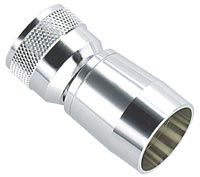
Recently, however, I searched for a type of showerhead I’ve used since my college days and couldn’t find a single useful reference anywhere on Google. It’s the simplest and most powerful of showerheads I’ve ever used and it’s called “The Skimpy” (pictured to the right). It shoots a concentrated, forceful mist in a controlled stream unmatched by any other showerhead I’ve tried. The last time I purchased one was at a local hardware store maybe five years ago. It was about $8. The only reference on Google was an image of the showerhead in an obscure “product photos” section of the Interbath website. Subsequent searches on Interbath turn up no mention of The Skimpy.
So, I have a few options here. I can move the old Skimpy to my new place and use a different showerhead in the second bathroom. Or I can scour the interwebs for a place that somehow might still have Skimpies. OR… I can write a blog post soliciting opinions far and wide on what the best showerhead in the world is.
So that’s what I’m doing. Number three.
If you have any useful information on what you believe to be the most excellent showerhead you’ve ever used, post it in the comments along with a brief explanation as to why it’s so great. With any luck, after a few weeks, we’ll have the world’s most complete resource on superlative showerheads.
UPDATE (4/13/11): The Kohler Flipside is the best showerhead in the world.
Cash Machine Parallax
It seems like the percentage of cash machines which still suffer from button/screen parallax is still pretty damned high. This design problem has already been solved in at least three ways (touch screen, angled display, and low-profile screen bezel) and yet it seems like 90% of all ATM machines still look like this:
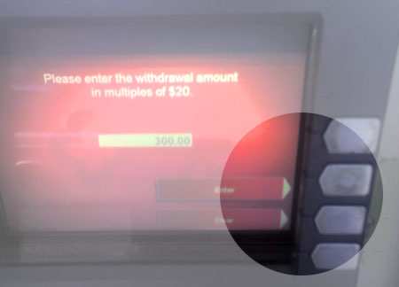
Kind of annoying.