Long Time No sIFR
It’s been almost two years since we originally released sIFR, and predictably, the world is still not a tangible step closer to a real custom typography solution for the web. Sure there are people bringing the subject up again in W3C mailing lists and companies waxing philosophical about the typographical ecosystem, but nobody is actually doing anything measurable about it. Talking is good, and I’d hate to suppress any constructive discussions that may be going on right now, but until I see something more than a “recommendation” or a “working spec”, I will continue to shake my head and wonder when we’ll see any execution.
We had a feeling this sort of stagnation would continue when we first released sIFR, and therefore, we haven’t stopped development on it since version 1.0. Version 2.0 was the big release and current defacto “sIFR standard” in place on most sIFR-ized web sites today. The list of sites employing this solution is long and impressive. From MSNBC, to Nike, to The U.S. Navy, we estimate the number of sIFR-sized sites to be in the thousands, spanning across hundreds of countries, and serving up billions of pages views annually.
For those running sIFR 2.0 or 2.0.1, we have a minor update for you: version 2.0.2. This update fixes a bug related to the Microsoft IE Eolas update and also degrades sIFR text gracefully to HTML/CSS in the presence of the Firefox AdBlock extension. On a tiny percentage of machines running the new IE (mostly Media Centers, I believe), sometimes sIFR text would show up as a broken image. This is now fixed. Additionally, the AdBlock fix removes the biggest of what I’d consider “material” downsides to using sIFR as a typography solution. Now even your AdBlocking visitors won’t miss a beat.
Version 2.0.2 is probably the last in the 2.0 series and is available at the standard sIFR landing page: mikeindustries.com/sifr.
Version 3!
The much bigger news, however, is the release of the sIFR 3 Alpha builds by lead developer Mark Wubben (“The Dutch Wolf“). Mark was the javascript genius behind version 2 and he’s now taking over lead development in this new version. I will still be involved as “spiritual advisor” (and tester, of course), but given duties at Newsvine, I’m pulling back a bit on the development side.
Some of my favorite features implemented so far are:
- Consistent font sizing, kerning, and leading, without the need for manual tuning
- Sizing through CSS
- Much better looking type, due to better anti-aliasing
- Flash 8 text effects such as shadows
- Easier configuration
So head on over to the first sIFR 3 Alpha article and let Mark know what you think. Or, if you’re really adventurous, you can download the nightlies.
A true solution for custom web typography will come eventually, but until that time, we will keep pushing forward with the tools we have.
Hacking A More Tasteful MySpace
UPDATE: (10/15/07) If you’re noticing jumbled text in Firefox while using this layout, simply change
"line-height: 1px" to "line-height: auto" in the body section of the CSS.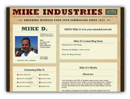 A guide to creating a more tasteful MySpace layout. Sample images and CSS are included at the bottom. End product: myspace.com/mikeindustriesThe social phenomenon that is MySpace is one I don’t fully understand, and yet, one I must fully respect. In fact, with over 50 million unique users, it is something everybody must respect. Any website which rolls up that amount of usership is doing something very, very right, and no matter what your thoughts on it as a vehicle for your own expression are, you must give it its full due for what it is to seemingly everyone else.
Several weeks ago, I finally signed up for an account, and within seconds I was instantly put-off by what had been created for me: a hastily-designed “profile page” with uninspired colors, misaligned tables, and a mish-mash of extraneous cruft and design elements which made this feel more like a halfway house than a “home”. Now, granted, I am a designer by trade so my tolerance for this stuff is orders of magnitude lower than most of the population, but clearly, this was not a place I even felt comfortable having my name on.
So with the default home page this underwhelming, what is a MySpacer to do? Customize, of course. One of MySpace’s greatest features is its ability to let you skin your own home page. Unfortunately, 99% of the customizations I’ve seen are chalkboard-screechingly awful, but what could a MySpace home page look like if some actual design thought went into it? That is the question I sought to answer.
But first — as Keith Robinson asked me when I first showed him what I was doing — “Ummm, why?” The answer is twofold. First, I love a design challenge. Second, we’ve been building a lot of new social components into Newsvine over the past several weeks and I wanted a good reference point for what is already done well online and what could be improved.
So without further ado, on with the surgery…
Read more…
sIFR 3: A Request for Requests
 The excellent new sIFR-licious UW Admissions Site, designed and developed by Mercury Cloud.Now that Flash 7 penetration is well into the 90% range, it’s time to start thinking about version 3 of sIFR. One of the big selling points of sIFR 2 was that it was backwards-compatible with Flash 6, but given the most current Flash adoption numbers, that doesn’t seem necessary anymore.
SO… what The Dutch Wolf and I would like to do is provide a new version of sIFR which offers baseline compatibility with Flash 7 and progressive-enhancement for Flash 8.
We’ve already come up with a few things we’d like to add but are requesting feature requests from designers and developers in order to make sure this new version is as complete as possible. Here’s initial punchlist:
- Ability to display crisper text (especially at small sizes) for people with Flash 8. The Flash 8 Player uses a new anti-aliasing algorithm that now renders Flash text as beautifully as Photoshop does.
- More complete text formatting options using Flash’s CSS support. This includes the ability to color individual spans within a single sIFR file.
- Ability to use (and abuse) Flash 8’s live effects like soft drop shadows behind text.
- On-the-fly resizability of sIFR elements when windows are resized.
- Actionscript 2 syntax.
A major requirement of this release is that it should only take you a minute or two to upgrade any existing sIFR installations, so rest assured that when the new version comes out, it’ll be a snap to install.
Since we’re already talking about sIFR, I wanted to quickly call out some excellent uses of it I’ve seen over the past few months:
- Will Prater and friends over at Mercury Cloud have redesigned the admissions site for my alma-mater, The University of Washington, and it is spectacular. Some of the best use of sIFR I’ve ever seen and just a fabulous site to boot.
- Chevrolet.com now uses sIFR on almost every page on the site thanks to Jim Amos and Campbell-Ewald.
- Khoi Vinh has redesigned The Onion and Paragraph making subtle and disciplined use of sIFR.
- Thanks to Eric Webster and Digitas, the Pontiac.com site uses sIFR for their mastheads. Pontiac.com is a good example of a Flash-heavy site making smart use of the technology.
- I can’t remember who sent me this site (please let me know so I can give you credit) but Propel Fitness Water now makes nice use of sIFR and they even somehow managed to give their sIFR text nice wide kerning. I’d like to know if that required manual editing of font files. Looks very nice.
sIFR also was featured in Print Magazine this month thanks to the excellent Patric King.
So enough of the sIFR lovefest… let’s hear some feature requests!
UPDATE: I almost forgot… well actually I *did* forget… the entire AT&T.com site now also uses sIFR, thanks to the great work of Joe D’Andrea.
Originality in Logo Design
“Never waste a stroke.”
That’s the best piece of advice you’ll ever get in logo design. However, it’s also advice that can inadvertently get you in trouble. Draw a blue circle on the screen and you’ve just stolen the Blaupunkt logo. Draw a yellow line and you’re copying Visa. Draw a black swoosh and you’re ripping off Nike. The less intricacies involved in creating your masterpiece, the more likely it is that someone has already created it.
This subject has resurfaced in my head this week because of a couple of questionable logo unveilings, and I think it deserves some discussion. First, let’s go over the three categories of what might be considered “logo theft”:
Read more…
ESPN.com Seeks Creative Director
 This just in: ESPN is looking to fill a very high-profile web position — Creative Director, ESPN.com. You heard it here first. Yes, that’s right… a chance to set the design standards for the largest sports site on the web and continue to blaze the trails ESPN has been blazing since the original days of ESPNet SportsZone back in the mid ’90s.
I’m not going to post a long description of the job since the position more or less sells itself, but I will say that this is a great opportunity to work with some very talented people on some very exciting projects. The position is out of the main ESPN headquarters in Bristol, Connecticut and is only suitable for a candidate with a wealth of experience managing design teams as well as a killer portfolio. Experience managing the design of high-traffic web properties is a huge plus as well.
Anyway, I don’t work at ESPN anymore but I’ve volunteered to post the position on this site in hopes that either a Mike Industries reader or a friend of a Mike Industries reader might be the right person for the job. If you (or someone you know) think you might have the right stuff, drop me a line through the contact form and I’ll see what I can do. I can’t answer many specific questions about the job but I can help shepherd the process along a bit. Any e-mails should include at the very least a URL where some of your work can be viewed.
A List Apart Redesigns, Makes Me Weep
 A List Apart, the venerable online periodical for web people, has quite possibly just pulled off the perfect redesign.
Everything is great. Nothing is bad. Click here to see the wickedness.
Favorite design touch: The hover underlines which disappear in the middle of the center-stacked text.
Favorite new feature: Adjustable color palettes for different issues.
Congratulations to Jeffrey Zeldman, Jason Santa Maria, Eric Meyer, Dan Benjamin, Kevin Cornell, Erin Kissane, and team on a great piece of work.
*Prediction: A center-stacked headline mini-boom begins today.
Dream Job at The New York Times
![]() So the New York Times is looking for a Design Director to lead the redesign of their flagship site, nytimes.com. Wow. Talk about a dream position.
So the New York Times is looking for a Design Director to lead the redesign of their flagship site, nytimes.com. Wow. Talk about a dream position.
If I didn’t love Seattle and what I’m doing right now so much, I’d be talking to them in a heartbeat. A chance to lead one of the world’s all-time most respected newspapers in an all-encompassing redesign and live in of one of the greatest cities on earth? What more could one ask for?
If you or anyone you know fits the bill, head on over to the Times job site (direct job link here) and check it out. We need more good people running more major news organizations’ web sites these days.
Hat Tip: Mark Hurst of Good Experience
sIFR 2.0 Released
It’s released! A long effort of several months is finally complete. sIFR 2.0 is here.
I’m all worn out from writing the official sIFR landing page so I’m going to keep this entry short, but I’ll just say that this release is the realization of everything we’ve always strived for in sIFR: rich, accessible typography for the masses with no pitfalls under any reasonable browsing conditions.
Release Candidate 4 was pretty solid, but this final release adds two improvements to the already rich feature set: the ability to show browser text while Flash text is loading (if desired) and graceful degradation to HTML text if users have FlashBlock installed. We’re particularly jazzed about working through the FlashBlock issue because it was the only circumstance where we felt sIFR wasn’t degrading perfectly, but thanks to the FlashBlock folks’ willingness to work with us and upgrade the FlashBlock extension, all is good in Flash-blocking land now. :)
I’d like to give a final thank you to the following people for the following reasons:
- Mark Wubben — Mark’s world-class javascript skills are the reason that sIFR is as robust and well-formed as it is. He and I have been working together long-distance from Seattle to The Netherlands for several months now, and I can say he’s the easily the best javascripter I’ve ever collaborated with. His only shortcoming is that he doesn’t have a Mac yet, but that will change before the summer I’m told. If you’re ever in need of a great javascripter or just an object-oriented developer genius, Mark is your guy.
- Shaun Inman — I can’t really say anything about The Wolf that hasn’t already been said. He is the man. His original IFR DOM-based Flash replacement routine was the catalyst for the creation of sIFR, and to this day, he’s still the first person I bug on Instant Messenger when I have a problem. In fact, I find him so useful that I embedded him in a Dashboard widget earlier this week… details possibly forthcoming (seriously). Shaun has some interesting things he’s getting ready to release as well, so keep an eye on him.
- Stephanie Sullivan — Hot beach volleyball mom by day, rabid sIFR advocate by night, Stephanie has helped write a lot of the sIFR documentation on the official sIFR Wiki as well as evangelize the technology at conferences and classes around the country. Tonight, Stephanie’s introducing sIFR 2.0 at TODCON in Las Vegas… we wish her luck.
- Danilo Celic — Along with Stephanie, Danilo is a key contributor over at Community MX. Danilo took the time to create a Dreamweaver extension to export sIFR swf files and even made sIFR tutorial in the form of a slick Breeze presentation… go check it out.
- Matt May — As an accessibility expert, member of the W3C, and just all around great guy, Matt’s opinion means a lot to us, and when he gave a clean bill of accessibility health to sIFR, we really started to feel great about what we’d done.
- Joe Clark — Much like Matt, Joe’s opinions on accessibility mean a lot to us. And much like Matt, Joe sees nothing inaccessible about sIFR. We like Joe.
- Dave Shea — Dave provided a very even-handed review of sIFR back in the beta days which helped us focus on making the good better and making the not-so-good, not-so-bad anymore. Thanks for a good post and the healthy discussion which followed.
- Andrew Hume — Andrew wrote a great article on his site, Usabletype.com, about how and when to use sIFR. He’s also been helpful in explaining proper usage to people when the opportunity arises.
- Jeff Croft — Croftie’s a big sIFR guy and much like Andrew, he’s been helpful in mitigating some of the discussion around the internet about proper use of this method. Jeff’s site is also a great example of beautiful sIFR use.
- Everyone who has used sIFR — Without the pool of hundreds of developers putting sIFR through its paces, we wouldn’t have made it as good as it is. There are simply too many combinations of browsers, OSes, plug-ins, and extensions out there to properly test something like this by yourself. To all who have helped us over the last several months, a big thank you.
Alright, now go check it out already!
sIFR 2.0 Is Almost Ready… Please Test
UPDATE: Version 2.0 is now available. See article here.
 Alright, sIFR 2.0 is finally ready for release! Before Mark and I release it, however, we’d like sIFR developers to run through a short set of testcases over on the sIFR Wiki.
The testcases represent some of the more complicated things that are happening under the hood of sIFR and can be found here.
Since we’ve only added two small things (a tiny Opera tweak and the ability to show browser text while the sIFR text is loading), we don’t anticipate any problems, but these testcases are meant to insure nothing was overlooked.
If you have a free minute, please run through the tests and let Mark or I know if you experience anything out of the ordinary. The whole suite should only take a minute. If every seems to work ok, please also feel free to post a comment on this page saying something like “Win XP/Flash 7 — Firefox 1.0, IE 6, all tests passed.”
Many thanks, and sIFR 2.0 will follow within days.
sIFR 2.0 RC4 is Here
UPDATE: Version 2.0 is now available. See article here.
Introducing sIFR 2.0 Release Candidate 4! RC4, you say? Why so many release candidates? Don’t you guys beta test?
Well, yes, we do… vigorously. But the truth is that RC1 should have still been a beta, but we had no idea how many improvements we could still make. The good news is that with RC4, we really don’t have any outstanding issues that we know of anymore. sIFR even works in Konqueror now! Hot damn!
So anyway, here is a list of what’s improved in RC4:
- Ability to roll sIFR headlines back to plain text dynamically, or turn them off or on persistently via cookies
- Better support for fringe browsers like Konqueror
- Improved transparency support for Mac browsers
- Squashage of various minor bugs affecting tiny percentages of the population
- Multiple speed improvements
- Mac IE support is now turned off by default. Although sIFR works fine with Mac IE in most situations, we figured since no one tests in that browser anymore and it accounts for such a small percentage of the population, we might as well save people the worry of having to test in it. It is possible to turn sIFR on for Mac IE if you’d like, however.
I may be forgetting a few minor things, but I think that’s about it. Many thanks to Mark Wubben, whose javascript expertise is responsible for almost all of RC4’s improvements. If anyone ever needs javascript or DOM work done, I highly recommend contacting Mark. His skills are second-to-none.
I also want to point everyone in the direction of the new sIFR Wiki. It is only in its beginning stages right now, but feel free to consult it for documentation, tips, tricks, and other sIFR-related goodness. If you are using sIFR on your site, also feel free to add yourself to the list of examples.
Big ups also to Danilo Celic who has created a fabulous Dreamweaver extension which can automatically export your sIFR-ized swfs for you. Danilo also has a nice video presentation showing how to use sIFR that you might want to check out if you haven’t already.
Here are the details about upgrading from previous sIFR versions:
Read more…