Design Signatures
I’ve spent a bit of time over the last month designing a new blog that I’ll be launching soon, and in doing so, I’ve become aware of some design and coding habits which, when put together, clearly compromise a bit of a “design signature”. If you’ve designed more than five sites in your site, you likely have a design signature too, although it’s probably different than most other designers and coders you know. You may not even know you have it, but you do.
Here’s part of what makes up my design signature:
- I start with a CSS reset
- For column layouts, I float every column (usually left but sometimes both left and right)
- I use the clearfix class to clear all of my containers
- I use dotted underlines for body-copy links that change to solid underlines on hover, and no underlines for links that appear within navigational lists
- I use desaturated colors for visited links
- I employ fixed-width centered layouts using a container div, auto margins, and a center text-align on the body
I almost can’t even think about producing a page template until all of these elements are in place, and no design would feel right to me without them. Additionally, I know the browser implications of them so well that I scarcely have to even test in IE anymore.
Do you have any design signatures of your own? If so, what are they and how do they affect your work?
When Your Neighbor Builds a Jackass Home
While out on the lake this weekend, I came across this sign:
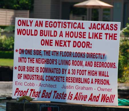
So nice. I love how the neighbors not only call out the homeowner but the architect as well. Wrecking a neighborhood is a team process.
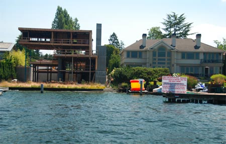
Here’s a shot of the offending house. It’s tough to tell how overbearing the concrete wall is from a straight-on angle, but it’s pretty awful:
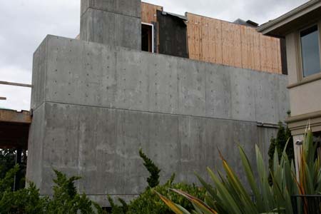
UPDATE: Below is a better (worse) shot of the prison wall —
All I Want From Adobe CS4…
 So word came out today that apparently Adobe Creative Suite 4 is right around the corner. Greeeeeaaaaat.
There are only three things I want from this new release:
1. A new install/update process that doesn’t feel like Adobe is rewriting every line of code on my entire hard drive. This includes the congruent request that Adobe not launch and quit five different “agents” sequentially in order to accomplish the above.
2. A new codebase that doesn’t feel like it’s chewing up every last bit of processing power on my new enough 2.4 GHz iMac with maxxed out RAM. Unless Adobe has signed my machine up as a node in the SETI project without telling me, I don’t understand why something as simple as the Save-To-Web command should invoke ten seconds of beachballs.
3. The long-needed “I-Work-On-The-Web-So-Turn-Off-All-This-Color-Profiling-Crap-Until-I-Say-Otherwise” button.
Chances of any of that being in the next release? I say slim. But I hope I’m wrong. My opinion is that over the last few years, Adobe Creative Suite has become the Microsoft Office for right-brained people. They simply ran out of really useful things that people needed so they just piled on things people didn’t.
Personally, I’m about one more disappointing release away from giving something like Pixelmator a shot.
Goodbye Movable Type, Hello WordPress
 A few months ago, I silently moved Mike Industries from the aging Movable Type platform to the quicker-developing WordPress platform. I didn’t even plan to change platforms, but after more than a week of trying unsuccessfully to move from Movable Type 3.0 to Movable Type 4.0, this blog was in such a state of disarray under the covers that I began to wonder if switching to WordPress would be quicker altogether.
You see, Movable Type is a platform designed to be static, and only through hackerations with .htaccess files and “bootstrap loaders” can you simulate a truly dynamic publishing system. Part of my move to version 4.0 was designed to use these new dynamic abilities, but in the end, it mucked up so much of my (admittedly custom) setup that I just wanted out completely.
WordPress, in contrast to Movable Type, is designed from the ground up to be dynamic, and through smart caching, it can be made to scale like a static site. This is much the same as how we designed Newsvine to be. As a designer and developer, it just feels a lot cleaner.
So after many years with Movable Type, more than a week of MT 4.0 upgrade attempts, and much assistance from MT’s good shepherd Anil Dash, I called the whole thing off and plotted a WordPress migration instead. Less than two days later, Mike Industries was live on WordPress with only a handful of edge-case issues to resolve (mostly related to inline javascript and php, mime-types, and other custom things I do around here).
Three months in, and now on the newly released WordPress 2.5 (great job on the interface, Happy Cog!), I couldn’t be happier to have made the switch. WordPress certainly isn’t perfect, and if I was starting from scratch, I might have chosen ExpressionEngine instead, but it sure is nice to be on a platform where if I don’t like something, I can just write a few lines of PHP or download a plug-in to address my needs.
Speaking of plug-ins, I’ve already written one of my own that I will release in a few days, but these are the ones I’ve had to install so far (shocking that some of these are even necessary, but oh well):
- Raw HTML – Best plug-in ever. Allows you to wrap PHP/HTML/JS/etc codeblocks in special comments which prevent WordPress from reformatting or encoding them (shocking this is necessary, but a very welcome plug-in)
- Domain Mirror – So that I can use subdomains like “mobile.mikeindustries.com”
- Mint Bird Feeder – So that I can use run my feed through Mint redirects
- Periods in Titles – So that I can use periods in my URLs
- Ping/Track/Comment Count – So I can separate comments from trackbacks from pings
- Subscribe to Comments – So users can receive e-mail notifications when there are new comments
- TextControl – To control how WordPress encodes and adds linebreaks
- WP-Cache – To reduce load on the database and increase scalability
So anyway, that’s about it for now. If you’re on a publishing platform that you don’t love but you’ve got too much inertia to convert to another, take it from me: spend the few days necessary and get it done… it’s not that hard… and I’ve got custom stuff all over the place.
Where to Find Great High Resolution Wallpaper
I’ve never been big into custom wallpaper/desktop pictures on my computer, mainly because I’ve never found a really good repository of them. Today, via a random Google search though, I came across Interface Lift’s great wallpaper section.
Holy crap there’s a lot of good stuff in there. All super high-resolution. All unwatermarked. Sunset Beach is workin’ nicely right now:

Apparently the site has been around for at least a couple of years, but hey, it’s new to me, so I figured I’d spread the word to any of my fellow rock dwellers.
A Rookie Guide to Digital SLR Cameras
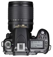 There comes a time in every point-and-shooter’s life when he or she wonders if there is more to photography than a palm-sized block of aluminum stowed away in one’s pocket. The ultracompact point-and-shoot has come so far in the last ten years that it’s tempting to write off DSLRs as largely irrelevant to most people’s lives, not offering enough utility to offset their bulky presence and hefty price tag. As soon as I bought my first truly great ultracompact a few years ago, the Casio EX-Z750, I was in this boat. 7.2 megapixels in your pocket… what more could one possibly need? After eventually moving up to the excellent 7x zoom Casio EX-V8, I told myself I would never need a DSLR.
But then I tried one for the first one, on loan from the fine folks at Nikon. A Nikon D80. Seemingly the “it” camera for the last couple of years. This article will not so much be a review of the D80, but rather a guide for DSLR virgins considering purchasing their first full sized digital camera.
First and foremost, will you use it?
We all love toys. We all love expensive toys. But nobody loves an expensive toy they never use. If you think you’re going to buy a DSLR and carry it around everywhere with you, you’re probably wrong. It’s heavy around your neck, it’s easily lost or stolen if you put it down in a public place, and it will never blend into the fabric of your life like a pocket camera will. In other words, be prepared to take it with you when you know you will be using it (e.g. sightseeing, stormwatching, portrait-taking, etc), but at all other times, it will probably stay at home. For this reason, even after you buy a DSLR, it’s probably good to keep your ultracompact point-and-shoot as your standard carry-along camera. Even on vacations, there will be plenty of times when the smaller camera is the only one on you at any given time. Again, I recommend the Casio EX-V8 as a fantastic ultracompact choice here. For the last few years, Casio has made the best all-around point-and-shoots, in my opinion.

Sunset at the top of Mauna Kea, 13,796 feet above sea-level. The highest peak above the ocean floor in the world. Definitely DSLR territory.
Nikon vs. Canon vs. everyone else
Most serious photographers will tell you there are only two real choices in the DSLR market: Nikon and Canon. Although companies like Olympus and Sony also make DSLRs, Nikon and Canon have such strong legacies in SLR photography that they’ve earned an unshakable amount of trust among professional photographers. Being an amateur, I am not one to question the conventional wisdom of professionals, so as far as I’m concerned, either Nikon or Canon should be your choice (for now, at least). The Nikon/Canon religious wars are less like the Mac/PC wars and more like BMW/Mercedes wars. With Macs and PCs, your Mac people think that PCs are horrendous piles of garbage and your PC people think Macs are overpriced, niche devices. BMW and Mercedes, on the other hand, really only differ in style… much like Nikons and Canons. They are equally priced, equally equipped, and even take cues off each other in the feature department.
For a good overview of the differences between Canons and Nikons, check out this article. My favorite quote:
“Canons are the best cameras available designed by engineers, and Nikons are the best cameras one can buy designed by photographers.”
That probably explains why I like this Nikon so much.
It’s the lens, stupid
Bodies come and go, but lenses are forever. So goes the saying. It may surprise you to know that some photographers are using the exact same lenses they were using 40 years ago. Even a brand new $5000 Nikon D3 can use a lens from the 1960s, if the photographer so chooses. These days, camera bodies and image sensors are evolving a lot faster than lenses, so to a large extent, it makes sense to invest more heavily in your lens(es) than in your cameras. Any photographer will tell you that they’d rather shoot with a cheap body and a great lens than the opposite.
There are essentially three things to consider when looking at lenses: speed, versatility, and stabilization.
Speed
Speed refers to how much light a lens lets in. If you’re like me, you hate flash photography and what it does to faces and objects, so you prefer to use natural light at all times. The only lenses that will let you achieve this are very fast lenses, usually with f-stops of 1.8 or lower. You can take a lens like this to a party at night and shoot beautiful naturally-lit shots even in the dimmest of corners (where you will probably be hanging out, since no one wants to stand with the dork carrying an SLR).
As a beginning photographer, your best option here is something John Gruber and Jim Ray (and millions of others) call “the best deal in photography”: the 1.8f 50mm prime lens. It’s small, light, fast, and just a little over $100. It is probably the only lens you will ever use after the sun goes down, and it also has an incredible narrow depth of field which is great keeping subjects in focus and backgrounds soft.

Tintin’s dog Snowy. This figurine is only a couple of inches long, and while his face is in focus, even his front paws are not. Narrow depth of field is a huge selling point of the 50mm prime lens.
Versatility
Although the 50mm prime has great light versatility, its fixed focal length won’t let you do any zooming, and thus, you may find yourself too far away at times to capture your ideal shot. Stalkers are well aware of this conundrum. In order to adequately frame subjects which are far away, you’ll need to pick yourself up a quality zoom lens. Even among zoom lenses, there is a wide range of versatility. There are 12-24mm (very wide angle), 70-300mm (very magnified), everything in-between, and even some further down and further out.
The first aftermarket lens I bought for my D80 was a Sigma 70-300mm, thinking it would come in handy for general use. More zooming would equal less walking and greater detail, or so I thought. In reality, it was a lens I found very little use for. Its inability to take “normal” wide angle shots, combined with the fact that at 300mm it takes a tripod to keep it from shaking, made it almost useless to me. I ended up trading it straight across for a Nikon 1.4f 50mm prime lens on Craigslist, which is much more useful to me (see above section on “speed”).
The most versatile lens in the world — and the one I eventually purchased — appears to be the Nikon 18-200mm VR lens. I bought this lens on recommendation from the great Ken Rockwell, and I couldn’t be happier with it. It does wide-angle shots at 18mm. It does telephoto shots at 200mm. Its focal length essentially covers you in 99% of the situations you’ll ever find yourself in. And it has VR, which I’ll discuss in the next subsection.
A lot of people have called the Nikon 18-200mm VR the most useful lens ever designed, and it’s not hard to see why. While professional photographers are used to carrying around a bag full of lenses, prosumers and weekenders would rather never have to change a lens. With the 18-200mm VR, you just pop the thing on and then forget about it. It’s a bit steep at $700, but worth it, in my opinion.
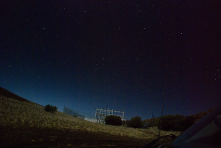
This picture was also taken atop Mauna Kea but under only the light of the moon. This is a 30 second exposure at ISO 1600.
Image stabilization
Both Nikon and Canon have image stabilization built into some of their best lenses now. I haven’t tested Canon’s out but it’s widely believed to be on par with Nikon’s VR (vibration reduction) technology. In a nutshell, VR is exactly what you probably think it is: a mechanism inside the lens detects camera shake and moves lens parts around in order to neutralize it. Does it work? It absolutely does. Is it noticeable? It absolutely is. I took some test shots around dusk, in low light, both with VR on and off and the difference is dramatic. The shots with VR off are blurry and unusable. Everybody’s hands have a different amount of shake to them, but most people report the ability to shoot about 4 stops faster when using VR. That is to say, if you can normally shoot handheld at 1/100, you should now be able to shoot at 1/15 (in much darker conditions).
As of today, Canon doesn’t appear to have an answer to the 18-200mm VR lens, but perhaps the closest thing they have is the Canon EF 28-300mm f/3.5-5.6L IS USM, but it’s about $2300. It goes up to 300mm which is nice, but the Nikon goes down to 18mm, which is more useful in my mind.

This photo was taken at 1/8 exposure and *no* VR. Blurry.

This photo was taken at 1/8 exposure *with* VR. Sharp!
Storage
The D80 uses an SD slot for storage, which I like, but some people prefer Compact Flash instead. Other models offer the use of either storage technology, sometimes in tandem. Pick whichever format suits you best, but with the cost of both Compact Flash and SD cards halving every several months, this may not be a huge factor in your purchasing decision. As of today, an 8 gig SD card can be had for $33.99 while an 8 gig CF card is about $39 so price per gig is roughly equivalent.
The megapixel myth
Image data is only as good as the source that captured it. In a DSLR camera, that includes both the lens and the image sensor. We’ve already covered the importance of the lens, but what about the sensor? Is a 6 megapixel sensor going to produce better photos than a 10 megapixel sensor? Currently, in most cases the answer is no. For most consumer/prosumer level DSLRs, the compact size of the sensor is such that megapixel levels above 6 do not increase the quality of the resulting image whatsoever. Edit (thanks Patrick): The answer is, “not always”. The size and sensitivity of the sensor is more important than the raw number of megapixels it produces so beware of judging cameras, even DSLRs, on their megapixel counts.
If you’re really interested in fully maximizing resolution and clarity, your only real choices are the new Nikon or Canon “full-frame” DSLRs. These cameras are all between $2000 and $8000 for the body only and have sensors which are much larger than any prosumer/consumer cameras. If you’re in the market for one, you’re probably way overqualified for this article.

High-resolution fire.
Interface and usability
Both Nikon and Canon have spent years refining their user interfaces, and users of each tend to prefer their own brand. My experience with Nikon was that I spent about 45 minutes reading the manual front-to-back (a rarity for me), then spent a couple of hours pushing buttons and turning dials, and I quickly felt pretty comfortable with the D80. Moving from the one-dial-one-button world of a Casio ultracompact to a 100-control DSLR still takes some adjusting, but as with most Apple products, the dials and buttons on the D80 seem to be designed very thoughtfully and generally serve their purpose while staying out of your way.
Filters
Most the time, the only filter you’ll ever need is a circular polarizer. Polarizers bend light as they enter the lens to either reduce or enhance reflections in the scene. They are particularly useful for reducing reflections off of water, snow, and buildings, and for creating more dramatic looking skies. Polarizers range from about 10 bucks to several hundred bucks, but most of the reading I’ve done suggests that a $40 polarizer is imperceptibly equivalent to the much more expensive ones. I use a Hoya that I bought for about $40 at Tall’s Camera.
What’s missing
In my mind, there are only three things missing from most cameras today, all of which I think will become standard equipment within a couple of years: GPS, wifi, and native HDR handling. GPS seems like a no-brainer and frankly I’m surprised it’s not more widespread already, considering how small GPS chips have gotten and the fact that a lot of phones have this capability already. Once all of my photos are automatically geotagged, it will become more interesting to collect and view them, and thus, I will take more of them. Wifi support is important to me because I’m often too lazy to transfer my photos to my hard drive or upload them online. Thankfully, a few months ago, the EyeFi was released, so that’s probably good enough, but it would be even nicer if it was built into the camera itself. HDR, or “high dynamic range” photography, is a method of photography whereby multiple shots at different exposures are composited together to produce dramatic, often surreal imagery. Some examples are here, in the Flickr HDR pool. It seems to me that a camera should theoretically be able to open the shutter once and take multiple shots from that, each during different points in the exposure, thus producing the layers necessary for the compositing.
Final analysis
So before you go out and buy a DSLR, here are some recommendations:
- Make sure you want one and have reasonable expectations for its usage
- Keep your ultracompact for everyday use, or buy a new Casio EX-V8
- When looking at DSLRs, trust what the pros use: Nikons and Canons
- Invest more in lenses than in bodies, disregarding any “resolution advantages” that aren’t also accompanied by larger sensors
- Purchase both a zoom lens for versatility and a fast prime lens for low light and narrow depth of field
If I was starting from scratch, here’s what I’d buy (List updated, from reader input):
- Nikon D80/D40x camera: $760/$545 (Go with the D40x if you’re price conscious, but know that it will not autofocus with some older lenses or even some inexpensive ones like the must-have 50mm 1.8f prime below)
- Nikon 50mm 1.8f lens: $105
- Nikon 18-200mm VR lens: $700
- Hoya Circular Polarizer: $30
- Total cost: About $1595 (D80) or $1380 (D40x)
If you’re just getting started with DSLRs, hopefully you’ve found this useful.
UPDATE: It’s now a few years later, and I’ve written an updated guide to Micro 4/3rds cameras — which I believe to be a better alternative to most DSLRS.
A Pretty Nice Laptop Case
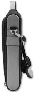 In the 15 or so years I’ve been using a laptop, I can’t say I’ve ever had the perfect laptop case. They’re either too big, too ugly, too minimalist, too weak, or too “handbaggy”. My ideal laptop case/bag is pretty simple:
- Made of semi-rigid ballistic nylon, similar to an Oakley case, providing a shell-like feeling
- Small handle to hold
- Tight-fitting, without a lot of extra bulk
- An auxiliary pocket for paper, a power cord, or a few other things
That’s really it. The problem is, this case doesn’t exist. The closest I had found was the Booq Vyper XS2, a spectacularly beautiful case which is hamstrung only by its baffling lack of handle and unfortunate omission of a utility pocket. The Vyper is so nice looking that I’ve considered buying one and actually grafting my own handle and pocket onto it.
Yesterday, however, I randomly found a pretty nice case that I wanted to pass along to anyone currently in the market for one: The Brenthaven Edge. It’s not quite as gorgeous and compact as the Booq, but it’s semi-rigid, has an extra pocket, and comes with a handle. It also has some pretty thick internal padding which would seem to make it quite “drop-proof”, although I’m not about to test that.
Anyway, that’s it… a quick holiday gift recommendation for you or your laptop toting loved one.
MSNBC Redesigns – Taste The Rainbow
 This weekend, msnbc.com began the multi-day process of rolling out their new redesign. It’s really, really nice… you should check out it.
Just so no one accuses me of kissing up to my new partners, I will say that I thought the last redesign several years ago was a bit of a step backwards from the landmark Roger Black look of the late 90s, but this newest redesign is not just a step forward, but a giant leap for newskind. It is not just a collection of features shoehorned together under one grid but a rather well orchestrated piece of communication design, worthy of further examination.
Let’s check out what’s going on under the hood:
Getting Rid of the Blues
Msnbc.com has always turned to blue as the primary color for its palette. Sometimes it’s royal blue, sometimes it’s electric blue, sometimes it’s subtle, and sometimes it’s dramatic, but it’s always been there — until now. The new palette is white, black, and grey with the spectrum of rainbow colors from the NBC peacock sprinkled tastefully throughout. It’s tough to pull off a rainbow palette in web design but this one is very sharp.
Speaking of blue, the shade chosen for all of the anchor text around the site is also very nice. For better or for worse, blue has become the de-facto apparel for hyperlinks on most mainstream web sites, but even the choice among blues is important. #0000FF is dated, unsophisticated, and highly lame, but there are still sites that use it. Interestingly, MSNBC and CNN have picked almost the exact same shade of blue in their latest redesigns, but hey, that just means they both have good taste.
Typography Tradeoffs
I’ve never liked Arial. It’s always seemed like nothing more than a font of last resort for those needing a widely available, compact sans serif. It’s plain, it’s unsophisticated, and it just screams “default” to me. For this reason, I was a bit disappointed to see the MSNBC redesign make such heavy use of Arial, particularly as display type. Surely something a bit more refined like Tahoma could be used. Or maybe even specify something like “Helvetica Neue, Corbel, Tahoma, Arial” so that users of OS X and Vista would get nicer sans serifs, most others would get Tahoma, and then Arial would be the font of last resort.
I asked Ashley Wells, msnbc.com’s Creative Director, about the Arial situation and he gave me a surprisingly satisfying answer: because msnbc’s new publishing system is very much WYSIWYG, editors are charged with not only writing headlines, but essentially designing them too. Meaning, how a headline wraps can have a dramatic impact on the presentation of the page. By using Arial, these wraps can be precise across most browsers. This is such a non-webgeeky way to think about publishing. I love it. Typesetting has always been something MSNBC has done a lot better than their competitors and it’s great to see that even as the company moves away from its Photoshopped-type-on-images style, the focus on typography is not completely lost.
Arial as a way to improve typography. Who would have thunk it.
BIg News, Big Treatments
One of the things I’ve always loved about MSNBC is that when big news happens, the layout of the front page adjusts to properly frame the importance of the story. At ESPN we called this “war mode” and it can only be accomplished by a mix of smart design and editorial participation. In the world of never-ending, unflavored news feeds we seem to be moving towards, it’s refreshing to see a news organization that still believes in the power and importance of layout.
Although the old msnbc.com had more layout flexibility than its competitors, the new site is several cuts above. There are dozens of layout options available for editors and that can increase infinitely as new ones are envisioned. So while most other news sites just pump their top stories into a standard headline-on-top-of-photo box, msnbc.com is actually designing their cover every time they publish. It makes checking the site several times a day that much more interesting.
Coding to Standards
As everyone who has ever worked on a big site knows, the longer you go between redesigns, the cruftier your code gets. Even the cleanest of redesigns tend to decay over time as more people get their hands on the code. WIth this latest redesign, however, MSNBC is debuting a totally new version of their home-grown publishing system (“WorkBench”)… one that is designed to — among other things — allow for feature extensibility without sacrificing the foundation of clean code that now anchors the site.
Before all of you standardistas and validatorians start piping up about inline CSS and random code oddities, realize that the site is very much in flux over these next few weeks as kinks get worked out. Also realize that a redesign of this magnitude requires the retrofitting of a lot of old code and templates that can’t always be eliminated with the flick of a switch.
As a result of the attention MSNBC is paying to web standards, the site now works equally well in all major browsers. It loads quickly, renders quickly, and is a joy to interact with.
An Open Dialog with Users
As part of the redesign process, MSNBC set up a blog to communicate with users about the redesign and all ongoing development efforts. These sorts of things are tricky because they tend to attract a lot of “drive-by” comments from users (e.g. “WTF! I hate it! Bring back the old!”). Once you filter out the inevitable noise though, there is usually plenty of insight to learn from. Having a blog to communicate with your users seems almost mandatory these days, but what I like about MSNBC’s is that it’s a sincere, serious effort. It’s just not a default TypePad installation that some PR flack pens to once a month. People from all sides of the organization have already written entries and answered questions, and it should be obvious to anyone who is paying attention that this is a company that cares about its community.
Newsvine Integration
I wish I could say that the Newsvine team had any significant role in this redesign, but we haven’t. This has been almost a year in the making and it’s all Redmond. That said, Newsvine did get a minor speaking part on the community page, and we look forward to further collaboration in the coming months.
The Bottom Line
This redesign is a perfect example of why “big media” is still alive and well, despite what some people would have you believe. It is thoughtful, it is innovative, and it is something no six-person company could ever produce. It is something, in fact, that most 300-person companies could never produce. As big media takes more cues from little media and little media returns the favor, both sides of the spectrum just get better. And that is great news for the news business and the news consumer.
Plug: Web Directions North
 I have nothing to do with the upcoming Web Directions North Conference in Vancouver, BC, but I thought I’d give it a plug anyway. I’ve been trying to convince Dave to throw this thing in the summertime when it’s warm and gorgeous in Vansterdam, but since it’s a wintertime event, it doubles handily as a ski trip to Whistler. If you’ve never been to the Vancouver/Whistler area of the world, you should consider going to this event. Why? Great speakers!
- Cameron Adams — Super nice guy, and one of the best javascripters in the world. Also, he’s the only guy I’ve ever met who looks Asian and sounds Australian. That is because he is both!
- John Allsopp — Legendary in his ability to appear non-geeky whilst discussing the geekiest of subjects.
- Daniel Burka — Designer of Digg, purveyor of fine Web 2.0 style.
- Andy Clarke — The sixth Beatle.
- Anil Dash — Thinks he’s never met me, but actually has.
- Kimberly Elam — Hooray for females at web conferences! Kimberly is a great author and designer.
- Brian Fling — Mobile design expert from BlueFlavor, and friend of the Vine.
- Derek Featherstone — Legendary for his ability to hold a beer glass to his lips using only facial suction.
- Tara Hunt — Hooray for even more females at web conferences!
- Brian Oberkirch — I met Brian once in New York. He knows his social media.
- Dave Shea — Did some sort of Zen Garden thing once.
- Jonathan Snook — Canada’s native son scripting expert.
- Josh Williams — The Billy Bob Thornton of the web design/dev world (he knows what I mean… it’s a huge compliment).
- Jeffrey Zeldman — The all-knowing, all-powerful, all-humble one. He is our yoda.
A trip to Web Directions North is also a great excuse to renew your passport, if it has expired. Off to go do that right now…
Gnomedex: No Stinkin’ Badges
Chris Pirillo’s Gnomedex conference kicked off last night in Seattle and the turnout looked fantastic. Lots of people from out of town, and a great venue to boot. The thing that pleased me more than anything else at the pre-conference party though was the design of the conference badges. Gnomedex badges are big and bold, with visual real estate doled out in almost perfect proportions. I wrote about the issue of carelessly designed conference badges a few months ago, and upon congratulating Chris on his conference last night, he informed me that the Gnomedex badge design was inspired by that article. Hooray for design evangelism!
Below is a photo of the badges snapped by Laughing Squid:
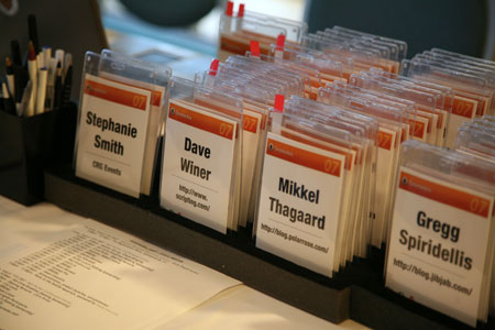
Positives:
- Attendee name is huge and readable from far away — set in
UniversHelvetica Neue Condensed Black, an extremely legibile, yet space-efficient typeface. - Attendee’s blog URL (instead of company) is listed below name. A nice touch considering the subject matter of Gnomedex.
- Title of conference and all other non-essential information is minimized.
- Sponsor (Polar Rose) is all over the lanyard instead of mucking up half the badge.
- Badge is two-sided.
Potential Negatives (Not many!):
http://could theoretically be lopped off the blog URL to increase the size and readability of the URL, but one could argue the prefix adds geek appeal.- A commenter on my previous entry suggested perhaps emphasizing the person’s *given* name so you know what to call them. This is more important in other countries though where names don’t always follow the “call me by the first name you see on my badge” rule. Not really fair to call this a negative, but it would be a nice potential issue to solve.
Oh, and there’s another big positive too. This has got to be the coolest badge ever. Party only! —