The Amazing Color Photography of Sergei Mikhailovich Prokudin-Gorskii

The Library of Congress has a spectacular collection of photos by Russian photographer Sergei Mikhailovich Prokudin-Gorskii that you must see. What makes them so amazing? Well, they are color photos taken about 100 years ago.
The process used to create and develop the photos is revolutionary yet simple. Essentially, three separate shots are taken, each with a different color filter over the lens: one red, one blue, and one green. The shots are then composited to form incredibly lifelike color portraits. It’s actually quite similar to color compositing in modern applications like Photoshop, but to see it applied to photos taken 100 years ago is mindblowing.
When I first saw this photo collection, my initial reaction was that it was fake, because these shots look like they could have been taken a few years ago. When you grow up in the modern color photography era, you’re subconsciously conditioned to actually think of the world as black and white around the turn of the 19th century because those are the only photos you ever see from that period. To see real-life scenes from back then in full color is surreal.
Prokudin-Gorskii’s collection is one of the most amazing I can ever remember seeing, and I’ve only gone through a few hundred photos so far. Here’s where to start:
- The exhibit home
- The making of the images
- A listing of some of the best pieces from the collection
- A browsable gallery of the entire collection
Note: Kottke, as usual, is about 8 years ahead of me on this.

Breaking Ground
344 days ago, I bought my first house. Today, I began demolishing it. You can view the live cam of the progress on the newly installed House by the Park Live Cam here.

Before: A charm-free 1953 house that’s never been updated, on a great plot of land.
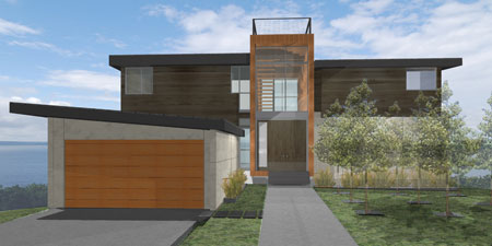
After: A rendering of what the new Northwest Modern house will look like.
It’s been a long but fun road getting to this point, and both my design/build firm — Build LLC — and I are extremely happy to be breaking ground. Throughout the design and construction process, I’ve kept Mike Industries mostly free of updates, instead opting to chronicle everything on A House by the Park. After all, I don’t want to stray from this blog’s laser focus on web design, remixed infomercials, and tasty beverages. So far, it seems that decision has been a good one, as Mike Industries averages about 10,000 RSS subscribers while HBP has only 547. It is not surprising that most people are uninterested the ins and outs of homebuilding.
That said, the design and construction process — and the in-situ documenting of it — has been extremely educational to me and I want to share a little of what I’ve learned so far:
The site itself: A House by the Park
I am not building the best home in the world and I am not the greatest writer in the world, but I honestly believe that HBP is the most complete and useful first-hand journal of custom homebuilding online today. There are updates on every aspect of the process, from finding the property, to negotiating, to choosing an architect, to homing in on a design, to the difference between a G.C. and a C.M. Every step of the process is in there, with costs attached. The cost thing is a bit controversial and several people have asked me why I’m exposing how much I pay for everything. The answer is simple: costs are the murkiest aspect of design and construction and if I’m going to demystify the process of building a home, it is essential to expose them. There is no sense in detailing interesting things for other perspective home builders only to leave them in the dark about what something similar might cost them. This blog is about transparency, and everything I can reveal, I will reveal.
HBP is also a great marketing tool for people and businesses involved in my project who do a great job. I plug Build all the time because they deserve it, and I also mention and/or link to contractors, consultants, and others who help along the way.
The economy
When the economy dropped off a cliff last October — right in the middle of design stage — I wavered as to whether or not I wanted to go through with construction. While mostly (but not completely) out of the market at the time, a sinking feeling that the U.S. financial system was about to implode got me briefly curled up in a ball like the rest of the country. I contemplated delaying the project until the economy recovered (if it ever recovered) both for my own mental well-being and because with real estate values plummeting, it seemed like a bad time to be investing more in real estate.
I jumped back and forth between wanting to build and wanting to delay, but in the end, what got me over the hump were a few things:
- This is the house I want to die in. I never want to sell it, so its paper value means less to me than its intrinsic value. This fact lessens my interest in turning any sort of profit and heightens my interest in getting it done as quickly as possible so my girlfriend and I can enjoy it before we are old and decrepit.
- The best time to build is when everyone’s business is slowing dramatically. If you build on the upswing, contractors’ bids and availability reflect the fact that they are in high demand. If you build at the bottom, many contractors and subs have already gone out of business so the labor pool has shrunk to match demand. But if you build on the downswing, the available pool of contractors is gigantic and the rates are lower as a result. So far, we are getting extremely competitive bids… a rarity in recent times, I hear.
- I feel a certain patriotic pride that I am helping put people to work at a time when our economy needs it most. My architects told me I’m one of the few who have “gotten out from under the covers” and I feel good about that. I feel we overspend quite a bit as a nation, and I don’t think people should just go out there and spend willy-nilly to stimulate the economy, but if you have the means to make a purchase right now, whether house, car, education, or other things, there’s never been a better time to do it.
The people
The number one thing that will determine whether or not a home building project is a success is what group of people you choose to work with. You can hire the greatest architect in the world, but if you aren’t on the same wavelength as him or her, your project will turn out horribly. Similarly, even if you make it through design stage with flying colors, the wrong contractor can bring the project in well above your budget level. When I interviewed two general contractors before moving forward with Build as my construction manager, one of them provided me with a “low estimate” and a “high estimate” to account for if things went well or poorly. Their low estimate was almost twice the total cost of the project when going the design/build route, and the high estimate was almost three times! An uninformed client would be out several hundred thousand dollars or more with the wrong decision there.
So far I have not hired a single person on this project that I regret hiring. Everyone’s been great and that has contributed to an ultra-low stress level for me.
Cost structures
I am procuring flat fee bids for every service I possibly can. Build charged me a flat fee for design and a flat fee for construction management. The electrical, plumbing, framing, and other bids are all flat bids as well. As a client, I love the flat fee system because I know exactly what I’m getting and I know exactly how much I’m paying for it. I don’t care if it takes someone longer or shorter than they estimated. I just want the work done and I want to pay a certain amount. As a designer, I also prefer this system. If someone wants a logo designed, I’d rather charge $5000 up front and agree to spend as much time as it takes to get the job done. If I kick ass and produce a great logo in a few hours, woohoo for me. If it takes me longer than expected, my effective hourly rate just decreases a bit. Not a big deal.
Anyone who agrees to pay an architect 15% of the cost of construction should think twice about how their interests are aligned. If the architect makes an extra 15% if he or she convinces you to use a material that is more expensive but not that much better than another material, how is that good for you? I’m not implying any sort of dishonesty here… just misalignment of interests. If I charged that way, I would also naturally gravitate towards the most expensive items my clients could afford.
I have a huge amount of respect for the fields of architecture and construction. I just want to be charged in a way that aligns my interests with my providers’.
Being green
The easiest way to “be green” is to live in a windowless, heavily-insulated, unlit, underground bunker. You’ll barely suck any energy from the grid and you can brag to your friends at parties that you have less of an impact on global warming than Ed Begley Jr. Of course if you do this, you will eventually complete your transformation into the Unabomber and not be allowed at parties — let alone in society — anymore.
The best way to think about building green is to figure out how to have as little of a negative impact on the earth as possible, whilst maintaining the reasonable level of comfort that an atmospheric parasite such as yourself is accustomed to. Does this mean giving up your beautiful west facing view for the sake of completely eliminating solar gain? No. But it means making other smart decisions along the way.
For me personally, it meant donating nearly 55 tons of material such as sandstone and teak to The Re-Store so it can be re-sold instead of shoved into a landfill. It also meant building a smaller, better insulated house than what is currently on the property. And finally, it meant not blowing $100k on environmentally questionable photovoltaic panels or drilling into my hillside for geo-thermal energy, but pre-wiring my roof for 5 or 10 years from now when we can unroll solar panels like beach blankets.
Tumbling as window shopping
I created a Tumblr at tumblelog.ahousebythepark.com to clip all of the interesting things I see on the web which may work well in the house. From appliances, to siding materials, to furniture, it’s a great place to store stuff you want to remember later. No more “where did I see that cool lamp?”. It’s all on the Tumblr. My architects can also monitor the Tumblr to get a feel for what sorts of things interest me and what they may have to design for along the way.
Onward…
Almost a year after beginning phase one, we now move onto phase two: construction. Phase one may be the make or break phase for curb appeal, but phase two is where bank accounts go to die. I don’t expect more than a small percentage of Mike Industries visitors to follow along, but if you’re interested, head on over to HBP and help shape decisions along the way.
We now return you to your regularly scheduled programming.
Examining Typekit
Last week brought word of a promising new type solution for the web called Typekit. Created by Jeff Veen and the smart folks at Small Batch, Typekit aims to solve the problem of custom typography on the web once and for all. Unlike sIFR, Cufon, and several other stopgaps before it, Typekit does not attempt to hack around the problem, but to solve it in a permanent way, which is exciting.
As a co-inventor of sIFR, I’ve been getting a lot of emails this week asking what I think of this new effort. In evaluating its promise, it’s important to examine the following characteristics, in order of importance: compatibility, functionality, legality, ease of use, and hackiness.
Compatibility
Compatibility is the most important aspect of any new web technology. If your shiny new method only works in 10% of web browsers, it’s nothing more than a proof-of-concept. It is this reality check that keeps me from getting excited about W3C meetings, Internet Explorer extensions, or anything else that doesn’t apply all browsers in the here and now… or at least the right around the corner.
Compatibility was also what pushed sIFR over the top in terms of popularity, working in over 90% of all systems and falling back gracefully in most others. It also came out at a time, 2004, when there wasn’t a whole lot of tolerance for leaving certain browsers behind or having things look ideal in a few browsers and not so ideal in others.
Typekit appears to be doing ok on the compatibility front, targeting current versions of Safari, Chrome, and Opera natively, the next version of Firefox (3.1) natively, and all versions of Internet Explorer via a “backup” EOT solution. Here’s what the browser share landscape looks like today:
- Works in:
- Internet Explorer: 66.1%
- Safari: 8.21%
- Chrome: 1.42%
- Opera: 0.68%
- Firefox 3.1 or greater: 0.18%
- Doesn’t work in:
- Firefox 3.0 or lower: 22.3%
- Miscellaneous other browsers: 1.11%
So you can see right off the bat that Typekit will work in just over 76% of browsers. Not quite as high as some of the methods that came before it, but it’s extremely important to recognize that the one group that’s keeping Typekit from almost universal compatibility is Firefox. I have no evidence to support this, but I imagine that Firefox users are among the quickest to upgrade, which would seem to suggest that this compatibility gap could be closed relatively quickly. Data shows that Firefox 3 is already used by 11 times more people than Firefox 2, and considering it was released just short of a year ago, this sort of upgrade pattern is encouraging.
Given the above data, combined with how often Firefox seems to annoy me these days with upgrade notices, I expect Firefox 3.1 or greater to be the dominant Firefox version in use one year from now, thus pushing Typekit’s compatibility percentage into the upper 90s fairly soon.
It’s also important to praise what Small Batch has done here on the compatibility front: their killer concept was involving type foundries in web-only licensing and propagating the font files through the standards-complaint @font-face CSS declaration, but they realized their solution would be academic if it didn’t work in Internet Explorer, so they made sure their backup implementation using EOT files took care of all IE users. The lack of this sort of practical thinking is what keeps a lot of great ideas from gaining traction on the web.
I also think that designers these days, self included, are a lot more amenable to things looking great on “most systems” as long as they at least work reasonably on other systems (as long as they look great on the particular system the designer uses). This is a bit of designer bias, of course, but it also represents an increasing desire in the design and development community to leave the old web behind. I still remember how much crap I took at ESPN from validatorians when we decided to leave Netscape 4 — with its 1% marketshare — behind. Now it’s all the rage… and I love it!
Functionality
By all accounts, Typekit will be more functional than any method that came before it. This is quite obviously because it uses a browser’s native font rendering technology. There are some concerns about reliability gaps stemming from downloading fonts off third-party servers, but I believe this fear will prove unfounded. Additionally, I imagine both the @font-face and EOT versions of fonts will come in larger files than sIFR font files (because usually you only embed a subset of characters in a sIFR font file) but with broadband penetration being what it is today, this too will prove immaterial. Additionally, even though sIFR font files may be smaller, the noticeable delay in rendering them probably more than makes up the difference.
Legality
I put legality in the middle of the pack and not at the top because, to my knowledge, there haven’t been any serious legal dust-ups over the use of technologies like sIFR and Cufon. So far, the burden has been on designers to buy the fonts they use before embedding them using sIFR or Cufon, but at the same time, there’s been no clear blessing or condemnation of this practice by foundries or type designers.
The nice thing about Typekit is that it specifically involves foundries and type designers in the process of licensing their fonts for use on the web. When you use Typekit, you know with certainty that what you’re doing has the direct blessing of the people who created and/or marketed the typeface you’re using. This is a nice piece-of-mind upgrade as well as a way of further compensating type designers for giving us the building blocks of web design.
Ease of use
Typekit promises to be easier to implement than either sIFR, Cufon, or any other font replacement technology. I guess we won’t know until we start using it, but it would shock me if it took more than a few minutes to implement, including licensing the font you want to use. sIFR’s second most common complaint other than “it uses Flash and Flash kills puppies” is that it’s a bit difficult to implement. Typekit’s improvement on this front will be more than welcome.
Hackiness
First let me say something I’ve said many times before: the entire world wide web is a hack. Get over it. Secondly, however, any technologies or methods — that work — which serve to dehackify it a bit are welcome. Typekit certainly dehackifies custom typography on the web by leaps and bounds. It was the solution we all knew would come eventually when we created sIFR as a stopgap five years ago. Just about the only things hacky about it are that it falls back to EOT (which, as discussed earlier, is great) and that it uses Javascript to handle the licensing nuts and bolts (meh, big deal).
Conclusion
Typekit is likely the best thing to happen to web design since the re-emergence of browser competitiveness. It will be embraced quickly and fervently when it is released this summer, and its creators should be loudly applauded for doing it instead of just talking about it. There are too many talkers in the world and not enough doers. The team at Small Batch has done an excellent job of taking a problem that a lot of people like to talk about and solving it in a practical, equitable way. It’s a welcome solution to a real issue and a significant step towards a leaner, Veener web.
Presto Chango
After almost five years of running Mike Industries, it’s time for a change! The fact that I made it this long without redesigning is either a testament to the majestic timelessness of the original design or my general uncomfortableness in doing “self identity” work. Since we know there is no such thing as timelessness on the web, we can therefore assume it’s the latter.
This redesign had five objectives, in order of importance:
- Make shared items such as found links, video, and photography more a part of the overall content presentation. I still write original posts 1-3 times a month, but it’s nice to keep things fresh in-between as well.
- Refresh things visually with a wider layout, new typography, and a fuller footer, among other elements.
- Modernize and completely rewrite the code that was brought over when I switched from Movable Type to WordPress a year ago.
- Offer more feed customization, including full-text RSS.
- Don’t break old pages with the new design.
… and away we go:
Bringing multi-source aggregation into the fold
It’s easy to take posts from other places like Delicious, Tumblr, and Twitter and display them in various places around your blog. It’s a bit harder to ingest those same posts into your blog’s publishing system and then output them as actual native blog posts that people can comment on. And finally, it’s incredibly hard to do the second thing in a way that’s flexible enough to display many different types of content in many different contexts.
Getting to the first stage would have been easy via a few lines of javascript, and in fact, I already got there with the previous design, embedding my Delicious links in the Mike Industries sidebar.
In trying to make it to the second stage, I tried several different “aggregation” plug-ins for WordPress, but eventually settled on a wonderful little creation called FeedWordPress, by the one they call “Rad Geek”. After installing the FeedWordPress plug-in, you simply give it some feeds to suck in, tell it how to categorize and tag items from each feed, and then let WordPress templates do the rest.
I was originally going to move over all of my link-saving from Delicious to Tumblr because I love Tumblr’s posting interface, but since my Tumblr account got hacked within a couple weeks of opening it, I decided to only use the Tumblr account to post fun stuff like videos. My initial reflex was to move all “collecting” to one platform, but since everything is getting pulled directly into the main blog anyway, I’ve convinced myself that the use of multiple platforms is actually a strength. I’m essentially pulling my Tumblr and Delicious feeds into the “Shared” column and my Twitter feed into the “Overshared” column.
I am unconvinced that Twitter will be a permanent part of this blog, since I still don’t enjoy either publishing or reading many tweets, but I’m giving it a try to see if it sticks. Twitter’s rising popularity continues to amaze me to the point where I’m almost ready to officially consider myself “too old”. On the one hand, I totally understand it because it’s so easy. But on the other hand, I totally despise it because it enables such laziness and extravagance of expression. Anyway, that’s a conversation for another blog post.
The single hardest part of the entire redesign was writing a script that ensured no items in the Shared column would render wider than the column itself. Since there will be plenty of YouTube video tags in there, it was essential to resize them all as the column renders, but not permanently in the database, so that they can render at full size when viewed from the permalink pages. I am no Wolf with regular expressions, but after hours and hours of hackerations, I came up with this:
I cribbed part of the short scale_image_240 function, but the rest was from scratch. Beforehand, I searched for quite some time on Google for a function to do exactly this and couldn’t find it, so hopefully this post will help some future searchers in their own quests to resize content.
Even though running these computations when the sidebars render isn’t too computationally ferocious, I went ahead and “widgetized” my sidebar in WordPress as well, so I could make use of the excellent WP Widget Cache plug-in. WP Widget Cache writes your entire sidebar out to disk so that it can be served up quickly and statically.
Ok, now that the geekiest part of the redesign has been explained, on to hopefully more interesting matters…
Separation of different content types
As much as I love what Doug and Dave have done with their superb redesigns, I just don’t like displaying original posts and peripheral content in the same column. I may not be the most prolific original post writer, but when I write an article, I want it front and center, and not pushed down by links or other distractions. With this redesign, the flow is simple: the most important stuff is on the left, the semi-interesting stuff is to the right of that, and the barely-interesting stuff is to the right of that. Size also flows according. The wide column is important, the medium column is semi-interesting, and the narrow column is barely-interesting.
Typography
sIFR lives on in the new Mike Industries — of course — in the form of Trade Gothic Condensed. While I don’t think sIFR should be used in every project (we don’t use it on Newsvine), I still find it an invaluable method to really shine up blog design. The first version of Mike Industries used Agency Condensed rendered with sIFR 2, while the new version uses the aforementioned Trade Gothic (a Stan favorite) and sIFR 3.
By the way, I don’t usually like to call fellow developers out, but I will say this about sIFR 3: it’s beautiful and it’s been ready for at least a year, in my opinion, and yet it’s not officially “released” yet. I find this highly unfortunate. When you’re developing software for the web, it’s never going to be perfect. As long as your software generally works and isn’t causing any damage, release it. The entire web is a beta. The entire web is a hack. It always will be. Don’t fight it. If you’re on Release Candidate 436, that’s a sign you may need to let go a little.
Aside from the Trade Gothic, Mike Industries now uses Helvetica Neue for body copy and downwind headers. I am certainly no devotee of Helvetica, like 90% of the people in the film are, but with anti-aliasing so much improved in the last decade, it does make for some good readability these days. Plus, I just needed to get off the Lucida Grande/Verdana bandwagon for awhile at least.
Grids, shmids
I feel like grids are the new web standards. What I mean is that they are a potentially useful tool to achieve a noble means, but they aren’t the second coming of the messiah. If grids help you do great work, then by all means learn them, love them, and live them. But if you’re perfectly happy eyeing layouts as a drunken painter eyes a canvas, then eye away. I’m no painter, but I’m plenty happy creating layouts without the use of grids or any sort of sizing heuristics. I don’t make sure my main column is sized according to a golden-ratio and I don’t make sure every line of type lines up vertically with every other.
I just do what feels right… and that’s plenty good enough for me. You should do the same, whether or not that involves the use of grids.
Feeds revisited and reloaded
Due to popular demand, I am now pushing out full text RSS feeds. I would still rather not publish these because of content theft and other reasons, but in the end, my reticence should not trump the will of my subscribers. I’ll try it out and unless I notice widespread plagiarism on spam blogs, full-text feeds will probably continue.
Also, after running this poll about a month ago, I’ve decided to include original and shared items in the default RSS feed (the one you’re probably already subscribed to). According to the poll results, most people want to see interesting links and other stuff in the main feed, so that was the justification. If, however, you find the shared items superfluous, please switch over to the Articles Only feed. I hate the idea of anyone unsubscribing entirely because the main feed is now updated too often.
One thing I can’t seem to figure out is how to correctly enable the “all” feed in WordPress. For all of you WordPress gurus out there, I basically applied a filter to my existing “/blog/feed” feed to remove the Overshared/Twitter categories. It is as follows:
function exclude_category($query) {

	if ( $query->is_feed ) {

		$query->set('cat', '-473,-281');

	}

return $query;

}
add_filter('pre_get_posts', 'exclude_category');
That correctly takes the stuff out of the “main” feed, but I need to provide another feed with everything in it. Something like maybe “/blog/feed?all”. I figured I should be able to just modify the line above to:
if ( $query->is_feed &! $query->query_vars['all'] ) {
… and it should work. It doesn’t. If anyone has any ideas, I’d love some help on that one (or another way to do it entirely).
Big footers are in
My footer now contains a lot of what was previously in my sidebar and more. I’m not sure how I feel about this yet. On the one hand, I like big, informative footers. But on the other hand, I don’t like burying such potentially important stuff so low on the page. If I end up getting rid of the Overshared column, some of the footer content may end up replacing it.
Backwards compatibility
Originally, I wanted to find a way to keep old blog posts in the old theme and style new blog posts with the new theme. I like this idea because it preserves the context in which posts were originally written and it also doesn’t break heavily designed posts like this one. In the end though, I was able to keep my main content area the same size as my old one, so the new theme really didn’t break any entries, so I have — for now — decided to move everything to the new theme. This decision is definitely subject to change though as I really don’t want to be tied to a 450 pixel wide white column for the rest of my life.
So anyway…
So anyway, that’s it. I’m pretty excited to get this rolled out, but at the same time there are still details that need some shining and bugs that need squashing. If you see any, give me a holler in the comments. Thanks!
Si Se Puede

No matter what your political leanings are, today is a special day. Above is my favorite poster from the presidential campaign. It was beautifully illustrated and silkscreened by The Date Farmers to help get out the vote in Texas… complete with authentic Mexican Revolution motif. I believe this is the only known depiction of Barack Obama where he looks reasonably badass.
Really, really beautiful.
Thoughts on the ESPN.com Redesign
A couple of days ago, ESPN.com launched their latest redesign; an effort many months in the making and much anticipated in the industry. I’ve been playing with the new site for a month or so now and have some positive and negative opinions to express, both as a sports fan and as one of the (drunk) driving forces behind some past ESPN.com redesigns.
First the standard caveat: designing a major media site is not as easy as it may appear. It is not like designing a blog and not like designing a standard “web presence” for a company. There are hundreds of internal stakeholders to answer to, millions of daily users to please, and a ton of legacy and third-party code that is often outside your control. Anyone who tries to knock down the virtues of a major media site redesign based on how far it falls short of perfection is making the wrong comparison. The most important benchmark to grade is simply the amount of improvement (or worsening) from the last iteration of the site. Secondarily, comparison against competitors is also very important.
First things first, there’s a lot to like about the redesign:
Cleanliness
In my five years at ESPN, there was always a lot of push and pull between design cleanliness and information density. On the design side, we always fought for an economy of elements on the page. Big striking headlines, well placed lead-ins, content modules here and there, but nothing to overload the screen. On the editorial and business side, there was always a push for more video, more features, and just generally more content all over the place. The ideal philosophy is of course somewhere in the middle, but over the last few years, I feel like ESPN had gone a bit too far in the “Times Square Billboard” direction, with too much visual distraction (especially in the form of autoplay video).
The new redesign gracefully chisels away a lot of the visual clutter and presents a calmer, gentler ESPN for your perusing pleasure. Gone is the autoplay video and other visual cruft that had built up over the years.
Note: When I refer to “visual cruft”, this is a phenomenon that happens to every content site over time. Essentially, you redesign and everything’s perfect, and then “plaque” kind of builds up over time in the form of code and design elements that are inserted to meet editorial or business needs. Each redesign is an opportunity to chisel off the plaque and start anew.
Code Quality
Don’t even bother trying to run the ESPN front page through the stupid W3C validator because that’s a lousy way to judge code quality. The tomato-throwers among us will of course do this immediately and point to the hundreds of validation errors as evidence of incompetence. The more seasoned among us know that 500 ampersand-related errors are meaningless in the grand scheme of things and we wish the validator could be configured to selectively mute certain types of benign errors.
The HTML for the front page is a svelte 22.8k gzipped (73.4k unzipped) and the code is pretty well written. All CSS for layout — natch — and decently structured HTML.
I will not comment on accessibility because I am not an accessibility expert. I’ve long railed against judging a site’s true accessibility by looking for alt text and well structured code, as I simply don’t believe those elements — on their face — make a site accessible or not. A site is accessible if observed user behavior suggests that disabled people can use the site with reasonable ease. If you don’t know how disabled people actually use your site, you have no idea if it’s actually accessible. Period. You may have followed best practices to improve its accessibility, but you just don’t know if it passes the test unless you test.
That said, I have no idea how accessible the new ESPN.com is in the real world. I imagine it’s ok, but certainly not perfect.
New Story Pages
I don’t have a whole lot of objective things to say about the new story pages, but they look cleaner than the previous incarnation. Very readable, very uncluttered, and good video integration where appropriate.
Navigation
ESPN moved to top navigation a few years ago and they’ve never looked back. I’ve long preached the benefits of putting your main navigation across the top of the screen and ESPN has fine-tuned their implementation with this release. Good rollovers, good information architecture, and just all-around snappy. I’d like to see msnbc.com move to top navigation with their next redesign.
Video
As mentioned above, gone is the awful autoplay video. In its place is a video tab which is a lot more polite to users. I don’t think many users will click on the video tab (because in general, no one clicks on tabs), but I do think when ESPN has great video, they’ll probably flip to “video mode” automatically… and I’m totally cool with that, as long as it doesn’t autoplay.
But it’s not all roses with the redesign. I do have some issues with it:
Below the Fold
By far the worst thing about the redesign is the ghettoization of the below-the-fold area on the home page. It’s tragically uninteresting. When I was working on the 2003 redesign, I remember John Skipper (rightfully) making a big deal about how important the below-the-fold area of the front page was and how we needed to make better use of it. The last redesign had a nice Flash feature slideshow thing going on and that is now gone, in favor of the gigantic heads of ESPN columnists. I love ESPN columnists, but their headshots add absolutely nothing to their stories. It’s a huge waste of space and it’s subconsciously a very unattractive area to scroll to.
Because of this, the new ESPN frontpage is now more of a “glance and go” site for me now. I don’t want to scroll because I have no confidence that there is anything worth scrolling to. Compare that to, for instance, the msnbc.com frontpage, where there are a ton of things to keep you interested all the way to the bottom of the page. I actually think msnbc.com is among the best in the industry at this.
One thing ESPN did to encourage people to scroll is put the main headline in the bottom area of the main marquee. Sorry, my screen’s big enough to still see it anyway. Not going to scroll.
Tinting Red is Dangerous
Unless your site caters to females, it’s always risky to tint your reds. Even the slightest tinge of pink on a site like ESPN can ruin the whole look. Generally ESPN has gone with shades of red (red plus black) or maintained very clear boundaries between reds and whites. With this redesign, there is a pretty noticeable gradient from red to light gray, and while it’s clear they limited the pink zone by using a steep gradient, it’s still noticeable.
Minimal Customization
I don’t see a whole lot of customization options besides the “My Headlines” tab. It’s very hard to do customization well, but this strikes me as not much of an effort at all.
Conclusion
All in all, I think it’s a nice redesign. Not one that knocks you on your ass and wows you to your core, but tasteful nonetheless. I found myself visiting competitive sites like Yahoo Sports, CNNSI, Sportsline, and Fox Sports to compare this against their latest versions, and after thinking about it, I still think ESPN’s design compares favorably to all comers.
What Should Go in a Default RSS Feed?
So after four or five years of not redesigning this site, I’m finally working up the energy to rearrange the furniture a little. Part of the motivation comes from realizing how much more I like the general design of my construction blog and the other part comes from the admission that a lot of the things I want to update my site with regularly are not articles about web design and development, and in some cases, not articles at all.
The first question to answer in this redesign is: what are the discrete types of content I will be posting once the redesign is complete. So far, this is what I’ve come up with —
- Web design and development articles
- Other articles
- Product Recommendations
- Random links of interest, a la what’s in my sidebar right now
- Newsvine seeds linking to interesting news stories I’ve read lately
- Photos
- Videos
- Links to latest entries on A House By The Park
- Latest Twitter posts
The items are more or less in order of what I think people would be interested in. The first three would be full text posts and the rest would be in some sort of compact form, either inline with the rest of the posts or more likely in a sidebar.
So far so good. I’m pretty confident I can pull all of that off with not too much work. The problem, however, is how that all manifests in an RSS feed. WordPress has a great feature where you can mix and match categories into different RSS feeds — which I fully plan to do — but what goes in the default feed? That is the $64,000 question. With somewhere between 5,000 and 10,000 subscribers, I don’t want to piss anybody off by shoving a lot more updates in there to relatively meaningless things like Twitter entries. As a reader, I prefer to subscribe to RSS feeds that update once or twice a week max and if one of my favorite blogs shoved the whole kitchen sink into their feed suddenly, I might unsubscribe.
On the other hand, however, I’ve had plenty of people say things to me like “I used to always read your blog… back when you updated it!” — clearly implying that 2 or 3 updates a month isn’t cutting it.
render(); ?>
So the first question to answer is “what should go in the default feed?” If you’re a current Mike Industries RSS subscriber, please vote in the poll to the right.
The second question is not really something I need votes on, but perhaps should be discussed in the comments below: when offering custom RSS feeds, is the best practice to create them by opting out of categories or opting in? Here are the two ways you can custom feeds in WordPress —
http://www.example.com/feed?cat=1,2,3
(Returns a feed with items from categories 1, 2, and 3)
or
http://www.example.com/feed?cat=-4,-5,-6
(Returns a feed with all items except from categories 4, 5, and 6)
The user interface for creating each style of feed can still be identical (a bunch of checkboxes), but the nature of the subscription is subtly different. Let’s say you’re subscribed to the first feed and I add a 7th category. Say category 7 is links to a third blog that is created at some time in the future. If you’re subscribed to the first feed, you won’t get the new stuff. If you’re subscribed to the second feed, however, you will, because you haven’t specifically excluded category 7. There are advantages and disadvantages to each. If you have any insight into this or any other related issue, I would love to hear your comments below.
LazyWeb Request: Date-Based Theme Switcher for WordPress
Jason Santa Maria said something in his last post about art directing blog entries that struck a chord with me:
“I am a huge proponent of preservation on the web. If and when I redesign, I will archive this version like I did with my last. I think it’s important to keep content and design paired together when possible. That’s where the context and meaning live.”
I agree with Jason and his reasoning is part of why I haven’t redesigned Mike Industries since launching it almost five years ago: I don’t like the idea of changing the visual context of past entries or having to make a new design backwards-compatible, especially with with some of the more visually complex entries that have appeared from time to time.
While I like Jason’s idea of archiving entire versions of his old sites at different subdomains, I think I’d actually rather just set a cut-off date whereby every blog post older than that date uses the old theme and every other page or post on the site uses a new theme. In searching around, I can’t find a way to do this in WordPress. It seems like something that could be the basis for a very useful plug-in. Call it “WP Non-Destructive Redesign” maybe.
Any WordPress hotshots out there know how something like this could be accomplished? For the quick and dirty version, ideally you’d first officially switch to a new theme and then there would be one setting in the plug-in’s options which would let you specify a cut-off date and a theme name to apply to the old stuff.
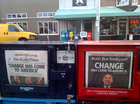
Two Paper Town
Sometimes people wonder why we have two newspapers in Seattle. The answer, of course, is that some people prefer reversed-out type:
I’m Launching a New Blog Today: “A House By The Park”
 Today marks the launch of my second blog, and first new one in over four years: A House By The Park. Please head over and have a look-see!
Why a second blog when I only post to Mike Industries a few times a month? Well, I’m building a house, together with Build LLC.
The first thing I noticed after deciding to build a house is that there aren’t any well-written, well-designed, detail-oriented blogs about building a house from the perspective of someone who has never done it before. There are a number of books on the subject, several of which I’ve purchased and zero of which I’ve opened, as well as random articles and photos from people at various points in their construction, but nowhere could I find a start-to-finish, real-time chronology of the entire process. That ends today.
Ahousebythepark.com will cover searching for the right property, dealing with real estate agents, interviewing and choosing an architect, making your way through the design and build process, and probably a thousand other things… all with the goal of helping future custom home builders better prepare for their own projects. I’ve backdated a bunch of entries before pushing the site live so there are already 26 posts to thumb through.
Somebody told me once that every human being should go through the home building process once in their lifetime. I don’t know if I agree with that, but if you feel you may ever decide to build a home for yourself, I invite you to subscribe to A House By The Park’s RSS feed and follow passively until something strikes your interest. I can’t guarantee the same highly intellectual nuggets of thought that fill the pages of Mike Industries, but I will try to write with the same level of detail and accuracy. For instance, I’m making my entire spreadsheet of expenses available online and within the blog posts themselves so readers can get a specific idea of what everything costs (Yay EditGrid! Separate post on this coming soon).
Finally, please feel free to link to or write about A House By The Park on your own site or other places of interest. Every little link helps. I estimate there are somewhere between 5,000 and 10,000 subscribers to Mike Industries so there are always great comments here, but on launch day, A House By The Park will have zero. Writing stuff is no fun until intelligent discussion and/or controversy ensues.
So that’s the pitch. Head on over, the water’s warm. I’ve even published a top-to-bottom complete chronology page to get you all caught up from the beginning without having to jump from page to page.