Twitter Buys Summify, Gives Everyone a Reason to Use It
Today, it was announced that Twitter has acquired an awesome little Pacific Northwest company called Summify. If you haven’t heard of Summify, they provide what I consider to be the best next-generation news delivery platform in the world right now.
Isn’t Twitter itself a news delivery platform though? Not really. Twitter is an information delivery platform, of which news is a small but extremely important subset. In other words, when you read a joke on Twitter, that’s not news. When you ask someone a question about a restaurant on Twitter, that’s not news. When you receive a response from an expertly crafted bot on Twitter, that’s not news. In short, the great majority of what Twitter traffics is non-news information.
It’s long been a complaint of Twitter users, however, that when they do want to use Twitter as a news source — perhaps even their only news source — it’s a less than ideal experience. People keep their excellent Twitter clients open all day hoping they’ll stay abreast on what’s going on in the world, but often they miss important events because the firehose of chatter drowns out critical links.
What Summify does is essentially stand in front of your firehose, collect the drops of water that are news-related, and then fill up a nice, tidy cup for you containing only (or mostly) news. You can tell Summify you want a tall, a grande, or a venti and the platform delivers the right sized cup to you at whatever interval you choose.
And oh by the way, Summify can analyze your Facebook account and your Google Reader account as well as your Twitter account if you’d like.
And oh by the way, your news summary is available via web, via RSS, via tablet, and via phone.
And oh by the way, Summify was created by a team of about under 10 people. Mircea, Cristian, and crew are extremely smart and very nice people, but still, what a great product from such a small team.
So why is this such a smart acquisition for Twitter? In my mind, there are two reasons.
First, although the Twitter design staff has gone to great pains to craft the interface and sign-up process such that people know how to use Twitter immediately, I feel like they’ve now solved that problem. Do a Twitter search for a trending hashtag and you’ll see all sorts of people of “various knowledge levels” getting around just fine.
I feel like the new problem to solve is not “how do I use Twitter” but “why should I use Twitter”. This problem doesn’t apply to everyone that is currently using it, obviously, but it applies to my mom, my fiance, and all of the other millions of the people in the world who just don’t see a value proposition yet. Basically the “I don’t have anything to say to strangers” crowd, the “I don’t care what celebrities are saying” crowd, and the “I already have Facebook” crowd.
With Summify folded into Twitter, there will now be one activity that almost everyone in the world can get obvious value from: a simple summary of what news stories you should know about every day, based on who influences you.
The second reason this is a great acquisition is that it helps hedge against a phenomenon that I think is coming over the next few years: information overload followed by consumption retreat. It’s only a matter of time before people look at all of the distractions they expose themselves to every day and realize it is keeping them from living productive lives. Twitter, Facebook, and RSS before them have hastened this effect, and while it’s still only a problem at the edges, it will get more pronounced each year.
Summify offers a simple antidote; one that Twitter can weave into their UI such that users can dial up or dial down their desired consumption level as they see fit. Right now there is actually a disincentive to follow people on Twitter, in many cases. Summify potentially eliminates that problem entirely by promising to send you better stories, not more stories for each new account you follow.
As a closing thought, I’ve had this idea in my head for the last few years of what a perfect news site looks like, and it’s quite simple: a white screen with a list of 5 or 10 links that changes once a day. That’s it. Here’s the tricky part though: the 5 or 10 links need to be THE 5 or 10 links that are most useful to me on any given day. In other words, let’s say there are 10,000 new stories every day. This site needs to be smart enough to pick the top 5 or 10 for me with almost 100% certainty. You will know it works when it’s creepy. I liken it to Barack Obama’s daily briefing he gets from his advisors. He doesn’t have time to scour news sites all day so his advisors tell him what he absolutely needs to see every morning and then, here’s the key part: he gets on with his life.
I want that.
I feel like Twitter — with Summify in tow — can eventually provide that.
Sign me up!
UPDATE: I forgot to mention that there is another great service worth trying called Percolate that is a slightly different take on curation than what Summify provides. Give it a shot.
Never Be Another

When someone dies, the phrase “there will never be another” gets used quite frequently. It’s one of those phrases that is both always true and yet almost always not true. It’s true that, yes, no other person will ever be exactly like any other person, but it’s usually false in the compliment it’s actually trying to pay.
In almost every case, when a public figure dies, there are plenty of his or her contemporaries ready to fill the void. A great guitarist died? Well we at least have hundreds of other world class guitarists to listen to. A basketball star died? Luckily we have plenty of those too.
The truth of the matter is that even best of the best in most fields, at any given time, is only a little better than the rest.
Counterexamples to this seem to happen only a handful of times per century. The number of times we lose someone whose impact was so dramatic and whose substitute seems so unfathomable is vanishingly small.
We lost that person yesterday in Steve Jobs, and we are only beginning to feel the impact of his absence.
What gets lost in all of these Steve Jobs tributes you read online is just how dark things were for personal technology only ten years ago. People forget that until the iPhone came out, “The Apple Way” was still largely on the sidelines. Windows PCs were unavoidable. Cell phones were unapproachable. There were even a few years around the turn of the century when many websites didn’t even work on Macs because developers only coded to PC Internet Explorer “standards” (airiest of air quotes there, of course).
It was just dark as hell out there; especially for those of us who wanted so badly for the story to end differently. The lesson that idealism and attention to detail could lose out to “good enough and a little cheaper” was not something we wanted to learn.
The long, but impeccably planned, turnaround that Steve Jobs has led over the last 14 years is impressive for thousands of reasons. None is more astounding to me than this one though: he was quite literally the one person on the face of the earth capable of pulling it off.
One. Out of 6,800,000,000 people.
He wasn’t just the best choice. He was the only choice. And that’s why we’ll miss him so much.
When people die after suffering from prolonged illness or pain, my thoughts are almost always positive. Death is not something I fear, and when it’s ultimately the relief method for someone’s pain and suffering, I feel happy for their newfound peace. I felt this way when Kurt Cobain died, for instance.
With Steve Jobs, however, I don’t get the feeling death was any sort of relief at all. Yes he was obviously at peace with the concept, as he expressed beautifully in his Stanford commencement speech, but SJ put the pedal to the metal until his final breath.
What would you do if you knew you had a short time to live? Most of us would quit our jobs. Many of us would travel. Some of us would relax and keep our stress levels down. What did Steve do? He hit the gas. He released the iPhone, unveiled the iPad, and led Apple to its current and still unfathomable status as the most valuable company in the world.
Just as incredibly, he was able to lift his body out of Apple without also removing his soul; on a day when many once feared AAPL stock would dive precipitously, it’s comfortably unchanged from the day before.
He had his flaws and he may not be the greatest person to ever live, but no one has ever left this world more on top than Steve Jobs has just left it.
Thanks for everything.
“Reality is Interesting to Us”
The fine folks at Frank just released a short, 7 minute documentary about the guys who designed and built my house: Kevin Eckert, Andrew Van Leeuwen, and the rest of Build LLC. It’s a really well done piece and captures what I liked best about working with Build: they design for how you will actually live; not how some architecture magazine thinks you should live (pop it full-screen so you can concentrate):
Favorite quote:
“We spend so much time in fantasy and ways that people aren’t actually living but how they picture that they would like to be living… and so, reality is interesting to us. What is physically and naturally occurring is better than any fictional, fantasy based thing that could be occurring.”
Incidentally, I find myself picturing Kevin and Andrew doing this video in white tank tops and plaid golf shorts and coming away with another impression entirely. Dressing the part is key. Well played, fellas.
5 Ways to Improve the new Twitter App
It is with great interest that I watch the evolution of Twitter, from a quirky niche service of questionable worth four years ago to a mainstream phenomenon that has disrupted everything from tiny blogs to big media. It’s really coming into its own, and with every new feature or product release, I find myself nodding in agreement at the improvements. The new Twitter for Mac app, however, remains an odd duck for me, even a month after its debut. Its release seemed rushed and incomplete, probably in order to debut alongside the new Mac App Store. A big clue to that is that there is no Windows version yet. If I had to guess, I would say the Twitter team decided they needed new desktop clients, they knew they could probably get something out on one platform in time to get a high position in the App Store, and so they did, releasing an impressive but ultimately incomplete product, figuring they would improve it later, as well as release a Windows version.
That strategy is understandable to me, and I certainly don’t think they’ve made the product worse than the last revision, but there are several features I’d like to see added which would make the native Twitter app better than its competitors, which it currently isn’t.
Let me also say that I’ve always watched everything Doug Bowman designs or directs with great interest and admiration. Doug is probably the second best interactive designer in the world, behind only me, so I always study his work very closely. He has no real weaknesses that I know of, and he has a great team working at Twitter. Doug’s great with interfaces, great with typography, great at expressing his thoughts, great at maintaining a product-centric view with everything he creates, and just a great guy in general. In short, Twitter could not have hired a better person to lead the Photoshop department.
That said, here are my suggestions for the Twitter team (feel free to pay me in Twitter stock, @dickc and @ev):
1. Inline retweet, fave, and follow notifications
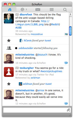 This is easily Echofon’s best feature, and I can’t believe they are still the only ones offering it. Essentially, when someone faves a tweet of yours or starts following you, Echofon inserts a small notification for you inside your tweet stream. It’s a powerful piece of positive feedback that has increased my enjoyment of Twitter at least 10x. I’m not one of those “I tweet for me, not for you” people. Everything I tweet, however intelligent, is aimed at people, and when people like a tweet enough to fave it, that’s great feedback. It’s one thing to tweet something you think is good, but another thing to get 20 faves within a minute telling you your suspicion was correct. I call this a fave parade. Echofon doesn’t do this with retweets yet, but they should. And so should Twitter. This should be the first feature addition they work on.
2. Visible, persistent tweeting area
The lack of a text field in which to tweet is, according to Doug, a deliberate decision. Doug told me the rationale behind this is that the focus of the app is on “consumption over production” and since people spend so much more time reading than writing on Twitter, the element should remain hidden until needed. I respectfully disagree with this rationale. Optimizing for consumption is not necessarily helped by de-optimizing the production process. Here is the production process on Twitter vs. Echofon:
With keystrokes (power users):
Twitter:
- Control-Tab to app (2 keystrokes)
- Control-N (2 keystrokes)
Total: 4 keystrokes
Echofon:
- Control-Tab to app (2 keystrokes)
Total: 2 keystrokes
With mouse (most users):
Twitter:
- Click on app
- Click on lower left icon
- Move mouse to “New Tweet”
- Click on “New Tweet”
Total: Three clicks and a mouse move
Echofon:
- Click on tweet field.
Total: One click
Twitter loses handily in both situations.
It is possible that Twitter is actually trying to get people to tweet less. Doug seemed to hint as much in our conversation about this. If this is a goal of Twitter — which I think is fine — I’d rather see it done via more creative means than obfuscating the interface though.
3. Better content suggestions
Building on the previous suggestion, if Twitter really wants more people to think of it as an information consumption service rather than a microblogging service, how about making it easier for (especially new) people to tune their streams? The “who to follow” feature is really well done, and I like it, but what about a Clippy-like presence in my tweet stream using a bit of artificial intelligence to suggest more people to follow? You could easily unfollow Clippy if you found him annoying, but for new users, an initial message like “Hey Mike, have you seen the new @live_from_egypt account? Live reporting from a news crew in Cairo. Follow it for updates.”
This AI-bot idea needs some further thinking, but the main point is, improve the consumption experience by improving the consumption experience… not by degrading the production experience.
4. Syncing
Echofon syncs your unread counts between multiple desktop clients and the phone client. Twitter does not. In fact, the Twitter iPhone client doesn’t even sync properly with itself sometimes. I get direct messages showing up as unread for days in a row sometimes, even after laboriously going through and “re-reading” them all. With more and more people using Twitter from multiple locations, syncing will become more and more of a necessity.
5. A configurable links-only view
This is a huge one. I actually wanted to build a company around this, but it seems like something Twitter or someone else should do. Here’s the concept: shield me from all information except links that have been tweeted/faved/retweeted by X or more of the people I follow. This builds on a concept I am using in my life more and more these days: I don’t want to hear about anything unless and until at least 2 people I know think it’s important. There’s just too much out there.
With a client that allows me to filter for links that have been tweeted at least twice, I might follow 1000 people instead of 100… or I might finally make use of lists. Imagine using this filter on a “list of tech CEOs”. I couldn’t care less what 2000 tech CEOs have to say, but I would like to know if at least 10 of them referenced the same link one day. It’s a very powerful concept, and one that encourages people to add more inputs instead of removing them.
General design notes
As with everything Doug designs or directs, the Twitter client is a beautiful work of art. From an esthetic standpoint, it’s really pretty to look at. I wish it had bigger edges to grab onto, followed the HIG more closely, and a few other minor things, but overall, I’m happy enough with the way it looks. I just don’t love the way it works. Hopefully if the excellent design team at Twitter agrees with some of the points above, we’ll see a more useful client released with the next revision. For now, however, I’m sticking with the client that makes up for its looks with its great personality: Echofon.
The Eagle Project
Now that it’s 2011 and the house blog is complete, it’s time to start writing on Mike Industries again. While one could argue this is a better post for the house blog, it’s really an independent design project so I’m posting it here.
In a nutshell, I want to build some sort of structure that will encourage eagles to land on it. I know very little about eagles, but I do know that before the top of a giant dead tree in my neighbor’s yard snapped off last year, we had eagles landing on it almost every week. Now, they just occasionally fly by and never seem to hang out. So the thought is, if I can build some sort of structure that has similar perching qualities to that dead tree, eagles should theoretically start landing on it.

Here is what I think I know about those qualities:
- The structure must be one of the tallest things in the immediate vicinity, although not necessarily the tallest
- It should have some sort of horizontal bar of a particular gauge on top of it for the eagles to wrap their claws around
- The perching area should be sparse. Eagles like having an unobstructed view of the territory below them.
- It does not seem necessary for the structure to actually look like a tree, as eagles perch on inorganic structures like street lights all the time.
- Should there be a good areas to build a nest near the top? I don’t know.
So far, I’ve thought of four different types of structures to build/commission/procure: a wooden totem pole, a rustic weathervane looking thing, a vertical rusty iron sculpture, and a temped-up PVC pole.
The totem pole
Installing an unpainted totem pole would work well because it eliminates the “what the fuck is that thing in your yard” factor. Everyone knows what totem poles are and it would fit well with the Native American culture that pervades the Pacific Northwest. The downside, however, is that I certainly couldn’t make it myself and it may be hard to find the right one. It would need to be maybe 50 feet tall, would be extremely heavy, and would be very permanent once installed. If eagles decided they didn’t like it, I’d be stuck removing it, which seems like a chore and a half.
Weathervane
For the weathervane, I’m envisioning as skinny of a metal pole as possible (maybe something like rebar) and then some sort of sculpture at the top of it that looks like a weathervane. It’s not even essential that it’s operational… just that it answers the question “what the fuck is that thing in your yard”. I like this idea because it’s potentially very adjustable after it goes up. If birds aren’t landing on it, I might be able to take it down and change what the top of it looks like.
Vertical rusty iron sculpture
There are some really good metal artists around, and it might be cool to just tell one of them my goals and have them propose something. The upside here is I’d get a nice, professional piece of art out of it, but the downside is that it’s likely people wouldn’t really know what it was… which isn’t a dealkiller. Also, depending on the design of the sculpture, it may or may not be adjustable after the fact.
The temped-up PVC jobbie
With one trip to Home Depot, I could probably get 50 feet of PVC pipe which I could anchor into the ground and just see what happens for a little while. It’s still a bit of a project as I don’t want the thing falling onto my house, but it’s doable for less than $100. It would no doubt look hideous, but it might be a good proof-of-concept before doing something more permanent and expensive.
Other ideas?
If anyone has any other ideas, I’d love to hear them.
Cognition Comments Considered Harmful
I was looking forward to writing a post this weekend about Happy Cog’s new commenting system on their otherwise excellent new blog, but the sage minds at Full Stop interactive beat me to it. You should read Nate’s whole post. It’s spot-on.
It’s interesting to me that Happy Cog is trying to eliminate the negative things associated with commenting by encouraging brevity, while for several years, the secret sauce I’ve cooked up to prevent comment spam has involved just the opposite: measuring the amount of time you spend typing and only entering your comment into the database if you spend more than a few seconds on it. It works like a charm and eliminates 99.9% of comment spam before it even gets in the front door.
In my opinion, what Happy Cog has created is useful. Let’s just not confuse it with a commenting system for a blog.
It doesn’t encourage community, it doesn’t encourage conversation, and for the most part, it’s not accretive in any way. What it does do is create a lot of linkbacks to your blog on Twitter. Is this valuable? Sure. But is it as valuable as free-flowing, insightful, conversations which elevate ordinary posts into conversation pieces?
Not for me it’s not.
For all the great things about Twitter — and there are many — one of the worst things about it is that it’s making us lazy ambassadors of our thoughts. Why spend an hour on a blog post when we can tweet out our main thesis in ten seconds? Why allow conversations on our blogs when we can just hear the first 140 characters of our readers’ opinions?
We know short attention spans are bad for our intellectual development. We should be creating solutions that fight against this threat… not feed into it.
How To Properly Apply for a Design Position
Back in 2004, I wrote an article called “How to Make Friends and Influence Art Directors” that continues to get a surprising amount of traffic. In the course of opening up a new design position at Newsvine/msnbc.com and seeing the applications, however, I feel like I need to update the article for 2010.
We’ve gotten so many poor applications for this position that it really makes me wonder if designers today are aware of how art directors actually hire people.
If you’re a designer and you’ll ever be looking for a new job in your life, you should read this.
First, let’s start with what matters and what doesn’t. There are exactly three things that matter to me when I evaluate you as an applicant:
- Is the stuff in your portfolio well designed and in keeping with the creative style I’m looking for? Note, “stuff” could be your blog, your personal site, or even fake clients you’ve done fake work for. It does not mean how big your clients are or how many projects you’ve worked on. As far as evaluating your design work itself, all that matters is how your stuff looks and feels.
- Are you a cool person to work with? This sort of thing can come out in a personal interview but it can also come through blog entries, tweets, or anything else that shows your personality off. It generally does not come from a cover letter though as I know you’re specifically crafting those words with the intent of landing a certain position.
- Do I know anyone personally or professionally who can vouch for you being a cool person to work with? The answer to this question does not need to be yes, but it of course always helps to know someone who knows someone. This is why.
Everything else? Doesn’t matter.
Résumé? Doesn’t matter. Where you went to school? Doesn’t matter. What societies you are a part of? Doesn’t matter. None of this sort of stuff matters unless and until you make it past the big three tests above… or at least the first two. Does that mean you shouldn’t spend time on your résumé? Of course you should, because if you get past the first stage, someone will probably look at it. Just don’t think it’s going to be your ticket towards getting noticed or getting in the door. I’ve seen résumés of design instructors with 10 years teaching experience and masters degrees in design who have the portfolios of junior high school kids. This is why we pay little attention to résumés.
How should I apply then?
The following, in my mind, is the perfect job application:
Dear ______,
I’m very interested in the ______ position at ______. I’ve used/admired the service for _____ and would love an opportunity to be part of its design team (you can substitute this sentence with anything that makes you sound uncommonly qualified or excited for this position). My stuff can be viewed here:
Blog/Personal Site: http://____
Portfolio with samples: http://____
Twitter account: http://____
Favorite thing I’ve done recently: http://____I’ve attached my résumé as well if you’re interested in my background or who I’ve worked with. Look forward to hearing from you.
Thanks,
________
That’s it. No long preamble. No links buried in a PDF or Word document. No hoops for the art director or HR person to jump through in order to see your stuff. If you want to add some more flavor towards the end, go ahead, but that’s the general recipe.
Almost none of the applications I have received follow anything close to this form, so I can only assume most people simply don’t know how they are being judged. Other professions are undoubtedly different, but in design, it’s simply a question of how sick your stuff is and how easy you are to work with. Give a hiring manager a good impression immediately on both of those fronts and you’re going to get an interview.
P.S. If you’ve already applied for the position mentioned above and haven’t heard back, it’s likely your style might not fit with what we’re looking for. It doesn’t mean we don’t admire your design skills.
P.P.S. If you haven’t applied for the position above and would like to, please do! We’re looking to hire the right person immediately.
P.P.P.S. On a related subject, besides Authentic Jobs and 37signals, are there any other great places to post design-related job listings these days? If you know of any, please let me know.
Another Nail in the Pageview Coffin
This weekend, msnbc.com launched a sweeping redesign of the most important part of their site: the story page. The result is something unlike anything any other major news site is offering and is a bold step in a direction no competitor has gone down (yet): the elimination of pageviews as a primary metric.
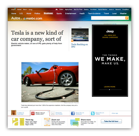
For many years, I’ve railed against tricks like pagination and “jump pages” as a means to goose pageviews. Honest people in the industry will tell you these are simply acceptable tricks to bump revenue a bit, while disingenuous or uninformed people will use “readability” as an excuse to make users click ten times to read ten parts of a single story. For this latest redesign, msnbc.com has decided to de-emphasize page views entirely and present stories in a manner that maximizes enjoyment and as a result, total time on site.
What do I mean by this?
Think of how a typical user session works on most news sites these days. A user loads an article (1 pageview), pops open a slideshow (1 pageview), flips through 30 slides of an HTML-based slideshow (30 pageviews). That’s 32 pageviews and a lot of extraneous downloading and page refreshing.
On new msnbc.com story pages, the above sequence would register one pageview: the initial one. The rest of the interactions occur within the page itself. Can msnbc.com serve ad impressions against in-page interactions? Sure, and that’s key to the strategy, but as a user, your experience is much smoother, and as an advertiser, the impressions you purchase are almost guaranteed to come across human eyes since your ads are only loaded upon user interaction.
This is the first time (to my knowledge) this sort of model has been deployed on a major media site with over a billion pageviews a month, and it has the potential to change the entire industry if it works. It’s also a big risk, as most advertisers are not used to thinking of inventory this way. We like big risks with big payoffs though and we feel that when you take care of the user and the advertiser at the same time, you’re probably onto something.
Ad model aside, there are also tons of other interesting things about the new msnbc.com story pages:
- Every form of storytelling (text, video, audio, slideshows, discussion, voting, and more) is now available right within each story page itself.
- The top navigation (nicknamed “the upscroll”) contains all basic elements when a page loads but if you scroll the page upward past its initial position, you get more interesting stories to read. It’s a great way of presenting a content-packed header without sacrificing screen real estate.
- A social bar at the bottom of the screen, powered by Newsvine, which lets you easier share content via Newsvine, Facebook, Twitter, and other services.
- An “annotated scrollbar” down the right side of the screen capable of teleporting you to any section of the page you desire.
- Bigger, easier to read text. Goodbye Arial, once and for all!
To be clear, the msnbc.com team is very proud of what’s been launched so far, but is under no illusions that things are perfect yet. Everyone involved in creating these new story pages is monitoring reaction closely and ready to modify anything that needs improvement. Since we have plenty of thoughtful design and development voices here on Mike Industries, I’d love to open this thread up for some reactions. What is working for you, and what, if anything, would you change? The team is listening.
Better E-Commerce Design using the Luhn Algorithm?
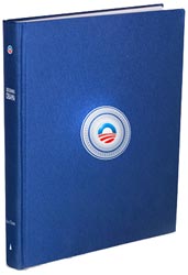 I finally put in my pre-order for SimpleScott’s Designing Obama book a few minutes ago. I wanted to buy it earlier but never overcame the inertia until I got a chance to have beers with Scott and then listen to him speak at the excellent Webstock conference in New Zealand last week (by the way, thanks to Khoi Vinh for asking me to step in for him as a speaker). Can I also just say that Webstock is the best designed conference I’ve ever seen?
Scott’s a great designer, obviously, but hearing about the care that’s going into just the production of the book is going to make this piece of art a must-have. I may even order two and keep one suspended in formaldehyde.
While ordering the book, one part of the process stuck out to me as something I’d never seen before, even having ordered probably a thousand items online in the past: when I typed in my credit card number, a green checkmark showed up immediately after the last digit was entered. My immediate suspicion was that they were counting digits and gave me a check to indicate I had typed in enough of them, but again, having never seen that before, my interest was piqued. I tried deleting the last digit and replacing it with a 1, then a 2, then a 3, and so on. Only when I typed the actual digit from the credit card did I get the green checkmark again.
Further investigation revealed that no server calls were being made, which means this was some sort client-side algorithm that verified credit card patterns. Iiiiiiiiiinteresting!. Even more investigation revealed that this was the work of something I’d never heard of: The Luhn Algorithm.
The Luhn Algorithm is a formula which can be run in javascript, PHP, and most other programming languages that uses some mathematical rules to determine if a credit card number is likely to be valid. Apparently, credit card companies issue numbers according to this algorithm, and if a number doesn’t fit it, it’s definitely not valid. Before you say to yourself “wow, that’s some neat, new technology I can use!”, note that the Luhn Algorithm has been around since 1954!
Although using this algorithm in your own projects is clearly not a necessity, I see a couple of potential advantages and a couple of potential disadvantages:
Advantages
- Instant UI feedback is a great tool to help users correct errors
- The checkmark is a nice bit of instant emotional validation to make sure users complete the process
Disadvantages
- Is there a guarantee that every card will always follow this pattern? What happens if one or many stop following it?
- Since it’s an unusual experience, does it add a bit of suspicion in some users? Would a less technical user assume their number was being broadcast across the internet more times than necessary?
I’m curious to see if this catches on as a trend.
Do You Want To Work At Newsvine?
I just opened up our first ever dedicated interactive design position this week. If you’re just a little bit crazy, you might be perfect for it.
The official way to apply is by sending an email to msnbcjobs@msnbc.com (which you should do if you’re interested), but if you’re a Mike Industries patron, feel free to contact me as well.