Another Nail in the Pageview Coffin
This weekend, msnbc.com launched a sweeping redesign of the most important part of their site: the story page. The result is something unlike anything any other major news site is offering and is a bold step in a direction no competitor has gone down (yet): the elimination of pageviews as a primary metric.
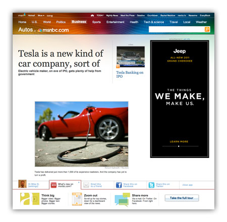
For many years, I’ve railed against tricks like pagination and “jump pages” as a means to goose pageviews. Honest people in the industry will tell you these are simply acceptable tricks to bump revenue a bit, while disingenuous or uninformed people will use “readability” as an excuse to make users click ten times to read ten parts of a single story. For this latest redesign, msnbc.com has decided to de-emphasize page views entirely and present stories in a manner that maximizes enjoyment and as a result, total time on site.
What do I mean by this?
Think of how a typical user session works on most news sites these days. A user loads an article (1 pageview), pops open a slideshow (1 pageview), flips through 30 slides of an HTML-based slideshow (30 pageviews). That’s 32 pageviews and a lot of extraneous downloading and page refreshing.
On new msnbc.com story pages, the above sequence would register one pageview: the initial one. The rest of the interactions occur within the page itself. Can msnbc.com serve ad impressions against in-page interactions? Sure, and that’s key to the strategy, but as a user, your experience is much smoother, and as an advertiser, the impressions you purchase are almost guaranteed to come across human eyes since your ads are only loaded upon user interaction.
This is the first time (to my knowledge) this sort of model has been deployed on a major media site with over a billion pageviews a month, and it has the potential to change the entire industry if it works. It’s also a big risk, as most advertisers are not used to thinking of inventory this way. We like big risks with big payoffs though and we feel that when you take care of the user and the advertiser at the same time, you’re probably onto something.
Ad model aside, there are also tons of other interesting things about the new msnbc.com story pages:
- Every form of storytelling (text, video, audio, slideshows, discussion, voting, and more) is now available right within each story page itself.
- The top navigation (nicknamed “the upscroll”) contains all basic elements when a page loads but if you scroll the page upward past its initial position, you get more interesting stories to read. It’s a great way of presenting a content-packed header without sacrificing screen real estate.
- A social bar at the bottom of the screen, powered by Newsvine, which lets you easier share content via Newsvine, Facebook, Twitter, and other services.
- An “annotated scrollbar” down the right side of the screen capable of teleporting you to any section of the page you desire.
- Bigger, easier to read text. Goodbye Arial, once and for all!
To be clear, the msnbc.com team is very proud of what’s been launched so far, but is under no illusions that things are perfect yet. Everyone involved in creating these new story pages is monitoring reaction closely and ready to modify anything that needs improvement. Since we have plenty of thoughtful design and development voices here on Mike Industries, I’d love to open this thread up for some reactions. What is working for you, and what, if anything, would you change? The team is listening.
Nice! I like a page that’s designed to keep me engaged with the content instead of trying to distract me with ads.
Only one thing really irked me: when clicking on a heading to the left, the heading in the content becomes visible, but the text below it is still grayed out. I didn’t click the heading because I wanted to spend quality time reading *just* the header. The first subheading and text should also become visible.
I’m really looking forward to hearing the results of this approach. It’s very jarring and confusing at first but once you get into it, figure out how things work spacially, it starts to feel natural.
It’s just that hitting those spots where the page stops scrolling but there is still a bunch of vertical navigation within that area is odd–odd in that it doesn’t match a lot of the models we see daily.
Hope you do a thorough follow-up and let us now how it’s worked out.
Agreed that it’s a little jarring at first, but it’s a step in the right direction. I’m not sure I’m a fan of the dynamic AJAX loading of elements as I scroll though, especially next to content. As I try to read, the ads provide enough distraction without preloading spinners and animated tags on the side of the page. Ads are a necessity, sure, but over-animating the supplemental material leads me away from the primary reason I’m there: To read the story.
Another unfortunate side effect of Flash ads is the z-index issue where as you scroll past them, they always overlap the social bar. This is pretty ugly.
Overall, I’m glad to see publications moving in this direction and hope that a sweet spot is found between content providers getting paid and readers having a good experience with consumption.
I don’t care for it. It feels too overwhelming and foreign. There’s just too much Web 2.0 for it to feel comfortable. I like having all the media right at my fingertips, but it’s too much stuff to have fullscreen on one page. I’d rather have additional content smaller, but expandable with a click (the video or slideshow expanding in an overlay).
A perfect site would have the full article on one page, easily accessible comments, and minimum clutter. This design seems to dedicate 75% of the page to clutter, while still requiring me to click to see the full article text. Meanwhile, comments are harder to use than other sites. I’d like to scroll/click through all comments, as well as leave my own comment, without having to leave the page.
Other notes: The massive white space near the headline is odd. The headline looks squished and the link(s) to additional content too prominent. The toolbar at the bottom is large and obtrusive. Slideshows look too similar to articles, and tend to confuse me when I come across them and find a portion of the content grayed out. Comments that are only 3-4 lines shouldn’t need to be expanded.
Positives: The top navigation is nice. Having transcripts for videos is great for those of us at work; I wish all videos had that. The ads are much better than most websites: they follow me but I don’t mind. Everything seems to load quickly, which is nice. I’m glad the site remembers my preferred font size.
I still think LaTimes.com is the best design I’ve seen. This design is not something I could stand on a daily basis. It needs to feel more like a traditional article and make the fancy stuff a bit more behind the scenes. Less is definitely more in this case.
[…] Mike Davidson on the MSNBC redesign. Very nice work, indeed! […]
hi Mike, I like the site!
I do however question that the more time on a site equals more enjoyment. The worst sites are the ones where you search and search and struggle to find what you are looking for. Reading the stats, people would say “he must have had a great experience because he was on the site for 45 minutes!”
I was quite surprised when I viewed a story on MSNBC yesterday for the first time since the switch; before I saw this blog entry. I immediately recognized I was viewing and interacting with news in a way I never had before. I instantly starting exploring the page to see what else it held. When I scrolled up and all this additional content appeared, I was actually amazed for a brief moment. I am definitely going to use this as a model of a different way to bring content to the masses.
Here are my comments:
* I don’t like that I have to interact with elements in-page, especially in scrolling subframes, to read longer content. I’d MUCH prefer a long page to a page with short scrollable elements because that’s just another layer of interactivity I need to deal with to read a site. If you must do something like that to collapse length, I think I’d prefer hide-show controls rather than the cramped scrolling regions.
* I don’t like that story elements are grayed out until I click to them, as in the “explainer” box. I clicked on one of those links, and the heading become dark, but the text right underneath it stayed gray, even though that was the majority of content shown in that box. What, I’m not supposed to be reading that part yet? Feels unnecessarily constraining – if I want to read something, and it’s visible on the page, let me read it; don’t make me figure out what to click to make it turn from light gray to black.
* I like the visual design. Very clean, plenty of breathing room. Much nicer on the eyes than most sites.
* I *really* hope the “scroll up for more information” thing does not become commonplace. The last thing I want to do when I go to a new web page is glance over at the scroll bar to see if I’ve been moved down the page, especially when there’s no visual cue (an anchor in the URL or obviously cropped content) that there is more content above.
* Nice NewsVine integration. Kudos to you for making those links with mainstream media.
* Even with the above gripes, I agree that this is light years ahead of the other mainstream news sites. The points above are minor; the focus on making things better for the user is the big news, even if there are still a few annoyances that need ironing out. In all, my assessment is: good work.
One other point: this design breaks Safari’s “reader” feature.
I can’t wait to read this headline on the redesign MSNB: “Another Nail in the Flash Font Coffin: Mike Industries ditches Flash fonts for HTML 5.”
[…] Another Nail in the Pageview Coffin June 29th, 2010 admin Leave a comment Go to comments ShareSaveAnother Nail in the Pageview Coffin: […]
I love the redesign but I’m uncomfortable with all navigational controls for content boxes being on the left. We read from left to right and all those “Next” links made me stop for a little while and look what happened on the right – it’s really confusing.
I can’t help but be very, very intrigued by all of this. Please keep tweaking, it’s exciting. :)
Overall, I dig it. But I really hate this trend going around, making the header of a page larger and larger. If I have to scroll down in order to *begin* reading the content, I personally see that as a major problem.
I’m not sure I love the new story pages from an aesthetic perspective — the headline is strangely disconnected from the article with the article indented under it, the measure seems too wide, and the icons are a bit messy and inconsistent. For my money, the features (Explainer, Video, Photos, etc.) are all much more visually appealing than the text of the story itself.
BUT…from a strategy and functionality perspective, they’re great. A huge improvement and much more forward-thinking than what most other news organizations are doing. The lack of pagination, the annotated scrollbar, the multimedia storytelling, and the social tools are all top notch.
Well-done, guys.
Great work. I particularly like the creative “upscroll” implementation.
I (humbly) echo the sentiment about the excess space around the headline, but I’m guessing that will be ironed out soon enough. Having navigation elements along three sides of the page seems a bit confusing at first glance, but I would have to spend some more time on the site to see if it became comfortable and more efficient than traditional schemes.
I haven’t read all of the comments, but a quick “find in page” for this article seems to indicate this hasn’t been pointed out: I think you need to add a small margin to the bottom of the content area to help avoid having content hidden by the fixed social nav. In the page you link to from this article, the last item in the “More from msnbc.com” bar graph/links area is partially covered by the currently selected social nav tab, which may make it harder to read and makes me wonder if there isn’t more content hidden below it. Just in case this is a browser-specific issue, I’m using Chrome 5 on Win 7.
[…] Another Nail in the Pageview Coffin Published: June 29, 2010 Source: Daring Fireball Mike Davidson: […]
[…] And now, according to a post by Mike Davidson, MSNBC.com is moving in that direction. […]
Hey guys, Ashley Wells here. I’m msnbc.com’s creative director. Thanks for the great feedback! Please keep it coming.
We have some tweaks to make, many of them to the areas you’ve mentioned above: header spacing, graying out too much text in our new explainers, etc.
What’s hard to see immediately is how dynamic the page layouts are. The headline area, for example, can accommodate a headline, deck, up to four teases to content below and four different ad sizes. The text body also has five different ad models, none of which require our editors to change the position of photos, link boxes, etc. Considering all of the variables, I’m pretty happy with it despite some trade-offs.
Many of the comments on our tour page discussion thread say the body text size is too big. Used to be that we got flack for making fonts too small. Maybe someone here could suggest a better balance? Very much open to ideas.
Thanks again for taking the time to check us out and share your thoughts.
[…] Another Nail in the Pageview Coffin | Mike Industries MSNBC's new redesign moves away from pageview inflating tricks. i say it's about time. (tags: advertising journalism msnbc) […]
Ashley, for what it’s worth, the font size seemed fine to me.
Sorry, but for me that’s a navigational mess. The base bar is too big, the side buttons are non standard and confusing, they’re’ “mystery meat”navigation for crying out loud. Embedded “read more” links. It’s pretty poor all over.
Firstly, the site is already more interesting than any other news site I can thing of, with the possible exception of BBC. Congrats on taking so many chances at once–overall it is on the right track. But there are several things that are “jarring” as others have said.
I definitely don’t like the “sneak attack” content that appears at the top when you scroll back up. This type of behavior is unexpected and could easily confuse readers–I’m sure you are more aware of your demographic than I am, but news sites are meant to appeal to every type of user, not just tech-savvy ones. However, I wouldn’t mind a click-triggered section called “top headlines” that opened up here when the user wants it to.
A couple of word choices for your new elements are simply bizarre. The term “explainer” is, ironically, vague as possible–not to mention the functionality of explainers, with all the grayed out text, is just weird. And calling those things at the very bottom “apps” is a complete misnomer. When I first saw the “close app” link, I wondered what the heck it would do, then clicked it. When I saw that it shrunk the bottom area, I finally figured that “app” refers to each tab on the bottom. It’s also jarring that each of them takes up a different amount of vertical space. I would also give a different background color for this section, setting it off more from the white area that holds the main content. Speaking of which…
Better delineation between the sections on each page. For the right nav, either “jump to text” is unnecessary or it should be prioritized differently, since it is the most important part. I’m not a fan of how they appear as unevenly spaced speech bubbles either–they look like inline comments, kinda like this site: http://www.djangobook.com/en/1.0/chapter02/
These “bubbles” should be opened so that they already show what section they link to (instead of having a mouse-over effect). And they should be evenly spaced.
But back to the subject of delineation–each section (text, photos, video, comments) should be more clearly distinct from the others, possibly using a slightly different background color for each area, or a stronger heading. Right now it feels like an Amazon product page, an all-white smorgasbord of stacked miscellany divided only by boring horizontal rules. Using the tab motif as a “show more” function is also simply a poor choice. In general, tabs are expected to
change the content area you are currently on (much like your “apps” section at bottom), not have “accordion” functionality and expand the page/section itself.
Most of the page requires mouse clicks to activate functionality. But on the “more from msnbc” section at bottom, you simply mouse over the various sections and the content on the right changes–confusing and unnecessary. Clicking to change these would be fine IMO. But the bigger issue is “trend this week” which is nebulous. You are already sorting these by number of stories published in 24 hours–does the trend graph also represent stories published, or does it reflect page views? And is it really needed? It just seems like an extraneous distraction.
Related to my earlier “apps” criticism, there is a link on the adjoining footer to “Apps” which means something entirely different (and in this case, more correct) and takes you to a page for iphone apps, etc.
The “hide tools/show tools” link for the bottom thingie would be better served hiding/showing a bar with the main nav for the site and a search box, instead of (or in addition to) the social site links.
I noticed that clicking “Leave a comment” warps me to a newsvine page. Just curious, will I get redirected back?… Posting a comment… having to register… validate email… okay, I’m back on this non-msnbc page… well, I’ll go back to the article and leave another comment since I’m “logged in” now… okay, takes me to “newsvine” again… what’s the difference between “post comment & vote” and “post comment”? hmm, guess I’ll try the first… okay, it just kept me here on this page, guess I have to find my own way back to the original story… scrolling to the top, looking for a prominent link to the story… okay, I was looking for the article title but I guess this generic “Read Article” link takes me back… there we go, now where is my glorious new comment? “view all comments” just took be back to that other site, let’s hit the back button… okay, let’s try “show discussion” this time–that’s better… guess my comment’s not on here yet, but as I look closer I see the comments are sorted by “thumbs up” — okay, that must have something to do with the other site I was on. at this point I’m really tired of trying to figure this out, and just going to move on now…
So those are my initial thoughts on the new story pages. It’s got some bold new ideas going, but needs help for the sake of clarity and sanity. I am going to guess that the ideas for these pages were inspired by Amazon product pages.
It’s inspiring to see such a large website taking some risks and trying to improve their product. Congratulations for the move to the people who accepted it and those who pushed for it.
The page as a whole may lack structure : it is not easy to identify a section while rapidly scrolling, which is a bit of a contradiction for a page which makes a great use of its vertical dimension. Subtle visual clues such as a different background color would help, such as zebra stripes for tables.
As said in previous comments, the icons on the right are maybe a little too eye catching for their purpose – which is great. Their movement is lovely and give to the page a life of its own.
The measure is a bit too long.
The margin-bottom below the ads row nested in the text is too small, the text feels “stuck to the ceiling” created by the ads block.
The gradient on the text is great – could live better applied on an extra line (higher) I guess.
Here it is for now.
Thanks again for setting such an example.
Thanks very much, everybody! Your comments are truly appreciated.
Brade, I gotta admit your stream-of-consciousness notes about the Discussion comment flow is particularly (funny) and helpful—we’re working on that area in particular right now.
No prob, thanks to you, Mike, and the team for being willing to get feedback. I believe it can be the best news site out there with some of the tweaks suggested here. Looking forward to the improvements.
[…] Another Nail in the Pageview Coffin | Mike Industries"This weekend, msnbc.com launched a sweeping redesign of the most important part of their site: the story page. The result is something unlike anything any other major news site is offering and is a bold step in a direction no competitor has gone down (yet): the elimination of pageviews as a primary metric." Plaudits for MSNBC's bold redesign. (msnbc design layout launch web_analytics ) […]
So, the icons on the right side of the screen are helpful, I think, but when I’m reading a long article, and scrolling, I perhaps the text icon could also inch closer to the icon below it to indicate where I’m at in the article. This would be a useful visual indication of how long a given article is. (It does appear as though the icons are spaced in a manner to give a relative idea of the length of the content.)
Also, the ability to use the arrow keys to flip between content sections or for navigation would be nice.
I’m not sure I agree with those who would like to see more (visual) differentiation between the content sections on a page, because as is, I’m more likely to read the whole set. If you were to visually distinguish one section from another, I might just think its unrelated content and skip it.
Also (related to my comment about the icons) because they don’t really move much, or move dynamically as per my suggestion, they don’t really visually represent which section you’re in. If I’m viewing the discussion, perhaps there should be a visual cue on the right-side “view discussion” icon that that’s where I’m at. Sort of a placeholder “you are here” indication.
[…] Another Nail in the Pageview CoffinMSNBC: Screw traditional metrics, we’re going to create a compelling user experience even if it means a 30x drop in “pageviews” […]
[…] users suffer. And he has written one or two scathing essays on this subject before, but now he is applauding msnbc.com for their recent article page design because essentially it is all Ajax; if you go and view a story […]
[…] users suffer. And he has written one or two scathing essays on this subject before, but now he is applauding msnbc.com for their recent article page design because essentially it is all Ajax; if you go and view a story […]
[…] conversions/sales from these ads? They should be looking at what MSNBC.com is doing and take note. MSNBC has killed pageviews in favor of time on site/sessions. Its simple enough these days to do it, so lets start shifting […]
[…] Merlin Mann have argued that this stuff hurts user experience. I tend to agree with Mr. Mann.Now, MSNBC has moved away from its pageview-maximization strategy and instead adopted a strategy that treats users as people, rather than pageview generators. If […]