5 Ways to Improve the new Twitter App
It is with great interest that I watch the evolution of Twitter, from a quirky niche service of questionable worth four years ago to a mainstream phenomenon that has disrupted everything from tiny blogs to big media. It’s really coming into its own, and with every new feature or product release, I find myself nodding in agreement at the improvements. The new Twitter for Mac app, however, remains an odd duck for me, even a month after its debut. Its release seemed rushed and incomplete, probably in order to debut alongside the new Mac App Store. A big clue to that is that there is no Windows version yet. If I had to guess, I would say the Twitter team decided they needed new desktop clients, they knew they could probably get something out on one platform in time to get a high position in the App Store, and so they did, releasing an impressive but ultimately incomplete product, figuring they would improve it later, as well as release a Windows version.
That strategy is understandable to me, and I certainly don’t think they’ve made the product worse than the last revision, but there are several features I’d like to see added which would make the native Twitter app better than its competitors, which it currently isn’t.
Let me also say that I’ve always watched everything Doug Bowman designs or directs with great interest and admiration. Doug is probably the second best interactive designer in the world, behind only me, so I always study his work very closely. He has no real weaknesses that I know of, and he has a great team working at Twitter. Doug’s great with interfaces, great with typography, great at expressing his thoughts, great at maintaining a product-centric view with everything he creates, and just a great guy in general. In short, Twitter could not have hired a better person to lead the Photoshop department.
That said, here are my suggestions for the Twitter team (feel free to pay me in Twitter stock, @dickc and @ev):
1. Inline retweet, fave, and follow notifications
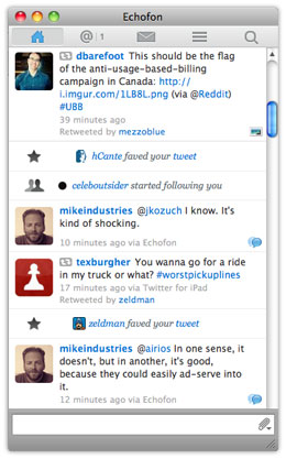 This is easily Echofon’s best feature, and I can’t believe they are still the only ones offering it. Essentially, when someone faves a tweet of yours or starts following you, Echofon inserts a small notification for you inside your tweet stream. It’s a powerful piece of positive feedback that has increased my enjoyment of Twitter at least 10x. I’m not one of those “I tweet for me, not for you” people. Everything I tweet, however intelligent, is aimed at people, and when people like a tweet enough to fave it, that’s great feedback. It’s one thing to tweet something you think is good, but another thing to get 20 faves within a minute telling you your suspicion was correct. I call this a fave parade. Echofon doesn’t do this with retweets yet, but they should. And so should Twitter. This should be the first feature addition they work on.
2. Visible, persistent tweeting area
The lack of a text field in which to tweet is, according to Doug, a deliberate decision. Doug told me the rationale behind this is that the focus of the app is on “consumption over production” and since people spend so much more time reading than writing on Twitter, the element should remain hidden until needed. I respectfully disagree with this rationale. Optimizing for consumption is not necessarily helped by de-optimizing the production process. Here is the production process on Twitter vs. Echofon:
With keystrokes (power users):
Twitter:
- Control-Tab to app (2 keystrokes)
- Control-N (2 keystrokes)
Total: 4 keystrokes
Echofon:
- Control-Tab to app (2 keystrokes)
Total: 2 keystrokes
With mouse (most users):
Twitter:
- Click on app
- Click on lower left icon
- Move mouse to “New Tweet”
- Click on “New Tweet”
Total: Three clicks and a mouse move
Echofon:
- Click on tweet field.
Total: One click
Twitter loses handily in both situations.
It is possible that Twitter is actually trying to get people to tweet less. Doug seemed to hint as much in our conversation about this. If this is a goal of Twitter — which I think is fine — I’d rather see it done via more creative means than obfuscating the interface though.
3. Better content suggestions
Building on the previous suggestion, if Twitter really wants more people to think of it as an information consumption service rather than a microblogging service, how about making it easier for (especially new) people to tune their streams? The “who to follow” feature is really well done, and I like it, but what about a Clippy-like presence in my tweet stream using a bit of artificial intelligence to suggest more people to follow? You could easily unfollow Clippy if you found him annoying, but for new users, an initial message like “Hey Mike, have you seen the new @live_from_egypt account? Live reporting from a news crew in Cairo. Follow it for updates.”
This AI-bot idea needs some further thinking, but the main point is, improve the consumption experience by improving the consumption experience… not by degrading the production experience.
4. Syncing
Echofon syncs your unread counts between multiple desktop clients and the phone client. Twitter does not. In fact, the Twitter iPhone client doesn’t even sync properly with itself sometimes. I get direct messages showing up as unread for days in a row sometimes, even after laboriously going through and “re-reading” them all. With more and more people using Twitter from multiple locations, syncing will become more and more of a necessity.
5. A configurable links-only view
This is a huge one. I actually wanted to build a company around this, but it seems like something Twitter or someone else should do. Here’s the concept: shield me from all information except links that have been tweeted/faved/retweeted by X or more of the people I follow. This builds on a concept I am using in my life more and more these days: I don’t want to hear about anything unless and until at least 2 people I know think it’s important. There’s just too much out there.
With a client that allows me to filter for links that have been tweeted at least twice, I might follow 1000 people instead of 100… or I might finally make use of lists. Imagine using this filter on a “list of tech CEOs”. I couldn’t care less what 2000 tech CEOs have to say, but I would like to know if at least 10 of them referenced the same link one day. It’s a very powerful concept, and one that encourages people to add more inputs instead of removing them.
General design notes
As with everything Doug designs or directs, the Twitter client is a beautiful work of art. From an esthetic standpoint, it’s really pretty to look at. I wish it had bigger edges to grab onto, followed the HIG more closely, and a few other minor things, but overall, I’m happy enough with the way it looks. I just don’t love the way it works. Hopefully if the excellent design team at Twitter agrees with some of the points above, we’ll see a more useful client released with the next revision. For now, however, I’m sticking with the client that makes up for its looks with its great personality: Echofon.
My #1 issue? Username autocomplete. How hard could that possibly be to implement?
I completely agree with all those points. Especially #5, I realized a some point that’s exactly how I was using Twitter. I’m building this as a business: http://readab.ly/ to scratch my own itch.
Regarding #1: Feedback is definitely one of the basics of UX and should be part of their app. People would feel like there’s much more going on around their tweets, for instance, I always look at my mentions tab, can’t wait for it to “lighten up” with a new reply.
Great post.
I really don’t care for having a tweet compose textarea be automatically focused when you focus on the app. That breaks all keyboard shortcuts not involving the Command (not Control, fyi) key.
I also really, really don’t want them to put notifications inline in my stream without it being an opt-in choice you have to enable. I never used Echofon, and that screenshot has promised me I never will. I can see the appeal, but I know that such a feature is really not for everyone. It reminds me of Flickr’s new comment system, which I equally hate (and am not the only one at by far).
I agree with the other three points, though. But, I also don’t think Doug had almost anything to do with the Twitter for Mac app. AFAIK, that’s Loren Brichter near-entirely by himself.
Dude. Didn’t you fix UTF-8 here like years ago? My last name got bu?ted again. ;)
You forgot to mention the fact that Twitter for Mac unnecessarily shortens all URLs using a Twitter t.co short URL, even if the URL you use in your tweet doesn’t force it to exceed 140 characters. This is so annoying that I sometimes open up Twitter in my browser to tweet with URLs so it doesn’t happen. This “feature” means that we no longer have ANY idea of what’s behind a link in a tweet, whereas full URLs (and some short URLs) give us context.
Jerome: Looks awesome! I just signed up. Let me in! :)
Faruk: The textfield isn’t auto-focused, but if it was focused when you left the app, it will be in focus when you return to the app. It’s perfect behavior. With regard to the inline notifications, yes, clearly that should be a configurable option. You’ll love it though… trust me. Regarding the development of the app: that sounds plausible, but doesn’t sound ideal, if true. Everyone needs teammates to check and improve their work. If Loren designed and built this himself, he did a great job, but probably could have produced an even better product with team collaboration. Also, sorry about the UTF thing. It’s actually a lot harder to solve than one would think. Apparently, converting a database from Latin-1 to UTF-8 is not an easy task. I even had the WordPress guys consult with me on it… not easy.
All good points, and we are on the same wavelength with #5 — I too had an idea for a twitter clone based on a rating system for tweets/messages so users could prioritize their tweets by avg. score, total ratings, or some combo of the two.
Echofon isn’t a visual stunner but it shocks me how many people think it’s ugly. It’s basic, functional and pretty stock standard OS X parts-bin (hell, it uses a drawer) but it’s not visually dysfunctional. I LIVE in it w/ regard to Twitter. Every other app I try dies the second I have to open a browser window to do something Twitter-related (see someone’s profile info, a conversation string, etc). I’m to the point where using twitter.com seems foreign.
Echofon’s name autocomplete could use some work (it’s type and tab autocomplete, but it’ll just guess which one you want in a case of multiple results), namely by copying what they’ve done in their iPhone app (would be easy enough to have a dropdown list using standard OS X bits).
Twitter’s app screamed “visual-polish over functional precision and usability” when I gave it a try. 2 hours and I was back on Echofon.
And I’m pretty sure Faruk should just change his surname to a question. “Faruk Ate?” “Yeah, about 3 hours ago, but I could go for a tea…”
Re: #5, for the stretches of time that I don’t have time to look at Twitter but I still want to keep up with links, I use paper.li.
Readably looks like a big step forward, though.
http://www.summify.com is doing #5 as well. I filter this myself by using Packratius and sending favourites and RT’d links off to Diigo.
Mike:
The reason I don’t like the notifications as part of it is that I (deliberately) miss 99% of my twitter stream. I look at it from time to time, but often enough just send stuff to it and then quickly close Twitter again to continue with work. That is, if I didn’t send it via bit.ly in the first place.
Basically, notifications inline would be useless for me, as I would miss most of them. Conversely, the way I *do* read Twitter is to quickly scan through tweets, and thus, notifications among them would just get in the way of that.
In other words, what I’m saying is, the way *I* use Twitter, that feature is not appealing to me at all. I am open to occasionally trying out other stuff, but I doubt I’ll like this because I hated Twitterific’s embedding of DMs and @mentions into one stream as well. :)
As for the database: yeah, guess that’s what happens when you don’t start out with UTF-8; one day it may bite you in the ass. Not worth investing too much time into, but SHAME ON YOU though. ;-)
Greg: Shush, there’s enough jokes about me and eating already.
Faruk: Blame WordPress. They were the ones who used Latin-1 originally as a database encoding. I was an innocent bystander. :)
Mike: and they never sorted that out for migrating customers? Bummer.
This is not meant to be offensive and I hope you can take some friendly critisism, so here goes.
In the interest of cleaning up on your own backyard before complaining about what the neighbours are doing, would you like to share your thoughts for your design on MSNBC / Newswine articles?
Seriously, what’s up with the icons on the far right that keeps wobbling up and down the screen. Earth to design team. Come in design team.
Heinrich: No problem. No design work is beyond criticism. I would say a few things:
1. It’s perfectly ok to critique the work of others even when your own isn’t perfect, since your own will never be perfect.
2. With regard to the “annotated scrollbar” on msnbc.com, I didn’t design or direct that, but I do think it’s interesting. It helps navigate to all of the various media types on a story page (video, polls, comments, slideshows, etc). It’s one of those things you’ll either use and love, or not use and forget about. Doesn’t really do much harm in my opinion.
3. With regard to Newsvine, you didn’t mention anything in particular, but the site hasn’t been redesigned since 2006 so it’s getting a bit long in the tooth. We’re working on a brand new one right now actually.
\o/ UTF-8 is şexy! \o/