Bloglines Gets Key Commands, Hijacks Browsers
UPDATE: Ben Lowery of Bloglines has not only responded promptly in the comments below, but now both problems are fixed. The “unread” display is now also exactly as I suggested. Kudos to Ben and Bloglines! Much better!
I’m a huge Bloglines fan and have used it as my only newsreader for almost two years now. It’s a smart product created by an even smarter person, Mark Fletcher. Almost every single feature Bloglines has added since launch has been implemented with the utmost of care and has improved my experience on the site incrementally. Yesterday, however, the site added two features which are in need of fixing. In their announcement about the feature additions, Bloglines asked users to express their thoughts about the changes publicly, so that’s what I’m doing.
Problem #1: Keyboard Shortcut Hijacking
I didn’t even know this was possible, but somehow, the addition of keyboard shortcuts to Bloglines has completely disabled system-level shortcuts in my browser. Bloglines, probably in reaction to Google’s new shortcut-heavy newsreader, has added all sorts of key commands to help users navigate through their feeds. Unfortunately, now I can’t hit Command-W to close my browser window. Nor can I hit Command-Q to quit or Command-T to open a new tab. It took me awhile to figure out what was going on, but it’s definitely Bloglines because if I’m not on a Bloglines page, the key-commands begin working again.
My first reaction was that although this is obviously caused by Bloglines, it’s a bug in Safari that it’s even possible for a site to cause such a crippling. But then I switched over to Firefox and the same thing happened! What the hell! Any key-command gurus know what’s going on here? And is this happening on PCs too? It’s very very weird. I’ve never seen a web page that can cripple a browser like this.
Problem #2: Unread vs. Keep New
As part of the feature upgrade, Bloglines added something I’ve been wishing for a long time they had: the ability to differentiate between items that are truly unread vs. items I’ve specifically indicated to keep as unread. The difference here being that the latter are news items I’ve specifically noted as important, but I just haven’t had the time to go through them yet.
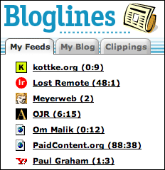 So the good news is that this feature has been added. Yay. The bad news is that the interface for it is not intuitive and it’s already annoying me. To the right is a diagram of the current implementation. Notice that some entries have one number and others have two separated by a colon.
Take the Kottke example. “0:9” means that there are 0 items I haven’t read and 9 items that I’ve specifically indicated deserve further review when I find a moment. Other entries, like Meyerweb, have only one number. The “2” means simply that there are two unread items. These numbers change wildly from month to month from me. Sometimes a site like Kottke will have zero “keep new” items and Meyerweb will have four… it just depends on where I’m at in my neurotic newsreading cycle.
The problem with this interface is a subtle one: First of all, colons imply either “time” or a “ratio”… neither of which apply in any helpful way to this situation. Second of all, there’s no intuitive clue as to whether the first number means “unread” and the second number means “keep new” or vice versa. Bloglines is forcing users to develop this association over time and it’s just not very helpful to do that.
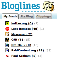 To the right is what I propose. Notice the lack of colons. Notice also that the “unread” number is the only number in bold… thus more closely mirroring what Bloglines users are already used to: bold equals unread. The “keep new” number is set in light gray and unbolded to help you establish a quick connection that it represents a totally different thing. Furthermore, it mirrors the mail application analogy that what you haven’t read is bold and everything else isn’t.
So anyway, that’s my two cents about the Bloglines update. Please address these two issues and I’ll continue to sing your praises as the best way to consume RSS on the web.
The Safeway Club
 Woody Allen (and I think Groucho Marx) once said “I would never join a club that would have me as a member.”
There is a special club, however, that I have refused entrance to dozens of times for entirely different reasons: The Safeway Club.
You see, I’m a huge supermarket snob. So much so that I have an entire post saved up which explains the difference between a good and a bad supermarket.
That said, I found myself at my local Safeway the other day. It’s a supermarket I hate for many reasons, not the least of which is their use of the “Safeway Club Card”. I’ve probably been to Safeway about 40 times in the last 10 years and every single time at the cash register they’ve asked me if I wanted to sign up for a Safeway Club Card. The conversation usually goes something like this:
Cute Checker Chick (CCC): Your total is $45.38. Do you have a Safeway Club Card?
Me: No.
CCC: Would you like to sign up for one?
Me: No thanks. I don’t come here often.
CCC: Ok. Thanks for shopping at Safeway.
40 different visits. Always the same result.
But this time, things went differently. I happened to be buying mostly alcohol (shut up… don’t judge) and the cute checker chick noticed that having a Club Card would take about 30% off my bill.
CCC: Your total is $33.29. Do you have a Safeway Club Card?
Me: No.
CCC: Now you do (throws card in my bag). Your total is $21.94.
Me: Ummm, ok. Thanks.
I tried to explain to the checker the significance of what she had just done but the accomplishment was mostly lost on her. One subtle difference in the delivery of the pitch and I am now a card-carrying Safeway Club member. Doesn’t mean I will start going there any more often, but hey, the card’s in my wallet now so I guess they figure that’s the first step in the assimilation.
All grocery stores with loyalty card programs should sign people up in this way. I can’t refuse a card if I’m not even asked to sign up for one.
iPod Giveaway #6: We Have A Winner
Last month’s iPod-A-Month Creativity Competition drew almost 500 entries but was a bit too easy. This month’s was significantly more difficult and unfortunately drew much fewer submissions. The good news, however, is that we not only have a winner in Jeremie Blais of Ottawa, Canada but $2304 was raised for the American Red Cross.
Jeremie’s entry showed effort, creativity, and taste, and as this month’s winner, he will receive an iPod Nano from me and a pair of $150 Etymolic earbuds from iLounge. Congrats Jeremie.
As always, the submission pool for competition ideas remains open until the end of the year.
The New Digs
As I was running after work the other day, I happened to jog by a young couple just as they were getting engaged. I mean, I was about 5 feet away right when the girl said yes. It was pretty cool and made me realize how lucky I am to have found an office in such a great area, and near such a beautiful running route.
A few months ago, when my co-founders and I started this new company, we looked long and hard before finding this space. Several other office buildings would have worked just fine, but this one was perfect. Like Goldilocks perfect. It’s not too small, not too big, and seems to fit just right with what we’re doing. It’s right on the water, near plenty of great restaurants, and is only a six-minute walk from my condo uptown.
Since moving in here several weeks ago, the team has accomplished an inordinate amount of work in a very small amount of time. So much so that we think a launch before the end of the year is highly probable.
But it’s not all work and no play around here. On a sunny day a couple of weeks ago, the crew went out parasailing in front of the office, and we have photos to prove it! Below are some shots of the new digs:
September Randoms
Some items of interest from this month:
- Keith, Matt, Nick, and Brian just launched BlueFlavor tonight. Head on over and check out their new shop.
- Andy, Richard, and Jeremy launched ClearLeft last week. Very check-out-worthy as well.
- I just won my fantasy football match against Scrivs tonight and am quite happy about it. In all fairness, my linebacker injured his wide receiver on Monday Night Football so it should have been closer. In other news, the NeinRüLz network continues to grow impressively.
- Finkbuilt is having a ketchup label design contest. Enter and win yourself some two-dollar bills.
- The 6th Monthly iPod Giveaway doesn’t have a ton of entries yet but has raised over $1600 so far for the Red Cross in the first week.
- I’m at the end of my rope with this Comcast HD PVR, and let me just tell you once again how badly it sucks. If you want to start watching way less TV, this is your device. If you like watching TV, however, definitely stick with your Tivo or another alternative.
- Speaking of annoying TV-related things, Rita Cosby, MSNBC’s new correspondent has a very annoying way about her. Am I the only one who is totally creeped out by her voice?
- Stan pointed me to the Leo Burnett site recently. It’s one of the most creatively designed and produced sites I’ve seen in a very long time.
- If anyone wants to create something really useful, develop an RSS-delivered web service which lets you know about every concert coming to your town before tickets even go on sale. I just found out the Black Keys played in Seattle last week. Slipped right past me, as these things sometimes do. I know there’s Upcoming.org, but for some reason they seem to miss a lot of stuff and aren’t very timely either. Is there anything better out there right now?
- I am liking Flash 8 quite a bit so far. The built-in components are still bloated as all hell though. I needed to make a simple MP3 player the other day and using the built-in media controller, it was 80k. I ended up hand-rolling a player instead and got it down to 3k including the skin. Hand-built components are still apparently the best way to deploy media in Flash… for audio at least. Also, with regards to Flash 8, we’ll be releasing a new version of sIFR pretty soon which takes advantage of the new Saffron text-rendering engine. I wouldn’t call this a mandatory upgrade at all, but it will provide crisper text — especially at small sizes — for people who have Flash 8 installed.
- One of the best articles I’ve ever read on electronic media evolution is Seth Goldstein’s Media Futures. It’s a five part piece with the fifth part itself being five parts, so make sure to read the whole thing when you get a chance. I first read Seth’s essay a few months ago but have re-read it a couple of times since. Great stuff. Seth also led an interesting discussion at Foo Camp on Attention Trust.
- Bananas Foster ice cream from Haagen Dazs is very, very good.
- Trimming your blogroll can be quite therapeutic.
- Crest Vanilla Mint toothpaste tastes a lot like a Captain & Coke.
Jet Blue’s Masterful Approach
 Photo by Lori Shepler (LA Times)At about 6pm yesterday I got a call from my friend Calvin.
“Are you watching the Jet Blue plane drama right now???”, he asked.
The first thought that went through my head, of course, was 9/11 and the chance that something terrible was happening again.
“Uhhh, what Jet Blue plane drama?”, I responded uneasily.
“A plane took off from Burbank and its landing gear turned 90 degrees after takeoff. It’s been circling above LAX for three hours trying to land. Turn on your TV!”
The first thing I did was check the major news sites. MSNBC.com, to their credit, was showing live video of the plane circling around. To their extreme discredit though, the video wasn’t viewable on a Mac. This is off-topic, but now is as good of a time to bring it up as any: MSNBC, get your shit together. Seriously. I know what it takes to deploy cross-platform video on a major news site. I’ve done it at ABCNews and ESPN. It’s not hard. Even if you use Windows Media as your format. Step it up already and support cross-platform video. CNN is kicking your ass in this department.
Anyway, end MSNBC rant.
Luckily, my new office is a six-minute walk from my place so I jammed home and turned on the TV. The jet was just beginning its final approach onto the runway and the tension was intense. Ordinarily, this would be when viewers might start thinking bad thoughts about Jet Blue. Instead though, here are some of the snippets heard from the TV commentators during the next few minutes:
Read more…
iPod Giveaway #6: Renew Orleans

Political, philosophical, and logistical questions aside, one thing appears clear about the recent disaster in New Orleans: the city is about to undergo the largest rebuilding effort in the history of the U.S.
No one knows how the new Orleans will compare to the old Orleans, but clearly a lot of interesting changes are in order. What new technologies will solve the geological challenges of the area? How many natives will return? How will a new population mix affect the culture of the city? Will the tourism and shipping industries be stronger in the long term due to this disaster and recovery?
Nobody knows for sure the answers to these questions, but the purpose of the 6th monthly Mike Industries iPod-A-Month Creativity Competition is to try and find out; to explore what the rebuilt New Orleans might look like. Using your medium of mastery (web, video, audio, print, etc.), create a short marketing or educational piece for the new city. This could be a poster advertising the new Riverwalk, a narrative audio of the history of the city, or anything else which might be useful in attracting people to the New Easy. Humor is perfectly ok for this project but let’s please keep everything in good taste.
The barrier to entry for this 6th competition is admittedly a bit high considering the skills required to put such a piece together, but the topic is important and I anticipate a few really great entries… albeit not 500 of them.
Given the increased challenge of this month’s competition, I am upping the prize from an iPod Shuffle to an iPod Nano. Thanks also to my friend Loren Schwartz who, over dinner last week, suggested this contest and as a consequence won himself a Nano as well. And of course, iLounge will also be chipping into the prize pool as usual with a pair of $150 Etymolic earbuds.
There are only three rules which must be followed:
- The competition will be open for exactly two weeks… ending at midnight on Tuesday, October 4th.
- Please post the link to your entry in the comments below.
- Keep it clean. Questionable Mardi Gras photos are obviously fair game, but censor when appropriate. :)
Good luck!
Note: All proceeds from Dreamhost signups which occur during this competition will be donated by me to the American Red Cross Hurricane Relief Fund. Additionally, Dreamhost will match that donation. If you’re thinking about switching hosting providers, now’s kind of a decent time to do it.
Total raised so far: $2304
Gillette’s Five Blade Folly
 What you see to the right is the latest in shaving ridiculousness from the fine folks at Gillette: the five blade “Fusion” razor. That’s right. Five blades. Six if you count the built-in trimming blade. In the battle to out-blade the competition, Gillette’s latest creation leapfrogs the Schick Quattro by one blade and aims to provide an even closer shave to the millions of men who apparently are having trouble with only three or four blades.
Gillette’s previous flagship razor, the Mach 3, has three blades while the Schick Quattro has four, but Gillette president James Kilts insists this latest “innovation” has nothing to do with the competition:
“The Schick launch has nothing to do with this, it’s like comparing a Ferrari to a Volkswagen as far as we’re concerned… There was never a plan to go to four.” — James Kilts.
render(); ?>
Now I’m no Schick fan, but I am a Volkswagen fan, so this comparison of Schicks to Volkswagens troubles me on an automotive level. What troubles me even more though is the outright lie that going to five blades had nothing to do with Schick’s four-blade model. So we’re supposed to believe that studies in Gillette’s labs showed that a 1, 2, 3, or 5 blade razor is great but a 4 blade razor isn’t? This launch has everything to do with Schick, and I think at 5 blades we’ve officially reached the point of imperceptible returns in the razor blade industry. Seriously. If you can’t get a close enough shave with 2 or 3 blades, maybe God is telling you to grow a beard.
I am no authority on close shaves since I currently sport a beard, but I have definitely gone through my paces with razors. I started with the Gillette Atra Plus in high school and never found anything easier on my face. I’ve never liked Schicks, thought the Mach 3 was pretty good, and absolutely hated the Sensor. Can’t do the electrics either… don’t have the right sort of face for it. So anyway, that’s my razor preference: What’s yours? And would you try a 5 blade model?
*Note: This is not part of an organized effort to hype the Gillette Fusion razor within the blade-enthusiast community. I do, however, recommend trying out some Mint-flavored shaving cream.
Originality in Logo Design
“Never waste a stroke.”
That’s the best piece of advice you’ll ever get in logo design. However, it’s also advice that can inadvertently get you in trouble. Draw a blue circle on the screen and you’ve just stolen the Blaupunkt logo. Draw a yellow line and you’re copying Visa. Draw a black swoosh and you’re ripping off Nike. The less intricacies involved in creating your masterpiece, the more likely it is that someone has already created it.
This subject has resurfaced in my head this week because of a couple of questionable logo unveilings, and I think it deserves some discussion. First, let’s go over the three categories of what might be considered “logo theft”:
Read more…
Mint Not Considered Harmful
 I’ve always wanted to write one of those “considered harmful” essays, but then I remembered Eric Meyer’s “Considered Harmful Essays Considered Harmful”, so I’m writing a “Not Considered Harmful” essay instead.
The subject for the day is Mint… something I find to be extraordinarily harmless. Beneficial, actually… the polar opposite of harmful. Yes, I know I’ve already written about my love for Mint last week, but a few things have developed since Mint’s release that I feel require comment. Here are a few of those things:
render(); ?>
- Lots and lots of people have purchased and downloaded Mint, and as far as I know, there’s only been one request for a refund. Yay!
- Shaun is completely bogged down helping people one-on-one (even over IM!) work through various intricacies of their server setup and how it relates to Mint installation. He is also simultaneously adding improvements here and there to the install process as well as fostering the development of the Mint Forums. In short, the man is slammed.
- Although the lion’s share of comments and blog posts I’ve read around the net are positive, I did see two isolated negative posts which went all the way from questioning whether or not people deserve to be compensated for software they develop to whether or not the group of Mint beta testers was somehow in the wrong for posting about Mint.