The Sorry State of WYSIWYG Web Editors
We got into a heated discussion in the office about WYSIWYG web editors today. While heated discussions are nothing new to us, neither side even being happy with their own argument was. When people are arguing over things they don’t even believe in, there can be no positive outcome.
My side was as follows: All web editors — including TinyMCE, YUI, and FCKEditor — are broken in different ways, and the only software I’ve seen which can satisfactorily desuckify one of them is WordPress. Because of that, we should deconstruct what WordPress has done to TinyMCE and apply the same duct tape to our own editor on Newsvine (we use TinyMCE currently, but are in the process of moving to YUI).
Our development staff’s side was as follows: All web editors — including TinyMCE, YUI, and FCKEditor — are broken in different ways, and because of the crazy amount of ridiculous cleaning, converting, regexing, transforming, and other shenanigans WordPress has to do to their editor just to get it to the state it’s in right now, it’s not worth spending the time to recreate such a mess, only to have it remain imperfect and possibly break in upcoming browser releases.
There are several things wrong with each editor but the particular problem we are trying to solve is that when you’re in HTML mode, you can’t create paragraphs just by putting double newlines between them. Some people say that because you’re in HTML mode, you shouldn’t expect an editor to do this for you, but I’ve been using blog software for six or seven years and that is the behavior I — and I believe most others — are accustomed to, so I couldn’t imagine releasing something without it. As mentioned above, the WordPress team has craftily hacked this functionality into their WYSIWYG system, but other platforms like Typepad have not.
I could go on and on for another hour about details, but after going through all of the WYSIWYG editor machinations we’ve gone through, I’m left wondering why the web development world still hasn’t figured this out yet. We can write an entire e-mail application, a replacement for Excel, and whatever the hell these things are, but we can’t replicate a toolset we’ve had in MacWrite since 1984?
Think of how much has happened in the last 25 years, and we haven’t been able to nail that.

TinyMCE circa 2009: Millions and millions crrrrrrrrazy features. Doesn’t work satisfactorily.
Microsoft Word circa 1991: Just enough features. Works plenty fine for most people.
I know hard-core coders like to hand-code html even when writing web comments (self included), but 90% of the world would rather not be bothered with that. What’s it going to take for this problem to go away? If you’re involved in WYSIWYG editor development, I’d love to know. Is it the disappearance of old browsers? Is it something that should be Flash-based? Is it just that no one’s really worked full-time on the problem yet? Why isn’t WordPress’s crazy hackery built into TinyMCE in the first place? So many questions…
So far, the one effort I’ve noticed that seems to take the cleanest possible approach is the WYSIWYM Editor. What-You-See-Is-What-You-Mean essentially translates to “the HTML code associated with what users type will semantically match what they intend”. Meaning, if I type two blocks of text separated by a double newline, I get two properly <p>d paragraphs out of that… not just a blob of text separated by <br> tags. Or if I bold some text, I get <strong> tags instead of other ridiculousness.
Sadly, the WYSIWYM Editor seems to have been in development since 2006 and is only at 0.5b, but happily, there appears to be a healthy flurry of activity around it lately. I really don’t mean to disparage the hard work that’s gone into all of these imperfect WYSIWYG editors in the past, and I do realize that browsers are the core culprits here, but it’s 2009 already and I’d prefer a solution to this longstanding real-world problem over almost anything promised in HTML 5, CSS 3, or any of the other specs we’ve been eagering awaiting for the last several years.
Last Rites

Last week was a sad week to be in the Newsvine offices. While we were toiling away, our friends upstairs at the Seattle Post-Intelligencer received their unemployment orientation in advance of being laid off two weeks from now. The conference room in which these talks occurred is right next to Newsvine headquarters, so during the course of entering and leaving the office throughout the week, I caught multiple glances of the scene and the people affected by it.
People losing their jobs is always a sad thing but I feel like this is the true beginning of the end for almost everyone who works at a newspaper. If you work at one and you aren’t intimately tied to the web operation, you should start making future plans as soon as possible. And honestly, even if you are intimately tied to the web operation, I wouldn’t feel too safe either.
The death of the newspaper is a depressing thing to absorb, but what’s much more disappointing to me is that I feel like news itself has been devalued. There’s an oversupply of news-“ish” information on the web, and people have decided — usually without realizing it — that free “news snacking” is a better value proposition than paying for in-depth reporting. As one who is surrounded by news snacks everyday in the form of Newsvine, RSS feeds, instant messages, and other inputs, I’m as guilty as anyone of this mentality. At the end of the day, I just feel like through my various short-attention-span news inputs, I will absorb most of the news zeitgeist without any cost to me.
Cost is a funny word though. It is generally used as it was used in the paragraph above: to denote the expending of money. Lately though, I’ve noticed there are many non-obvious costs associated with us becoming a society of news snackers:
- Our attention spans are shrinking below even the levels caused by the television explosion of the ’80s and ’90s
- We are consuming more and producing less (no, sharing or reblogging does not count as producing)
- We value timeliness of information more than depth of coverage, or even truth in some cases
- We are driving most kids completely away from journalism as a profession
- We’re uncovering more of the whos, whats, whens, and wheres, but less of the hows and whys
I suppose we’re saving some trees and removing some friction from the publishing flow in the process, but all of the above are very bad things; things that will probably take us awhile to fully realize the effects of.
A lot of people have been asking me lately how the P-I (and newspapers in general) could be saved and even whether I’d like to be a part of it. In fact, if you want to see a live session about it and you live in Seattle, I’ll be doing an event at the UW Business School on the subject next month.
I have several modest ideas but none of them involve saving the actual paper. I’m a lot more interested in saving the future of long-form and local reporting than I am in saving the newspapers themselves.
Rarely are one’s ideas completely original so I’m sure these are no exception, but here are the three most promising in my opinion:
Getting smaller and staying local
Many privately held businesses and all publicly held ones require growth. It isn’t enough to turn a healthy profit every year. If your business isn’t growing, your management is questioned and your stock declines. The first step in keeping local news viable is realizing that it may not be much of a growth business, and it may be quite a bit smaller of a business than it has been in the past. These two factors do not bode well for the prospects of publicly held local news companies in the future. Imagine the P-I as something more along the lines of what Cory Bergman has built with his network of neighborhood blogs like My Ballard. I would argue a fully built-out neighborhood blog network like this is more valuable than what the P-I currently has. Nothing against the P-I’s website… it’s great… but it doesn’t pull me in as a citizen of my neighborhood. It’s a conventional mix of local stories that usually aren’t that local to me along with national stories I prefer to read on sites like msnbc.com instead.
Local news companies need to concentrate on creating communities of people who talk to each other, not just people who read the news and leave. Where you can connect people, you can make money.
Make something that’s worth paying for again
I may not pay for every author I happen to read on a daily basis, but there exists a collection of more than a few people on my blogroll who I would pay $5 a month to read, if it were exclusive. I’ve always been bearish on paid content as a model, mainly because you could usually do better with advertising, but with CPMs dropping through the floor, I’m not convinced that is necessarily the case anymore. What I’d like to see attempted is positioning a publication as more of a “discussion club”. Heck, maybe you even can read the content for free, but in order to join the discussion, you need to be a paid club member. With membership also comes social events around town, swanky garb, and other niceties to help you rationalize your modest membership fee. I always thought the New York Times should have done this with Times Select.
Bear in mind, I’m not suggesting just throwing up a pay wall. That would not work. The idea is creating bits of value — in addition to content — that people would gladly pay several bucks a month for.
Partner with your people
As a great business, your customers should be your best partners. In the case of news agencies, this doesn’t need to stop at readers evangelizing your publication for you. In many cases, they are actually willing to help you run it. Why have a staff of 150 when you can have a staff of 15 and engage your community to help produce a lot of the content? People like doing things that benefit their community. Make sure your business is seen as a way to do that.
The future of journalism may be in pro-am publishing.
Anyway…
Overall, I’m not super optimistic about the future of a lot of these newspaper companies, but I really would love to see them at least replaced with something better. I still have a hard time believing that a 146-year-old company like the Seattle P-I is moving out of their own building before we are. I don’t see that as any sort of victory for Newsvine since we are much more of a news platform than a news agency, but rather an indication of what happens when you have everything to gain and nothing to lose versus everything to lose and nothing to gain.
Presto Chango
After almost five years of running Mike Industries, it’s time for a change! The fact that I made it this long without redesigning is either a testament to the majestic timelessness of the original design or my general uncomfortableness in doing “self identity” work. Since we know there is no such thing as timelessness on the web, we can therefore assume it’s the latter.
This redesign had five objectives, in order of importance:
- Make shared items such as found links, video, and photography more a part of the overall content presentation. I still write original posts 1-3 times a month, but it’s nice to keep things fresh in-between as well.
- Refresh things visually with a wider layout, new typography, and a fuller footer, among other elements.
- Modernize and completely rewrite the code that was brought over when I switched from Movable Type to WordPress a year ago.
- Offer more feed customization, including full-text RSS.
- Don’t break old pages with the new design.
… and away we go:
Bringing multi-source aggregation into the fold
It’s easy to take posts from other places like Delicious, Tumblr, and Twitter and display them in various places around your blog. It’s a bit harder to ingest those same posts into your blog’s publishing system and then output them as actual native blog posts that people can comment on. And finally, it’s incredibly hard to do the second thing in a way that’s flexible enough to display many different types of content in many different contexts.
Getting to the first stage would have been easy via a few lines of javascript, and in fact, I already got there with the previous design, embedding my Delicious links in the Mike Industries sidebar.
In trying to make it to the second stage, I tried several different “aggregation” plug-ins for WordPress, but eventually settled on a wonderful little creation called FeedWordPress, by the one they call “Rad Geek”. After installing the FeedWordPress plug-in, you simply give it some feeds to suck in, tell it how to categorize and tag items from each feed, and then let WordPress templates do the rest.
I was originally going to move over all of my link-saving from Delicious to Tumblr because I love Tumblr’s posting interface, but since my Tumblr account got hacked within a couple weeks of opening it, I decided to only use the Tumblr account to post fun stuff like videos. My initial reflex was to move all “collecting” to one platform, but since everything is getting pulled directly into the main blog anyway, I’ve convinced myself that the use of multiple platforms is actually a strength. I’m essentially pulling my Tumblr and Delicious feeds into the “Shared” column and my Twitter feed into the “Overshared” column.
I am unconvinced that Twitter will be a permanent part of this blog, since I still don’t enjoy either publishing or reading many tweets, but I’m giving it a try to see if it sticks. Twitter’s rising popularity continues to amaze me to the point where I’m almost ready to officially consider myself “too old”. On the one hand, I totally understand it because it’s so easy. But on the other hand, I totally despise it because it enables such laziness and extravagance of expression. Anyway, that’s a conversation for another blog post.
The single hardest part of the entire redesign was writing a script that ensured no items in the Shared column would render wider than the column itself. Since there will be plenty of YouTube video tags in there, it was essential to resize them all as the column renders, but not permanently in the database, so that they can render at full size when viewed from the permalink pages. I am no Wolf with regular expressions, but after hours and hours of hackerations, I came up with this:
I cribbed part of the short scale_image_240 function, but the rest was from scratch. Beforehand, I searched for quite some time on Google for a function to do exactly this and couldn’t find it, so hopefully this post will help some future searchers in their own quests to resize content.
Even though running these computations when the sidebars render isn’t too computationally ferocious, I went ahead and “widgetized” my sidebar in WordPress as well, so I could make use of the excellent WP Widget Cache plug-in. WP Widget Cache writes your entire sidebar out to disk so that it can be served up quickly and statically.
Ok, now that the geekiest part of the redesign has been explained, on to hopefully more interesting matters…
Separation of different content types
As much as I love what Doug and Dave have done with their superb redesigns, I just don’t like displaying original posts and peripheral content in the same column. I may not be the most prolific original post writer, but when I write an article, I want it front and center, and not pushed down by links or other distractions. With this redesign, the flow is simple: the most important stuff is on the left, the semi-interesting stuff is to the right of that, and the barely-interesting stuff is to the right of that. Size also flows according. The wide column is important, the medium column is semi-interesting, and the narrow column is barely-interesting.
Typography
sIFR lives on in the new Mike Industries — of course — in the form of Trade Gothic Condensed. While I don’t think sIFR should be used in every project (we don’t use it on Newsvine), I still find it an invaluable method to really shine up blog design. The first version of Mike Industries used Agency Condensed rendered with sIFR 2, while the new version uses the aforementioned Trade Gothic (a Stan favorite) and sIFR 3.
By the way, I don’t usually like to call fellow developers out, but I will say this about sIFR 3: it’s beautiful and it’s been ready for at least a year, in my opinion, and yet it’s not officially “released” yet. I find this highly unfortunate. When you’re developing software for the web, it’s never going to be perfect. As long as your software generally works and isn’t causing any damage, release it. The entire web is a beta. The entire web is a hack. It always will be. Don’t fight it. If you’re on Release Candidate 436, that’s a sign you may need to let go a little.
Aside from the Trade Gothic, Mike Industries now uses Helvetica Neue for body copy and downwind headers. I am certainly no devotee of Helvetica, like 90% of the people in the film are, but with anti-aliasing so much improved in the last decade, it does make for some good readability these days. Plus, I just needed to get off the Lucida Grande/Verdana bandwagon for awhile at least.
Grids, shmids
I feel like grids are the new web standards. What I mean is that they are a potentially useful tool to achieve a noble means, but they aren’t the second coming of the messiah. If grids help you do great work, then by all means learn them, love them, and live them. But if you’re perfectly happy eyeing layouts as a drunken painter eyes a canvas, then eye away. I’m no painter, but I’m plenty happy creating layouts without the use of grids or any sort of sizing heuristics. I don’t make sure my main column is sized according to a golden-ratio and I don’t make sure every line of type lines up vertically with every other.
I just do what feels right… and that’s plenty good enough for me. You should do the same, whether or not that involves the use of grids.
Feeds revisited and reloaded
Due to popular demand, I am now pushing out full text RSS feeds. I would still rather not publish these because of content theft and other reasons, but in the end, my reticence should not trump the will of my subscribers. I’ll try it out and unless I notice widespread plagiarism on spam blogs, full-text feeds will probably continue.
Also, after running this poll about a month ago, I’ve decided to include original and shared items in the default RSS feed (the one you’re probably already subscribed to). According to the poll results, most people want to see interesting links and other stuff in the main feed, so that was the justification. If, however, you find the shared items superfluous, please switch over to the Articles Only feed. I hate the idea of anyone unsubscribing entirely because the main feed is now updated too often.
One thing I can’t seem to figure out is how to correctly enable the “all” feed in WordPress. For all of you WordPress gurus out there, I basically applied a filter to my existing “/blog/feed” feed to remove the Overshared/Twitter categories. It is as follows:
function exclude_category($query) {

	if ( $query->is_feed ) {

		$query->set('cat', '-473,-281');

	}

return $query;

}
add_filter('pre_get_posts', 'exclude_category');
That correctly takes the stuff out of the “main” feed, but I need to provide another feed with everything in it. Something like maybe “/blog/feed?all”. I figured I should be able to just modify the line above to:
if ( $query->is_feed &! $query->query_vars['all'] ) {
… and it should work. It doesn’t. If anyone has any ideas, I’d love some help on that one (or another way to do it entirely).
Big footers are in
My footer now contains a lot of what was previously in my sidebar and more. I’m not sure how I feel about this yet. On the one hand, I like big, informative footers. But on the other hand, I don’t like burying such potentially important stuff so low on the page. If I end up getting rid of the Overshared column, some of the footer content may end up replacing it.
Backwards compatibility
Originally, I wanted to find a way to keep old blog posts in the old theme and style new blog posts with the new theme. I like this idea because it preserves the context in which posts were originally written and it also doesn’t break heavily designed posts like this one. In the end though, I was able to keep my main content area the same size as my old one, so the new theme really didn’t break any entries, so I have — for now — decided to move everything to the new theme. This decision is definitely subject to change though as I really don’t want to be tied to a 450 pixel wide white column for the rest of my life.
So anyway…
So anyway, that’s it. I’m pretty excited to get this rolled out, but at the same time there are still details that need some shining and bugs that need squashing. If you see any, give me a holler in the comments. Thanks!
How to REALLY Import your Delicious Links into Tumblr
I’ve been using Del.icio.us, the fabulous Joshua Schachter creation, as my linkrolling tool for a few years now. Although it can be a powerful tool for organizing and browsing through interesting URLs, I find I only use it for two things: saving links and displaying said links in the sidebar of Mike Industries. For that reason, there are probably any number of bookmarking services which would amply serve my meager needs.
One service that’s caught my eye recently is the increasingly popular Tumblr. I have friends who run their main blogs off of it and others who just run one of their multiple blogs off of it. I still like hosting my own WordPress blog and would never outsource this to a hosted service, but at the same time, running all linkblogging activity through a service like Tumblr sounds appealing — especially considering I can then pull all of that activity into my main blog using something like WP-O-Matic.
The super nice thing about Tumblr is how simple the posting interface is. The “Share on Tumblr” bookmarklet the company provides does a pretty good job of automatically figuring out what type of content you’re posting and treating it accordingly. In other words, if you seed from a YouTube page, the link gets posted as type “video” and is displayed accordingly. These sorts of interface niceties reduce the amount of work required to save links and thus encourage more linking activity. Both good things. The woefully inadequate “Press This” bookmarklet from WordPress just doesn’t measure up.
So… a couple of days ago when I decided I wanted to migrate all of my Del.icio.us bookmarks over to Tumblr, I couldn’t for the life of me find an automated way to do it. Tumblr has an import feeds feature but it is misleadingly named. It doesn’t actually import existing feeds. It only adds your feed URL and then posts any new items you add afterwards. This does nothing to aid in the migration of existing content over to Tumblr.
Using a combination of the Tumblr API sample code and some code I stole from Greg Neustaetter, I created a PHP script which imports all of your existing Del.icio.us bookmarkets into Tumblr.
Warning: I am not a PHP genius so I know the code isn’t pretty… but it works. It imported all 312 of my Del.icio.us bookmarks in under a minute.
In case you’re interested, here’s how to do it (caveat — you might want to do this on a fresh Tumblr account, just to be sure):
- Log into your Del.icio.us account.
- Hit http://del.icio.us/api/posts/all and save the file to your desktop as “delicious.xml”. Upload this file to your server.
- Upload Delicious-To-Tumblr.php to the same location on your server and edit the two lines in the file specifying your Tumblr email and password (to authenticate with the Tumblr API).
- Hit Delicious-To-Tumblr.php in your web browser and all of your entries will be imported.
Voila! Del.icio.us-to-Tumblr migration in about a minute. Enjoy.
Goodbye Bloglines…

The Bloglines Plumber. Poor guy. He was recently even replaced with balloons.
I wished this day would never come but have suspected for the last couple of years that it probably would. This weekend, I officially said goodbye to the website that changed the way I consume information more than any other site I’ve ever used: Bloglines.
I started using Bloglines in 2003 when it was the only viable web-based RSS Reader and before most people even knew what RSS was. It instantly changed my information consumption routine from pull to push. The thoughtfully designed interface and reliable uptime allowed me, and thousands of others, to quickly and efficiently sift through a lot of information in a short amount of time.
When Ask.com purchased the company from Mark Fletcher in 2005, I applauded the acquisition and just hoped the new company would more or less leave things they way they were. Unfortunately, over the last few years, uptime has gotten progressively worse and there haven’t really been any great features launched to offset the decline in reliability. Sure there’s a Bloglines Beta that’s been out for over a year now, but I don’t even like it as much as Bloglines Classic.
I don’t even mind the planned and unplanned downtime Bloglines occasionally sees. That’s fine. What I mind is that Bloglines has seemingly entered the late stages of Alzheimer’s over the last few months. Often I will read an item only to be reminded once, twice, or ten times in the future that that item is still “unread”. Or, all of the unread counts will rocket up to 200 and then back down a few minutes later.
When software starts to increasingly work against you, it’s time to change software, and so finally, I made the switch to Google Reader this weekend. I applaud Ben Lowery, Eric Engleman, and the Bloglines Team for all of the hard work they’ve put it over the last few years and I realize they are probably swimming against violent tides, but it’s just time to move on.
So far, I’ve found Google Reader to be much more reliable — which is no shock — but I’ve also found some niceties in the interface that I wasn’t expecting. One of the reasons I didn’t switch earlier was that I like Bloglines’ style of marking everything as read as soon as I click a feed and then allowing me to mark all as unread easily if I need to. I also like how Bloglines’ allows you to permanently save items on a feed-by-feed basis and separate them from the actual new items (Google makes you just “Star” them and they go into the big pile of Starred items).
I have to admit, I was extremely skeptical of Google Reader’s option of marking items as read as they pass through the browser’s viewport, but if you confine yourself to scrolling with the space bar, it actually works beautifully. In fact, I would go so far as to say the spacebar is Google Reader’s “killer key”. It just makes everything work better.
Another nice feature is the ability to view all items in a feed you’ve maybe just subscribed to and then quickly spacebar through everything. Google Reader only loads a few of the items and then as you get further down the list, it automatically loads more. Seamless. Great for feeds like Momoy which are image-heavy and text-light.
Finally, Google Reader’s mobile interface is spectacular on the iPhone. It’s really a joy to use.
So anyway, farewell Bloglines. You’re still my favorite website ever. Just not right now.
My Vote for Most Amazing iPhone App: Midomi
 The iPhone app universe is getting larger and larger everyday, but much like the blogosphere, tumblrsphere, and twittersphere, it’s mostly crap. Maybe crap is too strong a word. Perhaps “marginally interesting” is a better euphemism. There are thousands of unit convertors, restaurant recommenders, sports scoreboards, and other mind-numbingly obvious utilities that are simply mobile versions of things we’ve had on our desktops for over 10 years.
But then, there are the small handful of special apps that make you intimately aware of the transformative potential of mobile devices. There are probably less than 10 of them. As for as Apple endorsed apps, it’s maybe Google Maps (with GPS) and Remote. That’s about it. Currently, I have 22 third-party apps installed (most of which I rarely use) and only one of them is something I would describe as amazing: Midomi.
For those who haven’t downloaded Midomi yet, it’s a little app that let’s you identify songs in one of five ways:
- Holding the phone up while music is playing ambiently somewhere, like in a bar (Amazing)
- Singing into the phone (Even more amazing)
- Humming into the phone (Mind-numbingly amazing)
- Speaking into the phone (Less amazing)
- Typing into the phone (Not amazing at all)
I remember when a similar app called Shazam came out, and I tried using it to identify some songs on the radio and it didn’t seem to have too many songs in its database, but now, both Shazam and Midomi seem to have every song on earth cataloged. Being able to instantly identify (and purchase) songs wirelessly whenever and wherever you hear them is — for my money — the most impressive use of the iPhone I’ve seen. It’s simply magic.
But that’s only the beginning…
Where it really starts to get fun is the singing and humming. I’m convinced Midomi is the gateway drug to karaoke. I hate karaoke. I hate doing it myself and I hate watching others do it, unless they are awesome (i.e. fewer than 10% of people) and sing awesome songs (i.e. not Blondie or Gloria Gaynor). All the hate aside, I found myself singing and humming songs into my iPhone for over an hour last night, marveling at how it could magically decipher my awful tone-deaf chirping. Yes there was a little bit of alcohol involved. Don’t judge.
But the fun doesn’t end there! As soon as you belt out “and she’s buying a Stairway to Heaven”, Midomi doesn’t just identify it… it presents you with the same segment of the song, as sung by other anonymous Midomi’ers, so you can listen to how other people recorded it. The results are beyond entertaining.
As you can imagine, this is a diversion best performed outside the earshot of other human beings, and after a few drinks, which makes it a perfect activity for introverted alcoholics. And yet, at the same time, I could see it being turned into an entertaining party game: first person to sing or hum into the phone and not have their song recognized loses.
Anyway, if you haven’t downloaded Midomi yet, I highly recommend it. Are there any other apps out there that you consider truly amazing?
I’m Launching a New Blog Today: “A House By The Park”
 Today marks the launch of my second blog, and first new one in over four years: A House By The Park. Please head over and have a look-see!
Why a second blog when I only post to Mike Industries a few times a month? Well, I’m building a house, together with Build LLC.
The first thing I noticed after deciding to build a house is that there aren’t any well-written, well-designed, detail-oriented blogs about building a house from the perspective of someone who has never done it before. There are a number of books on the subject, several of which I’ve purchased and zero of which I’ve opened, as well as random articles and photos from people at various points in their construction, but nowhere could I find a start-to-finish, real-time chronology of the entire process. That ends today.
Ahousebythepark.com will cover searching for the right property, dealing with real estate agents, interviewing and choosing an architect, making your way through the design and build process, and probably a thousand other things… all with the goal of helping future custom home builders better prepare for their own projects. I’ve backdated a bunch of entries before pushing the site live so there are already 26 posts to thumb through.
Somebody told me once that every human being should go through the home building process once in their lifetime. I don’t know if I agree with that, but if you feel you may ever decide to build a home for yourself, I invite you to subscribe to A House By The Park’s RSS feed and follow passively until something strikes your interest. I can’t guarantee the same highly intellectual nuggets of thought that fill the pages of Mike Industries, but I will try to write with the same level of detail and accuracy. For instance, I’m making my entire spreadsheet of expenses available online and within the blog posts themselves so readers can get a specific idea of what everything costs (Yay EditGrid! Separate post on this coming soon).
Finally, please feel free to link to or write about A House By The Park on your own site or other places of interest. Every little link helps. I estimate there are somewhere between 5,000 and 10,000 subscribers to Mike Industries so there are always great comments here, but on launch day, A House By The Park will have zero. Writing stuff is no fun until intelligent discussion and/or controversy ensues.
So that’s the pitch. Head on over, the water’s warm. I’ve even published a top-to-bottom complete chronology page to get you all caught up from the beginning without having to jump from page to page.
LazyWeb Request: iPhone Power Miser
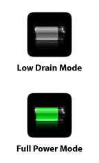 Given how pathetic the new iPhone 3G’s battery life is, and given that Apple recommends you essentially castrate your device in order to get more hours out of it, I have an idea for an app that would make the castration process both quicker and easily reversible:
An app that sits on your home screen and does nothing but turn a set of things on and off.
The app doesn’t even need to launch. Press it once and Bluetooth, Wifi, 3G, Location Services, and Push email all turn on. Press it again and they all turn off. Simple. Perhaps there are even three states to the button where the middle state is configurable.
With the above app, the process of going from power-sucking battery-hog to power-conserving battery-miser would take one-click.
Without the above app, here’s what it takes:
- Click on Settings
- Click on wifi
- Slide wifi slider to off
- Click on Settings Back button
- Click on Fetch New Data
- Slide Push slider to off
- Click on Settings Back button
- Click on General
- Slide Location Services slider to off
- Click on Bluetooth
- Slide Bluetooth slider to off
- Click on General Back button
- Click on Network
- Slide Enable 3G slider to off
- Click Home button to get back to main screen
15 steps! That is crazy.
I wouldn’t even might having my iPhone in conserve mode 90% of the time if it were easy to switch out on demand, but it isn’t. I’m not sure if iPhone developers have access to system settings like this, but if they do, this would make a great app. If not, it would also make a great app… Apple!
Captive Audience

Photo by Sunny in L.A.
A full month after the release of the iPhone 3G, I still see lines of people outside of Apple Stores around Seattle waiting to get their hands on one. Although the new, lengthy activation process is a waste of time for customers, it sure is good advertising for Apple. Having lines out front of your store tends to make passers by curious, and curiosity often leads to attraction.
After two weeks with my iPhone 3G, however, I must admit that I’m not as happy as I was with the original iPhone. In fact, if my original iPhone didn’t have an annoyingly quiet earpiece and speakerphone (should have gotten it replaced during the one year warranty period), I probably would have returned the 3G model or not even upgraded to it in the first place.
Now, granted the original iPhone set probably the highest bar for any electronic device I’ve ever owned, but here is what is maddening about the 3G version:
- Battery, battery, battery. When Steve Jobs mentioned a year ago that battery life was keeping Apple from releasing a 3G version, he wasn’t kidding. Unfortunately, they released one anyway, and now even people like me who use a measly 5-20 minutes of talk time a day can barely go sunup to sundown on a single charge. It’s crippling and it’s frankly embarrassing, in my opinion.
- In order to mitigate the battery life issue, I have now turned off Location Services, Push email, wifi, and Bluetooth, as well as dimming the screen. It’s kind of like buying a Porsche and replacing the engine with a Hyundai to get better gas mileage. Pretty ridiculous.
- The 3G AT&T plans are more expensive, which sucks, but at least one can rationalize the data part by remembering that you are getting faster speeds. However, what explains 1500 text messages going from $6 to $15 a month??? Text messages?
Ten cents a message as part of a plan is highway robbery. And considering most people won’t hit 1500 on the dot, it often times ends up being much more per message than that.Ok, it’s actually a penny a message. - The shape of the phone has changed ever so subtly such that I can’t even use my original iPhone dock with it. Apple doesn’t include a dock with the iPhone 3G and charges $30 for their new “compatible” dock. This is an especially low blow.
- In my mind, neither the white model nor the black model look as nice as the old silver model and I don’t consider plastic an upgrade over metal.
- Location Services takes quite a long time to triangulate your location and often doesn’t work. I guess since I was forced to turn it off, I shouldn’t really care anyway.
- I live near downtown Seattle and a good portion of the time, I’m still on Edge.
- There’s a $18 “upgrade” fee for no apparent reason to switch phones.
In the end, I’d be willing to overlook every item on that list if it weren’t for the battery life issue. I’m not opposed to charging my phone every single night but when you have to think about charging it even during the day, that’s just poor product planning. I’d gladly accept an extra few millimeters in thickness if it meant a 50% bigger battery.
So in closing, I would say that if you already have a first generation iPhone you’re happy with, by all means stick with it. When the iPhone 3G Rev B comes out in several months and sports an acceptable battery, you’ll be happy you’re not stuck with the “old” 3G model.
Don’t fall into the early adopter trap with this particular product release. Sometimes we Apple fanboys are such a captive audience that we ignore the flaws of the items we purchase. And by sometimes, I of course mean always.
Enterprise CMSes vs. Blog CMSes
True or false: Most major news organizations (e.g. The Washington Post, The Seattle Times, ESPN, etc) would be better off running their entire online publishing operations through a modified blogging platform (e.g. WordPress, Movable Type, Newsvine, or a home-grown solution) than through an enterprise CMS.
In other words, in five years, will mainstream news sites essentially be collections of individual writer blogs tied together mainly with section indexes and cross-linking?