Design Signatures
I’ve spent a bit of time over the last month designing a new blog that I’ll be launching soon, and in doing so, I’ve become aware of some design and coding habits which, when put together, clearly compromise a bit of a “design signature”. If you’ve designed more than five sites in your site, you likely have a design signature too, although it’s probably different than most other designers and coders you know. You may not even know you have it, but you do.
Here’s part of what makes up my design signature:
- I start with a CSS reset
- For column layouts, I float every column (usually left but sometimes both left and right)
- I use the clearfix class to clear all of my containers
- I use dotted underlines for body-copy links that change to solid underlines on hover, and no underlines for links that appear within navigational lists
- I use desaturated colors for visited links
- I employ fixed-width centered layouts using a container div, auto margins, and a center text-align on the body
I almost can’t even think about producing a page template until all of these elements are in place, and no design would feel right to me without them. Additionally, I know the browser implications of them so well that I scarcely have to even test in IE anymore.
Do you have any design signatures of your own? If so, what are they and how do they affect your work?
A New WordPress Plugin: Clean Notifications
 HTML email gets a deservedly bad name mostly because it’s used to send out spam and marketing and also because it’s tough to work with from a design and code standpoint.
However, under controlled conditions and in limited circumstances, HTML mail can be a whole lot cleaner than plain text email. In converting Mike Industries to WordPress recently, one of the things I noticed right away was that the e-mails WordPress would send me when new comments and pings came in were extremely verbose. Since WP sends out plain text emails, all of the links get spelled out as raw, unstyled URLs and the emails end up containing probably twice the amount of visible characters than they need to. This is especially frustrating when you’re trying to read notifications from a mobile device like the Jesusphone.
What could possibly tighten WordPress’ email notifications into more aesthetically pleasing hyperlinked missives? A plug-in which sends out better formatted mail!
Enter “Clean Notifications”. A plug-in that took only 30 minutes to write but is capable of providing digital pleasure to people all around the world.
Here is what a WordPress email looks like before Clean Notifications:

… and here is after:
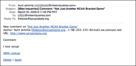
Note the economy of characters. Only the info you need, spaced for readability, and requires no configuration.
Download Clean Notifications and love WordPress just a little more.
Goodbye Movable Type, Hello WordPress
 A few months ago, I silently moved Mike Industries from the aging Movable Type platform to the quicker-developing WordPress platform. I didn’t even plan to change platforms, but after more than a week of trying unsuccessfully to move from Movable Type 3.0 to Movable Type 4.0, this blog was in such a state of disarray under the covers that I began to wonder if switching to WordPress would be quicker altogether.
You see, Movable Type is a platform designed to be static, and only through hackerations with .htaccess files and “bootstrap loaders” can you simulate a truly dynamic publishing system. Part of my move to version 4.0 was designed to use these new dynamic abilities, but in the end, it mucked up so much of my (admittedly custom) setup that I just wanted out completely.
WordPress, in contrast to Movable Type, is designed from the ground up to be dynamic, and through smart caching, it can be made to scale like a static site. This is much the same as how we designed Newsvine to be. As a designer and developer, it just feels a lot cleaner.
So after many years with Movable Type, more than a week of MT 4.0 upgrade attempts, and much assistance from MT’s good shepherd Anil Dash, I called the whole thing off and plotted a WordPress migration instead. Less than two days later, Mike Industries was live on WordPress with only a handful of edge-case issues to resolve (mostly related to inline javascript and php, mime-types, and other custom things I do around here).
Three months in, and now on the newly released WordPress 2.5 (great job on the interface, Happy Cog!), I couldn’t be happier to have made the switch. WordPress certainly isn’t perfect, and if I was starting from scratch, I might have chosen ExpressionEngine instead, but it sure is nice to be on a platform where if I don’t like something, I can just write a few lines of PHP or download a plug-in to address my needs.
Speaking of plug-ins, I’ve already written one of my own that I will release in a few days, but these are the ones I’ve had to install so far (shocking that some of these are even necessary, but oh well):
- Raw HTML – Best plug-in ever. Allows you to wrap PHP/HTML/JS/etc codeblocks in special comments which prevent WordPress from reformatting or encoding them (shocking this is necessary, but a very welcome plug-in)
- Domain Mirror – So that I can use subdomains like “mobile.mikeindustries.com”
- Mint Bird Feeder – So that I can use run my feed through Mint redirects
- Periods in Titles – So that I can use periods in my URLs
- Ping/Track/Comment Count – So I can separate comments from trackbacks from pings
- Subscribe to Comments – So users can receive e-mail notifications when there are new comments
- TextControl – To control how WordPress encodes and adds linebreaks
- WP-Cache – To reduce load on the database and increase scalability
So anyway, that’s about it for now. If you’re on a publishing platform that you don’t love but you’ve got too much inertia to convert to another, take it from me: spend the few days necessary and get it done… it’s not that hard… and I’ve got custom stuff all over the place.
MSNBC Redesigns – Taste The Rainbow
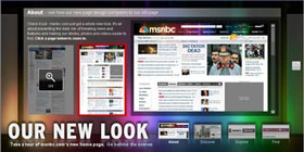 This weekend, msnbc.com began the multi-day process of rolling out their new redesign. It’s really, really nice… you should check out it.
Just so no one accuses me of kissing up to my new partners, I will say that I thought the last redesign several years ago was a bit of a step backwards from the landmark Roger Black look of the late 90s, but this newest redesign is not just a step forward, but a giant leap for newskind. It is not just a collection of features shoehorned together under one grid but a rather well orchestrated piece of communication design, worthy of further examination.
Let’s check out what’s going on under the hood:
Getting Rid of the Blues
Msnbc.com has always turned to blue as the primary color for its palette. Sometimes it’s royal blue, sometimes it’s electric blue, sometimes it’s subtle, and sometimes it’s dramatic, but it’s always been there — until now. The new palette is white, black, and grey with the spectrum of rainbow colors from the NBC peacock sprinkled tastefully throughout. It’s tough to pull off a rainbow palette in web design but this one is very sharp.
Speaking of blue, the shade chosen for all of the anchor text around the site is also very nice. For better or for worse, blue has become the de-facto apparel for hyperlinks on most mainstream web sites, but even the choice among blues is important. #0000FF is dated, unsophisticated, and highly lame, but there are still sites that use it. Interestingly, MSNBC and CNN have picked almost the exact same shade of blue in their latest redesigns, but hey, that just means they both have good taste.
Typography Tradeoffs
I’ve never liked Arial. It’s always seemed like nothing more than a font of last resort for those needing a widely available, compact sans serif. It’s plain, it’s unsophisticated, and it just screams “default” to me. For this reason, I was a bit disappointed to see the MSNBC redesign make such heavy use of Arial, particularly as display type. Surely something a bit more refined like Tahoma could be used. Or maybe even specify something like “Helvetica Neue, Corbel, Tahoma, Arial” so that users of OS X and Vista would get nicer sans serifs, most others would get Tahoma, and then Arial would be the font of last resort.
I asked Ashley Wells, msnbc.com’s Creative Director, about the Arial situation and he gave me a surprisingly satisfying answer: because msnbc’s new publishing system is very much WYSIWYG, editors are charged with not only writing headlines, but essentially designing them too. Meaning, how a headline wraps can have a dramatic impact on the presentation of the page. By using Arial, these wraps can be precise across most browsers. This is such a non-webgeeky way to think about publishing. I love it. Typesetting has always been something MSNBC has done a lot better than their competitors and it’s great to see that even as the company moves away from its Photoshopped-type-on-images style, the focus on typography is not completely lost.
Arial as a way to improve typography. Who would have thunk it.
BIg News, Big Treatments
One of the things I’ve always loved about MSNBC is that when big news happens, the layout of the front page adjusts to properly frame the importance of the story. At ESPN we called this “war mode” and it can only be accomplished by a mix of smart design and editorial participation. In the world of never-ending, unflavored news feeds we seem to be moving towards, it’s refreshing to see a news organization that still believes in the power and importance of layout.
Although the old msnbc.com had more layout flexibility than its competitors, the new site is several cuts above. There are dozens of layout options available for editors and that can increase infinitely as new ones are envisioned. So while most other news sites just pump their top stories into a standard headline-on-top-of-photo box, msnbc.com is actually designing their cover every time they publish. It makes checking the site several times a day that much more interesting.
Coding to Standards
As everyone who has ever worked on a big site knows, the longer you go between redesigns, the cruftier your code gets. Even the cleanest of redesigns tend to decay over time as more people get their hands on the code. WIth this latest redesign, however, MSNBC is debuting a totally new version of their home-grown publishing system (“WorkBench”)… one that is designed to — among other things — allow for feature extensibility without sacrificing the foundation of clean code that now anchors the site.
Before all of you standardistas and validatorians start piping up about inline CSS and random code oddities, realize that the site is very much in flux over these next few weeks as kinks get worked out. Also realize that a redesign of this magnitude requires the retrofitting of a lot of old code and templates that can’t always be eliminated with the flick of a switch.
As a result of the attention MSNBC is paying to web standards, the site now works equally well in all major browsers. It loads quickly, renders quickly, and is a joy to interact with.
An Open Dialog with Users
As part of the redesign process, MSNBC set up a blog to communicate with users about the redesign and all ongoing development efforts. These sorts of things are tricky because they tend to attract a lot of “drive-by” comments from users (e.g. “WTF! I hate it! Bring back the old!”). Once you filter out the inevitable noise though, there is usually plenty of insight to learn from. Having a blog to communicate with your users seems almost mandatory these days, but what I like about MSNBC’s is that it’s a sincere, serious effort. It’s just not a default TypePad installation that some PR flack pens to once a month. People from all sides of the organization have already written entries and answered questions, and it should be obvious to anyone who is paying attention that this is a company that cares about its community.
Newsvine Integration
I wish I could say that the Newsvine team had any significant role in this redesign, but we haven’t. This has been almost a year in the making and it’s all Redmond. That said, Newsvine did get a minor speaking part on the community page, and we look forward to further collaboration in the coming months.
The Bottom Line
This redesign is a perfect example of why “big media” is still alive and well, despite what some people would have you believe. It is thoughtful, it is innovative, and it is something no six-person company could ever produce. It is something, in fact, that most 300-person companies could never produce. As big media takes more cues from little media and little media returns the favor, both sides of the spectrum just get better. And that is great news for the news business and the news consumer.
Plug: Web Directions North
 I have nothing to do with the upcoming Web Directions North Conference in Vancouver, BC, but I thought I’d give it a plug anyway. I’ve been trying to convince Dave to throw this thing in the summertime when it’s warm and gorgeous in Vansterdam, but since it’s a wintertime event, it doubles handily as a ski trip to Whistler. If you’ve never been to the Vancouver/Whistler area of the world, you should consider going to this event. Why? Great speakers!
- Cameron Adams — Super nice guy, and one of the best javascripters in the world. Also, he’s the only guy I’ve ever met who looks Asian and sounds Australian. That is because he is both!
- John Allsopp — Legendary in his ability to appear non-geeky whilst discussing the geekiest of subjects.
- Daniel Burka — Designer of Digg, purveyor of fine Web 2.0 style.
- Andy Clarke — The sixth Beatle.
- Anil Dash — Thinks he’s never met me, but actually has.
- Kimberly Elam — Hooray for females at web conferences! Kimberly is a great author and designer.
- Brian Fling — Mobile design expert from BlueFlavor, and friend of the Vine.
- Derek Featherstone — Legendary for his ability to hold a beer glass to his lips using only facial suction.
- Tara Hunt — Hooray for even more females at web conferences!
- Brian Oberkirch — I met Brian once in New York. He knows his social media.
- Dave Shea — Did some sort of Zen Garden thing once.
- Jonathan Snook — Canada’s native son scripting expert.
- Josh Williams — The Billy Bob Thornton of the web design/dev world (he knows what I mean… it’s a huge compliment).
- Jeffrey Zeldman — The all-knowing, all-powerful, all-humble one. He is our yoda.
A trip to Web Directions North is also a great excuse to renew your passport, if it has expired. Off to go do that right now…
Adding a “Subscribe” Bar to Your Blog
It makes me uneasy that such a huge number of people still visit blogs the old fashioned way: by checking them manually every now and then. This, of course, is in opposition to subscribing via RSS and then only clicking over when there is new content.
I am guilty of keeping an extremely unpredictable publishing schedule at Mike Industries, sometimes posting multiple times per week, and other times going almost a month without any new entries. For this reason, I wish all readers were subscribers. That way, no one would ever be greeting with old content.
In an effort to convert more casual readers to subscribers, and hopefully convert people onto RSS in general, I’ve developed a PHP-powered module which prompts users to subscribe to my feed if they aren’t already. Here’s how it works:
- If you come to Mike Industries and don’t have at least one of two cookies, you see a bar encouraging you to subscribe via RSS or e-mail. One cookie is the “subscriber” cookie while the other one is the “promptclosed” cookie.
- If a user clicks over to Mike Industries from my feed, I set the “subscriber” cookie. If a user manually clicks the “close this message” link in the module, I set the “promptclosed” cookie. Both cookies last for three months.
In order to accomplish this, you need to do a few things:
- Write some simple HTML to display your prompt message. Include it at the top of every page of your blog, hopefully using something like PHP so you only have to do it once. Using PHP, or your dynamic language of choice, set the message to only render if neither the “subscriber” nor the “promptclosed” cookies are set. Here’s what mine looks like:
- Modify the URLs in your feeds such that they pass a variable at the end like “how-to-make-a-margarita?subscribed=true”.
- Using PHP, or your dynamic language of choice, insert code right above the code in step 1 which checks for the presence of “subscribed=true” in the query string and sets the “subscribed” cookie accordingly.
* Note: If you are using Mint w/ BirdFeeder like I am, you can skip steps 2 and 3 and just add the following to Birdfeeder’s class.php right above the line that says header("Location:{$_GET['seed']}");:
Voila. That’s it. An unobtrusive message encouraging you to subscribe which goes away after you either subscribe or decide to close the message.
Interestingly, I got this idea while experimenting with Google AdSense several months ago. I only wanted to show the ads to casual passers-by (perhaps coming in through search engines) and not to Mike Industries subscribers. Now that we have the ability to set cookies and identify who is a subscriber, we can do all sorts of things. I can imagine a small subset of features on the site which are perhaps only made available to subscribers. Who knows. I like the possibilities though.
How To Keep Widgets From Slowing Down Sites: WEDJE
The whole world is going to widgets. This overused, overhyped term refers to third-party code one places on their website or blog in order to display such things as Flickr photos, Twitter status, or iTunes playlists. Everybody and their mom is putting out widgets these days, and although only about 1% of them are useful or interesting, they are an important new distribution mechanism that is changing the way companies think about syndication.
But there is a big problem with widgets: they slow down the sites that use them. In the best case, you have a company like Flickr whose servers are almost always snappy, and in the worst case, you have a young startup that is constantly struggling against increasing demand and occasionally can’t serve up any code at all.
The problem is that in either of these cases, the completion of your site’s loading and rendering depends on someone else’s code living on someone else’s server. Including a fast and reliable Flickr widget still slows your site down by at least a split second and including a less stable one can leave your site hanging indefinitely.
We’ve been developing what we think is going to be a gangbusters widget at Newsvine over the last few months but just as we were getting ready to deploy it, Intern Rob and I hacked together what we think is a method of deploying widgets in such a fashion that they don’t affect the load times of their parent sites whatsoever.
Following is a breakdown:
Read more…
Drag N’ Validate
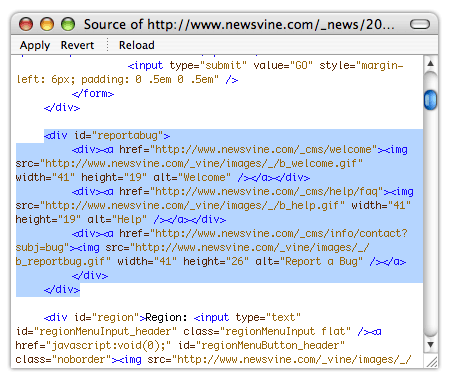
Ever find yourself debugging XHTML via your browser’s View Source command? I do it all the time. You know the routine:
- You add a module somewhere on the page and it’s borking your layout.
- You hit
View Source. - You drag-select the module in question, paste it into a Stickie Note, manually indent your tag tree with tabs, and then find out where your tags are unbalanced.
It’s a pain in the ass and maybe there’s a better way to do it, but here’s a tool I’d love to see:
Drag N’ Validate (or Dragon Validate) — Drag select a block of XHTML in any application, right click to pull up a contextual “Validate” menu, and the application will autotab the block for you and point out any validation errors.
That would be money.
Two Week Code Pushes: Fast or Slow?
I just finished reading a TechCrunch interview with Andrew Anker of Six Apart about their excellent new service, Vox. It’s a nicely conducted interview about a well-designed product that I think will be very successful, but this line struck me as a bit odd:
“Very early on in Vox’s development, we created a two week rapid iteration cycle where we made sure to push code religiously every two weeks. By doing that, we made sure that we were building a design cycle that was always two weeks away from fixing any problem.”
Do bi-weekly code pushes qualify as “rapid” these days? Even at Disney, we generally didn’t take much longer than that, and at Newsvine we push every single day. Multiple times even. We like the rapid pushes so much, in fact, that we even set up a machine to triumphantly speak out the filepath whenever someone pushes out code: click for a sample.
Maybe it’s because I’m impatient about site improvement and problem solving, but Andrew’s statement — if it were applied to me — would advocate a deliberate slowing down of the push cycle (perhaps for the better).
Does anyone else agree? With web technologies the way they are today, do you consider religious code pushes every two weeks a fast thing or a slow thing? Are scheduled infrequent pushes (meaning, much less than once a day) preferable to your development habits?
Mint Not Considered Harmful
 I’ve always wanted to write one of those “considered harmful” essays, but then I remembered Eric Meyer’s “Considered Harmful Essays Considered Harmful”, so I’m writing a “Not Considered Harmful” essay instead.
The subject for the day is Mint… something I find to be extraordinarily harmless. Beneficial, actually… the polar opposite of harmful. Yes, I know I’ve already written about my love for Mint last week, but a few things have developed since Mint’s release that I feel require comment. Here are a few of those things:
render(); ?>
- Lots and lots of people have purchased and downloaded Mint, and as far as I know, there’s only been one request for a refund. Yay!
- Shaun is completely bogged down helping people one-on-one (even over IM!) work through various intricacies of their server setup and how it relates to Mint installation. He is also simultaneously adding improvements here and there to the install process as well as fostering the development of the Mint Forums. In short, the man is slammed.
- Although the lion’s share of comments and blog posts I’ve read around the net are positive, I did see two isolated negative posts which went all the way from questioning whether or not people deserve to be compensated for software they develop to whether or not the group of Mint beta testers was somehow in the wrong for posting about Mint.