Idea: “Record This” Bookmarklet
Lately I’ve been intrigued by situations in which the amount of effort required to complete a task is not overwhelming but it is enough to prevent the task from getting done. The latest example, from a couple of weeks ago, was wine journaling. Sure it only takes a few minutes to pull out a laptop, log into your wine-dot-whatever account and structure a proper review, but unless a few minutes becomes a few seconds, I’m out… and so are thousands of other people.
Minertia is what I might call it… short for a “minimal level of inertia”.
Many companies have succeeded primarily because their products overcome minertia. Twitter is a good example of this. There were millions of people with (purportedly entertaining) thoughts, but none of these thoughts were worth spending more than 30 seconds to publish. Twitter provided a way to turn these idle thoughts into legitimate published communication with 30 seconds of effort, and BAM, they are the hottest company on the internet.
On to more pedestrian matters though: recording stuff on TV.
I’ll use Tivo as an example because that’s what I have, but this could apply to any DVR, Apple TV, Boxee, etc etc:
Here is how I decide to add a show to the repertoire of things my Tivo records automatically:
- Read about a new show somewhere online.
- Hear or read about it again somewhere else.
- Read about how good it is again and finally decide to do something about it.
- If I’m home, turn on the TV, navigate somewhat laboriously through on-screen menus and search for the show in order to set up automatic recording. If I’m away, go to Tivo.com and use their totally crappy search feature, try to find the program, and if that is even successful, set up automatic recording.
As you can see, this sometimes equates to several minutes of work (I’ve spent over 15 minutes trying to do this on my iPhone). Again, we’re not talking about a huge time investment here, but it’s enough to require steps 1-3 whereas with a little minertia reduction, people might be willing to record shows the first time they hear about them.
What got me thinking about this was an interview with Rex I read yesterday. In it, he mentions Modern Family as the best show on TV right now (I say it’s Dexter or Million Dollar Listing, but whatever). Thankfully, Rex’s interview was about the third time I’d heard this so I bucked up and did step 4. But here’s how much easier it could be:
- Read article on web which contains the name of a TV show.
- Click a bookmarklet to query Tivo, and Tivo spiders the page, highlighting all TV shows it recognizes.
- Click on the show you want, confirm with a little ajaxed-in dialog box, and a command gets sent to your Tivo to create a Season Pass for the show.
The effort would thusly be reduced to under 10 seconds.
As with the wine example, I fully expect someone to leave a comment pointing me to something that “kinda sorta” does this, but not in as optimal of a manner as I described above. Anybody know of something that does this? Or better yet, anyone work at Tivo and want to build this? :)
Newsvine is looking for a web developer
There’s no better place to be during an economic downturn than a solid, profitable company with a long track record of success. Come to think of it, there’s no better place to be during an economic boom than that sort of place either. Msnbc.com, proud parent of Newsvine, is just that sort of place. The most visited news site in the United States for the past 12 months and running, msnbc.com is hitting on all cylinders and is expanding the Newsvine team by one talented web developer.
As co-founder and CEO of Newsvine, I can tell you that this is a great place to work and retains the best aspects of a startup atmosphere while inheriting the equally great aspects of working for an established media organization like msnbc.com. If you’re interested in joining the crew, please read the job description below and send your stuff to msnbcjobs@msnbc.com. One caveat, however: We are specifically looking for someone who is passionate about writing code. Javascript, PHP, HTML, etc. This is not a design position and the only UI work involved will be on the implementation side, from a coding perspective.
Job description
The Newsvine Team is looking for an experienced, self-motivated, and passionate front-end developer to join us in building products and services on the Newsvine platform. Your primary responsibility will be to design and develop site features and functionality in a multi-tier web environment using PHP, CSS, JavaScript, and the YUI JavaScript library. Additional responsibilities include daily site support and maintenance. The ideal candidate is able to work on small teams under tight deadlines with little supervision. A computer science degree or equivalent is a plus, but experience, skill, and attention to detail are more important.
The ideal candidate will have a strong command of the following knowledge areas:
- X/HTML, CSS, DOM, and JavaScript
- PHP or similar scripting language
- Mastery of web standards and cross-browser compatibility
Preferable Job Qualifications:
- Experience working on large-scale, high-availability web sites
- Successful industry experience using latest DHTML and ajax technologies
- Experience with SQL and relational database implementations serving as the backend to production web applications
- Experience with, or an interest in, working with the YUI JavaScript library
- Familiarity with Subversion a plus
Examining Typekit
Last week brought word of a promising new type solution for the web called Typekit. Created by Jeff Veen and the smart folks at Small Batch, Typekit aims to solve the problem of custom typography on the web once and for all. Unlike sIFR, Cufon, and several other stopgaps before it, Typekit does not attempt to hack around the problem, but to solve it in a permanent way, which is exciting.
As a co-inventor of sIFR, I’ve been getting a lot of emails this week asking what I think of this new effort. In evaluating its promise, it’s important to examine the following characteristics, in order of importance: compatibility, functionality, legality, ease of use, and hackiness.
Compatibility
Compatibility is the most important aspect of any new web technology. If your shiny new method only works in 10% of web browsers, it’s nothing more than a proof-of-concept. It is this reality check that keeps me from getting excited about W3C meetings, Internet Explorer extensions, or anything else that doesn’t apply all browsers in the here and now… or at least the right around the corner.
Compatibility was also what pushed sIFR over the top in terms of popularity, working in over 90% of all systems and falling back gracefully in most others. It also came out at a time, 2004, when there wasn’t a whole lot of tolerance for leaving certain browsers behind or having things look ideal in a few browsers and not so ideal in others.
Typekit appears to be doing ok on the compatibility front, targeting current versions of Safari, Chrome, and Opera natively, the next version of Firefox (3.1) natively, and all versions of Internet Explorer via a “backup” EOT solution. Here’s what the browser share landscape looks like today:
- Works in:
- Internet Explorer: 66.1%
- Safari: 8.21%
- Chrome: 1.42%
- Opera: 0.68%
- Firefox 3.1 or greater: 0.18%
- Doesn’t work in:
- Firefox 3.0 or lower: 22.3%
- Miscellaneous other browsers: 1.11%
So you can see right off the bat that Typekit will work in just over 76% of browsers. Not quite as high as some of the methods that came before it, but it’s extremely important to recognize that the one group that’s keeping Typekit from almost universal compatibility is Firefox. I have no evidence to support this, but I imagine that Firefox users are among the quickest to upgrade, which would seem to suggest that this compatibility gap could be closed relatively quickly. Data shows that Firefox 3 is already used by 11 times more people than Firefox 2, and considering it was released just short of a year ago, this sort of upgrade pattern is encouraging.
Given the above data, combined with how often Firefox seems to annoy me these days with upgrade notices, I expect Firefox 3.1 or greater to be the dominant Firefox version in use one year from now, thus pushing Typekit’s compatibility percentage into the upper 90s fairly soon.
It’s also important to praise what Small Batch has done here on the compatibility front: their killer concept was involving type foundries in web-only licensing and propagating the font files through the standards-complaint @font-face CSS declaration, but they realized their solution would be academic if it didn’t work in Internet Explorer, so they made sure their backup implementation using EOT files took care of all IE users. The lack of this sort of practical thinking is what keeps a lot of great ideas from gaining traction on the web.
I also think that designers these days, self included, are a lot more amenable to things looking great on “most systems” as long as they at least work reasonably on other systems (as long as they look great on the particular system the designer uses). This is a bit of designer bias, of course, but it also represents an increasing desire in the design and development community to leave the old web behind. I still remember how much crap I took at ESPN from validatorians when we decided to leave Netscape 4 — with its 1% marketshare — behind. Now it’s all the rage… and I love it!
Functionality
By all accounts, Typekit will be more functional than any method that came before it. This is quite obviously because it uses a browser’s native font rendering technology. There are some concerns about reliability gaps stemming from downloading fonts off third-party servers, but I believe this fear will prove unfounded. Additionally, I imagine both the @font-face and EOT versions of fonts will come in larger files than sIFR font files (because usually you only embed a subset of characters in a sIFR font file) but with broadband penetration being what it is today, this too will prove immaterial. Additionally, even though sIFR font files may be smaller, the noticeable delay in rendering them probably more than makes up the difference.
Legality
I put legality in the middle of the pack and not at the top because, to my knowledge, there haven’t been any serious legal dust-ups over the use of technologies like sIFR and Cufon. So far, the burden has been on designers to buy the fonts they use before embedding them using sIFR or Cufon, but at the same time, there’s been no clear blessing or condemnation of this practice by foundries or type designers.
The nice thing about Typekit is that it specifically involves foundries and type designers in the process of licensing their fonts for use on the web. When you use Typekit, you know with certainty that what you’re doing has the direct blessing of the people who created and/or marketed the typeface you’re using. This is a nice piece-of-mind upgrade as well as a way of further compensating type designers for giving us the building blocks of web design.
Ease of use
Typekit promises to be easier to implement than either sIFR, Cufon, or any other font replacement technology. I guess we won’t know until we start using it, but it would shock me if it took more than a few minutes to implement, including licensing the font you want to use. sIFR’s second most common complaint other than “it uses Flash and Flash kills puppies” is that it’s a bit difficult to implement. Typekit’s improvement on this front will be more than welcome.
Hackiness
First let me say something I’ve said many times before: the entire world wide web is a hack. Get over it. Secondly, however, any technologies or methods — that work — which serve to dehackify it a bit are welcome. Typekit certainly dehackifies custom typography on the web by leaps and bounds. It was the solution we all knew would come eventually when we created sIFR as a stopgap five years ago. Just about the only things hacky about it are that it falls back to EOT (which, as discussed earlier, is great) and that it uses Javascript to handle the licensing nuts and bolts (meh, big deal).
Conclusion
Typekit is likely the best thing to happen to web design since the re-emergence of browser competitiveness. It will be embraced quickly and fervently when it is released this summer, and its creators should be loudly applauded for doing it instead of just talking about it. There are too many talkers in the world and not enough doers. The team at Small Batch has done an excellent job of taking a problem that a lot of people like to talk about and solving it in a practical, equitable way. It’s a welcome solution to a real issue and a significant step towards a leaner, Veener web.
The Sorry State of WYSIWYG Web Editors
We got into a heated discussion in the office about WYSIWYG web editors today. While heated discussions are nothing new to us, neither side even being happy with their own argument was. When people are arguing over things they don’t even believe in, there can be no positive outcome.
My side was as follows: All web editors — including TinyMCE, YUI, and FCKEditor — are broken in different ways, and the only software I’ve seen which can satisfactorily desuckify one of them is WordPress. Because of that, we should deconstruct what WordPress has done to TinyMCE and apply the same duct tape to our own editor on Newsvine (we use TinyMCE currently, but are in the process of moving to YUI).
Our development staff’s side was as follows: All web editors — including TinyMCE, YUI, and FCKEditor — are broken in different ways, and because of the crazy amount of ridiculous cleaning, converting, regexing, transforming, and other shenanigans WordPress has to do to their editor just to get it to the state it’s in right now, it’s not worth spending the time to recreate such a mess, only to have it remain imperfect and possibly break in upcoming browser releases.
There are several things wrong with each editor but the particular problem we are trying to solve is that when you’re in HTML mode, you can’t create paragraphs just by putting double newlines between them. Some people say that because you’re in HTML mode, you shouldn’t expect an editor to do this for you, but I’ve been using blog software for six or seven years and that is the behavior I — and I believe most others — are accustomed to, so I couldn’t imagine releasing something without it. As mentioned above, the WordPress team has craftily hacked this functionality into their WYSIWYG system, but other platforms like Typepad have not.
I could go on and on for another hour about details, but after going through all of the WYSIWYG editor machinations we’ve gone through, I’m left wondering why the web development world still hasn’t figured this out yet. We can write an entire e-mail application, a replacement for Excel, and whatever the hell these things are, but we can’t replicate a toolset we’ve had in MacWrite since 1984?
Think of how much has happened in the last 25 years, and we haven’t been able to nail that.

TinyMCE circa 2009: Millions and millions crrrrrrrrazy features. Doesn’t work satisfactorily.
Microsoft Word circa 1991: Just enough features. Works plenty fine for most people.
I know hard-core coders like to hand-code html even when writing web comments (self included), but 90% of the world would rather not be bothered with that. What’s it going to take for this problem to go away? If you’re involved in WYSIWYG editor development, I’d love to know. Is it the disappearance of old browsers? Is it something that should be Flash-based? Is it just that no one’s really worked full-time on the problem yet? Why isn’t WordPress’s crazy hackery built into TinyMCE in the first place? So many questions…
So far, the one effort I’ve noticed that seems to take the cleanest possible approach is the WYSIWYM Editor. What-You-See-Is-What-You-Mean essentially translates to “the HTML code associated with what users type will semantically match what they intend”. Meaning, if I type two blocks of text separated by a double newline, I get two properly <p>d paragraphs out of that… not just a blob of text separated by <br> tags. Or if I bold some text, I get <strong> tags instead of other ridiculousness.
Sadly, the WYSIWYM Editor seems to have been in development since 2006 and is only at 0.5b, but happily, there appears to be a healthy flurry of activity around it lately. I really don’t mean to disparage the hard work that’s gone into all of these imperfect WYSIWYG editors in the past, and I do realize that browsers are the core culprits here, but it’s 2009 already and I’d prefer a solution to this longstanding real-world problem over almost anything promised in HTML 5, CSS 3, or any of the other specs we’ve been eagering awaiting for the last several years.
Presto Chango
After almost five years of running Mike Industries, it’s time for a change! The fact that I made it this long without redesigning is either a testament to the majestic timelessness of the original design or my general uncomfortableness in doing “self identity” work. Since we know there is no such thing as timelessness on the web, we can therefore assume it’s the latter.
This redesign had five objectives, in order of importance:
- Make shared items such as found links, video, and photography more a part of the overall content presentation. I still write original posts 1-3 times a month, but it’s nice to keep things fresh in-between as well.
- Refresh things visually with a wider layout, new typography, and a fuller footer, among other elements.
- Modernize and completely rewrite the code that was brought over when I switched from Movable Type to WordPress a year ago.
- Offer more feed customization, including full-text RSS.
- Don’t break old pages with the new design.
… and away we go:
Bringing multi-source aggregation into the fold
It’s easy to take posts from other places like Delicious, Tumblr, and Twitter and display them in various places around your blog. It’s a bit harder to ingest those same posts into your blog’s publishing system and then output them as actual native blog posts that people can comment on. And finally, it’s incredibly hard to do the second thing in a way that’s flexible enough to display many different types of content in many different contexts.
Getting to the first stage would have been easy via a few lines of javascript, and in fact, I already got there with the previous design, embedding my Delicious links in the Mike Industries sidebar.
In trying to make it to the second stage, I tried several different “aggregation” plug-ins for WordPress, but eventually settled on a wonderful little creation called FeedWordPress, by the one they call “Rad Geek”. After installing the FeedWordPress plug-in, you simply give it some feeds to suck in, tell it how to categorize and tag items from each feed, and then let WordPress templates do the rest.
I was originally going to move over all of my link-saving from Delicious to Tumblr because I love Tumblr’s posting interface, but since my Tumblr account got hacked within a couple weeks of opening it, I decided to only use the Tumblr account to post fun stuff like videos. My initial reflex was to move all “collecting” to one platform, but since everything is getting pulled directly into the main blog anyway, I’ve convinced myself that the use of multiple platforms is actually a strength. I’m essentially pulling my Tumblr and Delicious feeds into the “Shared” column and my Twitter feed into the “Overshared” column.
I am unconvinced that Twitter will be a permanent part of this blog, since I still don’t enjoy either publishing or reading many tweets, but I’m giving it a try to see if it sticks. Twitter’s rising popularity continues to amaze me to the point where I’m almost ready to officially consider myself “too old”. On the one hand, I totally understand it because it’s so easy. But on the other hand, I totally despise it because it enables such laziness and extravagance of expression. Anyway, that’s a conversation for another blog post.
The single hardest part of the entire redesign was writing a script that ensured no items in the Shared column would render wider than the column itself. Since there will be plenty of YouTube video tags in there, it was essential to resize them all as the column renders, but not permanently in the database, so that they can render at full size when viewed from the permalink pages. I am no Wolf with regular expressions, but after hours and hours of hackerations, I came up with this:
I cribbed part of the short scale_image_240 function, but the rest was from scratch. Beforehand, I searched for quite some time on Google for a function to do exactly this and couldn’t find it, so hopefully this post will help some future searchers in their own quests to resize content.
Even though running these computations when the sidebars render isn’t too computationally ferocious, I went ahead and “widgetized” my sidebar in WordPress as well, so I could make use of the excellent WP Widget Cache plug-in. WP Widget Cache writes your entire sidebar out to disk so that it can be served up quickly and statically.
Ok, now that the geekiest part of the redesign has been explained, on to hopefully more interesting matters…
Separation of different content types
As much as I love what Doug and Dave have done with their superb redesigns, I just don’t like displaying original posts and peripheral content in the same column. I may not be the most prolific original post writer, but when I write an article, I want it front and center, and not pushed down by links or other distractions. With this redesign, the flow is simple: the most important stuff is on the left, the semi-interesting stuff is to the right of that, and the barely-interesting stuff is to the right of that. Size also flows according. The wide column is important, the medium column is semi-interesting, and the narrow column is barely-interesting.
Typography
sIFR lives on in the new Mike Industries — of course — in the form of Trade Gothic Condensed. While I don’t think sIFR should be used in every project (we don’t use it on Newsvine), I still find it an invaluable method to really shine up blog design. The first version of Mike Industries used Agency Condensed rendered with sIFR 2, while the new version uses the aforementioned Trade Gothic (a Stan favorite) and sIFR 3.
By the way, I don’t usually like to call fellow developers out, but I will say this about sIFR 3: it’s beautiful and it’s been ready for at least a year, in my opinion, and yet it’s not officially “released” yet. I find this highly unfortunate. When you’re developing software for the web, it’s never going to be perfect. As long as your software generally works and isn’t causing any damage, release it. The entire web is a beta. The entire web is a hack. It always will be. Don’t fight it. If you’re on Release Candidate 436, that’s a sign you may need to let go a little.
Aside from the Trade Gothic, Mike Industries now uses Helvetica Neue for body copy and downwind headers. I am certainly no devotee of Helvetica, like 90% of the people in the film are, but with anti-aliasing so much improved in the last decade, it does make for some good readability these days. Plus, I just needed to get off the Lucida Grande/Verdana bandwagon for awhile at least.
Grids, shmids
I feel like grids are the new web standards. What I mean is that they are a potentially useful tool to achieve a noble means, but they aren’t the second coming of the messiah. If grids help you do great work, then by all means learn them, love them, and live them. But if you’re perfectly happy eyeing layouts as a drunken painter eyes a canvas, then eye away. I’m no painter, but I’m plenty happy creating layouts without the use of grids or any sort of sizing heuristics. I don’t make sure my main column is sized according to a golden-ratio and I don’t make sure every line of type lines up vertically with every other.
I just do what feels right… and that’s plenty good enough for me. You should do the same, whether or not that involves the use of grids.
Feeds revisited and reloaded
Due to popular demand, I am now pushing out full text RSS feeds. I would still rather not publish these because of content theft and other reasons, but in the end, my reticence should not trump the will of my subscribers. I’ll try it out and unless I notice widespread plagiarism on spam blogs, full-text feeds will probably continue.
Also, after running this poll about a month ago, I’ve decided to include original and shared items in the default RSS feed (the one you’re probably already subscribed to). According to the poll results, most people want to see interesting links and other stuff in the main feed, so that was the justification. If, however, you find the shared items superfluous, please switch over to the Articles Only feed. I hate the idea of anyone unsubscribing entirely because the main feed is now updated too often.
One thing I can’t seem to figure out is how to correctly enable the “all” feed in WordPress. For all of you WordPress gurus out there, I basically applied a filter to my existing “/blog/feed” feed to remove the Overshared/Twitter categories. It is as follows:
function exclude_category($query) {

	if ( $query->is_feed ) {

		$query->set('cat', '-473,-281');

	}

return $query;

}
add_filter('pre_get_posts', 'exclude_category');
That correctly takes the stuff out of the “main” feed, but I need to provide another feed with everything in it. Something like maybe “/blog/feed?all”. I figured I should be able to just modify the line above to:
if ( $query->is_feed &! $query->query_vars['all'] ) {
… and it should work. It doesn’t. If anyone has any ideas, I’d love some help on that one (or another way to do it entirely).
Big footers are in
My footer now contains a lot of what was previously in my sidebar and more. I’m not sure how I feel about this yet. On the one hand, I like big, informative footers. But on the other hand, I don’t like burying such potentially important stuff so low on the page. If I end up getting rid of the Overshared column, some of the footer content may end up replacing it.
Backwards compatibility
Originally, I wanted to find a way to keep old blog posts in the old theme and style new blog posts with the new theme. I like this idea because it preserves the context in which posts were originally written and it also doesn’t break heavily designed posts like this one. In the end though, I was able to keep my main content area the same size as my old one, so the new theme really didn’t break any entries, so I have — for now — decided to move everything to the new theme. This decision is definitely subject to change though as I really don’t want to be tied to a 450 pixel wide white column for the rest of my life.
So anyway…
So anyway, that’s it. I’m pretty excited to get this rolled out, but at the same time there are still details that need some shining and bugs that need squashing. If you see any, give me a holler in the comments. Thanks!
How to REALLY Import your Delicious Links into Tumblr
I’ve been using Del.icio.us, the fabulous Joshua Schachter creation, as my linkrolling tool for a few years now. Although it can be a powerful tool for organizing and browsing through interesting URLs, I find I only use it for two things: saving links and displaying said links in the sidebar of Mike Industries. For that reason, there are probably any number of bookmarking services which would amply serve my meager needs.
One service that’s caught my eye recently is the increasingly popular Tumblr. I have friends who run their main blogs off of it and others who just run one of their multiple blogs off of it. I still like hosting my own WordPress blog and would never outsource this to a hosted service, but at the same time, running all linkblogging activity through a service like Tumblr sounds appealing — especially considering I can then pull all of that activity into my main blog using something like WP-O-Matic.
The super nice thing about Tumblr is how simple the posting interface is. The “Share on Tumblr” bookmarklet the company provides does a pretty good job of automatically figuring out what type of content you’re posting and treating it accordingly. In other words, if you seed from a YouTube page, the link gets posted as type “video” and is displayed accordingly. These sorts of interface niceties reduce the amount of work required to save links and thus encourage more linking activity. Both good things. The woefully inadequate “Press This” bookmarklet from WordPress just doesn’t measure up.
So… a couple of days ago when I decided I wanted to migrate all of my Del.icio.us bookmarks over to Tumblr, I couldn’t for the life of me find an automated way to do it. Tumblr has an import feeds feature but it is misleadingly named. It doesn’t actually import existing feeds. It only adds your feed URL and then posts any new items you add afterwards. This does nothing to aid in the migration of existing content over to Tumblr.
Using a combination of the Tumblr API sample code and some code I stole from Greg Neustaetter, I created a PHP script which imports all of your existing Del.icio.us bookmarkets into Tumblr.
Warning: I am not a PHP genius so I know the code isn’t pretty… but it works. It imported all 312 of my Del.icio.us bookmarks in under a minute.
In case you’re interested, here’s how to do it (caveat — you might want to do this on a fresh Tumblr account, just to be sure):
- Log into your Del.icio.us account.
- Hit http://del.icio.us/api/posts/all and save the file to your desktop as “delicious.xml”. Upload this file to your server.
- Upload Delicious-To-Tumblr.php to the same location on your server and edit the two lines in the file specifying your Tumblr email and password (to authenticate with the Tumblr API).
- Hit Delicious-To-Tumblr.php in your web browser and all of your entries will be imported.
Voila! Del.icio.us-to-Tumblr migration in about a minute. Enjoy.
Thoughts on the ESPN.com Redesign
A couple of days ago, ESPN.com launched their latest redesign; an effort many months in the making and much anticipated in the industry. I’ve been playing with the new site for a month or so now and have some positive and negative opinions to express, both as a sports fan and as one of the (drunk) driving forces behind some past ESPN.com redesigns.
First the standard caveat: designing a major media site is not as easy as it may appear. It is not like designing a blog and not like designing a standard “web presence” for a company. There are hundreds of internal stakeholders to answer to, millions of daily users to please, and a ton of legacy and third-party code that is often outside your control. Anyone who tries to knock down the virtues of a major media site redesign based on how far it falls short of perfection is making the wrong comparison. The most important benchmark to grade is simply the amount of improvement (or worsening) from the last iteration of the site. Secondarily, comparison against competitors is also very important.
First things first, there’s a lot to like about the redesign:
Cleanliness
In my five years at ESPN, there was always a lot of push and pull between design cleanliness and information density. On the design side, we always fought for an economy of elements on the page. Big striking headlines, well placed lead-ins, content modules here and there, but nothing to overload the screen. On the editorial and business side, there was always a push for more video, more features, and just generally more content all over the place. The ideal philosophy is of course somewhere in the middle, but over the last few years, I feel like ESPN had gone a bit too far in the “Times Square Billboard” direction, with too much visual distraction (especially in the form of autoplay video).
The new redesign gracefully chisels away a lot of the visual clutter and presents a calmer, gentler ESPN for your perusing pleasure. Gone is the autoplay video and other visual cruft that had built up over the years.
Note: When I refer to “visual cruft”, this is a phenomenon that happens to every content site over time. Essentially, you redesign and everything’s perfect, and then “plaque” kind of builds up over time in the form of code and design elements that are inserted to meet editorial or business needs. Each redesign is an opportunity to chisel off the plaque and start anew.
Code Quality
Don’t even bother trying to run the ESPN front page through the stupid W3C validator because that’s a lousy way to judge code quality. The tomato-throwers among us will of course do this immediately and point to the hundreds of validation errors as evidence of incompetence. The more seasoned among us know that 500 ampersand-related errors are meaningless in the grand scheme of things and we wish the validator could be configured to selectively mute certain types of benign errors.
The HTML for the front page is a svelte 22.8k gzipped (73.4k unzipped) and the code is pretty well written. All CSS for layout — natch — and decently structured HTML.
I will not comment on accessibility because I am not an accessibility expert. I’ve long railed against judging a site’s true accessibility by looking for alt text and well structured code, as I simply don’t believe those elements — on their face — make a site accessible or not. A site is accessible if observed user behavior suggests that disabled people can use the site with reasonable ease. If you don’t know how disabled people actually use your site, you have no idea if it’s actually accessible. Period. You may have followed best practices to improve its accessibility, but you just don’t know if it passes the test unless you test.
That said, I have no idea how accessible the new ESPN.com is in the real world. I imagine it’s ok, but certainly not perfect.
New Story Pages
I don’t have a whole lot of objective things to say about the new story pages, but they look cleaner than the previous incarnation. Very readable, very uncluttered, and good video integration where appropriate.
Navigation
ESPN moved to top navigation a few years ago and they’ve never looked back. I’ve long preached the benefits of putting your main navigation across the top of the screen and ESPN has fine-tuned their implementation with this release. Good rollovers, good information architecture, and just all-around snappy. I’d like to see msnbc.com move to top navigation with their next redesign.
Video
As mentioned above, gone is the awful autoplay video. In its place is a video tab which is a lot more polite to users. I don’t think many users will click on the video tab (because in general, no one clicks on tabs), but I do think when ESPN has great video, they’ll probably flip to “video mode” automatically… and I’m totally cool with that, as long as it doesn’t autoplay.
But it’s not all roses with the redesign. I do have some issues with it:
Below the Fold
By far the worst thing about the redesign is the ghettoization of the below-the-fold area on the home page. It’s tragically uninteresting. When I was working on the 2003 redesign, I remember John Skipper (rightfully) making a big deal about how important the below-the-fold area of the front page was and how we needed to make better use of it. The last redesign had a nice Flash feature slideshow thing going on and that is now gone, in favor of the gigantic heads of ESPN columnists. I love ESPN columnists, but their headshots add absolutely nothing to their stories. It’s a huge waste of space and it’s subconsciously a very unattractive area to scroll to.
Because of this, the new ESPN frontpage is now more of a “glance and go” site for me now. I don’t want to scroll because I have no confidence that there is anything worth scrolling to. Compare that to, for instance, the msnbc.com frontpage, where there are a ton of things to keep you interested all the way to the bottom of the page. I actually think msnbc.com is among the best in the industry at this.
One thing ESPN did to encourage people to scroll is put the main headline in the bottom area of the main marquee. Sorry, my screen’s big enough to still see it anyway. Not going to scroll.
Tinting Red is Dangerous
Unless your site caters to females, it’s always risky to tint your reds. Even the slightest tinge of pink on a site like ESPN can ruin the whole look. Generally ESPN has gone with shades of red (red plus black) or maintained very clear boundaries between reds and whites. With this redesign, there is a pretty noticeable gradient from red to light gray, and while it’s clear they limited the pink zone by using a steep gradient, it’s still noticeable.
Minimal Customization
I don’t see a whole lot of customization options besides the “My Headlines” tab. It’s very hard to do customization well, but this strikes me as not much of an effort at all.
Conclusion
All in all, I think it’s a nice redesign. Not one that knocks you on your ass and wows you to your core, but tasteful nonetheless. I found myself visiting competitive sites like Yahoo Sports, CNNSI, Sportsline, and Fox Sports to compare this against their latest versions, and after thinking about it, I still think ESPN’s design compares favorably to all comers.
What Should Go in a Default RSS Feed?
So after four or five years of not redesigning this site, I’m finally working up the energy to rearrange the furniture a little. Part of the motivation comes from realizing how much more I like the general design of my construction blog and the other part comes from the admission that a lot of the things I want to update my site with regularly are not articles about web design and development, and in some cases, not articles at all.
The first question to answer in this redesign is: what are the discrete types of content I will be posting once the redesign is complete. So far, this is what I’ve come up with —
- Web design and development articles
- Other articles
- Product Recommendations
- Random links of interest, a la what’s in my sidebar right now
- Newsvine seeds linking to interesting news stories I’ve read lately
- Photos
- Videos
- Links to latest entries on A House By The Park
- Latest Twitter posts
The items are more or less in order of what I think people would be interested in. The first three would be full text posts and the rest would be in some sort of compact form, either inline with the rest of the posts or more likely in a sidebar.
So far so good. I’m pretty confident I can pull all of that off with not too much work. The problem, however, is how that all manifests in an RSS feed. WordPress has a great feature where you can mix and match categories into different RSS feeds — which I fully plan to do — but what goes in the default feed? That is the $64,000 question. With somewhere between 5,000 and 10,000 subscribers, I don’t want to piss anybody off by shoving a lot more updates in there to relatively meaningless things like Twitter entries. As a reader, I prefer to subscribe to RSS feeds that update once or twice a week max and if one of my favorite blogs shoved the whole kitchen sink into their feed suddenly, I might unsubscribe.
On the other hand, however, I’ve had plenty of people say things to me like “I used to always read your blog… back when you updated it!” — clearly implying that 2 or 3 updates a month isn’t cutting it.
render(); ?>
So the first question to answer is “what should go in the default feed?” If you’re a current Mike Industries RSS subscriber, please vote in the poll to the right.
The second question is not really something I need votes on, but perhaps should be discussed in the comments below: when offering custom RSS feeds, is the best practice to create them by opting out of categories or opting in? Here are the two ways you can custom feeds in WordPress —
http://www.example.com/feed?cat=1,2,3
(Returns a feed with items from categories 1, 2, and 3)
or
http://www.example.com/feed?cat=-4,-5,-6
(Returns a feed with all items except from categories 4, 5, and 6)
The user interface for creating each style of feed can still be identical (a bunch of checkboxes), but the nature of the subscription is subtly different. Let’s say you’re subscribed to the first feed and I add a 7th category. Say category 7 is links to a third blog that is created at some time in the future. If you’re subscribed to the first feed, you won’t get the new stuff. If you’re subscribed to the second feed, however, you will, because you haven’t specifically excluded category 7. There are advantages and disadvantages to each. If you have any insight into this or any other related issue, I would love to hear your comments below.
LazyWeb Request: Date-Based Theme Switcher for WordPress
Jason Santa Maria said something in his last post about art directing blog entries that struck a chord with me:
“I am a huge proponent of preservation on the web. If and when I redesign, I will archive this version like I did with my last. I think it’s important to keep content and design paired together when possible. That’s where the context and meaning live.”
I agree with Jason and his reasoning is part of why I haven’t redesigned Mike Industries since launching it almost five years ago: I don’t like the idea of changing the visual context of past entries or having to make a new design backwards-compatible, especially with with some of the more visually complex entries that have appeared from time to time.
While I like Jason’s idea of archiving entire versions of his old sites at different subdomains, I think I’d actually rather just set a cut-off date whereby every blog post older than that date uses the old theme and every other page or post on the site uses a new theme. In searching around, I can’t find a way to do this in WordPress. It seems like something that could be the basis for a very useful plug-in. Call it “WP Non-Destructive Redesign” maybe.
Any WordPress hotshots out there know how something like this could be accomplished? For the quick and dirty version, ideally you’d first officially switch to a new theme and then there would be one setting in the plug-in’s options which would let you specify a cut-off date and a theme name to apply to the old stuff.
The Only Thing Worse Than Viruses…
Our CTO once said:
“The only thing worse than viruses — is virus protection software. And the only thing worse than virus protection software — is free virus protection software.”
So true. The most frustrating bug reports we get at Newsvine are the seemingly random ones. We’ll get a cluster of reports from people who all of a sudden can’t vote, can’t comment, or can’t perform some other necessary function. And none of the bug reporters seem to share common characteristics like what browser they are using, what proxy they are behind, or anything else. On more than one occasion, the common thread has turned out to be that they had a certain anti-virus or “internet security” product installed on their machine. The havoc that some of these programs wreak on HTML, javascript, and general HTTP connections is astounding to me sometimes.
I remember one instance where one of our image calls was to a file called “poke.gif?ad=whatever”. The image was not a decorative element but a functional element which was necessary for dealing with our transactional logs. It took days to figure out that the mere use of the word “ad” caused Norton to block the request completely. If we changed the word “ad” to “glad” the problem was solved. And even more paradoxically, if you just put an ampersand in front of the word “ad”, that also solved the problem. Simply maddening, although it was a frustrating enough episode to at least plant a little bug in all of our heads about virus “protection” software: if you’re trying to squash a bug that seems illogical or isn’t easily reproducible, always consider that it could be because of a user’s security software.
Last night, I was trying to debug a problem with Newsvine’s new commenting system with a user who was having issues, and it turns out he is using “CA Internet Security Suite” which came free with his RoadRunner broadband service. I downloaded this thing and installed it into my Windows XP instance running inside of VMWare Fusion.
Oh my god is this software bad. The first thing it does after it installs itself is to run a scan on my system. It then gives me an extremely alarmist dialog box telling me my system has been “infected with 36 instances of spyware”. It lists the spyware inside the dialog box. All 36 pieces of “spyware” are actually just harmless (and functional) cookies from places like Newsvine and AT&T. Just for kicks, I hit “Remove” and of course it prompts me to spend $70 for the full version just so it can clear my cookies. Brilliant.
So then I open up a web browser and I notice that the CA software is now checking every single server call the browser makes against its database of “safe” and “unsafe” sites, slowing the browsing experience down to a crawl.
And then, just for kicks, I try to visit my Newsvine page at http://mike.newsvine.com, and here’s the dialog box I get:
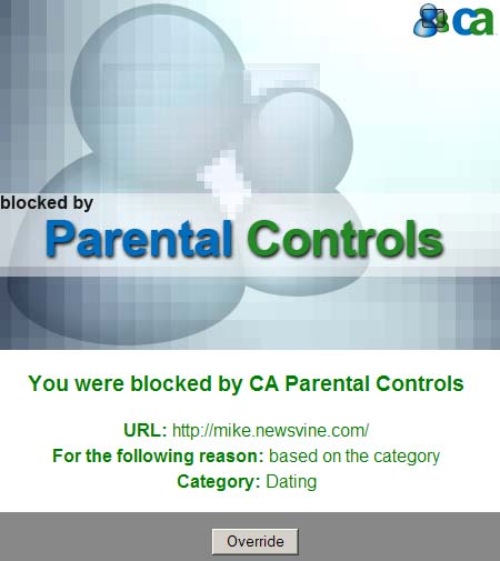
Blocked from my own site! Because it’s a “dating site”! Ridiculous.
We haven’t resolved our problem yet with the commenting system, but something tells me it has something to do with this stuff.
Having used a Mac for the last 24 years, I’ve just never really had to use anti-virus software. It’s a rude awakening seeing how the other half lives, in this case. If I used Windows on a daily basis, I think I’d opt not to use anti-virus software at all and instead set up automatic restore points once or twice a week. VMWare Fusion lets you do restore points automatically which is really nice. If I happen to contract a virus one day, I can just roll my machine back a few days and get rid of it.
Much better than having the Norton/CA gestapo stomping on my face every time I try to make a simple HTTP call.