Movable Type 3.2 Impressions
 I just upgraded to Movable Type 3.2 a few days ago, and as predicted, it has just enough nice new additions to keep me, once again, from switching to WordPress (sorry Matt!). If I were starting from scratch, WordPress might be my chosen platform, but MT gives me enough to keep me happy, and it’s still arguably better than WordPress in several important categories.
Some observations:
- I’ll start with perhaps the only major disappointment in MT 3.2 because that is what I would like the community’s help on: search. Since the beginning of time, Movable Type’s search function has been a severely limited raw CGI query which outputs ugly search results incapable (without serious hacking) of displaying themselves on a PHP, ASP, JSP, or other dynamic page. If you wanted the search results page to look nice, you had to either hack some design love into the cgi output or do what I currently do: set your CGI search results as a PHP variable and output the results with PHP. It’s a horrible hack and the worst part about it is that it doesn’t even return results 100% of the time. If the CGI query doesn’t return in time or gets throttled by MT’s search throttler, you get an empty record set. Anywayyyyyyyyyy, I am sick of this. Really, I am. So I got to thinking… why hasn’t someone just written a simple PHP function to query MT’s database and return a record set? Am I missing something here? Why would that be a hard/bad thing to do? If anyone is willing and able to do this, I, and plenty of other Movable Type users would be eternally thankful. The function would just need to take in search terms and return an unordered list showing a linked entry title, entry date, and either the MTExcerpt field or the first X number of words in the entry. Anybody see any problems with this? Seems like something a PHP/mySQL expert could do in like an hour, no?
- Movable Type has vastly improved the cleanliness of their URLs. You no longer need a mountain of hacks to produce custom, extensionless, search-engine-friendly URLs. This is a huge improvement and I am very thankful for it. However, it’s still missing one bit of flexibility I’d like to see, hopefully in the core, but perhaps in a plug-in: I like to save my files out with .php extensions for easier identification and editing, but on the web, I want to refer to them as extensionless. Movable Type will let you refer to them as extensionless, but only if you save them out as extensionless. What’s really needed in this case is the ability for MTPermalink (and any other tag which returns a URL) to automatically strip the extension off the end. Right now, I’m stuck using a regex in all of my MT templates to accomplish this.
- The Movable Type interface has been tidied up and beautified quite nicely with this latest addition. One of the main reasons I chose MT over WordPress from the beginning was the nicer interface, and MT has widened their lead in this department with 3.2. Matt showed me the new Aqua-like WordPress admin skin in San Francisco last week, and it looks nice, but I’m pretty happy with what MT 3.2 has done (besides using 10px Trebuchet all over the place… had to switch that to Lucida Grande, ASAP).
- The new trackback moderation is nice. I’ve already pretty much licked comment spam on my own, but illegitimate trackbacks have always bothered me. With MT 3.2, you can keep trackbacks from being posted immediately without applying this moderation rule to your comments as well. I want comments posted immediately. However, with trackbacks, immediacy is not as important… so this new feature is great.
- The new plug-in framework sounds great, and I like the name: BigPAPI. Good times.
- My favorite plug-in, MT Notifier, has been updated to work with MT 3.2 and it functions even better than before.
- Still no live preview, Six Apart??? C’mon! I need the ability to publish a new entry directly to a non-publicized URL (without it pinging anyone or adding it to my feed) to check visually intricate entries for design completeness and general visual quality. The only way to (kind of) do this right now is to publish your entry with a date long in the past and turn off pinging temporarily. That way, it’s live, but nobody knows about it. Horrible solution. Please fix.
Anyway, my overall opinion of this new version of Movable Type is a positive one, and I do recommend all MT users install this upgrade… but we’re still not quite there yet. I’ve been bugging Anil on IM a lot over the last couple of weeks, and both he and the Six Apart team are aware of these little nagging issues. They are dealing with them as time allows, but I of course, must continue pushing…
The Polls Are In
render(); ?>
I’ve wanted to add polls to this site for quite awhile now but never had the time to write a good voting component. Sure, there are some pre-made ones out there ripe for stealing but I wanted something fast, compact, flexible, and standards-based. Something I could just insert into any blog entry at any time to allow voting.
As luck would have it, we need polls at our new company, and so we busted one out. Several things like visual effects and more flexibility still need to be added, but I figured I’d let it loose for some early testing. Please make your selection on the right and post any suggestions or bug reports in the comments.
A couple of notes: You can only vote once. This is controlled via a combination of IP checking and cookies. The poll should work in all browsers, but we haven’t tested the obscure ones yet, so no guarantees at this early alpha stage.
The next thing on the plate is to add auto-updating, so for high-volume polls (certain not any on this here little popsicle-stand-of-a-site) you will be able to watch the results change on the fly.
Make Your Site Mobile-Friendly in Two Minutes
 After checking out B. Adam Howell’s excellent IYHY.com site a couple of weeks ago, I thought it might be a good idea to write a little tutorial about how to make your entire site more mobile-friendly without even touching your pages. You may think that since you write valid code and separate structure from presentation at all times, your site already works great on mobile devices. You may also think bad things don’t happen to good people. In both cases, you’d be wrong.
The fact of the matter is that the state of HTML rendering in the wireless world is all over the map right now. Some browsers, like Pocket Internet Explorer, are actually pretty good at parsing through standard web pages. Others can scarcely handle layout rules at all. And still worse are the mobile browsers that load all CSS and javascript files, attempt to use them, and screw up the experience even more in the process.
What’s really needed until HTML/CSS/JS support is improved in mobile devices is a little server-side filtering. By pulling out everything a mobile device can possibly choke on before it even gets to the mobile device, we can create a mobile version of our site which is not only viewable on more devices but is much quicker to download as well.
And you know what? The mobile version of your site is probably going to be much easier on screenreaders too.
Four easy steps
Outlined below are the four steps to get this done in a matter of minutes, provided you are in an Apache environment and can run PHP. If you’re not, these steps can easily be adaptable to other technologies.
Read more…
The Accessibility Chronicles
 Dean Kamen’s self-elevating wheelchair: not just assistive, but liberating.So everyone’s all of a sudden talking about accessibility again. Just as you thought 2005 was going to be the year of folksonomies, APIs, and Ajax, the discussion over the last two weeks seems to have centered on a “new” aspect of accessibility:
Whether we really know what we think we know.
Ever since the original movement towards web standards led by the WaSP and many others, we’ve had similar messages sent to us:
“Valid code makes for accessible websites.”
“Use proper semantics to help screenreaders interpret your pages.”
“Use lists for navigation and any other list-like content to improve accessibility.”
And so, for several years designers and coders took these rules of thumb to heart, tried in earnest to follow best practices, and went about thinking their websites were “accessible”.
Why would they think that? Not because they physically observed it, but because they were told it. And who could blame them? You’re a web worker with a million things on your plate. Which is easier to do: hire an accessibility consultant to physically test your sites with disabled people or simply believe what you’ve heard? 99% of us, including me, chose the easier route.
Read more…
Does Accessibility Belong on the Server-Side?
![]() If you think you knew how to design or code a site with disabled people in mind, head on over to this National Institute of Standards and Technology accessibility study (via: Henrik Olsen) and find out exactly how much you don’t know.
If you think you knew how to design or code a site with disabled people in mind, head on over to this National Institute of Standards and Technology accessibility study (via: Henrik Olsen) and find out exactly how much you don’t know.
Somewhere in Toronto, even Joe Clark is taking notes.
In a nutshell, Redish & Associates observed 22 screenreader users interact with a variety of web sites. Most were government sites, but Google was also included to represent search behavior. The results showed that most sites, whether or not they complied with the syntax of accessibility, were difficult to use based on the presentation of the content.
The study covers lots of ground, all the way from “skip navigation” links to recommendations against creating branded words like “LiveHelp” (apparently, screenreaders read that as “livahelp”).
Read more…
Improve the Weather with PHP
 Ever wanted to turn a cloudy day into a sunny one? Well now you can, with the magic of PHP. If you use the Live Theme here at Mike Industries, you may have noticed that the weather conditions displayed in the header have improved markedly over the last couple of weeks. We’ve gone from a summer of “partly cloudy” and “fair” days to “sunny”, “beautiful”, and “spectacular” days. Here’s the lowdown on the PHP-induced warming trend:
When I first launched the Live Theme, it was merely a live shot of Puget Sound with no weather conditions readout. But then I saw Michael Simmons’ handy dandy weather readout and got jealous enough to set up a weather readout of my own (full instructions will follow later in this article). Problem was, I didn’t like what I was seeing on the weather report. We are in the middle of our third spectacularly sunny Seattle summer in a row and my weather readout still said things like “Partly Cloudy”.
Then one day a couple of weeks ago, something made me snap. I looked out the window of my office at the 360 degree view, and I saw nothing but blue sky and one tiny speck of a cloud in the distance. I then went to the web and saw that Mike Industries was reporting “Partly Cloudy and 80 degrees”. It was clear at this point that something had to be done.
Read more…
Beautification Revisited
Beauty comes in many forms. For normal people, maybe it’s Ashley Judd in a bedsheet on a Sunday morning. For web dorks, however, it can be something as mundane as extensionless URLs or intelligent error pages. Sad as that may be, most of us don’t have the Ashley Judd option available anyway, so we shouldn’t feel too bad about deifying code.
Last week’s post on dirified URLs was supposed to bring about some sort of consensus opinion on smart URL-naming conventions. Thanks to everyone who posted their very helpful and enlightening comments, but in the end, we only discovered more options and came to no mutual conclusions. It appears that people just look for different things in their URLs and what you do with yours is up to you.
Having said that, I have completely redone my URL structure and 404 strategy at Mike Industries based on the comments received and some additional research.
Beautification by Dirification?
Related: Read the resolution to this article here: Beautification Revisited
 Although the subject of clean URLs has passed through the blogosphere plenty of times over the last year or two, I don’t feel there has been a definitive answer as to a) how important they are, and b) what the best way to implement them is. I plan on making a naming-convention change at Mike Industries this week and am soliciting user feedback as to the best way to go about it.
Are clean URLs even necessary?
Clearly the most compelling use of intelligent page naming is what is known in the industry as “vanity urls”. If we are calling out a special Lance Armstrong section on ESPN.com via the use of a television, radio, or print campaign, it is a huge advantage to point readers to something like “espn.com/lance”. A nice, clean, easy-to-remember URL is the only chance we have of planting information into our audience’s heads which may stick.
But what about the recent trend towards Googlefying URLs? In this case, you have a URL like:
https://mikeindustries.com/ blog/ archives/ 2004/ 04/ 20/ what_is_wrong_with_the_cottage_cheese_industry/
… which is neither memorable nor particularly vain. The idea, as I understand it, is mainly to pack the URL with keywords relevant to the subject of the page, so as to coax Google into awarding a higher page rank.
There appear to be advantages and disadvantages of naming pages in this fashion.
Read more…
HTML Language Equals Javascript
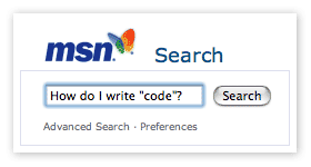 Today marked the launch of Microsoft’s vaunted new MSN Search site. The new front-page design is so clean you could eat off it. With such a simple, spartan layout, you’d think the code would be museum-quality as well.
I am not one to bring out the firing squad for minor validation errors, but the very first line of MSN’s search page is pure folly:
<html language=”Javascript”>
Yes. I’m not kidding. HTML language equals javascript. And English equals C++. It took the MSN Search team exactly 7 characters to mess this up. I guess that’s what $100 million buys you these days.
Here is an archive link in case things have changed by the time you read this article.
If there was any doubt whether or not most major sites have caught the standards bug yet, the answer is clearly no. We love our MSNs and our Googles and our Yahoos but none have yet to exhibit any real effort with regard to designing with standards. As I’ve said in previous posts, it is more important to judge web sites on what they offer versus whether or not they validate, but spectacles like this show just how far some companies are from even making a decent effort. I will reserve overall judgment on the new MSN search site until I see how well it works for me, but this just doesn’t look like a great start.
History says that regardless of user experience or code quality, the new MSN search site will be relatively “popular” once it’s baked into every corner of the Windows environment. So the question is, with this power to pervade, does it really even matter how good the code is?
Making Visited Links Radical
 Everyone does visited links differently. Jakob Neilson flunkies use the old school blue-and-purple combo to help show visitors where they’ve been. People with actual design taste use more palatable colors, or perhaps a font-weight variation instead. When Mike Industries launched, visited links differentiated themselves with a subtle grey background.
Although I liked the grey background implementation, it started to look more like a highlighter pen than anything else.
I decided to rethink the situation.
Since doing normal stuff is no fun, I decided to experiment with the :after pseudo class. What character could one insert after a link to indicate that the link had already been checked? Hmmm. How about a checkmark? The standard ISO character set gives us the mathematical “radical” sign (√) which looks remarkably like a hand sketched checkmark at small sizes. So this should be easy, right? You’d think something like this would do the trick:
a:visited:after {
	content: " √";
	font-size: 75%;
}
Nope. It turns out that prints the actual encoded character series for radical after each link. But by using the unicode entity instead ( \221A ), the checkmark renders perfectly after each visited link:
a:visited:after {
	content: " \221A";
	content: "\00A0\221A";
	font-size: 75%;
}
* Thanks to Jens Meiert for improving this technique as illustrated above by using a non-breaking space before the radical, instead of a regular space.
I am not so naive to think this has never been done before, but I certainly do like the effect. Sure, the :after pseudo class isn’t supported in PC IE, but at least it degrades silently in feature-challenged browsers.