Old Habits Die Easy
I’ve been using Yahoo Finance to keep tabs on my stocks for as long as I can remember. Ten years maybe? It’s a simple, fast-loading page which lists all of your stocks and any news associated with them. It’s perfect for my simple needs. But after Yahoo’s redesign a week or so ago, Yahoo Finance has been pissing me off. I know this may seem like a minor thing, but Yahoo is now forcing users to log in every 24 hours. For someone who uses two or three computers (or even one computer, really), this is a major pain.
I went to my Account Settings page on Yahoo to see if perhaps a preference got flipped, and to my delight I saw a panel which let me set the frequency of login prompts. Great! Upon visiting the panel, however, this is what I saw:
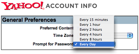
What a useless set of options! Every 15 minutes? Who the hell would choose that? Who would want any of those options? Why not have one for “every click” as well? You could call it the MySpace Setting.
Anyway, this is becoming a real nuisance so I’m going to kill my Yahoo Finance habit and find another site to track stocks on ASAP. Does anyone have any suggestions? Google Finance maybe? What do you use?
Back from Syndicate and IMC 2006
Two conferences, two vastly different crowds of people, and only two people I knew at both events combined. That’s the one sentence summary of my five days in New York and Las Vegas last week. It was a fun week, and definitely a personal highlight sitting next to Roger Black on stage, but I couldn’t help but notice how dissimilar the situations of the attendees at both conferences were.
On the one hand, there was the Syndicate crowd — a group of people pretty well ahead of the curve on the technology side, but well behind on the business side. The types of people who preach giving up all control of your content and basically letting any business issues just work themselves out. “RSS” was mentioned hundreds of times. “Web 2.0” almost as often. The focus here seemed to be — not surprisingly — on syndication, but there was very little talk about business models, products, creativity, or really anything outside the scope of “delivering information”. There were a few interesting exceptions which rounded the event out a bit, but that was the gist of things.
On the other hand, there was the Interactive Media Conference crowd — a group of people squarely on the other side of the equation. People working at traditionally profitable businesses (mainly newspapers) whose companies are quite obviously threatened by many of the concepts discussed at the Syndicate conference as well as plenty of other emerging forces. There were a number of visionaries there doing great things at their respective organizations, but this conference was all about established media.
So what was the more fun conference? For me it was the second, by quite a bit. For all the time I spend researching, using, and sometimes creating technology, I just don’t like talking or hearing about it when it’s not coupled with interesting, tangible products. I don’t want to hear about RSS. I want to hear about a product that is 1000 times better because of RSS. I don’t want to hear about Web 2.0. I want to hear about a service that, via its Web 2.0 approach to things, improves the lives of thousands of people.
I felt the Interactive Media Conference Crowd was much more interested how to use technology to improve their product, whereas the Syndicate crowd was looking for products with which to use their technology. Two honorable quests I suppose, but hey, how long can you really talk about RSS? For me, it’s about an hour until I eventually fall asleep.
Both talks went very well. Everyone on the Syndicate panel was mostly of like mind until we closed the session with a cursory discussion about full-text vs. excerpts in feeds. I’m an excerpt guy for now until certain rights, monetization, and content theft issues work themselves out, and someone else on the panel was for full-text. Judging from the reaction of the crowd afterwards, the world seems equally undecided. The full-text vs. excerpt debate is one that deserves its own blog entry — and will probably get one — but for now, my opinion is that people should do whatever makes the most business sense for them. At least one person at the conference mistakenly thought I meant that full-text feeds were evil and no one should use them. I can only attribute that to a bit of what I will now call The Jason Fried Effect (anybody want to do a Wikipedia entry on that?) — that is, when confident words are mistaken for unconditional advice.
The Interactive Media Conference panel was more interesting and touched on subjects ranging from typography on the web, to redesign strategies, to new distribution methods, to branding, to inverted pyramids. I was thrilled that Roger loved Newsvine and so did many others at the conference. That day I also learned that Forbes Magazine gave Newsvine their “Best of the Web” designation for user generated news sites. I don’t mention every time we get an award or recognition somewhere and I don’t spend any time entering us into competitions, but it’s always gratifying seeing the company get a step closer to the mainstream.
All in all, it was an interesting week, but I’m glad to be back in the office working on Newsvine. We’re launching some great new things in a couple of days.
Blackberry 8700g: The Dreaded Sidegrade
 Yesterday, I went out and bought a brand-new Blackberry 8700g at my local T-Mobile store. I’ve been using a Treo 600 for more than two years now and I just couldn’t resist New Phone Fever for any longer.
I had skipped the Treo 650 because frankly, it didn’t seem much better than the 600, and I was planning on going straight to the Treo 700 until Palm pulled two unfortunate moves on me:
- They released the Treo 700W a few months ago and it runs on WindowsMobile, leaving me only with tantalizing reports of a “Treo 700P” which would come out some time in the future and run on Palm’s OS. Such a painful wait this would be.
- When the Treo 700P was finally announced a few weeks ago, it was revealed that it would only run on Sprint and Verizon for the time being, again with the excruciating announcement that a GSM (T-Mobile) version was “in the works”.
Given that I didn’t feel like waiting who-knows-how-long for a GSM Treo 700P, I had a few options:
- Switch to Sprint and get the Treo. I’ve used Sprint before and they were nice enough to send me free stuff through their Ambassador Program so I don’t have any problem with this, but I have a few months left on my T-Mobile contract and I’m not exactly dying to leave T-Mobile anyway since they are quite good.
- Wait an indeterminate amount of time for Nokia’s E70… and given my lack of love for their N70, have no guarantee I’ll actually like it.
- Extend my contract with T-Mobile and pick up a shiny new Blackberry 8700g — a phone which has gotten pretty good reviews.
I’d been wanting to try a Blackberry for awhile since just as many people swear by them as swear by Treos, so I chose option #3.
After playing with this thing for about a day, I am convinced it falls into the category of a dreaded “sidegrade”. That is, a device which is an upgrade in some regards and a downgrade in others. For this reason, I may not keep it past the 14 day trial period. For those of you thinking about getting a Blackberry 8700g, here are the positives and the negatives (at least compared to a Treo):
Read more…
Coming To A Town Near You… Maybe.
 I don’t post too often about upcoming speaking gigs because I assume most readers don’t care, but since I have a few coming up, here’s a quick combined rundown. If you’re in town for any of these and want to talk a little shop, let me know:
Syndicate Conference – New York City
May 16
Keynote Panel: Grokking the Big Picture: An interview about how syndication is altering the worlds of media, publishing, and marketing.
Speaking with Eric Elia of Brightcove, David Geller of WhatCounts, and Dave Sifry of Technorati.
Interactive Media Conference 2006 – Las Vegas
May 18
Panel: If You Could Build Your Website from Scratch… What Would You Do Differently?
Speaking with Roger Black of Roger Black Studio (OMFG!), Darin Brown of Avenue A/Razorfish, and Lincoln Millstein of Hearst.
WebVisions – Portland
July 21
Session: Designing for Community Interaction.
WebVisions – Portland
July 21
Panel: Design panel.
Speaking with D. Keith Robinson of BlueFlavor, Dan Cederholm of SimpleBits, and Bryan Veloso of FaceBook/Avalonstar.
You Go, Norelco!
 This is probably the funniest product introduction site I’ve ever seen. It’s very well done and whatever agency created it for Philips Norelco should take a bow. Philips Norelco should also take a bow for having the guts to actually run it.
Warning: If you work within earshot of easily offended people, you might want to put on headphones.
It’s the perfect type of campaign for a potentially awkward product like this, and it’s pretty much by definition not offensive to a single person in their target audience.
Anyway, I’m just doing my part to keep this viral. It’s pretty hilarious. Make sure to hit up all the options in the main menu when the intro is over.
Are there many other recent examples of well-done, agency-created viral Flash campaigns? I feel like the memorable ones don’t come around often enough.
Welcome To BotSpace
Another day, another MySpace post. I don’t mean to keep picking on the wildly successful social networking site, but just now, I saw a banner ad which really made me wonder what’s going on over there.
Five minutes ago, at the top of my MySpace profile page, I noticed a large ad for a site called “MySpaceBot.com”. The impressive collection of testimonials fading in and out across the bottom of the ad piqued my interest. A screenshot is below:
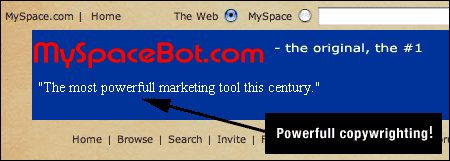
Whoa! I know this century is only six years old so far, but “the most powerfull [sic] marketing tool this century”? I had to have a look. Interestingly, the banner led to a site called “Friendbot.com”. Friendbot sells a product that — get this — specifically evades MySpace’s security procedures and performs all sorts of automated actions around the site. Here’s a sample of what evil Friendbot can do:
- Evades CAPTCHAS put in place by MySpace to curb spam
- Imports entire friend lists from anyone inside of MySpace
- Sends automated friend requests that appear to be human-generated
- All sorts of other evil bottish things
Here’s an interesting line from their FAQ:
Will I be banned from MySpace.com for using this program?
No you will not. But if by some miracle you manage to get banned, do not come blame us.


This whole Friendbot thing was starting to seem weird to me, so I dug a little deeper.
IE7 and Search Defaults: Not a Whineable Offense
I can’t believe the amount of chatter around the web today about Microsoft’s plans to include MSN search as the default search option in IE7. What exactly about this is surprising? And what exactly about it is wrong?
I am the last person on earth to give Redmond free passes for anything but this has been coming for years, and it’s perfectly ok in my book. Why is it ok?
- The more incentive Microsoft has to get IE7 proliferated into the population asap (preferably through auto-update), the better off the web development world, and by extension, the internet-using population will be.
- If Google was so concerned about this, why haven’t they used a few hundred million dollars of their war chest over the past year or two to help turbocharge the relatively blasé Firefox adoption rates we’ve seen lately? Google has always said they don’t need to make their own web browser, and they are right… but they *do* perhaps need to make someone else’s irrelevant.
- This is not much different than Microsoft’s decision to make everyone’s default start page “MSN.com” when it released Internet Explorer. If I’m not mistaken, out of all the things Microsoft was judged to be guilty of by the DOJ, that wasn’t one of them. I could be wrong about this, but I just don’t remember that being part of the verdict.
- OEMs can change the search default to whatever provider they’d like, and after that, consumers can change it again themselves (although many, of course never do… see: MSN.com’s 1 trillion daily users).
I suppose I understand why Google is throwing such a huge stink about this, because hey, why not? But in the end, I don’t think it’s anything that should be subject to government intervention. We all hate it when one company dominates any particular sector of business, and in the technology world, that company has usually been Microsoft. But it’s entirely possible that that company is now Google, and although we all love them, competition is almost always a good thing.
ABC Full Episode Streaming is Live… and it’s Spectacular
 Seinfeld fans will note the Teri Hatcher reference in the title of this post, but I just tried out ABC’s full-episode streaming video service which launched a few minutes ago (around 2am this morning), and it is indeed quite nice.
Lost, Desperate Housewives, Alias, and Commander in Chief. They are all available online now if you live in the U.S. — free of charge. This isn’t some B-reel lineup of shows starving for attention. These are ABC’s most popular programs, and now thanks to Disney Brass, the ABC team in Burbank, and the Disney Internet Group in both Seattle and North Hollywood, they are viewable on any computer with a broadband connection. No more PVR-induced BitTorrenting for me… at least with ABC shows.
I have a special regard for this product because it was the last project I worked on before leaving Disney to start Newsvine. My work was in the proof-of-concept phase and the final product doesn’t share a single line of code or element of design, but I still feel an affinity for what has been accomplished here. I think it’s really, really great.
Some items of importance:
- This service is fully cross-browser and cross-platform. No Internet Explorer/Windows Media mess to worry about. I’m so glad Flash video won out in the end, and although Steve Jobs had nothing to do with it, I’m sure he’s happy that these shows look and work great on Macs.
- This is perhaps the nicest looking Flash video I’ve ever seen. Not only are the video dimensions nice and large, but the picture is extremely clear and not choppy at all. You can tell a lot of work went into the encoding and delivery process. It’s also interesting to note that this is 400k and 700k Flash streaming and not progressive download. Progressive download has been a lot more common than streaming in the past and it’s nice to see such a great example of true broadband Flash streaming in action.
- As great as this service is from a design and engineering standpoint, what’s been accomplished here from a licensing standpoint is just as significant. Disney has wanted to stream television shows for several years now. I remember working on early prototypes a few years ago, but the problem back then was that internet rights had never been negotiated into the deals of the network’s most popular shows. This wasn’t specific to ABC but to all major networks including NBC, Fox, and CBS. Most people think that when a show like Desperate Housewives airs on ABC, the network has full ownership of it. That is not the case. They generally have rights to do certain things with it (viz. air it on TV, sell it on DVD, etc), but only recently have networks begun including internet distribution rights in these deals. It looks like we’re finally starting to see the fruits of these new licensing terms, and it’s a great great thing.
- My only complaint here is the lack of ability to pop the video full screen. I remember talking to Macromedia about this awhile back but can’t remember what their answer was with regards to whether or not they’d ever be able to build this functionality into the Flash plug-in.
- Actually, I have one other complaint and that is that the video is not available internationally, but hey, you have to crawl before you can walk.
So head on over to ABC.com and check this thing out for yourself. I’m sure it’s just the beginning of a lot more video-related initiatives to come at Disney. Big ups to everyone over there and to all the peeps in the Seattle office!
One more thing: I believe this is officially a “trial service” which will run until June 30th. Hopefully it will do well and continue on long after that.
MySpace: Unstoppable Force or Unnecessary Click Factory?
So I just read the big article about MySpace in today’s New York Times and it got me thinking a lot about growth, monetization, and user experience. People always talk so much about how many pages MySpace serves up and how that represents such dramatic growth.
After playing with the thing for a few weeks and writing a hugely ridiculous article on customizing it, one thing has really stuck out to me: there are a tremendous amount of extraneous page views being generated at that place. It’s a factory of unnecessary clicks. And so when one would view MySpace’s current page view trends on Alexa, one would see this:
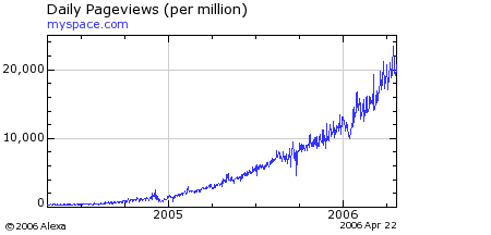
Here’s a sobering thought: If the operators of MySpace cleaned up the site and followed modern interface and web application principles tomorrow, here’s what the graph would look like:
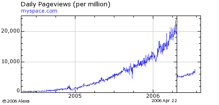
(Editor’s Note: I originally fat-fingered the first graph above when uploading it and used the Reach graph by mistake. Fixed. Both graphs show the exact same curve, however. Thanks to Owen Thomas of Business 2.0 for the heads-up.)
Read more…
Hacking A More Tasteful MySpace
"line-height: 1px" to "line-height: auto" in the body section of the CSS.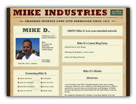 A guide to creating a more tasteful MySpace layout. Sample images and CSS are included at the bottom. End product: myspace.com/mikeindustriesThe social phenomenon that is MySpace is one I don’t fully understand, and yet, one I must fully respect. In fact, with over 50 million unique users, it is something everybody must respect. Any website which rolls up that amount of usership is doing something very, very right, and no matter what your thoughts on it as a vehicle for your own expression are, you must give it its full due for what it is to seemingly everyone else.
Several weeks ago, I finally signed up for an account, and within seconds I was instantly put-off by what had been created for me: a hastily-designed “profile page” with uninspired colors, misaligned tables, and a mish-mash of extraneous cruft and design elements which made this feel more like a halfway house than a “home”. Now, granted, I am a designer by trade so my tolerance for this stuff is orders of magnitude lower than most of the population, but clearly, this was not a place I even felt comfortable having my name on.
So with the default home page this underwhelming, what is a MySpacer to do? Customize, of course. One of MySpace’s greatest features is its ability to let you skin your own home page. Unfortunately, 99% of the customizations I’ve seen are chalkboard-screechingly awful, but what could a MySpace home page look like if some actual design thought went into it? That is the question I sought to answer.
But first — as Keith Robinson asked me when I first showed him what I was doing — “Ummm, why?” The answer is twofold. First, I love a design challenge. Second, we’ve been building a lot of new social components into Newsvine over the past several weeks and I wanted a good reference point for what is already done well online and what could be improved.
So without further ado, on with the surgery…
Read more…