 So I have this friend named Lavina who occasionally sends me e-mails and instant messages set in Comic Sans. I have told her repeatedly that this font has been officially banned, but she “just likes it” and continues to use it in various pieces of correspondence… even if it is just to piss me off.
So that got me thinking, should a website allow you to explicitly set the typeface of what you’re reading? Most sites set the typeface for you. My site gives you several choices derived from what I find to be very readable faces: Lucida Grande, Verdana, Helvetica, etc. But what about the edge case that just really loves Comic Sans? Should I throw Comic Sans in my dropdown menu on the right side of this site? Clearly not, unless I want to be publicly ridiculed at work.
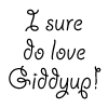
What I decided to try instead was adding a custom font field to the Readability section on the right side of this site. Click the “Or, specify your own…” link and type in any font you have installed on your system. Then, hit the “Set” button and voila! Mike Industries will reluctantly render in whatever twisted typeface you happen to think of that day. Even Comic Sans. Or worse yet, Giddyup (see picture above). The only downside is that you need to type the font name in exactly as your system labels it. So for instance, on the Mac, “ComicSansMS” works but “Comic Sans” does not. If you have a particular font you’d like to specify, just try a few variations of its name, with and without spaces, and you’ll get it after a few tries. If you don’t get it, the site will just render in whatever your default font is.
One thing I’d really like to be able to do with this is have a dropdown menu with all the fonts a user has installed instead of making people type a font name in. Does anybody have any idea if this is possible? My suspicion is that if it is, it may require writing something OS-specific… bad.
So for now, please enjoy the Custom Font Selector, and let me know if you have any ideas to improve it. I feel like this functionality is best suited for OS X users right now because we get to view true anti-aliased Postscript fonts in our browsers, but as mentioned with regard to Comic Sans, Windows users can “benefit” too.
 I love Movable Type. I really do. But there are two things about it which really chap my hide. The first is that it doesn’t offer dynamic page serving, so I must recompile my entire site after making a change. I can live with this problem as recompiling is just a question of hitting a button and waiting awhile.
 Information overload. It’s the next big issue in publishing, and technology in general. The day you have 400 e-mails in your inbox, 900 new items in your RSS aggregator, and 8 Instant Messenger windows on your screen will come. For some people, it’s already here.
 So what’s up with the little grey button at the bottom of this site? It is my official Invalidation Badge. It’s mere presence on every page of this site renders my entire domain XHTML 1.0 Non-Compliant. Invalid. Erroneous. Whatever you want to call it. Here are the various crimes this one line of code commits:
 When it comes to designing public sites, I am a big fan of giving control to the user. The old school of web design told you to specify a page’s visual parameters in such exact terms that users couldn’t really do anything to adjust it. This was mostly the by-product of inconsistent browsers and heavy-handed design techniques. Although we haven’t gotten completely away from browser issues yet, we now have stylesheets with which to create entire design motifs.
 So the other day,
  Paper selection can be as easy or as difficult as you want it to be. For a standard print job, you know your weights, your colors, and your “go-to” paper brand so it’s relatively simple. But what about when you really want to knock someone’s socks off?
 When you’re a kid, you are spoiled by all of the people in your life who want to tell you stories. Your parents, your babysitters, your grandparents, your teachers… everyone in your life is just dying to entertain and enlighten you. Whether it be fictional fairy tales or true life experiences, you are surrounded by narratives during your formative years.