All Olympic Logos, Ordered By Quality
AIGA just published a fantastic rundown of all Olympic logos, as graded by Milton Glaser. Glaser is a legend, having created some of the most iconic design work of the 20th century, including the I ❤️ NY logo and the fantastic poster for Bob Dylan’s Greatest Hits.
Logos, however, are a subjective endeavor, and one man’s trash is another man’s treasure. In other words, there is little objective truth in logo design… only a preponderance of opinions and feelings. It is possible to objectively grade a logo’s craftsmanship by looking for transgressions in things like alignment and stroke width, but in terms of how a mark makes you feel, beauty is much more personal.
With that in mind, there were some things in Glaser’s grading that I agree with and some that I disagree (even strongly) with, and thus, I decided to re-rank them according to a few criteria:
- Craftsmanship: How well is the logo made. You’d think more modern marks would have the advantage here, given how design tools have advanced, but that turns out to not always be the case.
- Timelessness: Newer marks have obviously experienced less patina throughout the years, but I try to correct for this in the grading. One could argue that for an ephemeral event like the Olympics, timelessness doesn’t matter, but as designers we should always aim for it when we can.
- Typography: Type in general is not strong across most of these marks. There are some notable exceptions though.
- Overall impression: This is the most important part of the grade as it is the true indicator of a logo’s effectiveness. It is also, however, the most subjective.
With those criteria in mind, here is my re-ranked list, in order of worst to best. Since I’ve ordered it this way, instead of by year, there is also a lot more snark at the beginning, but bear with me. Additionally, it’s important to remember that in practice, logos often go through many layers of politicking, compromising, and otherwise watering-down of what may have once been something much more impressive. Sometimes it is the designer’s fault that something didn’t turn out great and sometimes it is external factors entirely.
Evaluating Employees in Product Design & Development Roles
Results. Metrics. Impact.
When deciding how to evaluate employees, these are often the things companies land on. It makes sense on its face. If a company’s goal is to, say, grow its customer base from X to Y in 12 months, what better way to align employees to that objective than to try and directly measure their contribution towards it? You worked on Project A and it singlehandedly got the company 20% closer to its goal? Congrats, you are judged to be a successful employee and you will likely enjoy everything that goes along with that.
But what if you worked on Project B — not even by choice but because you were assigned it — and it ended up being a failure? Your results were terrible, you didn’t move metrics, and your project had no impact. Then what?
Welcome to the controversial world of employee evaluation in product design & development.
Three Years in San Francisco
I had only been to San Francisco on random business trips and a couple of times with my family when I was very young. It seemed like a place I might live if I had never found Seattle.
It was go-time now though.
A drawn-out dance of interviews over the course of six months resulted in an offer to move down to the City and join Twitter to lead its Design team. My wife and I had never considered leaving Seattle before, but the opportunity to join Doug, Dick, and a few other people I knew designing a product that reached hundreds of millions of people was exactly the sort of thing you drop everything for.
“We can always hightail it back up here the second things go to hell.”
Reboot!
It’s been 7 years since I last redesigned Mike Industries, and it feels like even longer. The old design still holds up considering the largely desktop audience it was designed for, but since it’s May 1st Reboot Day, and I’ve had some time on my hands since leaving Twitter, I thought I’d release a shiny new version today.
Say hello to Mike Industries, Version 3.
What is wrong with the old Version 2, you ask? Well:
- It’s not responsive.
- It ingests and displays all of my Tweets and saved Tumblr links, which seems like overkill now.
- Because of all the peripheral stuff being displayed, WordPress isn’t able to assemble the page very quickly and browsers are also slow to render it.
- It doesn’t take advantage of any of the great HTML, CSS, and related advancements that have developed in the last few years.
- It was just time for a change, and I felt like getting back into pixels and code again.
While I’ve spent the last few months putting this together, it only occupied a day or two of time per week. Lots of fits and starts, including periods of frustration and reflection where I’ve asked myself “Why am I not just moving everything to Medium?”
Faves from The Pixel Awards
Pardon the mess around here as I move around some furniture and get ready to start publishing on Mike Industries again, but I wanted to share a handful of sites, apps, and interactive projects that stuck out to me as I finished judging The Pixel Awards today. These projects were from about 20 different categories ranging from Fashion to Experimental to Student Work, so they may all be great at very different things. I found them all delightful and a reminder of the great work going on in our industry. Was also surprised at how many hamburger menus I saw across much of the field, but that’s a topic for another day!
Thank you to the Pixel Awards for having me as a judge. These were my faves:
On Teleportation

I remember the first time I heard of a real product described as a teleportation machine. It was only a couple of years ago, actually. A founder of a popular photo sharing network described the ultimate purpose of his product as a means to teleport anywhere around the world. I remember reading that sentence and thinking “this is a really great product, but it doesn’t actually make me feel like that.”
Maybe it was the fact that individual photos only provide a split-second glance into someone’s world. Maybe it was that filtering, cropping, and opportunistic life-editing sometimes creates a veneer that doesn’t feel like real life. Most of all though, I think it’s because the experience wasn’t live.
The difference between something typed or captured minutes before you see it and something you experience simultaneously — cooperatively — with the person doing the broadcasting is transformative.
We Are Expanding the Design Team at Twitter
First things first: we are expanding the Design Studio at Twitter! A few days ago, I opened 8 new positions, which can be viewed here. If you have fantastic design, production, or research chops and you love Twitter, we’d love to talk to you.
Secondly, below is a not-so-brief update on how things have gone in my first month here.
https://twitter.com/mikeindustries/status/273953643680645121
The City
So far, San Francisco has outperformed my already high expectations. It’s an even more enjoyable city to live in than I imagined. The only thing that’s been a bummer is housing selection and pricing. For a 1300 square foot place, I am paying about 2.5-3x what the same place would go for in a nice neighborhood in Seattle; and Seattle isn’t exactly cheap either. I thought I would just have to overpay a little down here in order to get into a decent place, but the reality is that the city is littered with apartments as expensive as $6000 a month that you wouldn’t even want to live in. Thankfully, we got a place on a great block in Noe Valley so at least the neighborhood is perfect for us, but man is it pricey for what it is.
The food in San Francisco has been predictably terrific, and I will just come out and say it: the coffee is better than it is in Seattle. Between Ritual, Philz, Martha’s, and Blue Bottle, just about the only place in Seattle which can compete is Uptown Espresso. That has surprised me a bit. It’s also nice being this close to In-N-Out Burger, which helps (almost) make up for the lack of Skillet down here.
People keep telling me the weather is supposed to turn to shit any day now, but it’s the middle of December and it’s been sunny and mid 60s for most of my time here. I could really get used to this, although I’m sure the summers won’t be nearly as nice as they are in Seattle. I still plan to fly up every couple of weeks during the summer and throughout Husky football season.
I’m Joining Twitter
Over five years and exactly 10,000 tweets ago, when I first tiptoed into the lonely textfield that was Twitter’s “What Are You Doing?” box, I typed the following:
Current thoughts: This could get extremely noisy.
— Mike Davidson (@mikeindustries) December 17, 2006
It was a reaction to many things, good and bad. The ease of publishing messages. The prevalence of insignificant breakfast trivia in the public feed. The lack of any filtering controls. The growing number of my friends becoming instantly addicted to it.
Since then, Twitter has gone from quirky little internet CB radio to exploding social upstart to what I now consider one of the most important information platforms in the world. At its best, Twitter is an international treasure.
As both a user and an information designer, I’ve grown to love Twitter more each year, and so it is with great excitement that I’m happy to announce I have agreed to move down to San Francisco and Join The Flock™ in the newly created position of Vice President, Design.
A Fond Farewell to Newsvine, NBC, and Seattle
The last time I wrote one of these posts, it was 7 years ago and I was getting ready to leave a great job at ESPN to start my own media company, Newsvine.
The concept was simple: license the same content that anchored the majority of most major news sites — specifically the Associated Press newswire — and marry it with original contributions from citizens around the world, all in an editorless environment controlled entirely by the community. Mainstream journalism and citizen journalism would stand shoulder to shoulder on the same stage for the very first time.
It was only the second startup I had been a part of, but the first I had founded and the first I had run as CEO. Together with my four colleagues, Lance Anderson, Mark Budos, Calvin Tang, and Josh Yockey (in alphabetical order) we set off to change journalism and show how lean a news organization could be run if given the right automation, the right strategy, and the right amount of support and passion from the community.
After two quick and productive meetings with Mike Slade and Nick Hanauer of Second Avenue Partners, we closed our Series A, left our jobs, and jumped off the cliff together.
The Deterioration of Hi-Ball Packaging Design
I’ve been a huge fan of Hi-Ball caffeinated mineral water for a few years now. It’s a crisp, light, sweetener-free way to get a little bit of caffeine in your system on a hot day. In addition to the virtues of the product itself, I was initially drawn to this beverage because of its beautiful packaging. Below is what the the bottle looked like when it debuted a few years ago:
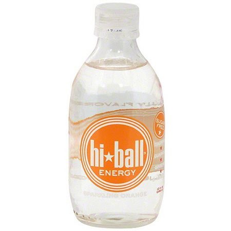
A compact, easily resealable 10 ounce bottle with a very reasonable 80mg of caffeine in it.
Then, a couple of years ago, the folks at Hi-Ball decided to change up the bottle design and go with a taller, skinnier variety:
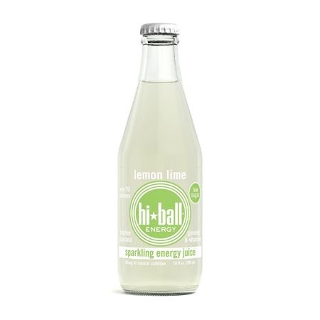
I didn’t have a huge problem with this change, although I was unclear how it qualified as an improvement. If anything, it was worse than the original since it’s much harder to reseal a glass bottle with a metal cap than with a plastic cap. Still, at least it was in that nice, convenient, 10 ounce size with only 80 mg of caffeine.
Fast forward to 2012 though, and Hi-Ball has completely dumped its beautiful glass bottles in favor of gigantic 16 ounce cans. These things are monsters:
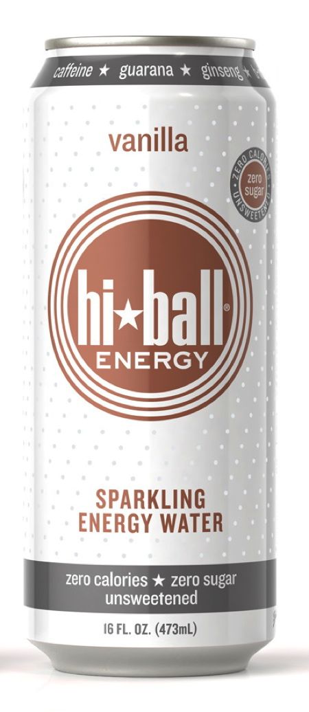
Furthermore, the cans have that gimmicky Coors Light feature where parts of it turn blue when it’s cold as the Rockies. You know how else I can tell a beverage is cold enough for me to drink? Because I keep it in my refrigerator.
Hi-Ball is pitching this change as better for its customers since the can holds more beverage, but that’s actually my least favorite part of the entire redesign. I don’t want 16 ounces of energy drink, and I definitely don’t want 160mg of caffeine. And you know what is really hard to reseal? An aluminum can.
People have suggested just drinking a portion of the beverage and then throwing away the rest — which is what I have been doing — but there’s just something unsatisfying about buying more than you want and then dumping the rest down the drain.
It seems clear to me that Hi-Ball is now trying to compete with the Red Bulls and Monster Energies of the world by offering their 16 ounce can, but even those companies offer smaller alternatives.
I find myself buying less and less Hi-Ball now that they’ve forced this super-size on everyone. I wonder if I’m alone or if others are abandoning ship as well.