All Olympic Logos, Ordered By Quality
AIGA just published a fantastic rundown of all Olympic logos, as graded by Milton Glaser. Glaser is a legend, having created some of the most iconic design work of the 20th century, including the I ❤️ NY logo and the fantastic poster for Bob Dylan’s Greatest Hits.
Logos, however, are a subjective endeavor, and one man’s trash is another man’s treasure. In other words, there is little objective truth in logo design… only a preponderance of opinions and feelings. It is possible to objectively grade a logo’s craftsmanship by looking for transgressions in things like alignment and stroke width, but in terms of how a mark makes you feel, beauty is much more personal.
With that in mind, there were some things in Glaser’s grading that I agree with and some that I disagree (even strongly) with, and thus, I decided to re-rank them according to a few criteria:
- Craftsmanship: How well is the logo made. You’d think more modern marks would have the advantage here, given how design tools have advanced, but that turns out to not always be the case.
- Timelessness: Newer marks have obviously experienced less patina throughout the years, but I try to correct for this in the grading. One could argue that for an ephemeral event like the Olympics, timelessness doesn’t matter, but as designers we should always aim for it when we can.
- Typography: Type in general is not strong across most of these marks. There are some notable exceptions though.
- Overall impression: This is the most important part of the grade as it is the true indicator of a logo’s effectiveness. It is also, however, the most subjective.
With those criteria in mind, here is my re-ranked list, in order of worst to best. Since I’ve ordered it this way, instead of by year, there is also a lot more snark at the beginning, but bear with me. Additionally, it’s important to remember that in practice, logos often go through many layers of politicking, compromising, and otherwise watering-down of what may have once been something much more impressive. Sometimes it is the designer’s fault that something didn’t turn out great and sometimes it is external factors entirely.
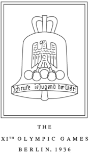
41. Berlin 1936 (Score: 5 out of 100)
Glaser score: 20 out of 100
Like almost everything else surrounding the 1936 Olympics, this logo is not something to be proud of. The Olympic rings are so misshapen that it’s easy to mistake them for something that bird is about to crap on. Not all marks from this time period looked this bad (as we’ll see further down the list), but this logo doesn’t even look German.
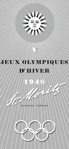
41. St. Moritz 1948 (Score: 5 out of 100)
Glaser score: 30 out of 100
Putting aside how unattractive this logo/poster/brochure is, what about it says Olympics or even Winter? There is a giant sun at the top, so that doesn’t help, and there are no references to sport other than the rings.
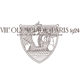
40. Paris 1924 (Score: 10 out of 100)
Glaser score: 20 out of 100
This was the very first Olympic logo so it’s tempting to give the designer a bit of a pass, but we can’t look past the legibility problems created by superimposing the type across the mark. The type itself is actually perfectly fine and period-appropriate and this logo would rank a little higher with a more thoughtful layout.
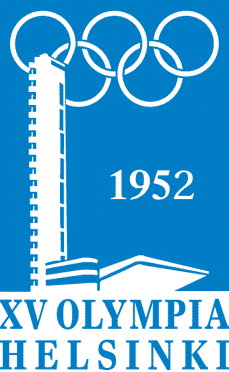
39. Helsinki 1952 (Score: 10 out of 100)
Glaser score: 40 out of 100
There’s nothing offensive or memorable about this logo. It’s the logo equivalent of plain vanilla ice cream out of a one-gallon tub.
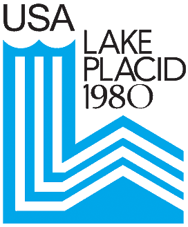
38. Lake Placid 1980 (Score: 10 out of 100)
Glaser score: 50 out of 100
Here is our first example of a nice concept muddled by very bad execution. The type is terribly inconsistent in both size and style. USA just larger than Lake Placid so as to appear as a mistake, while 1980 is just different enough of a typeface than the rest so as to also appear as a mistake. On top of everything else, the blue and white lines create spacing problems when they pivot.

37. Munich 1972 (Score: 10 out of 100)
Glaser score: 50 out of 100
This logo conveys no universally understandable meaning at all. It could be a logo for anything.
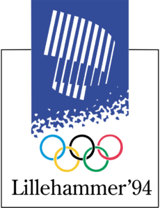
36. Lillehammer 1994 (Score: 10 out of 100)
Glaser score: 70 out of 100
Like the previous mark, this barely looks like an Olympic logo. Take away the rings and it could be a book cover for almost any series of books from the 1980s. And it’s from 1994.
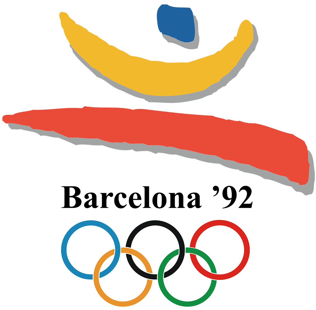
35. Barcelona 1992 (Score: 15 out of 100)
Glaser score: 85 out of 100
“Barcelona New Roman Bold” is perhaps where Glaser and I disagree the most. The type here is just a complete cop-out. It’s the equivalent of “redesigning” your logo these days by moving to Helvetica. While the general form of the mark above the type is good, it’s timelessness is ruined by the use of a drop shadow. Logos are like leather jackets: the more complicated they are, the more quickly they will go out of style. Keep it simple, kids.

34. London 1948 (Score: 15 out of 100)
Glaser score: 37 out of 100
The concept here is fine, showcasing the iconic buildings of the host city, but it’s muddled by poor execution. Note how the space inside the interlocking portions of the rings should be transparent but it’s not. Perhaps this is just an artifact of reproduction, but it’s hard to tell.
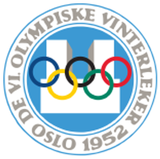
33. Oslo 1952 (Score: 18 out of 100)
Glaser score: 39 out of 100
Another fairly vanilla mark, although the type and use of color are clean and professional.

32. Albertville 1992 (Score: 18 out of 100)
Glaser score: 60 out of 100
I agree with Glaser here in that this logo just tries too hard for its own good. There is too much going on. Eliminate both sets of horizontal lines and this would be a better, simpler mark.
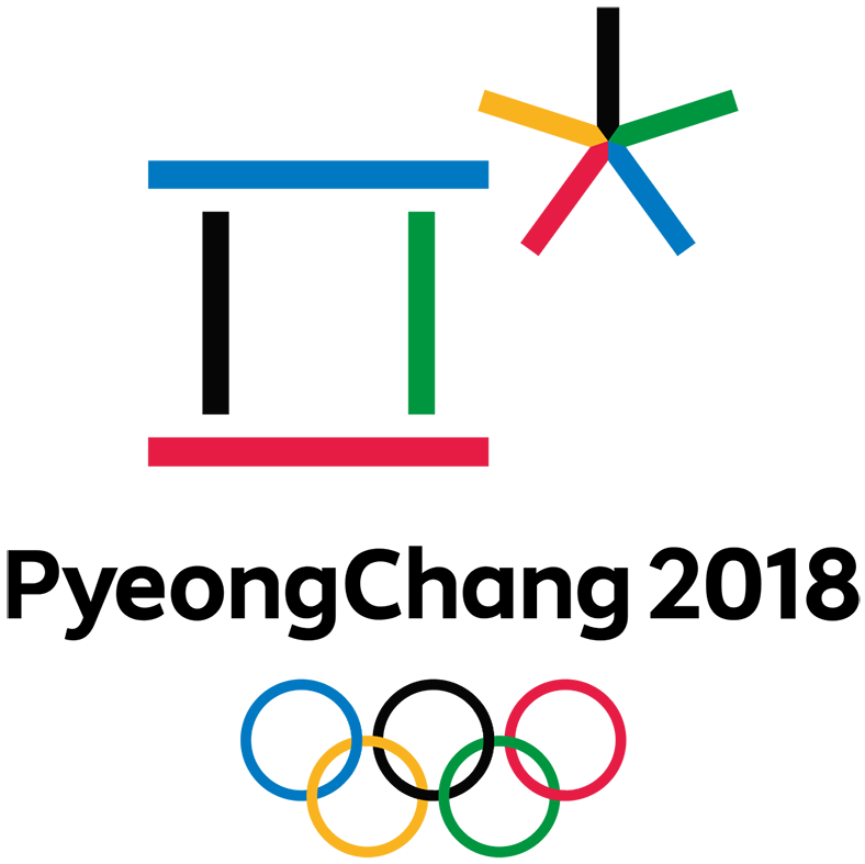
31. PyeongChang 2018 (Score: 20 out of 100)
Glaser score: 60 out of 100
As we move forward in time, we must grade logos more strictly, given how far design has advanced as a field in the last several decades. While not terrible, this mark falls into the category of Olympic logos that don’t feel as modern as the year in which they were designed. We have two years until this Olympics though, so maybe it will grow on me.
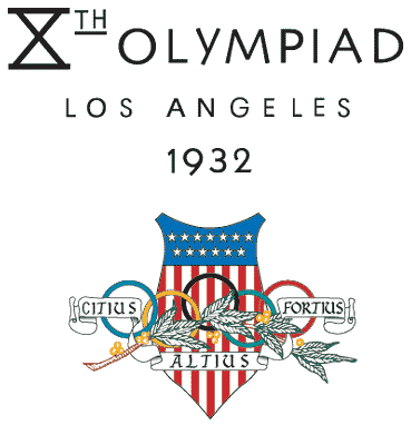
30. Los Angeles 1932 (Score: 25 out of 100)
Glaser score: 25 out of 100
The mark is a mess here, but the type above it is quite nice. With a little bit of surgery, this could have been a winner. Los Angeles is said to be chasing another Summer Olympics and it would be great for them to take another shot at this mark with a more modern esthetic.
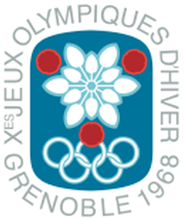
29. Grenoble 1968 (Score: 25 out of 100)
Glaser score: 60 out of 100
More vanilla ice cream. A decent looking seal, but unremarkable in almost every way.
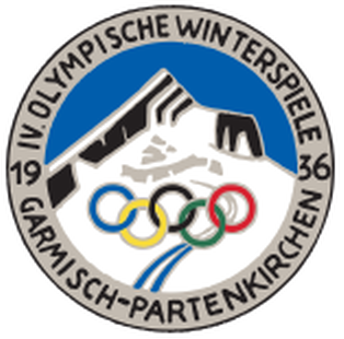
28. Garmisch-Partenkirchen 1936 (Score: 30 out of 100)
Glaser score: 40 out of 100
This is the point in the list where logos go from bad/unremarkable to decent. The type, the imagery, and the rings work well together here. Keep in mind, this was designed in 1936, the same year as the worst logo in this list.

27. Sapporo 1972 (Score: 35 out of 100)
Glaser score: 80 out of 100
Glaser likes this mark more than I do, perhaps because it piggybacks on his favorite one: the 1968 Tokyo logo. I think that by adding the snowflake and stacking all elements without enough whitespace, this logo does not approach the quality of its predecessor.
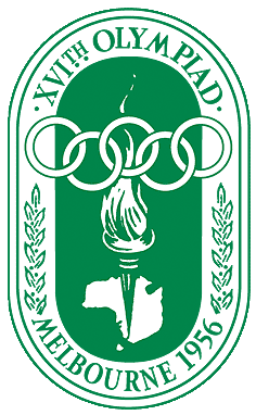
26. Melbourne 1956 (Score: 35 out of 100)
Glaser score: 35 out of 100
I can’t really defend what I like about this logo. It doesn’t rate particularly high for me in any one aspect, but it just hangs together well enough to be rated in the middle of the pack.
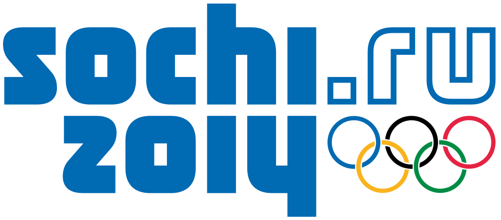
25. Sochi 2014 (Score: 35 out of 100)
Glaser score: 40 out of 100
The only pure typemark in this list, the type is actually pretty well done. The alignment of the “hi” and “14” is clever and gives the mark a nice center of gravity. That said, this logo conveys no meaning whatsoever. Its merit is purely graphical.
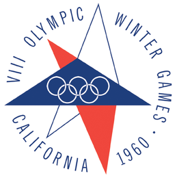
24. Squaw Valley 1960 (Score: 40 out of 100)
Glaser score: 80 out of 100
The origami-like aspect of this logo makes it a surprising choice for a North American Olympics, but it works. My only problem with this logo is the tightness of the rings instead the blue triangle. A little more whitespace and I’d probably move this further up the list.
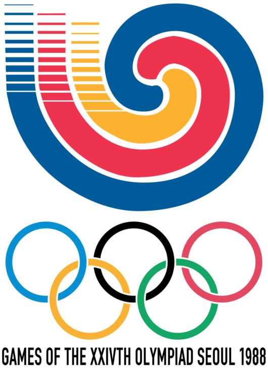
23. Seoul 1988 (Score: 40 out of 100)
Glaser score: 75 out of 100
This mark is bold and memorable but hamstrung by poor production quality. The fact that the curves on the waves are just barely imperfect make it impossible to tell if they are supposed to look hand-drawn or machine-rendered. You have to go with one or another (and frankly, either would have been fine).
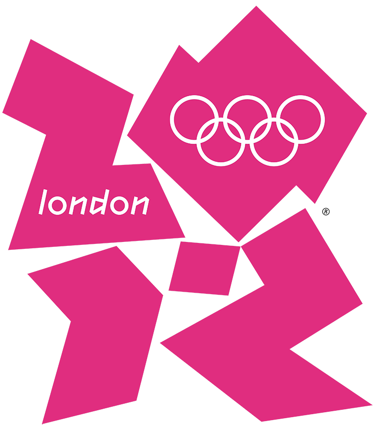
22. London 2012 (Score: 45 out of 100)
Glaser score: 80 out of 100
The logo everyone loves to hate! This logo’s redeeming quality is its originality. It’s not particularly pleasing to the eye on first glance, but it is memorable and not derivative of its predecessors. It will be interesting to see if this logo gets better or worse with time. I definitely like it more than when I first saw it.
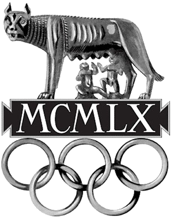
21. Rome 1960 (Score: 45 out of 100)
Glaser score: 80 out of 100
To anyone who doesn’t know this is the symbol of Rome, this logo is going to look a little bizarre… but it works. It’s Rome staring you in the face, gritting its teeth, and reminding you of the great city you are in. It’s hard to imagine a logo looking like this today, but this is a nice outlier in a century full of derivative marks.

20. Sarajevo 1984 (Score: 45 out of 100)
Glaser score: 60 out of 100
Crisp and clean, the Sarajevo mark doesn’t try too hard. It’s not super memorable, but it avoids the frivolous touches of many of its peers.
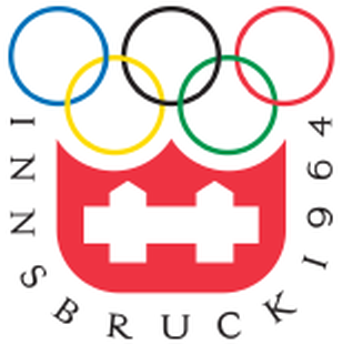
19. Innsbruck 1964 (Score: 50 out of 100)
Glaser score: 70 out of 100
The rings, the imagery, and the type all come together nicely here to form a clean mark. If you look closely, you can see a dead mouse.

18. Moscow 1980 (Score: 50 out of 100)
Glaser score: 40 out of 100
Decent concept with clean execution. Compare the correct spacing on the lines here with the problematic Lake Placid logo from the same year.
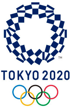
17. Tokyo 2020 (Score: 50 out of 100)
Glaser score: TBD
A plagiarism controversy caused the Tokyo Games to move on to option #2 and this is it. Graphically, it’s nice looking, but I’m not sure what meaning it conveys.
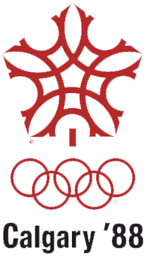
16. Calgary 1988 (Score: 50 out of 100)
Glaser score: 50 out of 100
The type here is weak but the mark is a nice assembly of rings, cropped into a pentagon (edit: and a maple leaf!).

15. Salt Lake City 2002 (Score: 60 out of 100)
Glaser score: 70 out of 100
The Salt Lake City logo probably has the biggest gap between mark and type quality, in my opinion. I love, love, love the mark, and I can’t stand the type. They just don’t work together. With different type, this could be one of best designs in this list.
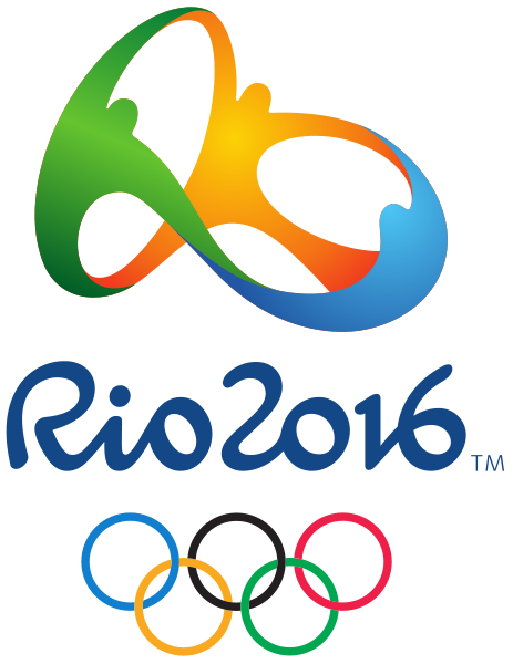
14. Rio 2016 (Score: 60 out of 100)
Glaser score: 85 out of 100
In contrast to the Salt Lake City logo, the mark and the type work really well together here. Unfortunately, I don’t think the “three people holding hands” thing is the strongest concept to begin with. Are they athletes? It doesn’t seem like it. Siamese triplet spectators? Maybe.
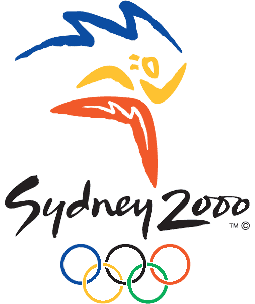
13. Sydney 2000 (Score: 65 out of 100)
Glaser score: 78 out of 100
Here is an example of a logo that works pretty well but may not age well. Something about it just seems very “temporary contemporary”. Also, it’s interesting that they picked rhythmic gymnastics as their flagship sport. The type works well with the mark here. (Edit: The shapes depicted here are a boomerang, a torch, and the Sydney Opera House.)
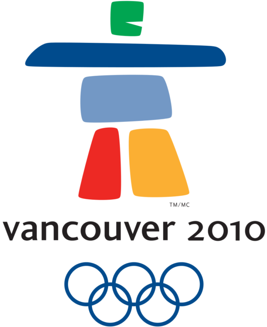
12. Vancouver 2010 (Score: 68 out of 100)
Glaser score: 70 out of 100
Another great mark with poor type pairing. The imagery here is a nod to native peoples of the Pacific Northwest, but the type is too modern to properly continue this theme.
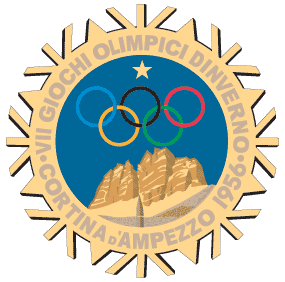
11. Cortina d’Ampezzo 1956 (Score: 70 out of 100)
Glaser score: 45 out of 100
Minus the frilly bits outside the ring itself, I find this logo quite pleasing. The mountain is beautifully illustrated and the gold tone combined with the deep blue sky puts us in a beautiful winter setting. The solo star at the top is just enough extra detail as well… any more elements and this mark’s beauty would start getting diluted.
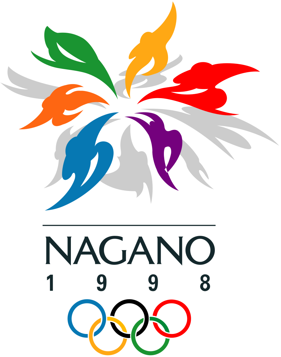
10. Nagano 1998 (Score: 73 out of 100)
Glaser score: 80 out of 100
This is the part of the list where the logos enter the “legitimately strong” category. Energetic imagery, bold colors, and complementary type, this logo is well put together.

9. Athens 2004 (Score: 75 out of 100)
Glaser score: 90 out of 100
A throwback to the original Olympics, this logo is simple and perfectly in keeping with the ethos of ancient Greece. Although the type is more modern than you would expect for this logo, it is understated enough to work. This is the first logo since 1960 (Rome) that actually looks hand-drawn, so it’s a nice break from 44 years of computer illustration.

8. Atlanta 1996 (Score: 75 out of 100)
Glaser score: 60 out of 100
The torch imagery is well-executed and doesn’t come off forced. This is a really nice bouquet of graphically disparate elements that come together to form something unique.

7. Beijing 2008 (Score: 80 out of 100)
Glaser score: 85 out of 100
The mark and the type work really well together here, using a Chinese calligraphic style that is a nod to the past but somehow modern enough for this era as well. If that’s a runner, he or she certainly seems happy, and above all else, this mark also just makes me feel happy.
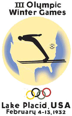
6. Lake Placid 1932 (Score: 80 out of 100)
Glaser score: 30 out of 100
This is the logo that I feel Glaser has underrated the most. The imagery is strong and you could imagine a modernization of this logo today looking fantastic. The ski jump is one of the most dramatic parts of the Winter Olympics and this illustration captures that drama nicely. It takes awhile to see that the backdrop is the United States, but I like this touch as well. Together with the classic type, the logo evokes many of the best posters from the early-to-middle 20th century and deserves much praise, especially considering it was designed way back in 1932.
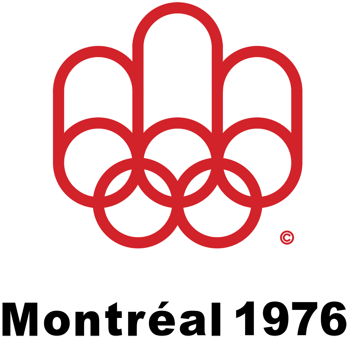
5. Montreal 1976 (Score: 85 out of 100)
Glaser score: 70 out of 100
Simple, clean, and not a wasted stroke. One of the purest designs in this list, Montreal holds up extremely well.
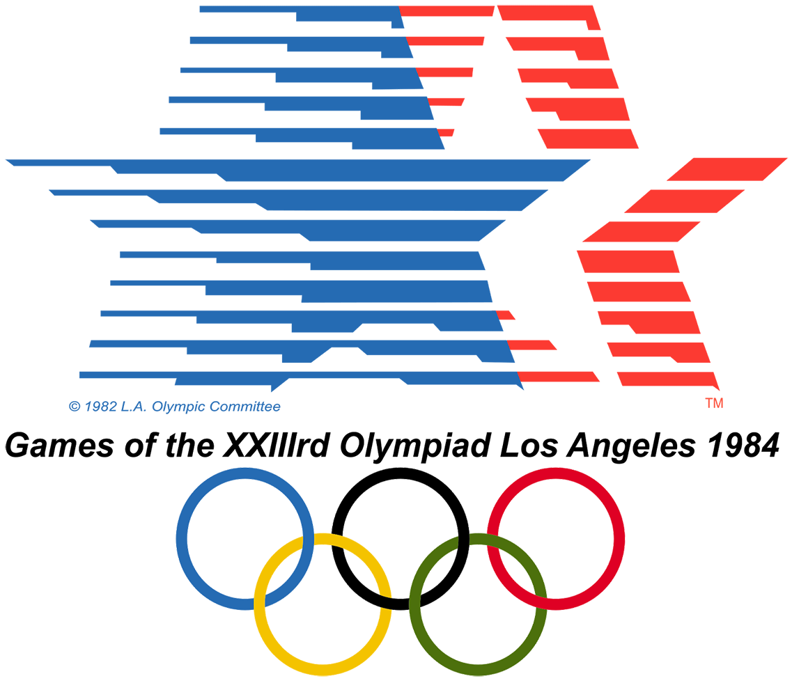
4. Los Angeles 1984 (Score: 87 out of 100)
Glaser score: 80 out of 100
I’ll admit I may be biased on this one since I lived in Los Angeles and went to the 1984 Olympics, but 30 years later, this logo has held up extremely well. It conveys speed, motion, and patriotism, with great use of whitespace and doesn’t at all look like it was “designed in the ’80s”. If this mark was used today, it would appear just as contemporary as it did when it was unveiled.
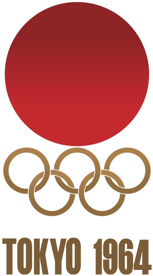
3. Tokyo 1964 (Score: 90 out of 100)
Glaser score: 92 out of 100
This is Glaser’s favorite. I like it, but it’s only 3rd on my list, mainly for its lack of creativity. It’s basically the Japanese flag, positioned a little too close to the rings beneath it. Thankfully, the Japanese flag is a beautiful thing, and the rest of the elements are understated enough to make the whole thing look great.
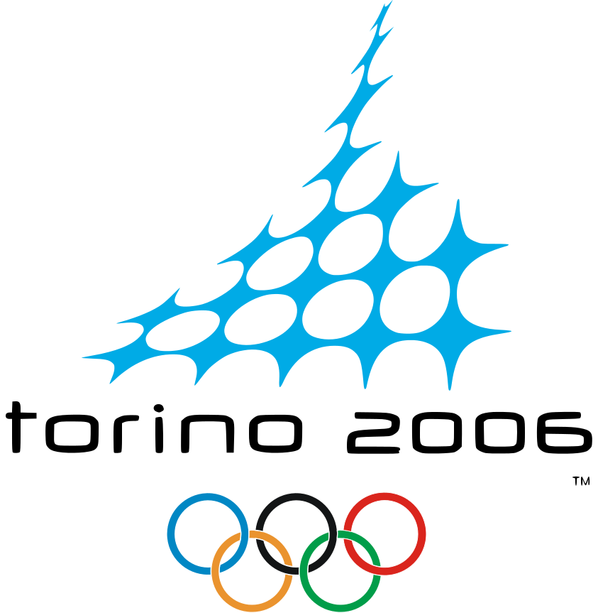
2. Torino 2006 (Score: 94 out of 100)
Glaser score: 40 out of 100
Torino is the Rodney Dangerfield of Olympic logos. It gets no respect! I find this logo original, modern, simple, and beautiful. The mark evokes speed, balance, flexibility, cold weather, snow, ice, and excitement, all in one shape. The type is simple and sleek. This is the best Winter Olympics logo ever designed, and it should age well.
1. Mexico 1968 (Score: 95 out of 100)
Glaser score: 80 out of 100
Number one overall on my list is Mexico 1968. To appreciate the quality of this logo, you really need to look at the entire system. The way the design language and typography developed for this Olympics took over the city in 1968 was just beautiful. From postage stamps, to statues, to parking signs, the system is cohesive and compelling, even almost 50 years later.
So there you have it: the best Olympic logos according to my unassailable subjective opinion. Feel free to add your own unassailable opinions in the comments. :)
(This post also available on Medium.)
Hi Mike,
I enjoyed reading your olympic logo ranking.
The Sydney Olympics logo uses of the shapes of Australian aborigine boomerang in combination with the sun and the profile of the Sydney Opera House to form the dancing figure. I thought it was a clever device that captures the playfulness of Australia, the location and the event, but as I am from Sydney I may be biased .
Simon: Aha, the Opera House. Makes sense! Thanks.
I am glad you explained more about Mexico. You’re right. It’s better in the context it was placed in.
Disagree with Los Angeles. It screams 80s to me.
Sochi was so close to great, if they just dropped the .ru and something that conveyed it was the winter Olympics.
All in all great list and as always I appreciate your perspective on design. Learned a lot from you over the years on that.
My favorite Olympics logo will always be this one for Boston 2024 https://pbs.twimg.com/media/B63oqa3IYAARUeI.png . I love it because 1) it’s an essentially Boston design, and 2) it reminds me that we were smart enough to say no.
OK. I really disagree with a few of these, but to each their own. The Barcelona ’92 icon is ICONIC. The Times New Roman was used to convey the “Latinness” of Barcelona and the red, yellow, and blue are primary colors so they relate to the ancientness of the Mediterranean.
Calgary ’88 represents a maple leaf and the logo also has hidden letter “C”s in it representing Calgary and Canada and there are even hidden cowboy boots on the end since Calgary is a western city. It’s actually quite ingenious but I agree with you on it using the wrong typeface.
Munich 1972 was designed by Otl Aicher the same guy who invented pictograms. It’s a sun of rays and it is iconic in my opinion and still timeless even today especially using the Univers font before it was even cool to use Univers.
I also really like LA 84 and Seoul 1998 which I both feel are energetic and timeless. Tokyo 1964 is simply the dot on the Japanese flag and lacks ingenuity. Mexico 1968 is really too complex and hard to discern in my opinion. It get the whole ancient Mexican art thing but it’s too complicated.
The logo for Lake Placid 1980 is for the bid, not for the games. The one for the Games themselves is awesome and one of my favs. The two “bowls” represent that it was the second time Lake Placid hosted (first in 1932) and the mountain shapes represent the Adirondacks and it even makes an “L” shape. Timeless stuff.
The official LP logo is at https://upload.wikimedia.org/wikipedia/en/thumb/9/99/1980_Winter_Olympics_logo.svg/747px-1980_Winter_Olympics_logo.svg.png
Cool read!
I personally believe that the Salt Lake 2002 logo is the best one of them all. It’s a snowflake, the desert, and mountains all at once. I also really like the Calgary ’88 logo.