Building a Better Conference Badge
I just got back from the Economics of Social Media conference put on by Rafat Ali, Staci Kramer, and the rest of the PaidContent crew and it was really an excellent event. One-day conferences are great because there’s no filler. There’s no scrambling to populate 50 panels with people who may or may not be the best choices to speak. There’s also no deciding which of 6 rooms you want to be in every hour.
One track. One room. All superstars. (Needless to say, I wasn’t a speaker.)
For Rafat’s first conference, they really knocked it out of the park. Not every panel was an A+ but there were no duds and they clearly had the right people on stage in most cases.
The only awful thing about EconSM though — as is the case with most conferences — was the design of the conference badges. While talking to Andy Sternberg of LAist, at one point I interrupted him and said:
“You know what super-complicated innovation would double the amount of socializing going on in this lobby? Double the size of the badges. I can’t see anyone’s name!”
Andy agreed.
… which got me thinking about something Kottke has penned about several times in the past: what should a badge really look like?
As an attempt to answer this question, I present the EconSM badge as reference and my newly proposed S.O.B. or “Socially Optimized Badge” as a proposal. An Illustrator file of the S.O.B. template is provided free of charge at the end for any conference organizers who want to use it.
The EconSM Badge (Typical of 99% of badges in the world)
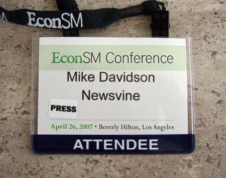
Crimes committed:
- Too small at 3 inches tall by 4 inches wide. Bump that puppy up to 4 by 6.
- First and last name on same line.
- Set in 25-ish point Arial: the worst font in the world and even more unreadable at that size and weight.
- Title of conference — the least important information on the badge — dominates the space.
- “ATTENDEE” is the boldest text on the badge. It’s not *that* important as speakers and attendees share 99% of the same privileges.
- Lanyard contains name of conference instead of being sold to a sponsor. No one cares what the lanyard looks like, so go ahead and sell it to Yahoo or something.
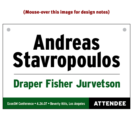
The S.O.B. or “Socially Optimized Badge”
The S.O.B. treats the conference badge like a highway sign, complete with a typeface modeled from U.S. highway signs: Interstate.
* Note: Contrary to popular belief, the actual typeface used on U.S. highway signs is FHWA Highway Gothic
Highway signs are designed to be read from as far away as possible and always present the most important information biggest and boldest. The S.O.B. allows you not only to minimize the awkward glances down while you’re talking to someone whose name you don’t remember, but also makes spotting people across the room a lot easier. The typical conference badge loses its readability at about 10 feet but from my own crack-testing, the S.O.B. appears readable from up to 30 feet away. Go ahead and try stepping away from your computer screen as far as possible and you’ll see the difference:
The Deliverables
As promised, here is the sample Illustrator file for the S.O.B. Use it with the knowledge that you are doing your part to bring people closer together at your conference. It really does make a difference. I’ve included the longest name I could think of (actually, Niall thought of it) so you shouldn’t have to reduce the font sizes at all as you print your own badges.
I’ll be interested to see what you think of the AEA badges.
I’ve just come back from a one day conference, and all we had on the name badge was a name. Which made networking pretty hard as I couldn’t place anyone in context.
Did make me think about networking at conferences though. I’m not convinced that the common approach of throwing a load of people in a room is enough. I’d like to see conference organisers trying to help the less practiced networkers (I am one) overcome their shyness/reticence.
Maybe a speed networking session? to get things going.
Another crime the EconSM badge commits is the poor vertical spacing between the conference name and the badge-holder’s name. Looks like only a centimeter of vertical padding — it leaves a big off-balanced white space below the name.
Eric, the AEA badges look gorgeous — hats off to you guys.
The badges should also be two-sided to make sure I can always see your information, even if your badge rotates in the wind or the general course of the day. Laminate also helps, reducing glare and badge size while still protecting. Used both techniques for the Widgets Live! conference, but did have to wait longer for each part of the process to dry.
Eric: Based on the image Rob linked to above, I’d say this:
1. Among the most beautiful I’ve seen from an artistic standpoint.
2. No company name?
3. Still commits the worst of the above crimes: a massive wasting of space. A full 60% of the badge is dedicated to information everyone at the conference already knows! Title and date of conference? Who cares? I already bought my ticket and I’m already there! I know sometimes people keep these things after the conference is over but sheesh… it’s not a Honus Wagner card!
How about this. Get rid of the swag bags and badges in one fail swoop. Print event T-shirts with the attendee name and company on the back. When people are huddled together in the lobby, you can’t see their badges anyway, so offer some personalised, awesome clobber to take away from the conference.
In a way though, people not being identifiable is an advantage, you don’t want to go to a conference and end up only talking to people who’s names you recognise from some website or another. Plus, we do quite well at introducing ourselves the rest of the time, I’m sure we’d manage at events, as socially inept as the geek crowd is expected to be, I’m pretty sure most of are familiar with the basics of human interaction.
Regarding the AEA badges: When I first designed them, I had never made a conference badge before, so the only thing I really set out to do was to make the name large and legible. The names read very well from far away (also opting for the split line approach). I’ve been planning on revising them soon because people have been asking if we could put company names on them, and I wouldn’t mind shrinking the logo a bit. I think it’s a balance that we need to find between function and aesthetic; it needs to work as intended for it’s purpose, but, as you mention, many people like to hang on to these.
As for your redesigned badge, I think it’s a great step in the right direction. I think we could probably do better than Interstate for legibility though. I know it is meant to be read from far away, but it’s not always the case. I try to consider type of badges as though I were reading 6-8pt type up close. I wouldn’t use Interstate that small, I would likely use a serif face because there are more hints and differentiation inherent in the letterforms, which can make it an easier read. The other element that I would poke at you for is very little contrast between the attendee name and company name. Once again, not saying the AEA ones are model citizens, but one thing I do like about them is that the attendee name is the only thing on white. It sends the viewer’s eye right there and in an instant registers that element as the most important. I would probably reverse out the company name on yours so that the attendee name could stand on it’s own a bit better.
Anyway, nitpicking now. These would be a gigantic step forward for ANY conference.
Oh, one last thing I meant to mention. The type sizes we use were chosen after setting names on badges for over 5 conferences. I had to find sizes that were both big, and could accommodate huge ass names. Unfortunately, “Stravropoulos” isn’t close enough to a test case for type size. We’ve received names that were much longer, or attendees who use their middle names as well (which I usually bump down to the last name line). But this also depends on how you create your badges. We currently do them about 95% dynamically through InDesign. If you have the flexibility and time to create or doctor each badge individually, then you can make the type as big as possible on each individual badge for maximum viewing.
Stuart — Conference t-shirts with everybody’s name on them might make it easier to indentify people, but it would also make everyone look like a total dork.
Imagine talking to an attractive woman at the bar with your name printed in bold on a t-shirt for a technology conference. It’s almost as bad as wearing a sports jersey with your last name on it.
Jason: I still think you can easily squeeze all of the “collectible” factor onto one half-inch tall line across the top or bottom. People keep the badges so they remember being at the conference more than for the badges themselves. Otherwise, we’d be seeing them on eBay.
I also stand by Interstate as the top choice for this application. Serifs are definitely useful but *much* more so when you’re trying to scan large swaths of text, as you would in a book or magazine. Interstate is specifically designed to be glanced at for a half second and it’s also one of the only fonts which looks even better condensed… thus allowing you to fit ridiculously long names much easier.
Agree with the other observations/nitpicks though.
Yup, I agree about the header/footer on the AEA. It’s on my list of things to revise for the same reasons you mentioned. FWIW, the darker line under the AEA logo box was originally used to differentiate types of attendees (Sponsors, Speakers, Volunteer, etc), but we haven’t really been making any other distinction than speakers lately, so there’s another reason to fix them up a bit.
I concur on all crimes. I think it would be easier, though, if everyone just got a nice t-shirt instead of a badge. Then I could have my name in like 180pt Courier New. And sell the back to advertisers.
I’d agree with the observation made by Jason, that Interstate probably isn’t the best typeface. It’s easy to read at long distances, but when you really need it, is when the guy comes up to you and starts talking, and you need to remember his name — quickly!
Also, on the name issue — Stravropoulos is far from the longest name you’ll be seeing on an attendee-list. If I’m around (and has written my full Norwegian name) you’ll be seeing “Joergen Arnor Gaardsoe Lom” on there… And even if I use my English-friendly, condensed name, I’m still “John Arnor G. Lom”, with the “John Arnor” taking up almost as much space as Stravopoulos.
I also like the idea of having them double-sided, so that you can still read them when the wind has done its thing.
But still, very, very good work! This would be much more helpful than the tiny 12pt Verdana-printed 3-by-2 black-on-red, that I’ve seen on political conferences..
I would certainly love seeing these pop up at my next conference!
Something I think should be considered (perhaps a v1.b?): barcode(s).
Several conferences and day-seminars I’ve attended require badge-scanning on entrance to meeting rooms or partner pavilions.
I love the ideas (mashing AEA and SOB) – but I’d still think the option of a barcode placement (especially w/ the 2-sided issue! Niall) would be a good preparation.
I suspect that this is not your style, Mike, but the nametags for the recent Gotham Ruby Conference in New York City were a hit with attendees.
My main gripe with conference badges is when people don’t wear them – in some cases because they consider themselves important enough that everybody knows who they are!
I’ve attended some conferences/conventions where the badge also includes a passport-size photo of the delegate. This has been mainly because the badge also acted as a pass to a number of related events elsewhere in the host city.
At one event the badge/pass also doubled as a free travel pass on the city’s buses/trams/metro for the duration of the convention.
I use Arial a lot because I like the “cleaness” of it, but I respect your opinion about web stuff more than just about anybody, so I would like to be told why I am wrong and a suggestion as to what I should use besides Arial.
I’d have to back up Mike on his use of Interstate. It was the first thing that popped into my head when I started reading this post.
But I also agree with Jason in reference to the use of white for highlighting. And I like how the AEA badges have the first name extra large and the family name smaller. That leaves more space for longer family names.
Of course these are all just suggestions and a starting point. This post is more about awareness than making cookie cutter badges with different colors.
Twisted Intellect: It’s a given that you’ll have to hand-do a few name tags per event so Stavropolous probably covers 99%… at least for U.S. conferences. Anyway, season to taste… it’s not a problem if it has to be shrunk a bit.
Luke: Those are nice! Is the graffiti hand-drawn for each name?
Andy: The best article on the subject of Arial is here. Aside from the snooty designer reasons not to like it, it has no readability hints to it at all, like Interstate’s little flourishes at the ends of its letterforms. Also, any font at a thin weight is unsuitable for a conference badge, in my opinion (as the lettering for the name and other important info).
I think your prototype is missing one key usability target — it does not make clear what the person’s given name is.
As a regular attendee of multinational conferences, a common design element is that the name by which to call the person is set in either in larger type, underlined, or otherwise emphasised.
Whilst in Western countries, the first name is the name to address the person; in others the last component of the name is the given name. (i.e. Jong Il, in Kim Jong Il). It also removes the confusion if there are 3 or more names, which belong to the given name and which to the family name.
Always good fodder on this here site, Mike. Just spent 20 minutes on this page, and I’m firmly convinced I’ll be pissed at the next conference I attend when I can’t read the guy’s name two feet across from me.
And now I have to go read the Wiki write-up on the Interstate face. Another 20 minutes, gone. Thanks.
I’d look into using Clearview in lieu of Interstate. It’s made a few recent road trips a little more enjoyable as I’ve found it appealing to my design sensibilities while also being more legible at a distance than Interstate.
Many conferences use tags that you have to clip on. A lanyard is much better because it works no matter what you wear. I’d imagine that women like them better for this reason. What about a portrait format rather than landscape?
How about virtual blog badges for speakers’ and conference attendees’ blogs? They’ll update in real time to reflect what events the speaker/attendee goes to.
http://blog.confabb.com/?p=29
Mike: yep, the graffiti is hand-drawn for each name. The artist we hired actually did two per person, so we could choose which one we liked best. But then, our conference was just 120 people.
Nice redesign!
(Small transcription tweak; the hotel name was changed to a city name. I understand; “Beverly Hills” just seems to roll off the fingers. ;)
The one thing perhaps holding it back from wide adoption (IMHO, of course) is actually one of the criteria for the new design, mentioned again in the comments:
Title and date of conference? Who cares?
The answer is: both the conference organizers and their enforcers — security. If the badge for EconSM looks “close enough” to the badge for every other conference, then how can the security personnel tell with a very quick glance that you really belong there?
The hope is that it’s the same for everyone, but they need to be sure. Putting the info in tiny 12-point type just makes their job more challenging.
This is an fortuitous colloquy, since it applies directly to the job I’ve held over the last five years and just spend the last week explaining to clueless clients.
I do identity, graphics, print and web for candidates running for political office, which makes me (in effect) a specialist in message as well. The failure in this industry stems from two extremes: Fickle bean counters who don’t understand why a two-bit slapped-together layout doesn’t work, and graphic artists who get too creative for their own good. The point is always the message, the information. How do we convey that effectively?
Next time you drive through town during political season, take a look at the yard signs. Flip through the direct mail and look at the layouts and typography. Mike McGavick’s staff should have been fired and sent back to school for their crimes. His name was 30% of the sign height, blue on red, while they crammed everything around it — from “Republican” to “US Senate” to his website and contact info… barely leaving room for the federally mandated disclaimer at the bottom. Yikes.
As you correctly pointed out (maybe a bit unintentionally), Name ID is paramount, particularly in settings where the obvious intent is to connect with people. Everyone knows what conference they’re at — what they don’t know is who else is there.
Bravo on the redesign, by the way. I likey. A fan of black, forest green and light grey are we? Wonder where that keeps coming from. :)
Although I agree with most of the decisions on the sample badge, one thing I don’t fully agree with is that the conference name is least important item. The primary function of the badge is to display a name to attendees, but the badge does still function as advertising, reinforcing the brand identity of the conference, which is a pretty big deal if you want to hold another one. This isn’t very significant to attendees who have already decided to attend, but for other people in the area who are not involved with the event in question, repetition done well can create the impression that the event is of a much larger scale than it may actually be. By exposing non-attendees to the conference by repeatedly running into wandering participants, you can plant the seed of a sale for the next year. A well-designed brand mark will convey at least some information about the conference’s topic, which provides an opening for some incidental interaction with those who stumble upon it by accident. I’ve never been to a conference where I didn’t have to explain it to at least one innocent bystander. Branding definitely shouldn’t be more prominent than the user’s name, of course, but brand recognition shouldn’t be entirely buried.
One interesting thing the Gel conference does is printing the schedule upside down on the badge. When you look down at the lanyard, you can see the schedule for the day.
They also color code the badges. White are regular-old attendees and orange-ish are the volunteers/staff.
I’ll have to snap a pic and post it here…
Unfortunately badges aren’t produced by designers. I’ve designed templates only to see them a) implemented by people who don’t care about spacing, etc; or b) turned down altogether because “our system that outputs the badges can’t control spacing/font size so we have to use the lowest common denominator.” I can imagine for most conferences with hundreds of attendees this is the case.
Is it possible to create a dynamic box in indesign (or another app) that will scale up or down depending on the size of the name? This solution would be the best way to handle really long names while keeping the average name at a good and legible type size.
Jason, this may slot right in to your current system.
I’d like to second Jonathan’s point about including the schedule/agenda on the back of the badge. When possible, I stick the agenda in behind the badge at political conventions — it’s very helpful.
Awesome information. Now if I can only find people to help me implement this for Gnomedex ’07 at a very inexpensive pricepoint. Any ideas?! :)
Kim: That is a great point. I was not aware of the given name issue. I’m thinking I should make an S.O.B. 2.0 based on this and all of the other great suggestions as well.
Kyle: Clearview. Yes. I remember reading the excellent writeup about that project but couldn’t remember the name of it. Thanks for the link. I may try a version with that typeface. I like it.
Qwerty: I’m up for portrait style as long as it maximizes the type size. Landscape seems a bit easier to accomplish this with.
Glenn: Good suggestion and perhaps another addition for version 2.0. I still don’t think that information needs to take up a ton of space but perhaps a more creative treatment would do it well.
Devon: I’m just glad I don’t need to hear McGavick’s shrill little voice anymore. I’m in Seattle so I had to stomach his TV commercials for months.
MonkeyT: Point taken, but I wonder what the actual “hit rate” of bystander conference exposure is. I know I always take my badge off immediately after leaving the facilities. They should do a study on this. “They”, meaning someone besides me. :)
Jonathan: I love the schedule idea. Yeah, post a pic if you can.
andrea: Sounds like a lucrative business opportunity to me. Own the “conference badge design/printing” sector and you’re in good shape!
Nick: It’s gotta be possible although I’m not an InDesign Expert.
Mike, while Clearview proper would be nice, it’s too bad the clone in the Roadgeek set wouldn’t help. Sadly the license only covers web use. Also a Highway Gothic clone is in there too.
Mike, it would be nice if we could get S.O.B. 2.0 in an SVG format (perhaps in addition to the EPS). SVG would be more open source friendly and should be easily imported into Inkscape.
Although I agree with you on the legibility issue, I have to wave the wearability flag. The larger name tags, even with the lanyard, are uncomfortable to wear. At the Pixel Conference in Chicago the nametag was probably four wide by seven inches tall, and a pain to wear. It was like wearing the conference brochure around my neck.
Ironically, the names were still very small, probably 16pt, in a condensed font, with the entire week-long conference schedule printed below it – taking up both sides, in another minute condensed typeface.
I’d add that conference badges should be double sided.
Put the same thing on both sides, they always seem to get turned the wrong way while wearing them…
Anyone have any ideas where I can find 4″ x 6″ vinyl or laminate badge holders for something this big? Obviously, this design is made for a landscape orientation. I’ve found lots of badge holders that are 4×6″ but are oriented vertically. Thanks in advance!
I found one of the best badges ever! They are reusable too. It is called BIG Badge Selfit System.
The website is http://www.biggroup.com or http://www.identicard.com
They even did our lanyards. I think they do laminated badges as well. I worked with a guy name Shane, he was excellent
[…] crammed with affiliations and job titles making them not only ugly, but worthless (Here’s a good example for reference (scroll down to second […]
I use a badge holder that has a “pocket agenda” in the bottom half, with the back page for notes. the name badge uses a 30 font for the name on a 2 1/4 x 3 1/2 name card. I’m tempted to put “If you can read this – flip me over” or “Hi, I’m John – would you mind flipping me over?” on the back of the badge, thought it would be a good ice-breaker/conversational piece, but maybe not for this crowd. anyone see anything cool done on the back?
My solution to this conference nametag problem might be of interest:
http://big.first.name/nametags
@Jason Lee: that is a cool service. Thanks!
[…] year, Mike Davidson wrote a great post entitled “Building a Better Conference Badge“, in which he harangues the makers of conference badges for their poor design. He talks about […]
[…] Building a Better Conference Badge is a good read for all organizers. The NV nametags definitely need a redesign. Space for user-tagging is a good idea, but you need to tell people to do it when you give them out. […]
That’s what I used —
http://flickr.com/photos/redux/307193578/
[…] for example, your typical conference ID badge. Mike Davidson pondered on the topic last year. (Go on—give it a read. I’ll wait.) What problem was he out to solve? Or, in other words, […]
[…] Some wisdom on this from Jason Santa Maria (with a lovely looking blog, btw) in turn referencing Mike Davidson: […]
Hi, very interesting… can we translate and put on our website (www.mktnews.it)? Of course we will link the original article…
i’m coming to this late, but i am glad i stumbled upon this post. i’ve been working for the same conference several years now and need some font advice. all templates must be set up to run and batch process through standard PC applications (excel, word, etc.) and must use standard PC fonts as the location of each conference changes from country to country and the office computers are set up a mere 7 days before the conference begins. all materials are printed and produced on-site, using these basic laptops and office equipment. the conference is a high-level international security workshop (= lots of older eyes). the badge templates are currently set up in a word document and the name font is currently verdana bold, while the title and institution are in an italic serif (most likely times new roman bc of the limitations). what standard PC fonts might you suggest that would be better? not much choice. btw, since everything is batch processed, the font size is limited to 18 pt for the name, 14 pt for the title and institutions, i think, as we have to accommodate some pretty long-ass int’l names and titles. thanks!
Thank you, thank you, thank you for the S.O.B. I organize conferences for senior executives (think OWM–old white male)and a readable name badge is key. So are locally grown fresh fruit and vegetables to keep their hearts beating for another day of networking ;)
Hello:
I was searching in google because I just got hired to create name tags for a Video Conference, and I have never done that before. This page has helped me so much… now I have an idea more or less how to create these tags. I was not sure if I should use InDesign… Or what typeface would be best. Thank you all so much for your comments. I really need some help with this. :)
Thank you. Love your writing and great points raised. I manage some events and have a similar beef with the name tags. Good to see some constructive ideas. Also, as a side note, your “About me” page is pretty amazing.
Mike, I found your site a few months ago and loved the layout! I have a conference next week and these look great! Only problem is my skills with AI are not as good as Photoshop lol. I figured this out when I first started messing with them but forgot what I did. I did something to the text where each letter is separate ( I think it’s rasterized?). Anyway if some can give me push in the right direction I appreciate it. :-)>
Do you have a recommendation on badge equipment? We actually take pictures of attendees and put them on the badge. The problem we are having is the quality of the photo. I really don’t know where to look. We are currently using Aptika’s ID Pack. This is a great software but the camera situation is a problem. We were also looking into using maybe the Ipad or Windows RT Surface to use as a camera and attendee check in but the ipad is not great with windows and we have yet to test the Windows RT Surface. Any suggestions is greatly appreciated.