Treoing your Tivo
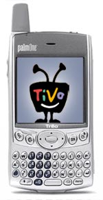 Jason Shellen, of Google, wrote briefly today about his experience programming a Tivo from a Treo 600 cell phone. Jason was using Tivo’s new “Online Scheduling” feature and sounded very impressed with the whole experience.
I’ve been scheduling recordings on my Series 1 DirecTivo with my Treo 600 phone for several months now, but I’ve been using the open source TivoWeb software instead. Installing the tiny TivoWeb package on your box turns it into a full-fledged web server with access to the outside world. The end result is that from any browser in the world (including the nice one on the Treo), you can access every aspect of your Tivo’s interface. You can even search for programs or physically change what channel your TV is tuned to… all via IP. And since TivoWeb is HTML and CSS driven, it’s a snap to create stylesheets which look great on desktop browsers and handheld devices as well.
So I’m wondering… has anyone tried both the official Tivo Online Scheduling feature and the TivoWeb Project’s open-source implementation? Are there any compelling reasons to use one over the other? I’m sure the lack of command-line setup and other Unix scariness is a big plus on the side of Tivo’s official service, but is it as powerful as what the TivoWeb Project gives you? In other words, can I freak housesitters out by changing channels from halfway across the world?
I think if more people were aware of features like remote scheduling, we wouldn’t see the levels of DVR/VCR ambivalence we still see in the market today. Why is Doogie Howser telling me how to pause football games when a less annoying celebrity could be telling me about remote scheduling?
Making Visited Links Radical
 Everyone does visited links differently. Jakob Neilson flunkies use the old school blue-and-purple combo to help show visitors where they’ve been. People with actual design taste use more palatable colors, or perhaps a font-weight variation instead. When Mike Industries launched, visited links differentiated themselves with a subtle grey background.
Although I liked the grey background implementation, it started to look more like a highlighter pen than anything else.
I decided to rethink the situation.
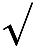
Since doing normal stuff is no fun, I decided to experiment with the :after pseudo class. What character could one insert after a link to indicate that the link had already been checked? Hmmm. How about a checkmark? The standard ISO character set gives us the mathematical “radical” sign (√) which looks remarkably like a hand sketched checkmark at small sizes. So this should be easy, right? You’d think something like this would do the trick:
a:visited:after {
	content: " √";
	font-size: 75%;
}
Nope. It turns out that prints the actual encoded character series for radical after each link. But by using the unicode entity instead ( \221A ), the checkmark renders perfectly after each visited link:
a:visited:after {
	content: " \221A";
	content: "\00A0\221A";
	font-size: 75%;
}
* Thanks to Jens Meiert for improving this technique as illustrated above by using a non-breaking space before the radical, instead of a regular space.
I am not so naive to think this has never been done before, but I certainly do like the effect. Sure, the :after pseudo class isn’t supported in PC IE, but at least it degrades silently in feature-challenged browsers.
Mike Industries Zeitgeist: Week One
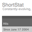 Well it’s been a good first week here at Mike Industries. Over 50,000 page views, plenty of scathing editorial and healthy discussion in the comment threads, and not a single piece of hate mail! Not that readers might be interested in such things, but I thought I’d share some of the nuggets gleaned from ShortStat during the first week:
- Total Page Views: 50,304
- Top Platforms: Windows – 69%, Mac – 25%, Linux – 2%
- Top Browsers: Firefox – 41% (wow), IE – 23%, Safari – 17%
- Top Three Referrers: Mezzoblue, Zeldman, Kottke
- Most interesting referrer: The “Eater” (what the hell is this?)
- Coolest blog discovered via referrer: Thought Anomalies
- Number of deaths reported from the Invalidator Badge: 0*
Anyway, more ramblings are on the way this weekend. Thanks to everyone who has put up with them so far. Expect updates to this site once or twice a week as excess mental energy allows.
* In case there was any doubt, yes, the Invalidator Badge is clearly hyperbole.
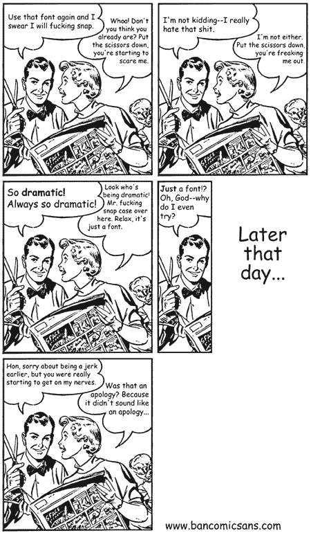
You Know You’re a Design Dork When…
You know you’re a design dork when this is just about the funniest comic you’ve ever seen:
(Original comic available at bancomicsans.com)
Converting CGI Movable Type Templates to PHP
 I love Movable Type. I really do. But there are two things about it which really chap my hide. The first is that it doesn’t offer dynamic page serving, so I must recompile my entire site after making a change. I can live with this problem as recompiling is just a question of hitting a button and waiting awhile.
The second problem, however, is that Six Apart left a few important pages as raw CGI queries. I’m talking mainly about the Search Results page, the Comment Listing page, and the Trackback page. I understand why the company initially set things up this way since when Movable Type first came out, not nearly as many people were using PHP as they are now. But now that PHP is so widespread, it would sure be nice if the company offered its customers an easy way to convert these templates to PHP.
Short of this, I’d like to share the ways I de-CGI’d these templates on Mike Industries. If you build portions of your pages dynamically with PHP, this entry is for you.
Read more…
Giving Full Typographic Control to the User
 So I have this friend named Lavina who occasionally sends me e-mails and instant messages set in Comic Sans. I have told her repeatedly that this font has been officially banned, but she “just likes it” and continues to use it in various pieces of correspondence… even if it is just to piss me off.
So that got me thinking, should a website allow you to explicitly set the typeface of what you’re reading? Most sites set the typeface for you. My site gives you several choices derived from what I find to be very readable faces: Lucida Grande, Verdana, Helvetica, etc. But what about the edge case that just really loves Comic Sans? Should I throw Comic Sans in my dropdown menu on the right side of this site? Clearly not, unless I want to be publicly ridiculed at work.
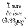
What I decided to try instead was adding a custom font field to the Readability section on the right side of this site. Click the “Or, specify your own…” link and type in any font you have installed on your system. Then, hit the “Set” button and voila! Mike Industries will reluctantly render in whatever twisted typeface you happen to think of that day. Even Comic Sans. Or worse yet, Giddyup (see picture above). The only downside is that you need to type the font name in exactly as your system labels it. So for instance, on the Mac, “ComicSansMS” works but “Comic Sans” does not. If you have a particular font you’d like to specify, just try a few variations of its name, with and without spaces, and you’ll get it after a few tries. If you don’t get it, the site will just render in whatever your default font is.
One thing I’d really like to be able to do with this is have a dropdown menu with all the fonts a user has installed instead of making people type a font name in. Does anybody have any idea if this is possible? My suspicion is that if it is, it may require writing something OS-specific… bad.
So for now, please enjoy the Custom Font Selector, and let me know if you have any ideas to improve it. I feel like this functionality is best suited for OS X users right now because we get to view true anti-aliased Postscript fonts in our browsers, but as mentioned with regard to Comic Sans, Windows users can “benefit” too.
Newsmap as a Model for Smart Aggregation
 Information overload. It’s the next big issue in publishing, and technology in general. The day you have 400 e-mails in your inbox, 900 new items in your RSS aggregator, and 8 Instant Messenger windows on your screen will come. For some people, it’s already here.
With the internet still growing and changing at such a rapid rate, the raw amount of information your brain processes will see a huge increase in this decade. There’s probably even a Moore’s Law-esque equation for it. So if we are finding that the flow of information into our lives is only going up and our free time is only going down, how do we deal with this increasing imbalance?
The answer is agentry. A smart agent of sorts that sits on your desktop and acts as mediator between you and the world. If you want something from the world, your agent goes out and finds it for you. If the world wants something from you, it needs to talk to your agent first. We may have various agents in our lives already but none accomplishes what the smart agent of the future will accomplish.
Read more…
March to Your Own Standard
 So what’s up with the little grey button at the bottom of this site? It is my official Invalidation Badge. It’s mere presence on every page of this site renders my entire domain XHTML 1.0 Non-Compliant. Invalid. Erroneous. Whatever you want to call it. Here are the various crimes this one line of code commits:
- An ampersand is not properly encoded
- An alt tag is missing
- An attribute called “myfavoritetag” is made up
- An attribute is missing quotes
- A script tag is missing its type and language attributes
- A non-closing tag is missing its trailing slash
- A tag is upper case… gasp!
By invalidating my entire site with this one line of code, I ensure that I am made aware the instant it matters. The instant this stuff starts to break anything in the real world, I will know. If I only had a few small errors on a few random pages around my site, I could easily miss the day when “the big switchover” happens and wind up with broken pages I don’t know about. And since this code is in the form of a server-side include, I can freely remove it with a few clicks.
It’s kind of like carrying a canary down a mine shaft with you. As long as the canary is alive and chirping, you know you’re okay for air. Actually, I guess it’s not really like that.
Read more…
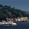
Site Experiment: Puget Sound Cam
 When it comes to designing public sites, I am a big fan of giving control to the user. The old school of web design told you to specify a page’s visual parameters in such exact terms that users couldn’t really do anything to adjust it. This was mostly the by-product of inconsistent browsers and heavy-handed design techniques. Although we haven’t gotten completely away from browser issues yet, we now have stylesheets with which to create entire design motifs.
By using a dynamic style switcher like the one on the upper right side of this page, we can offer users the choice of several different looks. Since there really is no accounting for taste in any form of media consumption, you only increase the likelihood that users will enjoy your site by offering them a few choices.
Read more…
Putting the Face Back in Typeface
 So the other day, Zeldman opined that he’s not seeing the sort of creative explosion he once expected from the web. I can’t say I disagree too much with that, but if you look in the right places, new jewels pop up every week.
Take Ni9e.com’s latest typographic illustration project. After watching it 20 or so times, I think it might really be the coolest thing I’ve ever seen in Flash. It’s creative, artistic, simple, and brilliant. The Bob Dylan (Garamond) one is my favorite, although all others are fantastic as well. Sometimes when I see stuff this good, it makes me want to get out of design altogether. I mean, when the bar is set this high, what’s the point of even jumping!
I can only guess how this was done:
- Use a pressure-sensitive tablet to draw a musician.
- Record every stylus movement using a custom-built Flash routine.
- Compile a text file containing the lyrics of a song from that musician.
- Write some Actionscript which recreates the original movement of the stylus, but using letters from the lyrics instead of a plain black line.
- Use the pressure-sensitivity to create bigger letters for when the stylus was pressed down hard, and smaller letters for when the stroke was light.
- Import the song and play it while the figure is being drawn.
It is great work like this which keeps me inspired about the web industry. Kudos Ni9e.com.