Reboot!
It’s been 7 years since I last redesigned Mike Industries, and it feels like even longer. The old design still holds up considering the largely desktop audience it was designed for, but since it’s May 1st Reboot Day, and I’ve had some time on my hands since leaving Twitter, I thought I’d release a shiny new version today.
Say hello to Mike Industries, Version 3.
What is wrong with the old Version 2, you ask? Well:
- It’s not responsive.
- It ingests and displays all of my Tweets and saved Tumblr links, which seems like overkill now.
- Because of all the peripheral stuff being displayed, WordPress isn’t able to assemble the page very quickly and browsers are also slow to render it.
- It doesn’t take advantage of any of the great HTML, CSS, and related advancements that have developed in the last few years.
- It was just time for a change, and I felt like getting back into pixels and code again.
While I’ve spent the last few months putting this together, it only occupied a day or two of time per week. Lots of fits and starts, including periods of frustration and reflection where I’ve asked myself “Why am I not just moving everything to Medium?”
The answer to the Medium question is two-fold, for me:
- As someone who designs things for a living, there is a certain amount of professional pride in creating one’s own presence on the internet. It’s kind of like if an architect didn’t design their own house. Almost every non-architect — which is 99% of the world — should live in a house designed by someone who knows what they are doing, but if you have the skills, why not use them?
- In working through all of the various issues that come with designing a modern, responsive site, I gained a whole new appreciation for how well-built Medium really is. I mean, I knew it was well-built before, but it really is the highest-quality solution for most people out there. Aside from the exquisite craftsmanship, the network effects that now occur around well-written articles on Medium rival and sometimes exceed those experienced during the Blogging Days of Yore. For this reason, I going to — at least initially — cross-post articles on both Mike Industries and medium.mikeindustries.com, which is a sub-domain on the Medium platform. Coincidentally, I have also owned meatium.com for a long time, so if I ever start up a food blog for carnivores, I might host Meatium on Medium.
This site, when active, has always been a bubbling cauldron of experimental hacks and concepts, and I’m happy to say that version 3.0 continues this tradition. The site is still a work-in-progress, but below is the philosophy behind it, as well as a host of implementation tidbits.
First Principles
In the past, I’ve taken a certain amount of pride in some of the bells and whistles around this site. The landmark feature of Mikeindustries 1 was a header displaying a background image of the view outside my apartment window, updated every few minutes. The site also had a font selector in the sidebar which allowed you to customize the typeface throughout the site. Back in 2003, that was kind of cool… to me at least. Mikeindustries 2 was all about sIFR and separate columns for articles, links, and Tweets.
I started off Mikeindustries 3 with the opposite approach: what is the bare minimum I need? When an article is displayed, do I need any elements at all besides the text itself? If I get draconian here, can I do the whole thing as one template to rule them all? If I put everything someone might want to know about me into a single About page, do I even need persistent navigation?
And perhaps the most confounding question of all: what about my design work? While part of me really wants to keep it all online and easily accessible, the other part of me recognizes how dated all digital work gets and wonders if it’s worth it at all. The most recent version of my portfolio is also in Flash, so clearly a straight porting wasn’t going to happen.
In the end, I decided to take a down-to-the-studs approach, launch the foundation on May 1st, and then slowly add things back in if and when necessary. At this point in my career, design leadership is a bigger part of my skillset than hands-on design, so I imagine any sort of portfolio I might put together in the future would serve a different purpose than it did 7 years ago.
Content
I settled on three types of content for the new site: What I’m Writing, What I’m Reading, About Me. The first is made up of original blog posts authored in WordPress. The second is a running list of articles I’ve faved in Instapaper. While I read of lot of things on the internet and Tweet out links to many of them, I’ve found that my Instapaper faves represent all of the best long-form stuff I’ve come across, and that is really all I want to publish here. So… the main Mike Industries stream is now comprised of What I’m Writing and What I’m Reading. If you want to dig into either separately, there’s navigation for that. The third type of content is a simple About Me page for people who are interested in contacting me or finding me on other networks.
WordPress
Hoooooooboyyyy. Where to start on WordPress. I love WordPress, I am so glad it exists, and I’m happy to host my stuff on it, BUT, it is an absolute bear for someone with my particular skills inventory. If you have no skills at all, you just pick a theme, do all of your customizations in the GUI, and be happy with what you get for free. If you are a PHP wizard who has worked on dozens of custom WordPress installations, you just build everything from scratch, hack when you need to hack, and know where all the bodies are buried. For someone like me, however, who knows HTML and CSS very well but is only a script kiddie with PHP and WordPress functions, the task of building any sort of site is daunting.
Here’s generally how my progression went:
Step 0: Spend a week or two in Sketch coming up with a great design that fits my objectives and makes me happy. No problem.
Step 1: Begin coding from scratch. The HTML and CSS part go well, but when I get to the task of snapping it into WordPress templates, I realize there is so much WordPress functionality that already exists that I am not getting for free if I don’t use a existing WordPress theme.
Step 2: Begin looking for an existing theme that remotely resembles my design. Realize there is none. I probably wasted an entire week on this.
Step 3: Take the one that seems closest anyway and then crack it open to see how it’s coded. HOLY SHIT FUCK THAT THERE IS NO WAY I AM USING THIS RAT’S NEST SPUN FROM GARBAGE.
Step 4: Look for another theme that is as simple as possible and just gets me to a reasonable baseline. I wasted another week or two on this as every theme I looked at still included things I didn’t need or want. Maybe I am misjudging, but even the standard “twentyfifteen” theme that comes with WordPress seemed like overkill.
That’s when I realized why I was having such a hard go at it: most themes are built for non-technical people so they can make customizations in the WordPress GUI, and thus, contain a ton of extra code to make this possible. While that is noble, it’s not for me.
This is one of the many points when I almost threw my hands up and just moved to Medium.
The last thing I tried ended up being the right approach for me: take the simplest built-in theme (which I believed was probably twentyfifteen), keep all of the template files, but strip them down to nothing except a few bare-bones functions that I know I needed.
Using an almost blank set of templates, I was able to get Mike Industries 3 90% working within a week or two. But, as the saying goes “the first 90 percent of the code accounts for the first 90 percent of the development time. The remaining 10 percent of the code accounts for the other 90 percent of the development time.”
That last 90% would be spent on some nasty CSS layout bugs but also some really cool stuff, outlined below.
Elasticity
No one would build a website these days without crafting it to adjust nicely across a wide range of screen sizes. Down in the coal mines, we call this Responsive Design, as most people reading this blog already know. I’m calling this section Elasticity though, because the solution I settled on feels more elastic than anything else. The last time I redesigned this site, there was no such thing as “vh” and “vw” units. Now there are, and they are amazing! Most type blocks, as well as some div heights and widths are now specified as a percentage of the viewport width (vw) or viewport height (vh). For instance, on desktop, you’ll notice that the large image goes about 70% down the screen, allowing for a preview of the first article. Also, if you stretch your browser window horizontally, you’ll notice that the type resizes with it. There are also upper and lower limits for type so things don’t get too cray-cray. I’m really digging this method of sizing. As for the traditional concept of responsiveness, I only used one breakpoint; you either get the one-column mobile/tablet layout or the two column desktop layout. Seems more than adequate, especially considering I’m also doing some other things like limiting paragraph line-length, which maximize readability at certain screen sizes.
Typography
As I mentioned, type sizing is dynamic, which is cool, and I decided to stick to a system face, Avenir on Apple devices, Roboto on Android devices, and Helvetica/sans on everything else. This is an area where I may switch to a webfont eventually, but I really hate it when sites go blank for a few seconds as they load their fonts. Even with sIFR, we never recommended people use it for large bodies of text. I find Avenir looks pretty sharp here actually.
As has been my practice in the past, I don’t use grids — baseline or otherwise. Grids are sort of like the equivalent of weighing your ingredients when you bake. They are the “correct” thing to do and they ensure a certain level of precision, but they aren’t always necessary, depending on your experience and your goals. Furthermore, unlike in baking, if you got an element wrong, you can fine-tune it at any time. (I should also note here that I’ve been doing a lot of baking lately and I absolutely weigh my ingredients, for now.)
Imagery and color
Imagery and color are where things got really fun in this project. I initially built a lot more than what I’m launching but then ended up commenting a lot of it out for now, because I’m not sure I need or want a user navigable gallery of photos as part of the core experience. Not until I think it through a little more, at least.
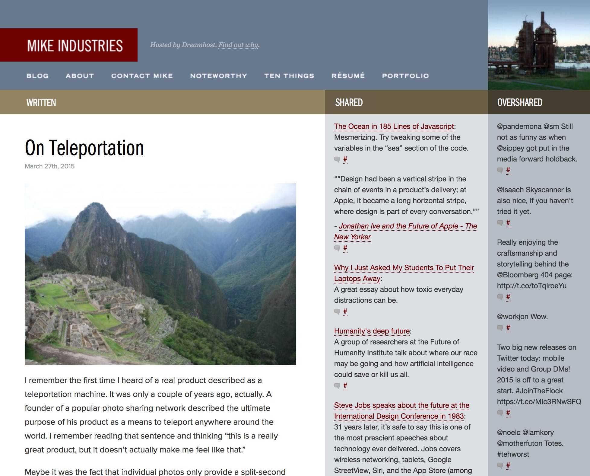
My primary goal for imagery on Mike Industries 3 was to build a system which allowed me to keep things fresh with minimal effort. In thinking what the dead-simplest flow would be for featuring new images, I actually settled on email! If I could just email any photo on any device at any time to a secret email address and that would publish it to the site, that would be fantastic. Luckily, there is a WordPress plug-in called Postie which facilitates this sort of thing. I tried to stay away from plug-ins entirely, but this one only hits the publishing side and not the rendering side, so it seemed like a great choice. The next step was figuring out how to integrate it such that its output could be used as a randomized series of background images in the header. I’m not completely settled on this format yet, but I essentially have it listen for new images sent to an email address and then publish each as a post with a special tag. Then, in PHP on the rendering side, I have WP loop through these posts, create an array of image URLs, titles, and dates (from EXIF data), and then display one randomly when you hit the front page and a few other pages. If an individual post has a “featured image” attached to it, I use that image instead. I’d post the PHP, but that would expose me for the hack that I am. Pay no attention to the code behind the curtain!
Alright, so, big beautiful images all over the site with minimal effort to keep fresh! What could go wrong? Well, the downside is that big beautiful images are also big in load time. For people with giant retina monitors and good connections, I love serving up a crystal clear phatty, but for more constrained environments — especially mobile — that 800k file would be much better off at 50k or so.
There are SO many ways of dealing with adaptive image sizes these days, but most of them left me unimpressed. Even srcset, which is an emerging standard, feels wrong to me. I’ve never liked the idea of hardcoding image sizes in HTML and srcset makes this even worse. To me, the ideal long-term solution has the client send some screen resolution info to the server and the server dynamically decides what image to send. Luckily for me, someone already wrote something like this a few years ago: Matt Wilcox‘s Adaptive Images. For some reason, it’s gone largely unsupported and dormant since then, but I found it to work perfectly for my purposes. The mechanism is simple:
- All requests for images get intercepted by PHP.
- PHP reads a cookie with the user’s viewport resolution information.
- PHP then checks to see of a version of that image at the appropriate resolution breakpoint has already been cached. If so, it serves it.
- If there is no cached file at the right resolution yet, or if the cached file is stale, PHP creates one and then serves it.
Super simple and works with very little configuration or retrofitting of existing imagery. This was important to me as I’m not about to sign up for going through 10 years of HTML IMG code and changing a bunch of shit.
Alright, so now that all of our images are adaptive in file size and resolution, we’re done, right? Turns out, not exactly. Even on fast connections, there is still an annoying lag before a large image loads and renders. Because the rest of the layout renders instantly, I had a giant placeholder space to figure out what to do with. Once again there are SO many ideas for what to do in this situation. You can read a good run-down of a bunch of them here. Not surprisingly, Medium’s is probably the best implementation. Since I’m trying to keep things as simple as possible and not use javascript except where absolutely necessary, I came up with my own serviceable solution.
Using the aforementioned Adaptive Images PHP script as a baseline, I added a couple of lines to it that save out a tiny, 10-pixel wide version of every image as well as the chosen adaptive size. Then, I load that tiny image as a background-image of a div behind the main photo div and stretch it to fit the entire dimensions of the div. The effect looks amazing in Chrome and slightly less good in Safari, due to surprising differences in how they interpolate images. As a result, the tiny sub-1k file loads instantly, showing you an interesting gradient mesh that approximates the full image, and then the full-image quickly fades in when it is loaded (accomplished with the css transition property).
For the icing on the cake, I wanted to set the color scheme of the page (type, sidebar color, etc) to match the dominant color in the photo. The first time I saw this done, it was in Dave Shea’s last Mezzoblue redesign a lonnnnnnnng time ago, but the color was set manually. I’m too lazy for that, so I began looking for ways to find dominant colors programmatically. A lot of people have tried different methods to do this and most of them don’t work very well. The one I found that worked the best and was easiest to implement is called Color Thief. Unfortunately it’s javascript-based, but in this case, I’m cool with that, because if I was going to do it server-side, I would want to build something that only did the calculation once and stored it. In fact, let me just call timeout and describe how this entire set of things should work in WordPress, in case someone knows how to build it:
- Photo is uploaded into WordPress.
- WordPress stores tiny-resolution file for the gradient mesh version.
- WordPress performs dominant-color and perhaps even dominant-palette calculation a la Color Thief and stores it as attachment metadata.
- All of this is just magically available in PHP.
So, since none of that exists yet — to my knowledge, at least — I’m just using ColorThief.js for now, which is why you see the color palette fade into prominence in concert with the high resolution imagery. I’m looking forward to streamlining this when someone builds something like what is described above. Is that you? I think that should be you!
Final Retrofits
Throughout this entire redesign, I was worried about how all of my legacy articles would look. Clearly there are going to be some weirdly formatted older posts that contain some experimental stuff, but what about the 99% of posts that use a pretty standard mix of (non-responsive) text and inline imagery? Turns out, one style rule pretty much fixed everything: img {max-width: 100%; height: auto}. That one rule kept all my images from sliding off into the gutter on smaller screens and made the site look like it’s been responsive for years. Magic.
One Last Thing: Blog Comments!
I got most of the way through this redesign thinking I would just keep comments turned off and hide all of the tens of thousands of great comments that readers have written over the last couple of decades… because who does blog comments anymore??? But then I got to thinking, I miss comments, and I never really had much of a comment spam or trolling problem on here before… so COMMENTS ARE BACK BABY. What’s old is new again. YOLO.
… and with that, I’m happy to ring in Mike Industries Version 3. It’s great to be back.
Comments! YOLO indeed.
Congrats on the launch! Excited to see Mike Industries show up in my rss reader again.
It’s looking good Mike. Glad to see you back in the saddle.
Glad your back. You and I are opposites in that I know PHP better than design, but I know design better than the average PHP programmer. I’ve learned a lot from you over the years.
It is funny how the “painters house never gets painted.” You spend all this effort programming and designing and it’s your site that is always last or is “thrown together” quicker.
Glad you have returned.
I feel old just clicking this comment button.
The new design looks great! Kudos!
Regarding “I really hate it when sites go blank for a few seconds as they load their fonts” — have a look at the work of Bram Stein at bramstein.com. He’s documented several techniques, and published some JavaScript, to avoid the flash of blankness and the related Flash Of Unstyled Text (FOUT).
As an aside: It feels great to write a blog comment instead of a tweet. So liberating.
This is some great shit. And I’m super impressed that 1) you have comments turned on, and 2) they’re not powered by Disqus or Facebook or whatever is popular nowadays. It’s like Mountain Dew Throwback-level good.
Huzzah! Congrats on the reboot.
“This is one of the many points when I almost threw my hands up and just moved to Medium.”
Yup. Also working on a reboot (obviously not a May 1 reboot), and I’m at the same fork in the road. Ashamed but also proud to admit I’ve got an newer-but-still-older install of Movable Type still sitting on the server that I might put to use.
Thanks for the inspiration to get my game on.
Welcome back, Mike.
Looks great Mike!! Just was curious – was using Jekyll or some other static site generator in the cards at any point? Welcome back!
Happy to see the traditional comment system in place, rather than the lazy incorporation of Disqus like 99% of the web is doing these days. Also glad to see that you resisted the temptation to transition to Medium — standalone sites are a lot of work, but they’re what ultimately promotes content longevity. If/when Medium ever shuts down, all that hard work could go right with it.
WordPress is the true double-edged sword. It’s great for rapidly deploying general-purpose websites (something you pointed out as far back as 2006), but gets easily stretched out of its own comfort zone once you start trying to do things in a way that doesn’t conform to what WP prefers. For professional, complex projects, I’ve been using Craft. For my own noodling around, I’ve actually begun rolling back to pure, 100% static HTML/CSS with no PHP, no Javascript, no bells, no whistles. If it can’t be done in those core languages, it’s (for the most part) unnecessary. Working with pages doesn’t take nearly as long as you’d expect, and the peace of mind you get from knowing nothing front-facing ever needs to be patched is excellent.
Glad to see you back! This place used to be the source of some very engaging discussion with yourself and other readers, and I look forward to seeing that again. Who knows, maybe Donald Trump will even attempt to link directly to your content.
Cameron, what version of MT do you have? I’m still rocking MT 3.34. I may just bite the bullet and migrate to WordPress.
I’m horrified to think that my site design is now 10 years old. And this post is reminding me why it got past 9 years… when did all this become a pain in the ass? Or are we all just getting too busy/old to noodle around with pet projects? Well, I mean, those of us with jobs.
(I’m jealous as hell of how well you pulled this off.)
Thanks all!
Adrian: Thanks for the pointer to Bram’s work. Will investigate!
Andrew: I briefly looked at Jeckyl, but for some reason, database-driven publishing still seems like the best choice to me. I don’t want to go back to the days of republishing an entire site every time I make a change.
I’m glad to see you blogging again. I’ve always enjoyed reading what’s going on in your head!
An RSS icon right there in the site navigation. Warms my heart.
Great write up Mike. thanks for sharing all of this!
Congratulations on the redesign, it looks great! This comes too late to help you – sorry! – but as far as minimal, useful bases go for starting a WordPress theme, the nicest I’ve found by far is Underscores, developed by the Automattic Theme Division, which is the basis for a lot of the wordpress.com native themes. It gives you some nice basic HTML5 templates that you can figure out quickly without learning/fighting against a whole bloated framework or dubious code, along with SASS if you want it:
http://underscores.me/
They’ve recently launched Components, too, which extends on the principles of Underscores and adds some layout options:
http://components.underscores.me/
Thanks Stef. I looked at underscores.me and can’t remember why I bailed on it. It probably would have been a better starting point though, you are right.
Congratulations on the reboot! I like Mikeindustries 3 a lot.
And thanks for sharing the development process.
Digging the reboot and like some others have said, glad to see you show back up in my RSS feeds.
With free certificates now available with LetsEncrypt, will you be moving to HTTPS for the site?
Kyle: Thanks for the heads-up! Just added a LetsEncrypt cert. Hadn’t even heard of that. Should be all secure now!
Mike: Nice work on the cert. The LetsEncrypt project’s great, I’ve deployed their certs to several sites now and it’s really refreshing to be able to secure sites without expensive and manual certificate installation.
WordPress is a bit clunky when you switch to HTTPS, so as well as changing your WP_SITEURL (Admin, Settings, General and change the WordPress address & Site address) you’ll probably need to search your DB for all the instances of “https://mikeindustries.com” and replace them with “https://mikeindustries.com” otherwise you’ll get mixed content warnings and things like stylesheets & JS may not load. Running protocol-relative URLs would be nice (setting everything to //example.com) but I’ve tried this a few times with WordPress and wouldn’t recommend it as it seems to subtly break things.
There are a couple of ways to search-and-replace your WordPress DB easily:
* searchreplacedb (a nice PHP script – make sure you delete it when you’re finished, please, as it provides direct access to your DB!) – https://interconnectit.com/products/search-and-replace-for-wordpress-databases/
* wp-cli (if you’re comfortable with the commandline; hopefully your host has it installed already, or you have cmd perms enough to install it yourself) – http://wp-cli.org/
Please back up your database first, just in case!
The former’s pretty straightforward, just download & unzip, rename its directory to something secret, upload it and visit the location. (If you have any issues with v3, as I’ve had with some nginx setups, the older v2 works fine.) It’ll auto-detect all your settings from the wp-config.php file so there’s no messing about with configuration, plus it’ll ask to do a dry run first and prompt you before doing anything for real. PLEASE delete it afterwards though, there are a tonne of sites around that’ve left this script with its original directory name sitting on their servers, then they wonder why they keep leaking all their data and getting hacked :/
wp-cli is a commandline tool, which you may or may not be comfortable with. For Dreamhost there’s a support page here:
http://wiki.dreamhost.com/WordPress_wp-cli
Something along the lines of the following will see you right (lose the –dry-run bit when you’re happy):
wp search-replace “https://mikeindustries.com” “https://mikeindustries.com” –precise –recurse-objects –dry-run
You might want to repeat that for “//www.mikeind…” -> “//mikeind…” if you’ve ever had your site configured that way, too.
Oh, one other thing: you may need to flush your caches afterwards if you use wp-super-cache or another object cache, otherwise things may act a little strange for a while. (wp-cli lets you do this with `wp cache flush` or `wp super-cache flush` depending.)
Finally, on a wider webserver note, you may want to configure an http -> https redirect if you’d like to nudge everyone over to the secure site. Not entirely sure how you do this with Dreamhost, though, sorry!
Stef: Weird, it seems like I haven’t had to do any of that. Unless I’m missing something, everything seems to “just work” now. Although the one thing I haven’t done is automatically push people to https.
Yeah, maybe WordPress is getting better at running both HTTP & HTTPS together and my former experiences are becoming out of date? The homepage is where the mixed content issues seem to bite, though:
https://mikeindustries.com/blog/
Stef: Yeah, on second glance, you are correct. I didn’t notice any problems in Safari, but in Chrome, some mixed content gets blocked by default. Did some search-and-replaces on my other blog last night and it seemed to fix things so I will also do that here. Thanks!